Ads/Posters
신한카드 모던 럭셔리 광고
신한카드 톤 — 모던 럭셔리 + 카드 hero
신한카드 모던 럭셔리 광고 summary
Copy this ChatGPT image prompt to create Ads/Posters results. Its subject, background, style, and composition are organized for quick iteration.
Related keywords: 신한카드 모던 럭셔리 광고, 신한카드 모던 럭셔리 광고 프롬프트, Ads/Posters 프롬프트, Ads/Posters AI 이미지 프롬프트, ChatGPT 이미지 프롬프트, AI 이미지 생성 프롬프트, AI 프롬프트, 이미지 프롬프트
How to use 신한카드 모던 럭셔리 광고
Keep the prompt structure and swap the subject, background, palette, or composition to create new variations.
- Keep the main subject and adjust the palette and background for your brand, season, or channel.
- If the result feels busy, simplify the background and make the subject, composition, and lighting more specific.
- After copying, ask ChatGPT to adapt it for your platform, aspect ratio, or text requirements.
Original prompt
[Input]
- language: Korean
- output_size: 1024x1536

[Purpose]
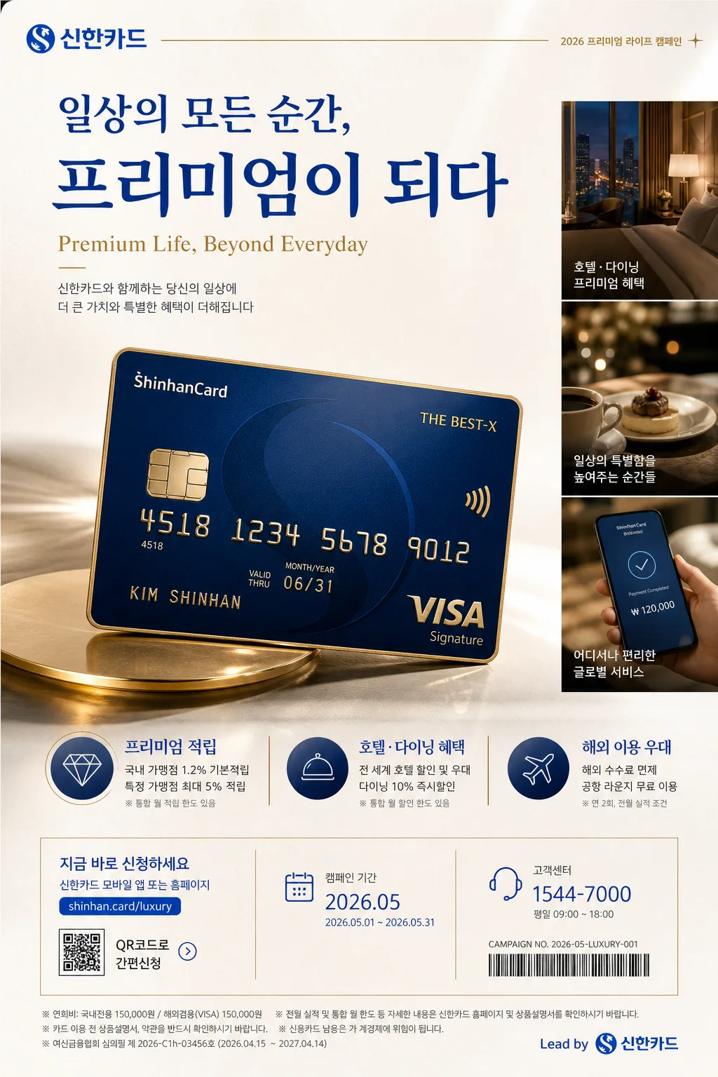
신한카드 모던 럭셔리 광고 포스터, 세로형 브랜드 캠페인 비주얼, 카드 혜택과 프리미엄 라이프스타일을 함께 보여주는 정교한 광고 컴포지션.
고급 카드 광고의 히어로 컷, 작은 라이프스타일 서브컷, 혜택 정보, 캠페인 디테일, 약관형 마이크로 텍스트가 함께 배치된 현실적인 프리미엄 매거진 광고 포스터.

[Composition]
- 전체 프레이밍: 세로 1024x1536 기준으로 카드 히어로가 화면 하단~중앙 약 55%를 차지하고, 상단 20%는 헤드라인과 영문 부제, 우측 또는 하단 일부에는 작은 라이프스타일 컷과 혜택 라벨이 들어가는 비대칭 럭셔리 레이아웃.
- 배경 처리: 프리미엄 스튜디오 배경 위에 은은한 크림-화이트 그라데이션, 미세한 종이 질감, 금속성 하이라이트, 얇은 골드 라인 장식을 더해 실제 금융 광고 지면처럼 구성하고, 화이트 계열 바탕에 신한 블루와 골드가 또렷하게 돋보이게 처리.
- 포스터 정보 요소: 상단에는 브랜드명과 캠페인 카피, 중앙에는 카드 히어로와 라이프스타일 컷, 하단에는 혜택 3종, 가입 안내, QR 코드 영역, 작은 바코드형 관리 번호, 캠페인 날짜 라벨, 법적 고지용 마이크로 텍스트를 배치.
- 시선 흐름: 브랜드 헤드라인 → 영문 부제 → 카드 히어로 → 라이프스타일 컷 → 혜택 정보 → 하단 안내 영역 순으로 자연스럽게 읽히도록 조명과 타이포 크기를 조절.
- {브랜드 톤}은 전체 톤앤매너의 기준으로 반영하고, 텍스트 밀도와 프리미엄 감도를 그에 맞게 조절.
- {시그니처 결}은 카드 매크로 디테일과 라이프스타일 컷의 조합 방식으로 표현.
- {제품·소재}는 카드 실물 질감, 표면 반사, 함께 놓인 라이프 오브제로 구체화.
- {무드·라이팅}은 스튜디오 조명 방향과 하이라이트의 질감으로 재현.
- {컬러 팔레트}는 배경, 카드 엣지, 액센트 라인, 텍스트 컬러에 일관되게 적용.
- {카피·타이포}는 상단 메인 카피, 영문 부제, 혜택 카피의 계층 구조로 배치.
- {레이아웃}은 카드 히어로와 작은 라이프 컷, 큰 카피의 상대 비율을 결정.
- {비율}은 최종 세로 광고 포스터 비율로 유지.

[3. CORE STRUCTURE]
1. Background layer: premium studio backdrop with soft off-white base, subtle cream-to-white gradient, fine paper grain, faint brushed-metal sheen, and a few thin metallic gold rules that frame the campaign information.
2. Hero card area: a glossy premium Shinhan-style card rendered as the main subject, angled slightly in a controlled three-quarter view, occupying the lower-center to mid-frame with crisp edge definition, realistic reflective highlights, fine laminated texture, embossed dummy digits, IC chip, contactless symbol, and a small printed member-name credit.
3. Lifestyle inset: a smaller supporting lifestyle cut placed near one side of the hero card, showing an elegant everyday premium scene such as a hotel lounge table, leather wallet, espresso cup, phone screen with payment confirmation, boutique receipt, and soft bokeh city light; it should suggest benefits and usage while staying secondary to the card.
4. Header copy block: large Korean headline placed in the upper section with strong hierarchy, followed by a smaller English subtitle, short Korean benefit copy, and a campaign label such as “2026 프리미엄 라이프 캠페인”.
5. Benefit information strip: add three concise benefit modules with icon-like markers and short Korean labels, for example “프리미엄 적립”, “호텔·다이닝 혜택”, “해외 이용 우대”, each with small supporting microcopy.
6. Poster utility details: include a small QR-code placeholder area, barcode-like campaign management strip, date label “2026.05”, tiny customer-center line, website-style line “shinhan.card/luxury”, and fine-print terms across the bottom as realistic advertising details.
7. Accent details: thin gold rules, refined light streaks, micro reflections, small registration marks, and editorial grid notations used to signal premium finance branding with realistic printed-ad depth.
8. Brand anchoring: {브랜드 톤} expressed through restrained luxury composition, precise spacing, controlled contrast, and real-world financial campaign information.
9. Signature expression: {시그니처 결} translated into a polished card-macro + lifestyle combination that feels like an upscale editorial ad.
10. Product emphasis: {제품·소재} shown with believable material texture, polished surface, chamfered card edge, tactile foil detail, and clean separation from the background.
11. Mood rendering: {무드·라이팅} used to create a studio-lit, warm, high-end commercial finish.
12. Color integration: {컬러 팔레트} applied across card accents, typography, icon modules, QR area, and subtle background reflections.
13. Copy hierarchy: {카피·타이포} arranged with the brand name most prominent, English subline smaller, benefit copy compact and legible, and fine print realistically small but not broken.
14. Layout balance: {레이아웃} maintained so the hero card, small lifestyle cut, large copy, benefit modules, and bottom information band feel editorial and intentional.

[4. STYLE RULES]
- Typography: use Pretendard or Noto Sans KR for the Korean headline in bold 700–800 weight, large display size; use a clean sans-serif English companion line in medium weight; keep spacing tight and premium, with realistic hierarchy for headline, subhead, benefit labels, and legal microcopy.
- Color palette: apply Shinhan blue, white, and gold accent as the main system, with off-white #F6F4EF, deep blue #0046A6, rich navy #0B1F3A, and metallic gold #C8A24A.
- Shadow and depth: use a soft drop shadow with 4px y-offset, 14px blur, 15% opacity for the card and inset elements; add natural contact shadow under the card, glossy edge reflections, and subtle paper grain so the poster feels physically photographed and print-ready.
- Texture: smooth laminated card sheen, tactile chip detail, metallic foil accents, subtle paper-like background grain, faint brushed-metal highlight, and believable lifestyle-object textures such as leather, ceramic, glass, and printed receipt paper.
- Graphic details: include refined gold dividers, small benefit icons, QR-code area, barcode-like campaign strip, tiny grid labels, and bottom disclaimer text as part of a premium financial advertisement.

[5. VISUAL STYLE]
- Camera / lens: high-end commercial product photography look, Phase One IQ4 style capture with 100mm macro lens at f/8 for the card hero, plus a separate 85mm f/1.8 feel for the lifestyle inset.
- Lighting: studio softbox key light from upper-left at about 45°, gentle fill from right, slight rim highlight to define card edges, with warm specular control and clean reflections; lifestyle inset uses shallow-depth warm lounge lighting with soft highlight rolloff.
- Color grade: cool clean white base balanced with Shinhan blue, restrained gold highlights, and a slightly warm luxury finish reminiscent of premium bank campaign photography.

[6. MOOD]
Premium financial brand editorial — a polished Vogue Business / Aesop-adjacent luxury ad aesthetic with precise corporate restraint, realistic campaign details, tactile product materiality, and a confident modern Korean credit-card advertising tone.

[7. CRITICAL]
- Korean text accuracy: 반드시 아래 문구가 이미지에 정확히 보여야 함.
  - "신한카드"
  - "한글"
  - "영문 부제"
  - "혜택 카피"
- Additional Korean text to render clearly in the image: "나다운 선택이 가장 좋은 답", "2026 프리미엄 라이프 캠페인", "프리미엄 적립", "호텔·다이닝 혜택", "해외 이용 우대", "2026.05", "자세한 내용은 신한카드 앱에서 확인".
- Layout invariants: card hero must remain the dominant subject, the lifestyle cut must stay secondary, and the large copy must be clearly legible with a luxury ad hierarchy.
- Composition invariants: preserve realistic card geometry, readable Korean typography, controlled reflective highlights, and a credible premium finance poster structure with benefits, QR area, barcode-like strip, and fine-print information.

[8. 🚫 PROHIBITED]
- Fake official seals, awards, or certifications
- Broken Korean characters or unreadable typography
- Celebrity composites or unauthorized likeness