광고/포스터
토스 미니멀 핀테크 광고
Toss 톤 — 미니멀 핀테크 + MZ 친근
토스 미니멀 핀테크 광고 검색 요약
토스 미니멀 핀테크 광고은 광고/포스터 결과물을 만들 때 바로 복사해 활용할 수 있는 ChatGPT 이미지 프롬프트입니다. 주제, 배경, 스타일, 구도 조건을 함께 담아 빠르게 시안을 만들 수 있도록 구성했습니다.
관련 키워드: 토스 미니멀 핀테크 광고, 토스 미니멀 핀테크 광고 프롬프트, 광고/포스터 프롬프트, 광고/포스터 AI 이미지 프롬프트, ChatGPT 이미지 프롬프트, AI 이미지 생성 프롬프트, AI 프롬프트, 이미지 프롬프트
토스 미니멀 핀테크 광고 활용 포인트
원본 구조를 유지하면서 피사체, 배경, 색감, 구도를 바꿔 다양한 시안으로 확장할 수 있습니다.
- 핵심 소재는 유지하고 브랜드, 계절, 채널 목적에 맞는 색감과 배경을 바꿔보세요.
- 결과가 산만하면 배경 요소를 줄이고 피사체, 구도, 조명 조건을 구체화하세요.
- 복사한 뒤 ChatGPT에서 플랫폼, 화면 비율, 텍스트 포함 여부를 추가로 요청할 수 있습니다.
프롬프트 원문
[Input]
- language: Korean
- output_size: 1024x1536

[Purpose]
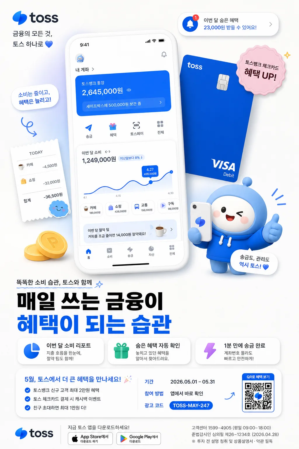
Toss-like fintech advertisement poster, designed as a vertical app-promo editorial for social feeds, subway screen ads, and paid mobile placements.
Friendly, clean, MZ-oriented brand visual with a realistic app-screen hero, debit card detail, character illustration, benefit modules, event information, and bold Korean copy hierarchy.

[Composition]
- Main hero area (top 52%): {제품·소재} arranged as the primary focal cluster, with the app screen slightly larger than the card and character to establish a clear visual anchor. Show believable UI details such as account balance cards, spending graph, transfer button, notification pill, and small icon rows.
- Secondary support area (mid-to-lower 28%): add friendly illustration elements, floating rounded badges, tiny receipt snippets, coin icons, and benefit chips placed around the hero so the ad feels like a real fintech campaign rather than a blank product mockup.
- Campaign information area (lower 20%): include short Korean headline/subcopy, CTA button, QR code block, app-store style download buttons, campaign period, small legal disclaimer, and a tiny customer-center line.
- Background treatment: warm white or near-white matte studio surface with gentle depth, subtle paper texture, realistic ambient shadow, faint pastel glow behind the app screen, and a polished social-ad finish.
- Spacing and framing: centered vertical layout with energetic layered placements, readable typography blocks, and a balanced poster rhythm that feels approachable, premium, and content-rich.
- Apply {브랜드 톤}, {시그니처 결}, {카피·타이포}, {레이아웃}, and {비율} as the organizing logic for all placements.

[3. CORE STRUCTURE]
1. Hero cluster: place the app screen front-most, with the card slightly offset behind it and the character illustration adjacent, creating a layered fintech product spotlight. Add tiny UI labels such as “소비”, “송금”, “혜택”, “자산” inside the screen.
2. Copy zone: set a large Korean-first headline near the lower-middle area, supported by two short feature blurbs in pill cards. Example feature blurbs: “이번 달 소비 리포트”, “숨은 혜택 자동 확인”, “1분 만에 송금 완료”.
3. Campaign details: add small but legible poster information such as “2026.05.01–05.31”, “앱에서 바로 확인”, “QR로 혜택 보기”, “광고 코드: TOSS-MAY-247”, and a compact disclaimer line.
4. Accent shapes: add rounded geometric accents in {컬러 팔레트}, including soft circles, capsule tags, small check icons, graph dots, and sticker-like labels. Keep their scale supportive and integrated with the product story.
5. Shadow treatment: give each object a gentle, believable drop shadow that separates it from the matte background while maintaining a light fintech campaign feel.
6. Brand finish: keep the entire scene consistent with {무드·라이팅} and {브랜드 톤}, maintaining a modern fintech ad feel with real promotional context, not a catalog-style product mockup.

[4. STYLE RULES]
- Typography: use Pretendard Bold for the main headline, Pretendard SemiBold for subcopy, and Pretendard Regular for microcopy/disclaimers, with strong sans-serif proportions and large size contrast for ad readability.
- Color palette: use Toss Blue, clean White, and friendly accent tones from {컬러 팔레트}; keep saturation crisp, polished, and premium rather than neon-heavy.
- Border/shadow: soft drop shadow with 4px vertical offset, 14px blur, 14% opacity; use subtle rounded cards, translucent UI panels, and light keyline dividers where useful for a real app-campaign design.
- Typography behavior: set the headline as a strong Korean-first lockup with optional small English support, using compact line breaks and confident spacing. Place microcopy, QR label, and date text smaller but still legible.
- Graphic detail: include believable app icons, spend-category chips, mini charts, notification badges, and small sticker labels such as “NEW”, “혜택”, “무료 송금” to add realism without overwhelming the main message.

[5. VISUAL STYLE]
- Camera / lens: studio product-render look inspired by a 50mm lens perspective at f/5.6, straight-on vertical framing, clean ad composition.
- Lighting: high-key studio lighting with softbox key from upper-left at 45°, very subtle fill from right, faint ambient bounce on the white surface, and a soft blue glow behind the app hero.
- Color grade: cool-clean fintech palette with Toss Blue, white, and soft pastel accent support; keep contrast crisp, edges polished, and UI text sharp.
- Material realism: app screen glass should have a controlled reflection, card should have matte plastic texture with slight edge thickness, and paper-like background texture should be faint but visible.

[6. MOOD]
Premium mobile-finance campaign ad — friendly startup UI aesthetic with a polished Toss-like brand finish, realistic promotional details, smart benefit storytelling, and energetic Korean social-feed readability.

[7. CRITICAL]
- Korean text accuracy: the following strings must appear exactly as rendered text if used in the design: “토스”, “Toss”, “오늘도 돈 관리, 쉽게”, “이번 달 내 소비 리포트”, “혜택 확인하기”, “2026.05.01–05.31”, “QR로 혜택 보기”.
- Maintain a fintech ad composition with an app-screen hero, friendly illustration, large copy hierarchy, QR/download CTA area, campaign date, and small disclaimer line.
- Objects must remain clean, non-distorted, and product-ad polished; avoid any uncanny facial or object deformation.
- Keep the layout centered and vertical, with clear separation between hero objects, benefit cards, CTA, and typography.

[8. 🚫 PROHIBITED]
- Fake official seals / certifications
- Broken Korean characters