광고/포스터
까사미아 럭셔리 가구 광고
까사미아 톤 — 한국 럭셔리 가구
까사미아 럭셔리 가구 광고 검색 요약
까사미아 럭셔리 가구 광고은 광고/포스터 결과물을 만들 때 바로 복사해 활용할 수 있는 ChatGPT 이미지 프롬프트입니다. 주제, 배경, 스타일, 구도 조건을 함께 담아 빠르게 시안을 만들 수 있도록 구성했습니다.
관련 키워드: 까사미아 럭셔리 가구 광고, 까사미아 럭셔리 가구 광고 프롬프트, 광고/포스터 프롬프트, 광고/포스터 AI 이미지 프롬프트, ChatGPT 이미지 프롬프트, AI 이미지 생성 프롬프트, AI 프롬프트, 이미지 프롬프트
까사미아 럭셔리 가구 광고 활용 포인트
원본 구조를 유지하면서 피사체, 배경, 색감, 구도를 바꿔 다양한 시안으로 확장할 수 있습니다.
- 핵심 소재는 유지하고 브랜드, 계절, 채널 목적에 맞는 색감과 배경을 바꿔보세요.
- 결과가 산만하면 배경 요소를 줄이고 피사체, 구도, 조명 조건을 구체화하세요.
- 복사한 뒤 ChatGPT에서 플랫폼, 화면 비율, 텍스트 포함 여부를 추가로 요청할 수 있습니다.
프롬프트 원문
[Input]
- language: Korean
- output_size: 1024x1536

[Purpose]
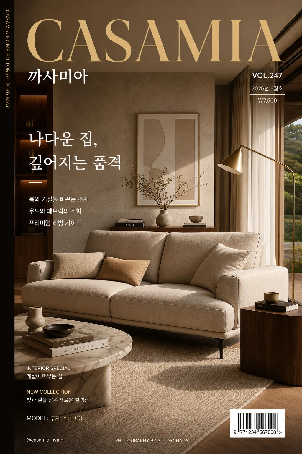
Luxury furniture advertising key visual in a high-end editorial style, designed like a premium interior magazine cover page featuring CASAMIA. Vertical poster composition for brand campaign use, with realistic interior styling, readable Korean editorial cover text, and a premium lived-in showroom atmosphere.

[Composition]
- Main hero furniture occupies 55–60% of the frame, placed slightly below center so the upper third can carry the magazine masthead, issue details, and campaign headline.
- Background is a refined luxury residence interior: warm neutral wall surfaces, natural wood flooring, full-height curtains, a stone or plaster feature wall, framed art, a side table, sculptural lamp, ceramic vase, coffee-table books, textured rug, and a subtle window view that makes the scene feel real.
- Keep the scene balanced and editorial, with {레이아웃} guiding the overall structure and clear visual hierarchy between hero product, masthead, cover lines, barcode area, and supporting interior accents.
- Use {브랜드 톤} to determine the brand personality, while preserving a polished luxury furniture advertisement look.
- Add magazine-cover authenticity: issue number “VOL.247”, date label “2026년 5월호”, small price “₩7,500”, barcode block at lower-right, tiny spine text along the left edge, and a small credit line near the bottom.

[3. CORE STRUCTURE]
1. Hero zone: Showcase {제품·소재} as the dominant focal element, styled like a premium catalog centerpiece but placed within a believable furnished room; show tactile material texture, seams, grain, cushions, legs, reflections, and crisp silhouette edges.
2. Interior context: Surround the hero with luxury home elements that reinforce {시그니처 결}: walnut side table, warm ivory rug, brushed metal floor lamp, linen curtains, stacked design books, ceramic object, fresh branches in a vase, and a muted abstract artwork.
3. Lighting layer: Apply {무드·라이팅} so the furniture surfaces reveal premium depth, soft highlights, natural shadow falloff, and convincing contact shadows on the floor and rug.
4. Color hierarchy: Build the full palette around {컬러 팔레트}, keeping the warm base tones dominant and allowing gold/charcoal accents where they strengthen contrast, typography, lamp details, or small decor.
5. Typography layer: Place {카피·타이포} in a magazine-ad layout with clear hierarchy: large top masthead “CASAMIA”, Korean title line “까사미아”, main cover line “나다운 집, 깊어지는 품격”, and 2–3 short Korean feature blurbs.
6. Editorial details: Include small magazine elements without overpowering the furniture: “VOL.247”, “2026년 5월호”, “INTERIOR SPECIAL”, “NEW COLLECTION”, “MODEL: 루체 소파 03”, “PHOTOGRAPHY BY STUDIO HAON”, and a barcode area labeled “9 771234 567008”.
7. Layout finish: Match {레이아웃} with a refined editorial grid, readable text zones, layered interior depth, and a sophisticated ad composition that feels like a premium home magazine cover.
8. Format consistency: Keep the entire visual aligned to {비율}, with all major elements comfortably readable in a tall vertical poster.

[4. STYLE RULES]
- Typography: Use Pretendard or Noto Sans KR for Korean copy in medium to semibold weight, paired with a refined serif-like English treatment for brand emphasis; title size should be large and editorial, subtitle and supporting copy smaller with elegant tracking.
- Required cover text placement: Top masthead “CASAMIA”; near masthead or hero area “까사미아”; main Korean headline “나다운 집, 깊어지는 품격”; feature blurbs “봄의 거실을 바꾸는 소재”, “우드와 패브릭의 조화”, “프리미엄 리빙 가이드”.
- Magazine metadata: Add “VOL.247”, “2026년 5월호”, “₩7,500”, “MODEL: 루체 소파 03”, “@casamia_living”, and tiny left-spine text “CASAMIA HOME EDITORIAL 2026 MAY”.
- Barcode area: Place a small realistic barcode block at the lower-right or lower-left, integrated into the cover design, with tiny numeric text below it.
- Color palette: Beige #D8C8B2, gold #B89A5A, charcoal #2F2F2F, wood brown #8A6342, warm ivory #F5F0E8.
- Border/shadow: Soft realistic drop shadow 4px y-offset, 14px blur, 18% opacity; no hard outline, no sticker-like edge.

[5. VISUAL STYLE]
- Camera / lens: High-end interior editorial look shot on a Hasselblad X2D 100C with 80mm lens at f/5.6, straight-on composition with slight architectural perspective control.
- Lighting: Soft daylight from large floor-to-ceiling windows at upper-left, with gentle fill from the right and subtle bounce off pale flooring to preserve material detail.
- Color grade: Warm cream + muted beige + brushed gold + deep charcoal, with restrained contrast and premium magazine tonal separation.
- Rendering detail: Photorealistic fabric weave, natural wood grain, brushed metal highlights, ceramic glaze variation, linen curtain texture, rug fibers, and realistic shadows beneath all furniture and decor.

[6. MOOD]
Premium interior editorial — comparable to a Kinfolk x Architectural Digest luxury home spread with the polished elegance of a high-end Scandinavian furniture campaign. The image should feel like an expensive real magazine cover photographed in a styled apartment showroom, not a flat mockup.

[7. CRITICAL]
- Korean text accuracy: 반드시 다음 한글 문자열이 정확히 보여야 함: “까사미아”.
- English text accuracy: 반드시 다음 영문 문자열이 정확히 보여야 함: “CASAMIA”.
- Additional Korean cover text should be legible and natural: “나다운 집, 깊어지는 품격”, “2026년 5월호”, “봄의 거실을 바꾸는 소재”, “우드와 패브릭의 조화”, “프리미엄 리빙 가이드”.
- Composition invariant: luxury furniture hero remains the clear focal point, with editorial typography, magazine metadata, barcode area, and interior styling supporting it rather than competing for attention.
- Typography must remain clean, premium, and fully legible; all Korean characters must be rendered without distortion.

[8. 🚫 PROHIBITED]
- Fake official seals / certifications
- Broken Korean characters