広告・ポスター
퍼시스 오피스 가구 광고
퍼시스 톤 — 사무실 가구·솔루션
퍼시스 오피스 가구 광고の概要
広告・ポスター画像を作るためのChatGPT画像プロンプトです。主題、背景、スタイル、構図を整理し、すぐに試せるよう構成しています。
関連キーワード: 퍼시스 오피스 가구 광고, 퍼시스 오피스 가구 광고 프롬프트, 広告・ポスター 프롬프트, 広告・ポスター AI 이미지 프롬프트, ChatGPT 이미지 프롬프트, AI 이미지 생성 프롬프트, AI 프롬프트, 이미지 프롬프트
퍼시스 오피스 가구 광고の活用方法
元の構造を保ちながら、被写体、背景、色、構図を変更して別案に展開できます。
- 主題を維持し、ブランドや季節、媒体に合わせて色と背景を変更してください。
- 結果が複雑な場合は背景要素を減らし、被写体、構図、照明を具体化してください。
- コピー後、ChatGPTに媒体、アスペクト比、文字の有無を追加で指定できます。
プロンプト原文
[Input]
- language: Korean
- output_size: 1024x1536

[Purpose]
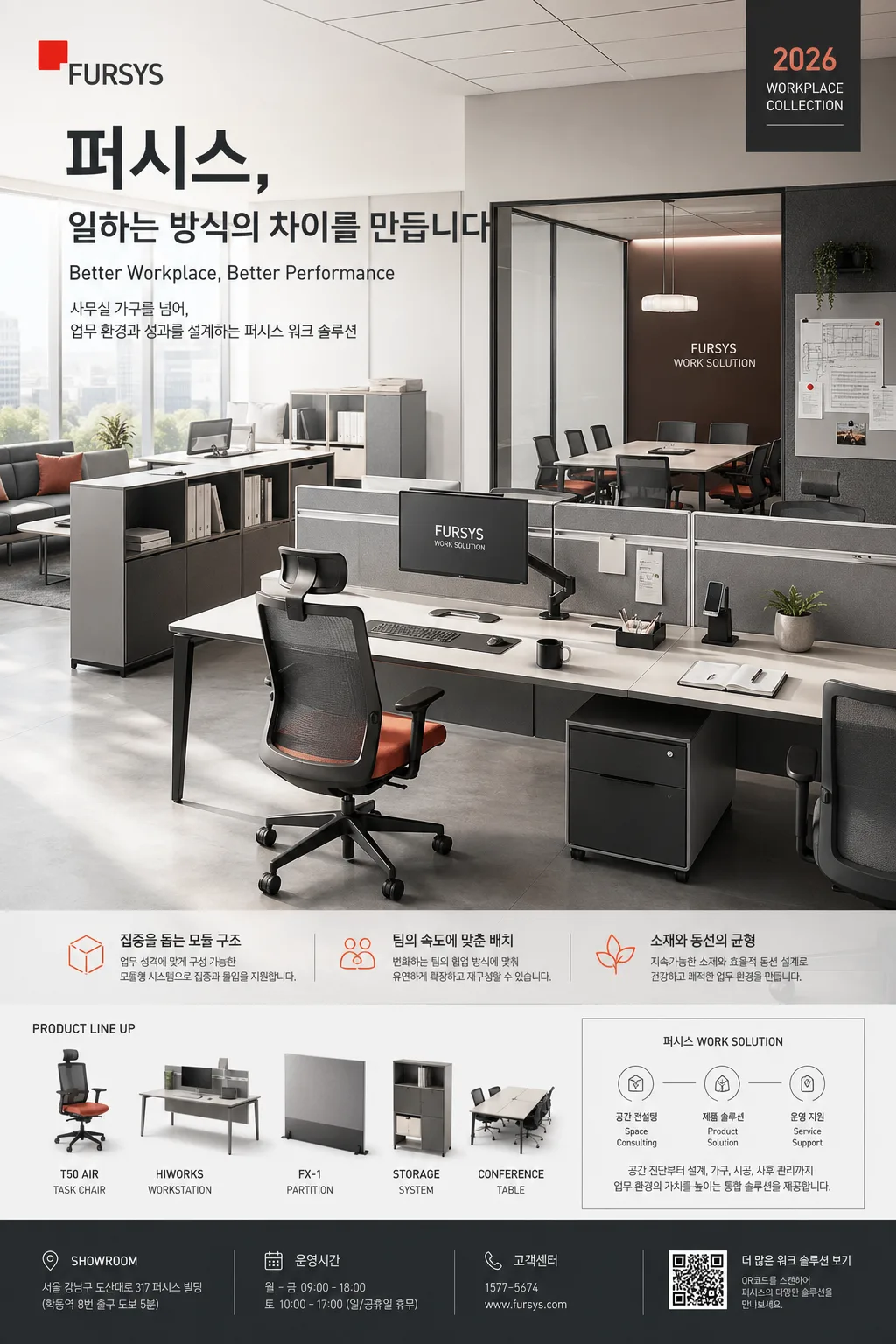
Korean office furniture advertisement poster, premium corporate brand hero layout with product-and-solution positioning for social and print use.
Realistic editorial ad composition that communicates workspace credibility, product clarity, and brand refinement through a lived-in contemporary office scene, campaign information, product notes, and practical contact details.

[Composition]
- Main hero area: {제품·소재} arranged as the primary focus inside a real workspace setting with desks, chairs, partitions, meeting surfaces, monitors, notebooks, cable trays, acoustic panels, documents, a small plant, and daily office objects that support the furniture story; keep the scene vertically stacked for a 1024x1536 poster.
- Brand presence: {브랜드 톤} represented through restrained corporate styling, a clear “퍼시스” brand mark, and a campaign label such as “2026 WORKPLACE COLLECTION” embedded naturally into the poster system.
- Signature structure: {시그니처 결} should be visible in how desk, seating, partitions, storage, monitor arms, and meeting surfaces relate to each other in a practical solution-oriented arrangement.
- Lighting and mood zone: {무드·라이팅} across the full scene, with clean highlights on product edges, tactile material surfaces, realistic shadows under legs and chairs, and readable copy panels integrated into the architecture.
- Palette and hierarchy: {컬러 팔레트} used to separate hero products, background architecture, product labels, and typography zones with a controlled premium corporate look.
- Typography zone: {카피·타이포} placed in a clear advertising hierarchy with strong brand recognition, concise supporting copy, small product callouts, and realistic campaign information.
- Layout balance: {레이아웃} with a tall hero upper-to-middle zone, brand and headline near the upper area, product feature blurbs along the side or lower middle, and a detailed information footer near the lower third.
- Aspect and framing: {비율} maintained as a vertical poster composition with crisp spacing, disciplined alignment, and enough environmental context to feel like a photographed office campaign rather than a sterile catalog mockup.

[3. CORE STRUCTURE]
1. Background plane: build a contemporary office environment with neutral architectural surfaces, glass partition lines, fabric acoustic texture, faint ceiling grid, floor reflections, pinboard details, and real workplace traces that make the furniture feel installed and used.
2. Hero furniture cluster: place {제품·소재} in a realistic office configuration that suggests actual use, with the main workstation as anchor and task chairs, partitions, storage modules, lounge or meeting table elements supporting the composition.
3. Brand atmosphere layer: infuse {브랜드 톤} through corporate confidence, polished edges, modular planning, and a solution-driven workplace presentation style; include small branded signage reading “퍼시스 WORK SOLUTION”.
4. Visual signature layer: express {시그니처 결} through modular alignment, practical spacing, cable management, desk-to-storage rhythm, chair placement, and an integrated workplace system feel.
5. Light shaping: render {무드·라이팅} with clean directional brightness, soft shadows, controlled reflections, and visible material depth on wood grain, fabric mesh, matte metal, laminate, and partition surfaces.
6. Color control: apply {컬러 팔레트} as the dominant corporate palette, using the accent color as precise cues in icon labels, small dividers, chair fabric, or poster information tags.
7. Copy block placement: set {카피·타이포} in a structured ad layout with the main Korean brand line prominent, supporting English line secondary, and compact workplace benefit copy; add short feature blurbs such as “집중을 돕는 모듈 구조”, “팀의 속도에 맞춘 배치”, “소재와 동선의 균형”.
8. Information footer: design the lower information area described by {레이아웃} as a realistic campaign footer with campaign title, date, showroom or consultation detail, QR-code area, small barcode/catalog code, website, phone number, and product material notes.

[4. STYLE RULES]
- Typography: use Pretendard SemiBold for the main Korean headline, Noto Sans KR Regular/Medium for supporting lines, and a clean sans-serif English companion; headline around 52–72px feel, supporting copy around 22–28px feel, micro-information around 12–18px feel.
- Color palette: {컬러 팔레트} should read as charcoal #2B2D30, white #F7F7F4, with one restrained accent tone such as muted blue-gray or muted green depending on the brand tone.
- Poster information design: include realistic advertising details in Korean, for example “VOL.247”, “2026년 5월호”, “오피스 솔루션 상담 예약”, “서울 쇼룸 10:00–18:00”, “www.fursys.com”, “1588-0000”, “CATALOG CODE FS-WORK-26”, plus a small QR area and a barcode-style block.
- Product callouts: add 3–5 small leader-line labels near furniture details, such as “인체공학 시트”, “배선 정리 시스템”, “저소음 파티션”, “모듈형 데스크”, “친환경 마감재”.
- Border/shadow: use soft editorial shadowing, roughly 4px y-offset, 12px blur, 15% opacity, with a premium print-ad finish and tactile depth.

[5. VISUAL STYLE]
- Camera / lens: full-frame commercial photography look, 35mm lens for the overall workspace scene with mild perspective depth, paired with a 50mm detail feel for product clarity.
- Lighting: soft window light from upper-left at about 45°, gentle fill from right, clean office reflections controlled for premium readability, with diffused daylight that feels like a high-end workplace shoot.
- Color grade: cool neutral corporate grade with charcoal, white, and a single accent note; preserve natural material tones and keep saturation disciplined.
- Realism details: include believable scale, seams, screws, fabric weave, subtle fingerprints on glass, paper edges, monitor glow, cable ports, chair casters, and floor contact shadows so the furniture reads as real and purchasable.

[6. MOOD]
Premium corporate furniture campaign — sleek workplace editorial with a Magma / Dezeen office feature feel, elevated by realistic showroom-campaign details, product annotations, and a calm professional workday atmosphere.

[7. CRITICAL]
- Korean text accuracy: 반드시 정확히 보여야 하는 문구 — “퍼시스”, “워크”, 그리고 필요한 경우 {카피·타이포} 안에 포함된 한글 카피.
- Additional Korean text must remain crisp and readable when included: “2026 WORKPLACE COLLECTION”, “오피스 솔루션 상담 예약”, “집중을 돕는 모듈 구조”, “팀의 속도에 맞춘 배치”, “소재와 동선의 균형”, “서울 쇼룸 10:00–18:00”, “www.fursys.com”.
- Layout invariants: office hero composition, furniture-as-solution framing, vertical ad hierarchy, realistic workplace environment, product callouts, and compact information footer must remain consistent.
- Typography must stay crisp and legible with no broken Korean characters.

[8. 🚫 PROHIBITED]
- Fake official seals / certifications
- Broken Korean characters
- Celebrity composites / unauthorized likeness