広告・ポスター
세븐일레븐 편의점 광고
세븐일레븐 톤 — 글로벌 편의점
세븐일레븐 편의점 광고の概要
広告・ポスター画像を作るためのChatGPT画像プロンプトです。主題、背景、スタイル、構図を整理し、すぐに試せるよう構成しています。
関連キーワード: 세븐일레븐 편의점 광고, 세븐일레븐 편의점 광고 프롬프트, 広告・ポスター 프롬프트, 広告・ポスター AI 이미지 프롬프트, ChatGPT 이미지 프롬프트, AI 이미지 생성 프롬프트, AI 프롬프트, 이미지 프롬프트
세븐일레븐 편의점 광고の活用方法
元の構造を保ちながら、被写体、背景、色、構図を変更して別案に展開できます。
- 主題を維持し、ブランドや季節、媒体に合わせて色と背景を変更してください。
- 結果が複雑な場合は背景要素を減らし、被写体、構図、照明を具体化してください。
- コピー後、ChatGPTに媒体、アスペクト比、文字の有無を追加で指定できます。
プロンプト原文
[Input]
- language: Korean
- output_size: 1024x1536

[Purpose]
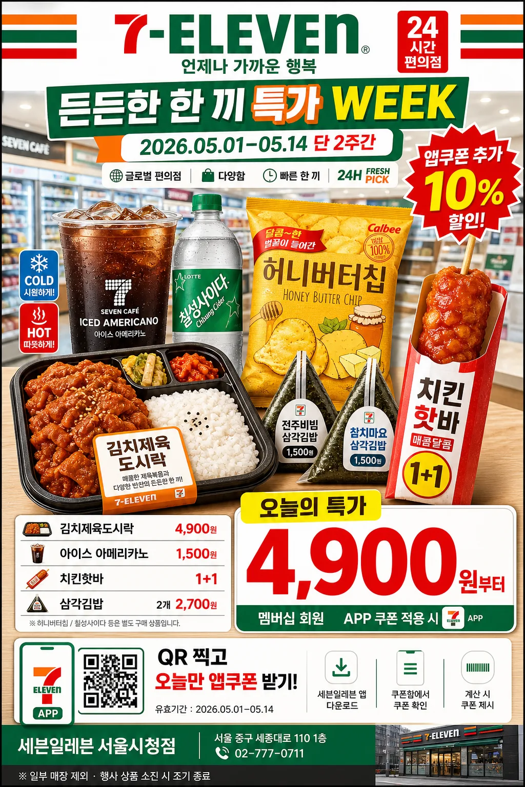
Vertical convenience-store retail advertisement poster for a 7-Eleven-style campaign, designed as a product-hero sale poster with strong price readability, real in-store promotional details, and a lively Asian convenience-store flyer atmosphere.

[Composition]
- Main product hero sits in the lower-mid 55% of the frame, with {제품·소재} arranged as the central merchandising cluster: 도시락 tray, hot food sleeve, snack packs, iced drink cup, bottled beverage, and small seasonal side items with realistic packaging reflections.
- Header zone occupies the top 18% with bold brand presence, campaign title {행사명}, date strip {기간}, and a small convenience-store signboard feel using {브랜드 톤} and {시그니처 결}.
- Use a real retail poster hierarchy: brand masthead, event ribbon, hero products, oversized {메인 가격}, benefit badge, small product list, coupon/QR area, and store information footer.
- Background treatment: bright convenience-store interior with shelf rails, price-tag strips, refrigerator glow, overhead LED panels, checkout-counter hints, and glossy printed poster texture.
- Composition is upright and commercial, with a straight-on poster layout that feels mounted near the entrance of a 24-hour store; include energetic accent shapes, sale stickers, dividers, and small barcode-style retail details.

[3. CORE STRUCTURE]
- Header area (top 18%): place the English brand text "7-ELEVEN" prominently with {카피·타이포}, a Korean subtitle line, a campaign ribbon reading {행사명}, and a date/issue-style strip showing {기간}.
- Brand identity strip: reinforce {브랜드 톤} and {시그니처 결} using red, orange, green, and white convenience-store bands, plus a small “24H FRESH PICK” retail label.
- Hero product block (mid 50%): showcase {제품·소재} as a stacked promotional bundle with realistic labels, condensation on drinks, warm steam cues around hot food, tray highlights, and shelf-ad realism.
- Price block (lower-right or lower-center 20%): set {메인 가격} as the largest numeric type, with a red burst badge for {추가 혜택} and a smaller line for member discount / app coupon.
- Supporting copy block: include {추천 상품 목록} as 3–5 compact menu/pricelist rows with prices, separated by fine dividers like an actual convenience-store sale poster.
- Coupon and store info area: add a small QR coupon box labeled {쿠폰 문구}, a barcode-like scan strip, {매장명}, {주소}, {연락처}, and {하단 안내} in the bottom footer.
- Layout discipline: keep the composition symmetrical enough to feel official while using dynamic retail stickers, diagonal sale ribbons, small icons for cold/hot/new, and realistic print finishing.

[4. STYLE RULES]
- Typography: use bold sans-serif retail typography such as Pretendard ExtraBold / Noto Sans KR Bold for Korean, compact tracking for the price, and a clean high-visibility masthead feel for the brand line.
- Color palette: {컬러 팔레트} with crisp white fields, saturated convenience-store red/yellow/green accents, warm food highlights, cool refrigerator blues, and small black text support where needed.
- Retail graphics: use bright sale bursts, rounded coupon boxes, thin divider rules, price-tag tabs, small QR/barcode blocks, app coupon icon, and shelf-label motifs that match a real Korean convenience-store promotion.
- Border/shadow: subtle printed-poster shadow, 4px y-offset, 12px blur, 15% opacity; use clean edge separation like a retail flyer mounted under store lighting.

[5. VISUAL STYLE]
- Camera / lens: straight-on commercial product advertising shot, full-frame 50mm lens at f/5.6 for sharp catalog clarity and minimal perspective distortion.
- Lighting: store LED overhead key light combined with soft daylight fill from the front-left, producing even illumination, mild reflections on packaging, condensation on beverage surfaces, and appetizing highlights on hot food.
- Color grade: clean retail-grade saturation with bright whites, punchy red-yellow-green accents, natural product color, and slightly cool neutral balance to match convenience-store signage.
- Material realism: printed poster paper with faint satin sheen, realistic plastic cup lids, foil snack packaging, cardboard food sleeves, clear PET bottle reflections, and crisp product-edge separation.

[6. MOOD]
High-clarity convenience-store promotional poster — lively real retail flyer energy with a Korean/Japanese street-corner chain-ad feel, fast to read, bright, appetizing, practical, and immediately commercial.

[7. CRITICAL]
- Korean text accuracy: 반드시 정확히 보여야 하는 문자열: "든든한 한 끼 특가", "오늘만 앱쿠폰", "김치제육도시락 4,900원", "아이스 아메리카노 1,500원", "핫바 1+1".
- Branding text accuracy: must preserve the English brand text "7-ELEVEN" exactly as part of the ad copy hierarchy.
- Required rendered poster details: "{행사명}", "{기간}", "{메인 가격}", "{추천 상품 목록}", "{쿠폰 문구}", "{매장명}", "{주소}", "{연락처}" must appear as readable Korean retail copy.
- Composition invariants: product hero + large price layout, store-promo hierarchy, straight-on poster framing, crisp Korean typography, realistic convenience-store products and printed flyer texture.

[8. 🚫 PROHIBITED]
- Fake official seals, government marks, certification stamps, or counterfeit authority emblems
- Broken Korean characters, garbled mixed-language text, unreadable prices, or warped typography
- AI-smooth plastic textures, over-rendered sheen, impossible packaging, or unrealistic product shapes
- Celebrity composites, recognizable public-figure likenesses, or distorted human figures