広告・ポスター
마켓컬리 새벽배송 광고
마켓컬리 톤 — 새벽배송 + 프리미엄 식품
마켓컬리 새벽배송 광고の概要
広告・ポスター画像を作るためのChatGPT画像プロンプトです。主題、背景、スタイル、構図を整理し、すぐに試せるよう構成しています。
関連キーワード: 마켓컬리 새벽배송 광고, 마켓컬리 새벽배송 광고 프롬프트, 広告・ポスター 프롬프트, 広告・ポスター AI 이미지 프롬프트, ChatGPT 이미지 프롬프트, AI 이미지 생성 프롬프트, AI 프롬프트, 이미지 프롬프트
마켓컬리 새벽배송 광고の活用方法
元の構造を保ちながら、被写体、背景、色、構図を変更して別案に展開できます。
- 主題を維持し、ブランドや季節、媒体に合わせて色と背景を変更してください。
- 結果が複雑な場合は背景要素を減らし、被写体、構図、照明を具体化してください。
- コピー後、ChatGPTに媒体、アスペクト比、文字の有無を追加で指定できます。
プロンプト原文
[Input]
- language: Korean
- output_size: 1024x1536

[Purpose]
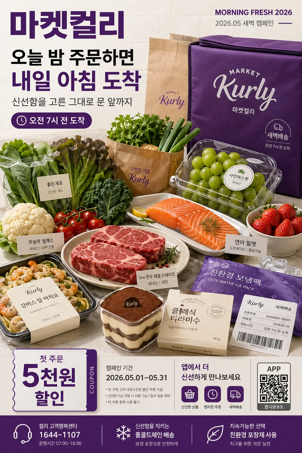
Korean premium grocery delivery advertisement poster, vertical 2:3 editorial-commerce ad layout. Designed to sell freshness, speed, morning convenience, and premium daily food selection through a realistic photographed grocery campaign with readable promotional information.

[Composition]
- Main hero takes about 58% of the frame, positioned slightly lower-center so the food spread feels abundant, premium, and ready to arrive at dawn.
- Header zone occupies the top 16% with a strong Korean headline, small campaign metadata, and a recognizable purple delivery-ad identity.
- Use {브랜드 톤} as the overall brand direction, keeping the visual language aligned to a premium Korean grocery campaign.
- Build the core scene around {시그니처 콘셉트}, with a polished delivery-ad aesthetic that feels fast, fresh, curated, and believable for a mobile commerce poster.
- Feature {대표 식재료} as the central subject group, arranged like a styled market spread with premium packaging, paper bags, chilled gel packs, produce labels, and a folded delivery invoice detail.
- Background should combine warm off-white tabletop paper, subtle cool-gray grain, faint kitchen-tile texture, and purple brand accent panels so the food colors and typography feel grounded in a real morning scene.
- Include realistic advertising details: coupon badge, app-download QR placeholder, delivery-time label, campaign date, benefit footnote, and small customer-service/contact line in the lower information zone.

[3. CORE STRUCTURE]
- Top header band: Place the main Korean masthead “마켓컬리” in large type at the upper-left, with a small campaign code “MORNING FRESH 2026” and date label “2026.05 새벽 캠페인” aligned near the upper-right.
- Hero product area: Arrange {대표 식재료} as a layered still-life cluster with the freshest item at the visual front, slight overlap between items, readable package stickers, small origin tags, a purple delivery pouch, and light realistic shadows beneath each object.
- Brand accent layer: Introduce {컬러 팔레트} as vertical purple ribbons, thin divider rules, coupon labels, app UI chips, and a lower information bar that frames the food without overpowering it.
- Copy block: Set {메인 카피}, {서브 카피}, and {배송 시간} in a clean promotional hierarchy, with the brand name largest, the delivery claim secondary, and supporting copy in a compact sans-serif stack.
- Promotional details: Add a rounded badge reading {프로모션 문구}, a campaign period line {행사 기간}, and a small app instruction line {앱 안내}; include a QR-code-like square marked “APP” and a tiny barcode-style delivery label for realism.
- Layout logic: Use {레이아웃} with a premium magazine-ad rhythm; the hero should look curated and plentiful, and the typography should balance the weight of the food cluster, labels, and lower information band.
- Size lockup: Keep the vertical balance consistent with {비율}, ensuring the poster reads clearly on mobile screens, in-app banners, and social placements.

[4. STYLE RULES]
- Typography: Use Pretendard and Noto Sans KR for modern sans-serif hierarchy, with bold 700–900 weight for the main title and 400–500 weight for supporting copy; small labels can use 18–24px while the headline should feel like 72–110px scale.
- Color palette: {컬러 팔레트} should resolve into deep market-purple, warm white, charcoal black, fresh green, and amber food highlights, with readable contrast across all Korean copy.
- Border/shadow: Add a soft drop shadow with 4px y-offset, 14px blur, 16% opacity under products; use crisp product edges, realistic paper folds, package seams, condensation droplets, and natural ingredient texture.
- Print finish: Use a premium editorial poster finish with subtle paper grain, sharp contrast on text, gentle satin highlights on packaging, and tactile details in stickers, labels, bags, and produce surfaces.

[5. VISUAL STYLE]
- Camera / lens: Shot like a high-end food campaign on a Phase One IQ4 with 80mm lens at f/8, top-down-to-slight-front hybrid angle for clean packaging and ingredient clarity.
- Lighting: {무드·라이팅}; soft diffused daylight from upper-left at 45°, with a faint cool fill from the right and gentle bounce light under the hero items to preserve freshness and texture.
- Color grade: Warm white base with controlled purple accents, warm amber highlights on food surfaces, natural greens and reds in produce, and neutral blacks for typography; overall grade should feel crisp, premium, commercial, and dawn-delivery focused.

[6. MOOD]
Premium Korean grocery editorial — a polished magazine-ad feel similar to a Kinfolk-style still life fused with a high-end e-commerce campaign, enriched with realistic app-commerce labels, delivery packaging, and fresh morning atmosphere.

[7. CRITICAL]
- Korean text accuracy: 반드시 다음 문구가 정확히 보여야 함: “마켓컬리”, “새벽배송”, “오늘 밤 주문하면 내일 아침 도착”.
- Additional Korean copy should be readable and correctly spaced: “첫 주문 5천원 할인”, “2026.05.01–05.31”, “앱에서 더 신선하게”, “오전 7시 전 도착”.
- Typography must remain clean and premium, with no broken Korean characters, no garbled spacing, and no distorted letterforms.
- The hero food cluster must stay neatly composed and commercially believable, with realistic proportions, ingredient textures, chilled-package details, and no unnatural deformation.
- Preserve the exact advertising feel: premium, fresh, delivery-focused, editorial, and suitable for a Korean grocery app campaign.

[8. 🚫 PROHIBITED]
- Fake official seals / certifications
- Broken Korean characters
- Celebrity composites or unauthorized human likenesses
- Deformed food, impossible packaging, or unreadable promo labels