広告・ポスター
갤럭시 Z폴드 광고
갤럭시 Z폴드 톤 — 폴더블 다이나믹
갤럭시 Z폴드 광고の概要
広告・ポスター画像を作るためのChatGPT画像プロンプトです。主題、背景、スタイル、構図を整理し、すぐに試せるよう構成しています。
関連キーワード: 갤럭시 Z폴드 광고, 갤럭시 Z폴드 광고 프롬프트, 広告・ポスター 프롬프트, 広告・ポスター AI 이미지 프롬프트, ChatGPT 이미지 프롬프트, AI 이미지 생성 프롬프트, AI 프롬프트, 이미지 프롬프트
갤럭시 Z폴드 광고の活用方法
元の構造を保ちながら、被写体、背景、色、構図を変更して別案に展開できます。
- 主題を維持し、ブランドや季節、媒体に合わせて色と背景を変更してください。
- 結果が複雑な場合は背景要素を減らし、被写体、構図、照明を具体化してください。
- コピー後、ChatGPTに媒体、アスペクト比、文字の有無を追加で指定できます。
プロンプト原文
[Input]
- language: Korean
- output_size: 1024x1536

[Purpose]
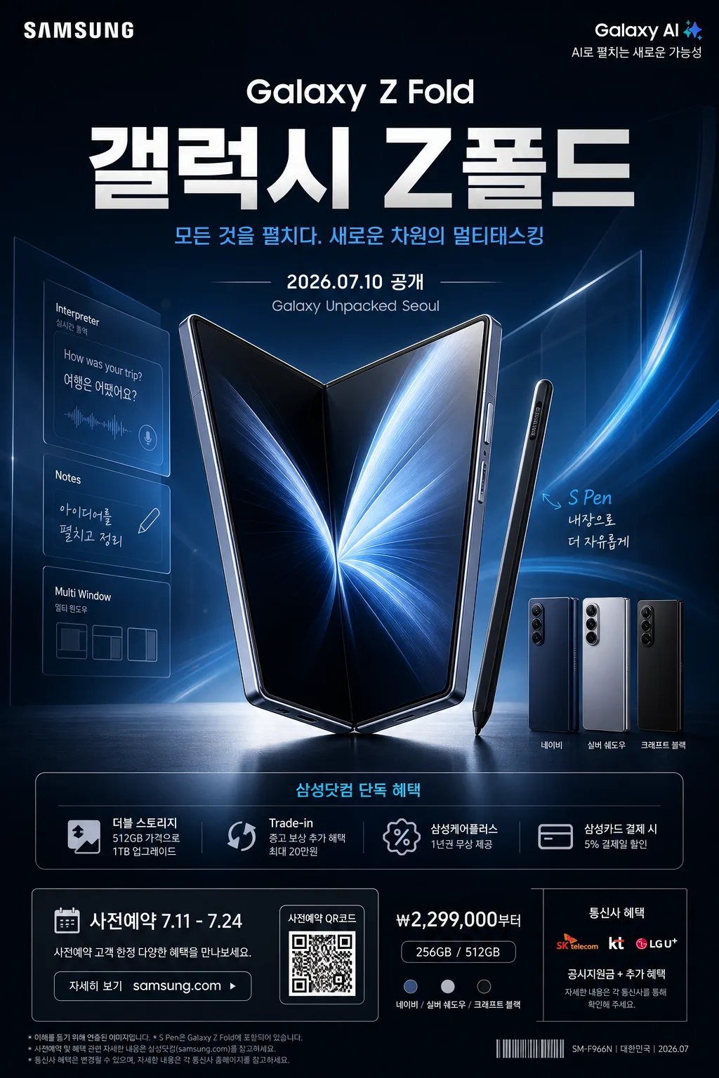
Samsung Galaxy Z Fold premium product advertisement poster, vertical hero composition with dynamic fold-open motion, launch-event information, and a luxury flagship brand finish.
Designed as a high-end commercial key visual that feels like a real Samsung flagship launch banner for a foldable smartphone, including polished product photography, Korean headline copy, event details, preorder cues, and retail campaign footer information.

[Composition]
- Main product placement: {제품·소재} occupies the center 55% of the frame, with the fold-open angle clearly readable, screen planes separated, hinge detail visible, and a strong hero silhouette.
- Composition direction: {레이아웃} with the product slightly angled from lower-left to upper-right, creating a sense of unfolding motion and forward energy.
- Background treatment: premium studio launch backdrop with layered gradients, subtle reflective floor, faint glass panels, soft blue light ribbons, and realistic interface reflections that make the phone feel photographed for a flagship campaign.
- Text placement: {카피·타이포} sits in the upper or mid-upper hero area, balanced against the product mass, with a headline, Korean subheadline, short benefit lines, date label, and compact preorder information.
- Brand feel: {브랜드 톤} with a refined flagship-tech finish, and {시그니처 결} emphasized through motion, precision edges, premium contrast, hinge highlights, and elegant Samsung-coded blue accents.
- Real advertisement details: include a small Samsung-style wordmark area, launch date label, benefit strip, QR/barcode-style reservation block, and legal microcopy along the bottom edge to make the poster feel commercially usable.

[3. CORE STRUCTURE]
1. Hero product zone: {제품·소재} rendered as the dominant object, with the fold line, hinge, inner display, outer frame, and screen planes clearly separated, crisp edges, premium polished surface, and realistic reflections.
2. Motion cue layer: {시그니처 결} expressed through a subtle unfolding arc, faint motion streaks, layered product echoes, blue light trails, and translucent geometric panels that imply transformation and multitasking power.
3. Lighting layer: {무드·라이팅} using studio-grade highlights on the metal frame, rim light along the hinge, screen glow, and controlled shadow falloff to create depth and luxury.
4. Color system: {컬러 팔레트} applied as the primary palette across backdrop, accent glows, interface reflections, small information blocks, and bottom campaign strip, keeping the image unmistakably Samsung-coded.
5. Typography layer: {카피·타이포} placed with large headline hierarchy and crisp alignment that feels like a global tech launch poster. Set bold cover line in Korean: "갤럭시 Z폴드" and subtitle: "한글 부제".
6. Campaign information layer: add realistic short Korean microcopy such as "2026.07.10 공개", "사전예약 7.11–7.24", "삼성닷컴 단독 혜택", "Trade-in 추가 보상", "Galaxy Unpacked Seoul", and "자세히 보기 samsung.com".
7. Footer and retail layer: include a compact lower footer with a QR/barcode-style area, tiny product code, price-from label like "₩2,299,000부터", storage label like "256GB / 512GB", carrier-benefit icons as simple graphic marks, and fine legal text.
8. Layout finish: {레이아웃} anchored with strong balance between product mass, headline copy, launch details, and footer information so it reads as a complete premium vertical campaign poster.
9. Format handling: {비율} must be kept as a tall vertical poster with no cropping of key product edges, hinge, screen, headline text, launch date, or footer details.

[4. STYLE RULES]
- Typography: use a modern sans-serif such as Pretendard or Noto Sans KR for Korean text, bold 700–800 weight for the main headline, medium 500 weight for subtext, and small 300–400 weight for legal and retail microcopy, with tight tracking and clean geometric spacing.
- Color palette: Samsung Blue, white, deep graphite, icy silver, and a subtle electric accent from {컬러 팔레트}; use high-contrast dark-to-light separation to keep the product premium and futuristic.
- Information hierarchy: headline largest, product hero second, subtitle and benefit blurbs third, date/preorder strip fourth, footer details and microcopy smallest but readable.
- Graphic elements: add refined blue light ribbons, translucent folding-plane outlines, tiny UI-like multitasking window reflections on the screen, small spec chips, and an elegant bottom campaign strip.
- Product realism: show believable glass, metal, hinge seams, display reflections, bevels, antenna lines, and faint fingerprints or studio dust only if subtle and realistic.
- Border/shadow: soft studio shadow under the product with 4px y-offset, 14px blur, and 18% opacity; use realistic contact shadows, polished reflections, and refined depth around the device.

[5. VISUAL STYLE]
- Camera / lens: high-end studio product photography look, shot on a Hasselblad X2D 100C with 80mm lens at f/8 for crisp surface detail and controlled perspective.
- Lighting: studio key light from upper-left at 45°, strong rim light from upper-right to define the folding edges, plus a soft fill from front-center to preserve screen readability.
- Color grade: cool premium tech grade with Samsung blue highlights, neutral whites, graphite shadows, and slight cyan-tinted reflections for a flagship launch feel.
- Rendering detail: photorealistic product surfaces, crisp typography, believable printed-poster finish, glossy screen reflections, sharp hinge detail, and commercial-grade retouching.

[6. MOOD]
Luxury global tech launch poster — Samsung Unpacked key visual energy with a polished editorial-commercial finish, premium retail campaign realism, and an aspirational next-generation mobile lifestyle tone.

[7. CRITICAL]
- Korean text accuracy: the following Korean strings must appear correctly and without broken characters: "갤럭시 Z폴드", "한글 부제".
- Additional Korean campaign text should appear correctly: "2026.07.10 공개", "사전예약 7.11–7.24", "삼성닷컴 단독 혜택", "자세히 보기 samsung.com", "₩2,299,000부터".
- The product must read as a foldable smartphone with a clear open-fold silhouette, visible hinge, and separated screen planes, not a generic phone.
- Keep the composition vertical, premium, and ad-like; preserve the exact sense of dynamic unfolding motion and luxury tech branding.
- Make the poster feel like a real flagship launch advertisement with headline, subtitle, event date, preorder information, QR/barcode-style reservation block, benefit chips, and fine-print footer.

[8. 🚫 PROHIBITED]
- Fake official seals / certifications
- Broken Korean characters
- Celebrity composites or unauthorized likeness