Ads/Posters
Garmin 스마트워치 광고
Garmin 톤 — 스포츠·아웃도어 결
Garmin 스마트워치 광고 summary
Copy this ChatGPT image prompt to create Ads/Posters results. Its subject, background, style, and composition are organized for quick iteration.
Related keywords: Garmin 스마트워치 광고, Garmin 스마트워치 광고 프롬프트, Ads/Posters 프롬프트, Ads/Posters AI 이미지 프롬프트, ChatGPT 이미지 프롬프트, AI 이미지 생성 프롬프트, AI 프롬프트, 이미지 프롬프트
How to use Garmin 스마트워치 광고
Keep the prompt structure and swap the subject, background, palette, or composition to create new variations.
- Keep the main subject and adjust the palette and background for your brand, season, or channel.
- If the result feels busy, simplify the background and make the subject, composition, and lighting more specific.
- After copying, ask ChatGPT to adapt it for your platform, aspect ratio, or text requirements.
Original prompt
[Input]
- language: Korean
- output_size: 1024x1536

[Purpose]
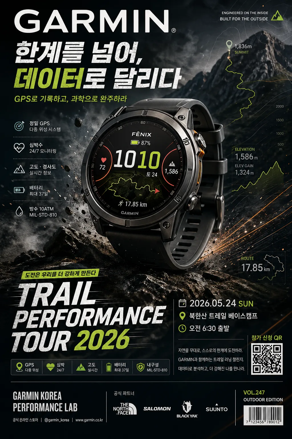
Korean Garmin smart watch advertising poster, premium sports/outdoor product key visual for social media and brand campaign.
Vertical hero ad with a single watch as the main subject, emphasizing performance, durability, GPS precision, endurance tracking, and rugged outdoor credibility.
The poster should feel like a real campaign asset seen in a sports magazine, outdoor retail display, or mobile-first brand launch page, with product information, campaign details, and energetic graphic layers.

[Composition]
- Hero subject placement: {제품·소재} occupies the center 55–60% of the frame, slightly above midline, with crisp cutout edges, realistic metal/glass/strap detail, and a believable product shadow falling onto the dark terrain-textured surface behind it.
- Background treatment: outdoor-inspired dark backdrop with layered depth, subtle rock texture, mist, faint trail-map contour lines, GPS route marks, altitude graph fragments, and natural atmosphere; avoid flat studio emptiness.
- Framing direction: strong diagonal energy from lower-left to upper-right, with motion cues, trail dust particles, thin navigation-line graphics, and athletic accent strokes guiding the eye toward the watch face.
- Typography zone: upper area contains a bold campaign headline and Garmin brand wordmark; lower area contains short sports copy, feature chips, campaign date/time/venue, ticket/QR-style callout area, and small sponsor/retail information.
- Apply {브랜드 톤} and {시그니처 결} throughout the layout so the visual reads immediately as Garmin, while still using rich outdoor-performance details and realistic advertising finish.

[3. CORE STRUCTURE]
1. Main hero area (center 55–60%): {제품·소재} rendered as a premium outdoor-performance watch, sharply detailed, with realistic brushed metal, glass reflections, bezel grooves, side buttons, sensor back hints, strap texture, and a readable sports watch face showing heart rate, GPS route, altitude, battery, and time UI.
2. Atmosphere layer (full background): {무드·라이팅} with subtle environmental cues, dark-to-neutral depth, faint mountain ridge silhouettes, trail texture, mist, dust, and small map-grid details that support the product without stealing focus.
3. Accent energy layer: controlled dynamic highlights, athletic contrast, diagonal speed lines, GPS node dots, elevation graph ticks, and small orange/lime signal markers around the watch silhouette, matching {컬러 팔레트} and reinforcing motion/performance.
4. Copy block area: {카피·타이포} placed in clean stacked hierarchy, with the main brand wordmark strongest and Korean campaign copy below it. Include realistic poster text such as "한계를 넘어, 데이터로 달리다", "TRAIL PERFORMANCE TOUR 2026", "2026.05.24 SUN", "북한산 트레일 베이스캠프", "오전 6:30 출발", "GPS · 심박 · 고도 · 배터리", and a small CTA "참가 신청 QR".
5. Layout balance: {레이아웃} arranged so the product, copy, technical labels, feature chips, barcode/QR-style area, and sponsor strip feel like a polished premium sports ad with authentic campaign information.
6. Format treatment: {비율} with a tall editorial poster structure, using the vertical space for brand headline, hero watch, event-detail strip, feature callouts, and small production credits.
7. Realistic poster details: add a small bottom sponsor/retail area with micro text such as "GARMIN KOREA PERFORMANCE LAB", "공식 온라인 스토어", "@garmin_korea", and "VOL.247 / OUTDOOR EDITION"; include a small barcode-like rectangle or QR-code-like square as a visual campaign element, not a certification.

[4. STYLE RULES]
- Typography: use a clean sports-ad sans serif such as Pretendard or Noto Sans KR for Korean, with bold weight for the main brand line, condensed bold for campaign headline, and medium/small weights for supporting copy, feature chips, date labels, and micro credits; size hierarchy should be clear and poster-like.
- Color palette: {컬러 팔레트} anchored by deep charcoal #101418, near-black #0B0D10, forest/grass green #2F6B3F, muted olive #556B4E, and Garmin-style accent orange #FF6A00 or electric lime #B7F000 depending on the chosen signature look.
- Border/shadow: soft but defined product shadow, 4–6px downward offset, 14–18px blur, 18–22% opacity; use realistic contact shadow, subtle rim highlights, and atmospheric depth rather than a flat sticker look.
- Graphic elements: include contour-map lines, route pins, elevation ticks, small feature badges, thin dividers, date capsule labels, and a bottom information strip, all integrated into the premium outdoor-ad system.
- Text density: make the poster content-rich but still professionally organized, with clear hierarchy and legible Korean copy.

[5. VISUAL STYLE]
- Camera / lens: Canon EOS R5 with 85mm product-ad look, f/4, high-resolution studio-grade clarity with slight telephoto compression for a premium hero feel.
- Lighting: directional outdoor-like key light from upper-left at about 45°, subtle rim light from right to separate the watch, controlled specular highlights on the glass face, and low atmospheric fill revealing terrain texture and floating dust.
- Color grade: deep charcoal + grass green + sharp signature accent, with clean contrast and restrained saturation, similar to a modern performance campaign.
- Material realism: glass should show precise reflections, bezel engraving should look machined, strap should show tactile rubber/silicone grain, and the watch face UI should be crisp enough to read as a real sports tracking display.

[6. MOOD]
Premium outdoor-performance campaign — Garmin brand key visual with the crisp discipline of a high-end sports magazine ad, the precision of technical product photography, and the energy of a real trail-running event poster.
The final image should feel rugged, data-driven, aspirational, and commercially finished.

[7. CRITICAL]
- Korean text accuracy: 반드시 다음 문자열이 정확히 보여야 함: "GARMIN", "브랜드 톤", "시그니처 결", "제품·소재", "무드·라이팅", "컬러 팔레트", "카피·타이포", "레이아웃", "비율".
- Additional Korean poster text should be legible and correctly rendered: "한계를 넘어, 데이터로 달리다", "2026.05.24 SUN", "북한산 트레일 베이스캠프", "오전 6:30 출발", "참가 신청 QR", "공식 온라인 스토어", "GPS · 심박 · 고도 · 배터리".
- Composition invariants: single watch hero remains the focal point, with athletic outdoor energy, premium product detail, readable sports UI, realistic poster information, and strong brand-ad hierarchy.
- Typography must be clean and legible; no broken Korean characters, no distorted letters, no gibberish text.

[8. 🚫 PROHIBITED]
- Fake official seals / certifications
- Broken Korean characters
- Celebrity composites or unauthorized likeness
- Melted, unreadable watch UI or distorted product geometry