広告・ポスター
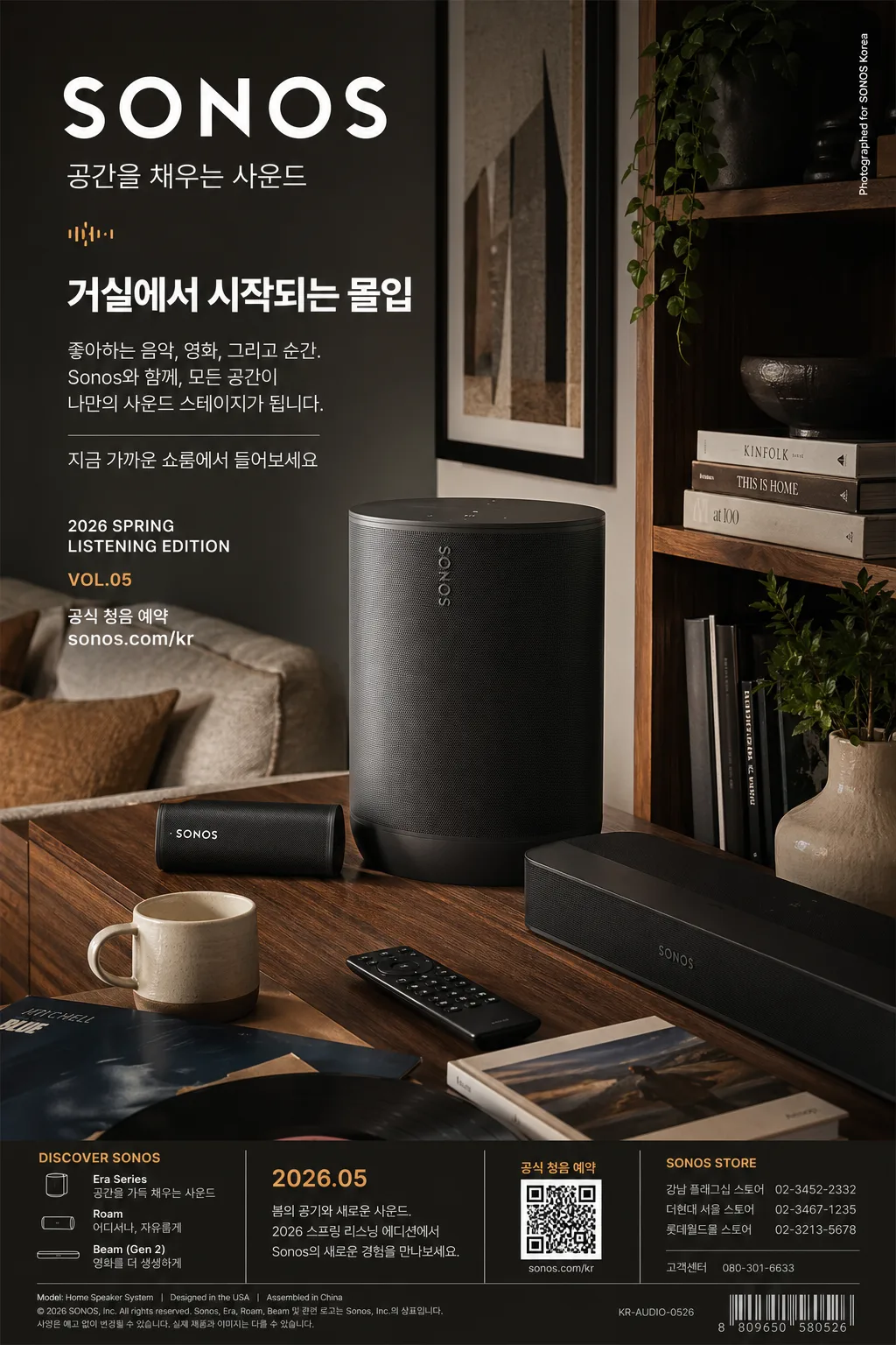
Sonos 스피커 광고
Sonos 톤 — 미니멀 사운드
Sonos 스피커 광고の概要
広告・ポスター画像を作るためのChatGPT画像プロンプトです。主題、背景、スタイル、構図を整理し、すぐに試せるよう構成しています。
関連キーワード: Sonos 스피커 광고, Sonos 스피커 광고 프롬프트, 広告・ポスター 프롬프트, 広告・ポスター AI 이미지 프롬프트, ChatGPT 이미지 프롬프트, AI 이미지 생성 프롬프트, AI 프롬프트, 이미지 프롬프트
Sonos 스피커 광고の活用方法
元の構造を保ちながら、被写体、背景、色、構図を変更して別案に展開できます。
- 主題を維持し、ブランドや季節、媒体に合わせて色と背景を変更してください。
- 結果が複雑な場合は背景要素を減らし、被写体、構図、照明を具体化してください。
- コピー後、ChatGPTに媒体、アスペクト比、文字の有無を追加で指定できます。
プロンプト原文
[Input]
- language: Korean
- output_size: 1024x1536

[Purpose]
Sonos speaker advertising poster in a premium lifestyle-product format, designed for vertical brand marketing, store display, and social-media ad placement.
Create a real home-audio campaign key visual: a richly staged modern living-room scene where the speaker feels physically installed, used, and desirable, with polished Korean ad copy and realistic product-marketing details.

[Composition]
- Main subject placement: a single or grouped {제품·소재} hero anchored in the lower-center to center-right 55% of the frame, large enough to show grille texture, seams, buttons, material finish, and grounded contact shadow.
- Background treatment: refined living-room or study setting with matte wall surfaces, warm wood shelving, stacked books, framed art, soft textiles, a ceramic cup, a small plant, and a console or side table; keep the product dominant while allowing believable lifestyle details around it.
- Spacing and framing: upright poster framing with a clear product halo created by lighting and depth of field, a natural tabletop or console edge, and balanced asymmetry that feels like a premium home audio brand ad photographed in a real apartment.
- Text overlay system: place {카피·타이포} in a crisp editorial hierarchy in the upper-left to mid-left area; add compact campaign details such as "2026 SPRING LISTENING EDITION", "VOL.05", "공식 청음 예약", "sonos.com/kr", and a small vertical credit line "Photographed for SONOS Korea" without overlapping the product silhouette.
- Poster-detail layer: include a small bottom information strip with product-series notes, date label "2026.05", a tiny QR-style reservation block, store/contact microcopy, and subtle divider lines that make the advertisement feel printed and commercially real.

[3. CORE STRUCTURE]
- Hero product zone: showcase {제품·소재} as the main visual anchor, cleanly lit with realistic material definition, visible woven grille pattern, subtle edge highlights, tactile buttons, and a grounded shadow so the speaker feels physically present in the room.
- Interior context zone: build the {레이아웃} around the product using modern home objects that naturally belong in a listening space — vinyl sleeve, art book stack, linen sofa arm, remote control, wooden shelf edge, ceramic vase, plant leaves, and a side table — while keeping the speaker unmistakably central.
- Light-and-material zone: apply {무드·라이팅} with soft directionality that reveals matte plastics, woven grilles, cloth fibers, brushed metal or wood grain, small dust-free highlights, and realistic ambient reflections without turning the scene into glossy CGI.
- Brand identity zone: express {브랜드 톤} and {시그니처 결} through disciplined spacing, premium typography, restrained but content-rich editorial layout, and consumer-electronics polish similar to a high-end audio campaign.
- Color balance zone: distribute {컬러 팔레트} so dark neutrals establish depth, soft white areas keep the copy readable, wood adds warmth, and one accent color provides controlled contrast in small graphic marks, labels, or divider lines.
- Copy zone: render {카피·타이포} as a clean advertising lockup with clear hierarchy, generous line spacing, exact Korean/English spelling, and supporting microcopy such as "공간을 채우는 사운드", "거실에서 시작되는 몰입", and "지금 가까운 쇼룸에서 들어보세요".
- Print-realism zone: add tiny production details near the bottom edge — campaign code "KR-AUDIO-0526", model-name credit "Model: Home Speaker System", tiny legal-style text, and a compact barcode-like retail mark — making it look like a finished vertical poster rather than a sterile mockup.

[4. STYLE RULES]
- Typography: use Pretendard or Noto Sans KR for Korean copy in medium to bold weight, with a modern grotesk sans look; set the main brand wordmark feel in bold uppercase Latin if used, and keep subtitle, date label, URL, and bottom-strip microcopy highly legible.
- Color palette: use deep charcoal #1E1E1E, soft white #F4F4F1, warm wood brown #A06F46, and one accent from {컬러 팔레트} for subtle contrast; maintain muted saturation, premium contrast control, and natural material color variation.
- Shadow and depth: use a soft realistic drop shadow under the speaker, about 4px y-offset, 14px blur, 18% opacity, plus faint ambient occlusion near contact points; add gentle depth of field in the background so books, plant leaves, and wall art feel photographic.
- Graphic elements: use fine divider lines, small campaign labels, subtle geometric sound-wave marks, QR-style square block, and bottom information bar as refined advertising elements; they should support the layout, not compete with the product.

[5. VISUAL STYLE]
- Camera / lens: full-frame commercial product photography look, 50mm lens at f/4 for the interior-wide product scene, or 85mm f/2.8 if the product is isolated tighter; keep perspective natural and advertisement-ready.
- Lighting: soft window light from upper-left at roughly 45°, with gentle fill from the right side and a faint rim on the product edges; use diffused daylight like an upscale home editorial shoot, with believable shadows cast onto the tabletop, books, and wall.
- Color grade: neutral-warm grade with charcoal shadows, clean white highlights, natural wood warmth, realistic fabric tones, and restrained accent coloration; avoid heavy teal-orange treatment and avoid oversaturation.

[6. MOOD]
Premium home-audio brand editorial — calm modern interior magazine atmosphere, warm residential realism, precise product advertising, and quiet luxury sound-tech confidence.

[7. CRITICAL]
- Korean text accuracy: the following strings must appear exactly as rendered, without broken characters:
  - "SONOS"
  - the Korean subtitle text specified by {카피·타이포}
  - the sound-copy text specified by {카피·타이포}
  - "공간을 채우는 사운드"
  - "공식 청음 예약"
  - "2026.05"
- Composition invariants: preserve a premium speaker-plus-living-room ad structure, with the product clearly dominant, text cleanly separated from the speaker, and the overall mood kept refined, modern, and realistic.
- Typography invariants: keep all text sharp, correctly kerned, and fully legible; no distorted glyphs, no accidental extra words, and no misordered lines.
- Detail invariants: include realistic lifestyle props, poster campaign metadata, small URL/contact-style text, QR-style reservation block, and bottom information strip while keeping {브랜드 톤}, {시그니처 결}, {컬러 팔레트}, {레이아웃}, and {비율} visually respected.

[8. 🚫 PROHIBITED]
- Fake official seals, certification marks, or award badges
- Broken Korean characters or corrupted Latin text
- Celebrity composites or unauthorized likenesses