廣告/海報
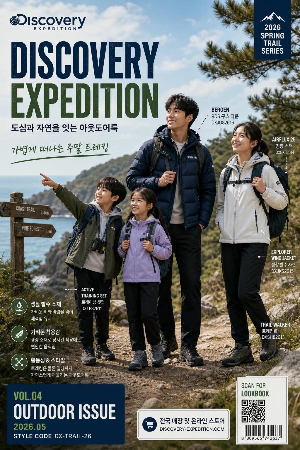
Discovery Expedition 아웃도어 광고
Discovery 톤 — 아웃도어 + 한국 캐주얼
Discovery Expedition 아웃도어 광고摘要
這是用來製作廣告/海報內容的 ChatGPT 圖像提示詞,已整理主題、背景、風格與構圖,方便快速調整。
相關關鍵字: Discovery Expedition 아웃도어 광고, Discovery Expedition 아웃도어 광고 프롬프트, 廣告/海報 프롬프트, 廣告/海報 AI 이미지 프롬프트, ChatGPT 이미지 프롬프트, AI 이미지 생성 프롬프트, AI 프롬프트, 이미지 프롬프트
Discovery Expedition 아웃도어 광고使用方式
保留原始結構並替換主體、背景、色彩或構圖,即可延伸出不同版本。
- 保留核心主體,並依品牌、季節或平台調整色彩與背景。
- 如果畫面太複雜,請減少背景元素並具體描述主體、構圖與光線。
- 複製後可要求 ChatGPT 配合平台、長寬比或文字需求調整。
提示詞原文
[Input]
- language: Korean
- output_size: 1024x1536

[Purpose]
Discovery Expedition outdoor brand advertisement, editorial poster-style vertical ad with a family-friendly Korean casual outdoor look.
Hero product marketing image for social feed and campaign key visual, preserving the brand’s recognizable outdoor-commercial tone while adding believable campaign details, product callouts, and outdoor lifestyle context.

[Composition]
- Main subject placement: {시그니처 결} occupies the central hero zone with a confident commercial pose, surrounded by readable campaign typography, product labels, and small editorial details that make the ad feel like a real outdoor fashion poster.
- Background treatment: natural outdoor setting that matches {무드·라이팅}, such as a rocky forest trail, coastal overlook, campsite path, or mountain ridge, with real textures like stone, grass, wind, fabric folds, backpack straps, trail signs, and sunlit atmosphere.
- Spacing and framing: use {레이아웃} to balance product emphasis, lifestyle realism, and advertising information; create clear headline hierarchy without making the scene feel empty or sterile.
- Product styling: feature {제품·소재} as the focal wardrobe or gear element, integrated into the scene with polished commercial finishing, visible stitching, zipper pulls, fabric grain, pockets, layered outdoor accessories, and authentic fit.
- Color integration: use {컬러 팔레트} across clothing, accents, landscape tones, icons, and graphic panels so the frame reads immediately as Discovery-style.
- Poster information layer: include campaign season, date label, product series tag, QR/barcode-style purchase area, small store/online notice, and 2–3 short Korean feature blurbs placed like a finished retail campaign ad.

[3. CORE STRUCTURE]
1) Hero zone: place the model and/or product in a strong commercial pose with clear silhouette separation, keeping the body and gear readable at a glance; show realistic interaction with the outdoor setting, such as walking on a trail, holding a map, adjusting a jacket, carrying a daypack, or standing against wind.
2) Environment layer: build the outdoor context with mountain, coastline, forest, campsite, or open-air natural cues that support the brand’s adventure identity; include believable secondary details such as trail markers, textured rocks, grass, distant hikers out of focus, a folded map, carabiner, water bottle, or boot prints when appropriate.
3) Brand-copy zone: set the English title “DISCOVERY EXPEDITION” in a prominent ad headline position, supported by the Korean line from {카피·타이포}; add short Korean poster blurbs such as “가볍게 떠나는 주말 트레킹”, “생활 발수 소재”, “도심과 자연을 잇는 아웃도어룩”.
4) Campaign details: include small realistic ad text elements: “2026 SPRING TRAIL SERIES”, “VOL.04 OUTDOOR ISSUE”, “2026.05”, “전국 매장 및 온라인 스토어”, “STYLE CODE DX-TRAIL-26”, and a small QR/barcode area labeled “SCAN FOR LOOKBOOK”.
5) Styling details: ensure {브랜드 톤} comes through in clothing fit, material realism, practical pocketing, layered styling, family-friendly casual energy, and sports-outdoor utility details.
6) Finishing pass: maintain crisp edges, realistic shadows, fabric texture, natural skin tones, readable Korean typography, and high-end catalog clarity so the image feels like a finished national campaign visual, not an illustration.

[4. STYLE RULES]
- Typography: use a bold condensed sans for the English headline, such as Helvetica Neue Condensed, DIN Condensed, or Pretendard ExtraBold, with supporting Korean in Pretendard or Noto Sans KR; headline size should dominate the layout while secondary text stays compact and poster-like.
- Korean copy system: render a clear hierarchy with main Korean support copy from {카피·타이포}, then 2–3 short feature blurbs in smaller weights; use realistic spacing, line breaks, and punctuation suitable for a Korean outdoor retail advertisement.
- Color palette: {컬러 팔레트} expressed with deep outdoor blue, forest green, bright white, and charcoal gray; use clean contrast, controlled saturation, and accent color chips or small graphic tabs that echo the campaign palette.
- Graphic elements: add real ad-layout details such as thin rule lines, small coordinates, seasonal label, product callout arrows, QR/barcode block, retail footer, and subtle translucent information panels that integrate with the photo.
- Border/shadow: subtle soft shadow under the subject or product, about 4px y-offset, 12px blur, 15% opacity; use refined poster layering and light graphic framing only when it supports the campaign layout.

[5. VISUAL STYLE]
- Camera / lens: high-end commercial fashion outdoor photo, shot on a 85mm f/1.8 or 70-200mm at f/4 for crisp subject isolation and premium ad clarity.
- Lighting: natural sunlight with soft directional fill, such as overcast diffused daylight or late-afternoon side light, creating realistic contour, clean product visibility, and dimensional outdoor atmosphere.
- Color grade: Discovery blue + green + white + charcoal with slightly cool commercial grading, clean whites, deep but controlled shadows, vivid outdoor contrast, and believable highlights on technical fabric.
- Realism details: emphasize jacket seams, backpack webbing, shoe tread, fabric wrinkles, wind movement, hair texture, hands, natural facial expression, environmental depth, and realistic printed typography composited into the poster.

[6. MOOD]
Premium outdoor campaign editorial with Discovery Expedition’s recognizable catalog-ad energy, similar to a polished W+K-style sportswear commercial and National Geographic adventure branding balance.
The mood should feel aspirational but reachable: Korean family-friendly weekend adventure, stylish casual outdoor wear, fresh air, practical gear, and a finished retail campaign poster ready for subway, store window, and social feed use.

[7. CRITICAL]
- Korean text accuracy: the image must correctly render the Korean support copy implied by {카피·타이포} and any Korean brand text used in the layout without broken characters.
- Required readable text elements: “DISCOVERY EXPEDITION”, “2026 SPRING TRAIL SERIES”, “2026.05”, “가볍게 떠나는 주말 트레킹”, “생활 발수 소재”, “도심과 자연을 잇는 아웃도어룩”, “전국 매장 및 온라인 스토어”.
- Exact visual consistency: preserve the exact composition framing, palette, lighting style, typography weight, and overall ad mood associated with Discovery Expedition.
- Maintain realistic human anatomy and natural proportions if a model is present.
- Keep {브랜드 톤}, {시그니처 결}, {제품·소재}, {무드·라이팅}, {컬러 팔레트}, {카피·타이포}, {레이아웃}, and {비율} visually reflected in the final image.

[8. 🚫 PROHIBITED]
- Broken Korean characters
- Fake official seals / certifications
- Celebrity composites or unauthorized likeness