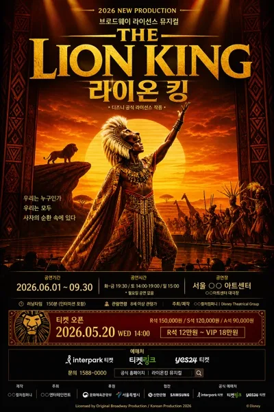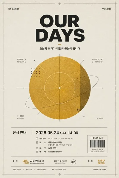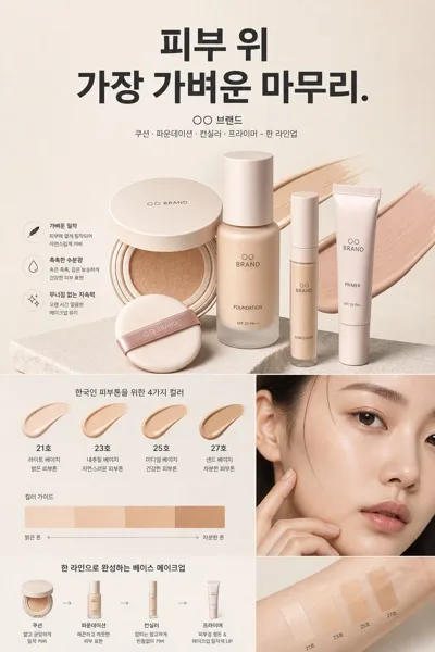
Ads/Posters
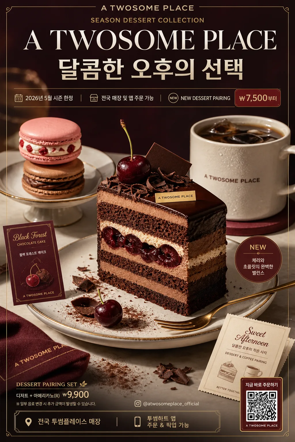
투썸플레이스 디저트 커피 광고
투썸 톤 — 디저트 럭셔리
투썸플레이스 디저트 커피 광고 summary
Copy this ChatGPT image prompt to create Ads/Posters results. Its subject, background, style, and composition are organized for quick iteration.
Related keywords: 투썸플레이스 디저트 커피 광고, 투썸플레이스 디저트 커피 광고 프롬프트, Ads/Posters 프롬프트, Ads/Posters AI 이미지 프롬프트, ChatGPT 이미지 프롬프트, AI 이미지 생성 프롬프트, AI 프롬프트, 이미지 프롬프트
How to use 투썸플레이스 디저트 커피 광고
Keep the prompt structure and swap the subject, background, palette, or composition to create new variations.
- Keep the main subject and adjust the palette and background for your brand, season, or channel.
- If the result feels busy, simplify the background and make the subject, composition, and lighting more specific.
- After copying, ask ChatGPT to adapt it for your platform, aspect ratio, or text requirements.
Original prompt
[Input]
- language: Korean
- output_size: 1024x1536

[Purpose]
Korean premium dessert coffee advertisement, vertical product poster for social media feed, café counter display, and in-store seasonal menu signage.
Luxury café dessert editorial with a strong hero dessert, realistic coffeehouse details, campaign information, and elegant brand copy hierarchy.

[Composition]
- Center the dessert hero in the mid-to-lower 55% of the frame, with the main copy occupying the upper 20% and secondary campaign information arranged as polished poster details around the frame.
- Background should be a refined studio café surface in deep wine, warm white, and muted gold accents, with subtle gradient falloff, tactile tabletop grain, porcelain shine, folded napkin texture, cocoa dust, cream highlights, and small reflections.
- Keep the composition symmetrical and premium, using {브랜드 톤} as the overall brand feel and {시그니처 결} as the dominant visual texture.
- Feature {제품·소재} as the main subject cluster, styled as a premium café dessert set: hero dessert on a ceramic plate or cake stand, a secondary coffee cup slightly behind it, a dessert fork, a small receipt-style promo card, and tiny garnish details that naturally support the product.
- Add realistic poster commerce elements: price tag text, promo period, app/order note, store availability line, and small QR/barcode-style area in the lower corner.

[3. CORE STRUCTURE]
- Top header zone (upper 18%): Place {카피·타이포} as the primary headline treatment, with the English line slightly larger and the Korean line supporting it beneath; use generous tracking and crisp alignment. Include the brand line “A TWOSOME PLACE” above or below the headline, plus a small campaign label such as “SEASON DESSERT COLLECTION”.
- Campaign detail strip (upper-mid 10%): Add short Korean poster information in small type: “2026년 5월 시즌 한정”, “전국 매장 및 앱 주문 가능”, “NEW DESSERT PAIRING”, and a compact price marker like “₩7,500부터”.
- Hero zone (center 45%): Present {제품·소재} as the focal object, shot like an upscale dessert campaign with glossy highlights, precise edges, creamy layers, chocolate sheen, fruit garnish, cake crumb detail, condensation on the coffee cup, and a luxury patisserie finish.
- Supporting texture zone (lower 20%): Add tabletop reflections, soft crumbs, cocoa powder traces, cream swirls, a gold dessert fork, a branded napkin corner, and a small menu card that reinforces {시그니처 결} while keeping the dessert visually dominant.
- Brand framing zone (edges and corners): Use {브랜드 톤} to guide thin gold hairline rules, corner information blocks, a lower-right barcode/QR-style ordering area, and restrained brand marks that make the poster feel like a finished café advertisement.
- Layout balance: Keep {레이아웃} exactly readable as a large hero dessert with bold copy, supported by realistic café-ad details, short subcopy, pricing, and campaign metadata.
- Format constraint: Maintain {비율} as a tall poster with clear vertical hierarchy and premium in-store display readability.

[4. STYLE RULES]
- Typography: Use Pretendard Bold for Korean copy, Noto Sans KR Medium for supporting lines, and a refined serif like Cormorant Garamond for the English accent; headline size should feel poster-scale, with smaller subcopy at 40–55% of headline size and micro-details at realistic menu-poster scale.
- Required Korean/English visible text examples: “A TWOSOME PLACE”, “한글”, “달콤한 오후의 선택”, “2026년 5월 시즌 한정”, “전국 매장 및 앱 주문 가능”, “₩7,500부터”, “NEW DESSERT PAIRING”, “@atwosomeplace_official”.
- Color palette: Deep wine burgundy, soft ivory white, and metallic gold accents from {컬러 팔레트}; keep blacks muted and shadows warm rather than gray.
- Border/shadow: Apply a soft studio shadow with 4px y-offset, 14px blur, 18% opacity, plus thin gold separator lines at 1–2px for a luxury finish.
- Details: Make all food surfaces appetizing and photographic: real whipped cream peaks, layered sponge, ganache gloss, powdered sugar, moist crumb, espresso crema, ceramic glaze, and gentle condensation.

[5. VISUAL STYLE]
- Camera / lens: Shot like a Phase One IQ4 studio food campaign with an 80mm or 110mm macro lens at f/8, emphasizing crisp dessert texture and premium surface detail.
- Lighting: Controlled studio softbox key light from upper-left at 45°, subtle bounce fill from lower-right, and a gentle rim light to separate the dessert from the background.
- Color grade: Rich burgundy + ivory + brushed gold with controlled highlight rolloff, polished café-advertising contrast, and clean editorial saturation.
- Physical realism: Show believable scale between dessert plate, coffee cup, fork, napkin, receipt card, and tabletop; avoid overly perfect synthetic surfaces by including natural crumbs, tiny cream ridges, coffee crema variation, and soft specular highlights.

[6. MOOD]
Premium dessert café editorial — like an upscale Korean café campaign photographed for a seasonal menu launch, with high-end magazine polish, warm dessert indulgence, and refined burgundy-gold luxury.

[7. CRITICAL]
- Korean text accuracy: 반드시 다음 문자열이 정확히 보여야 함: “A TWOSOME PLACE”, “한글”.
- Composition invariants: vertical poster layout, single hero dessert focus, large copy at top, realistic café poster details, no broken typography, no warped packaging.
- All added text must feel intentional and café-ad related: short Korean promo lines, price, date, store/app availability, handle, barcode/QR-style ordering block.
- Keep {브랜드 톤}, {시그니처 결}, {제품·소재}, {무드·라이팅}, {컬러 팔레트}, {카피·타이포}, {레이아웃}, and {비율} visually reflected exactly as the controlling creative inputs.

[8. 🚫 PROHIBITED]
- Fake official seals / certifications
- Broken Korean characters
- Celebrity composites / unauthorized likeness