광고/포스터
던킨도너츠 광고
던킨 톤 — 도넛 + 친근 글로벌
던킨도너츠 광고 검색 요약
던킨도너츠 광고은 광고/포스터 결과물을 만들 때 바로 복사해 활용할 수 있는 ChatGPT 이미지 프롬프트입니다. 주제, 배경, 스타일, 구도 조건을 함께 담아 빠르게 시안을 만들 수 있도록 구성했습니다.
관련 키워드: 던킨도너츠 광고, 던킨도너츠 광고 프롬프트, 광고/포스터 프롬프트, 광고/포스터 AI 이미지 프롬프트, ChatGPT 이미지 프롬프트, AI 이미지 생성 프롬프트, AI 프롬프트, 이미지 프롬프트
던킨도너츠 광고 활용 포인트
원본 구조를 유지하면서 피사체, 배경, 색감, 구도를 바꿔 다양한 시안으로 확장할 수 있습니다.
- 핵심 소재는 유지하고 브랜드, 계절, 채널 목적에 맞는 색감과 배경을 바꿔보세요.
- 결과가 산만하면 배경 요소를 줄이고 피사체, 구도, 조명 조건을 구체화하세요.
- 복사한 뒤 ChatGPT에서 플랫폼, 화면 비율, 텍스트 포함 여부를 추가로 요청할 수 있습니다.
프롬프트 원문
[Input]
- language: Korean
- output_size: 1024x1536

[Purpose]
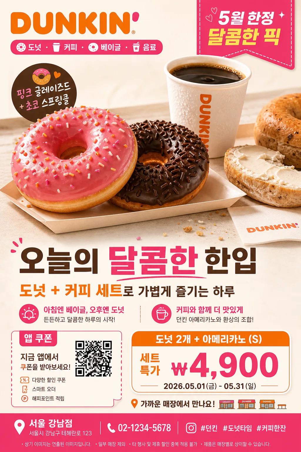
Korean Dunkin donut advertisement poster, vertical retail promo layout, product-forward brand ad for social feed, in-store standee, and print display.
A bright Dunkin-style commercial composition with a hero donut set, coffee pairing, bold price callout, promotion details, store information, and realistic fast-food poster typography.

[Composition]
- Main hero takes about 52–58% of the frame, slightly above center, with {대표 제품} and {세트 구성} arranged as the visual focal point: glossy donut macro detail, coffee cup, small paper tray, napkin edge, and a few natural crumbs/sugar grains for appetizing realism.
- Background is a smooth studio bakery-ad backdrop with warm off-white base, soft tabletop reflection, and pink/orange graphic panels derived from {컬러 팔레트}; add a believable counter surface and subtle printed promo-card texture.
- Top brand area contains {브랜드명} wordmark treatment, small campaign badge reading {배지 문구}, and a short product category strip: “도넛 · 커피 · 베이글 · 음료”.
- Middle-lower copy area carries {메인 카피}, {한글 부제}, and a compact 2–3 line product description, balanced with the hero image and connected by rounded orange/pink graphic ribbons.
- Lower third includes {프로모션 가격}, {행사 기간}, {CTA 문구}, a small QR-style coupon box, store/address line {매장 정보}, contact {문의 연락처}, and hashtag text {해시태그} in a real retail poster footer.
- Use {브랜드 톤}, {시그니처 결}, {레이아웃}, and {비율} as the guiding art direction cues.

[3. CORE STRUCTURE]
- Hero area (upper 55%): feature {대표 제품} with {세트 구성} as the dominant subject, styled like a polished quick-service restaurant campaign image with glaze highlights, cream texture, toasted surface detail, coffee condensation, and slight three-dimensional pop.
- Brand accent zone (top 12%): place the primary {브랜드명} treatment in strong pink/orange contrast; add a small “NEW SEASON PICK” or Korean promo ribbon beside it while keeping Korean text crisp.
- Product message zone (middle 18%): set {메인 카피} in large bold Korean, followed by {한글 부제}; add two short feature headlines such as “아침엔 베이글, 오후엔 도넛”, “커피와 함께 더 맛있게”.
- Price / offer block (lower 15%): include a rounded rectangular pricing callout aligned to {레이아웃}, with bold numerals for {프로모션 가격}, small terms line for {행사 기간}, and a coupon/QR icon box labeled “앱 쿠폰”.
- Footer information strip (bottom edge): include {매장 정보}, {문의 연락처}, {CTA 문구}, {해시태그}, and tiny legal-style promo notes in readable Korean, similar to a real chain-store retail poster.

[4. STYLE RULES]
- Typography: use a bold sans-serif commercial system such as Pretendard ExtraBold or Noto Sans KR Bold for the main offer, with a lighter matching sans for supporting copy; headline should be large, friendly, and compact, while store details and terms use smaller clean text.
- Color palette: use the exact tone family from {컬러 팔레트} — Dunkin pink, orange, and white — with warm bakery neutrals, cocoa brown accents, and high-contrast separation for price readability.
- Border/shadow: apply a soft studio drop shadow under the hero object, about 4px y-offset, 14px blur, 18% opacity, plus subtle paper-card shadows behind price tags and coupon blocks.
- Graphic treatment: use retail-ad style separators, rounded price tags, small dot patterns, diagonal accent blocks, coupon perforation marks, and friendly bakery icons to make the poster feel like a real seasonal fast-food advertisement.

[5. VISUAL STYLE]
- Camera / lens: commercial product photography look, 85mm f/1.8 for the hero product or 70–100mm equivalent, slightly compressed perspective, sharp focus on the front-facing item.
- Lighting: studio softbox key light from upper-left at 45°, gentle fill from right, subtle rim light to separate the product from the backdrop, warm commercial highlights on glaze and cup surfaces.
- Color grade: warm bakery-commercial grade with saturated pink-orange accents, clean whites, and slightly creamy highlights; maintain vivid brand color integrity.

[6. MOOD]
Premium quick-service food campaign — modern Dunkin-style retail poster with a bright, energetic American chain-ad aesthetic, appetizing bakery warmth, and realistic Korean store-promo details.

[7. CRITICAL]
- Korean text accuracy: 반드시 정확히 보여야 하는 문구 — “던킨”, “도넛”, “커피”, “베이글”, “음료”, “오늘의 달콤한 한입”, “아메리카노 세트”, “행사기간”, “앱 쿠폰”, “가까운 매장에서 만나요”.
- Rendered poster copy should include: “오늘의 달콤한 한입”, “도넛 + 커피 세트”, “₩4,900”, “행사기간 2026.05.01–05.31”, “서울 강남점 · 02-1234-5678”, “#던킨 #도넛타임 #커피한잔”.
- Layout invariants: hero product must remain the dominant element, pricing must stay clearly visible, brand wordmark area must be near the top, and the footer must look like a real Korean retail advertisement with address/contact/coupon details.
- Typography must read cleanly with no broken Korean characters and no distorted Latin lettering.

[8. 🚫 PROHIBITED]
- Fake official seals / certifications
- Broken Korean characters
- Celebrity composites or unauthorized celebrity likeness
- Distorted food anatomy, melted unreadable products, or warped cups