Ads/Posters
토니모리 캐릭터·과일 광고
토니모리 톤 — 캐릭터·과일·친근
토니모리 캐릭터·과일 광고 summary
Copy this ChatGPT image prompt to create Ads/Posters results. Its subject, background, style, and composition are organized for quick iteration.
Related keywords: 토니모리 캐릭터·과일 광고, 토니모리 캐릭터·과일 광고 프롬프트, Ads/Posters 프롬프트, Ads/Posters AI 이미지 프롬프트, ChatGPT 이미지 프롬프트, AI 이미지 생성 프롬프트, AI 프롬프트, 이미지 프롬프트
How to use 토니모리 캐릭터·과일 광고
Keep the prompt structure and swap the subject, background, palette, or composition to create new variations.
- Keep the main subject and adjust the palette and background for your brand, season, or channel.
- If the result feels busy, simplify the background and make the subject, composition, and lighting more specific.
- After copying, ask ChatGPT to adapt it for your platform, aspect ratio, or text requirements.
Original prompt
[Input]
- language: Korean
- output_size: 1024x1536

[Purpose]
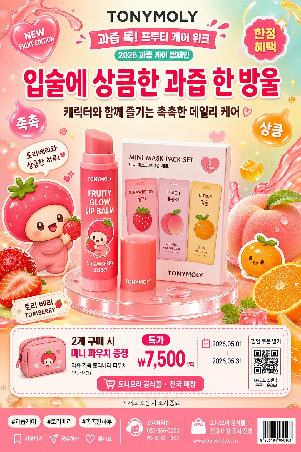
Korean character-and-fruit cosmetic ad poster in the TONYMOLY brand family, vertical 1024x1536 retail promo layout for social feed, store POP, and poster use.
Bright, playful commercial graphic with a product hero, mascot-like character accents, glossy fruit freshness cues, and realistic retail information such as campaign title, promo dates, benefit strip, price label, QR-style coupon box, and hashtag copy.

[Composition]
- Center {제품명} / {제품·소재} in the lower-middle 38% of the frame as the primary product hero, with the label facing front and the packaging finish clearly readable.
- Build a cheerful character-and-fruit frame around the hero: {캐릭터명} on one side, {대표 과일} pieces, jelly droplets, fruit slices, sticker tags, and rounded mascot shapes on the other side.
- Use a high-key beauty-ad background with pastel gradient panels, glossy acrylic platform, fruit-colored splash ribbons, soft studio shadows, and small retail sticker callouts that make the poster feel like a real cosmetic launch display.
- Place the headline and brand area in the upper third, a benefit/coupon strip near the lower third, and a compact store information footer at the bottom; keep the product visually dominant within a safe 12% print/social margin.
- Apply {브랜드 톤} across the whole ad so the execution feels like a specific Korean cosmetics campaign, not a generic cute illustration.
- Follow {레이아웃} and {비율} so the poster reads immediately as a product-first cosmetics advertisement with character collaboration and fruit visual cues.

[3. CORE STRUCTURE]
- Top brand zone upper 16%: place the English wordmark text "TONYMOLY" clearly, then add {프로모션명} as a Korean campaign title and a small seasonal label such as "2026 과즙 케어 캠페인" or "NEW FRUIT EDITION".
- Main headline zone upper-middle 18%: render {메인 카피} as the largest Korean phrase, with {서브 카피} below it in a friendly ad-safe hierarchy.
- Hero product zone middle 42%: render {제품명} / {제품·소재} as a crisp commercial product object with polished highlights, readable front label, clean cap/tube/pack edges, and a beauty-retail finish.
- Character-and-fruit zone left/right flanks: build {시그니처 비주얼} using {캐릭터명}, {대표 과일}, fruit peels, floating jelly cubes, tiny hearts, sparkle decals, sticker tabs, and rounded decorative badges that feel intentionally designed.
- Promotion strip lower 14%: add readable retail information: {혜택 문구}, {가격 정보}, {행사 기간}, and {판매처}; include a small QR-style coupon square, tiny barcode-like retail mark, and a micro line "재고 소진 시 조기 종료" in Korean.
- Social footer zone bottom 10%: include {해시태그}, a small save/share icon row, customer-service style microcopy, and a store address/contact placeholder line such as "토니모리 공식몰 · 전국 매장 동시 진행".
- Decorative graphics: add fruit juice splashes, glossy pastel bubbles, label stickers reading "촉촉", "상큼", "한정 혜택", and a small character speech bubble, while preserving a polished commercial arrangement.

[4. STYLE RULES]
- Typography: use Pretendard Bold or Noto Sans KR Bold for Korean copy, and a clean geometric sans-serif for English; headline around 42–64 px equivalent, subcopy 20–28 px equivalent, promo footer 14–18 px equivalent, with crisp anti-aliased edges.
- Korean headline hierarchy: {메인 카피} must be the dominant phrase; {서브 카피}, {혜택 문구}, {행사 기간}, {가격 정보}, and {판매처} should read like real cosmetic retail poster text.
- Color palette: use {컬러 팔레트} as the core scheme, with bright fruit hues like coral, strawberry pink, tangerine orange, lemon yellow, mint, cream white, and glossy translucent accents.
- Border/shadow: apply a soft studio drop shadow with 4 px y-offset, 14 px blur, 18% opacity beneath the product, fruit pieces, character stickers, QR-style coupon box, and acrylic platform.
- Layout details: include small decorative tag shapes, coupon tabs, rounded sticker labels, dotted divider lines, retail barcode-like detail, and social micro icons, all aligned to the vertical poster grid.
- Material finish: make packaging plastic, balm tube, mask pouch, or compact surfaces slightly glossy; make fruit pieces juicy with visible pulp, rind, and tiny moisture beads.

[5. VISUAL STYLE]
- Camera / lens: front-facing commercial product shot, equivalent to a 70–85mm lens at f/8 for a tight, distortion-free advertising look.
- Lighting: studio key light from upper-left at about 45°, gentle fill from front-right, soft but defined product shadow, controlled highlight sheen on packaging and glossy fruit surfaces.
- Color grade: candy-bright retail ad grade with clean white base, saturated fruit colors, glossy pastel contrast, and lively Korean beauty-store display energy.
- Rendering finish: polished product photography mixed with premium 3D character-sticker graphics, smooth vector-like typography, and realistic printed-poster details.

[6. MOOD]
Playful Korean cosmetics campaign — magazine-grade beauty retail ad with the cheerful energy of a youthful character collaboration, fruit-scented freshness, limited-time promotion, and friendly store-poster realism.

[7. CRITICAL]
- Korean text accuracy: ensure every Korean string is clean and readable, especially "{프로모션명}", "{메인 카피}", "{서브 카피}", "{혜택 문구}", "{행사 기간}", "{가격 정보}", "{판매처}", and "{해시태그}".
- English text accuracy: render "TONYMOLY" clearly if used, with correct letter order, no reversed letters, and no broken glyphs.
- Required readable rendered text examples: "{메인 카피}", "{혜택 문구}", "{행사 기간}", "{가격 정보}", "{판매처}", "촉촉", "상큼", "한정 혜택", "재고 소진 시 조기 종료".
- Product priority: {제품명} / {제품·소재} must remain the hero, while {캐릭터명}, {대표 과일}, sticker tags, coupon strip, and social footer support the campaign story.
- Commercial realism: the poster should include believable beauty-ad details such as QR-style coupon square, tiny barcode-like retail mark, save/share micro icons, hashtag line, promo period, and store/online availability.

[8. 🚫 PROHIBITED]
- Fake official seals / certifications
- Broken Korean characters or malformed Hangul syllables
- Unauthorized celebrity composites or impersonation