広告・ポスター
우리카드 광고
우리카드 톤 — 친근 + 신뢰
우리카드 광고の概要
広告・ポスター画像を作るためのChatGPT画像プロンプトです。主題、背景、スタイル、構図を整理し、すぐに試せるよう構成しています。
関連キーワード: 우리카드 광고, 우리카드 광고 프롬프트, 広告・ポスター 프롬프트, 広告・ポスター AI 이미지 프롬프트, ChatGPT 이미지 프롬프트, AI 이미지 생성 프롬프트, AI 프롬프트, 이미지 프롬프트
우리카드 광고の活用方法
元の構造を保ちながら、被写体、背景、色、構図を変更して別案に展開できます。
- 主題を維持し、ブランドや季節、媒体に合わせて色と背景を変更してください。
- 結果が複雑な場合は背景要素を減らし、被写体、構図、照明を具体化してください。
- コピー後、ChatGPTに媒体、アスペクト比、文字の有無を追加で指定できます。
プロンプト原文
[Input]
- language: Korean
- output_size: 1024x1536

[Purpose]
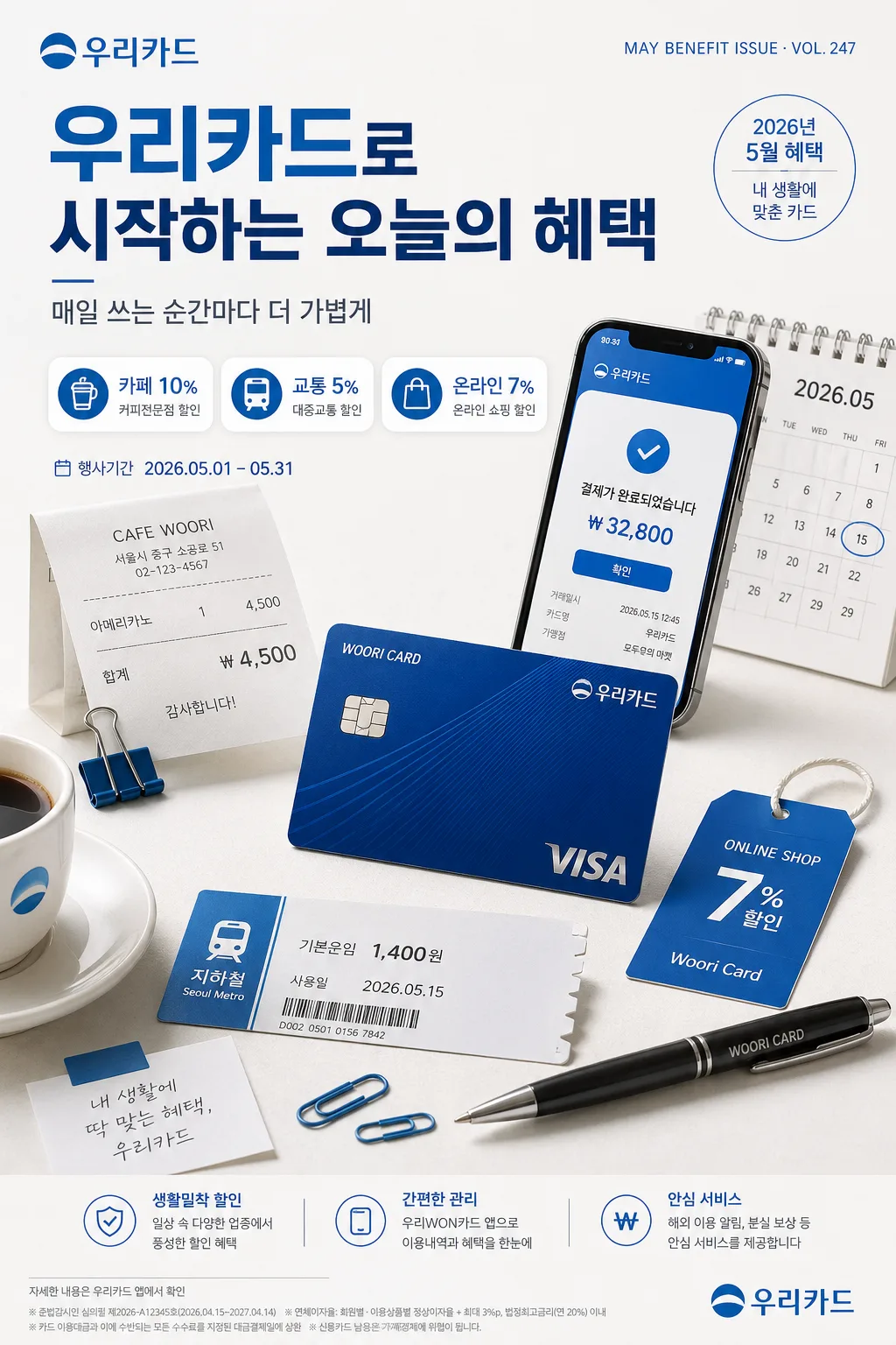
Korean credit card advertisement poster for 우리카드, brand-friendly lifestyle still life, vertical promotional key visual for social feed, app banner, and outdoor media.
Create a real commercial finance campaign image that presents a card + daily life tabletop scene with believable benefit information, small campaign details, and a precise financial-brand finish.

[Composition]
- Main subject: {제품·소재} placed as the hero cluster in the lower-middle 55% of the frame, with the card angled slightly toward camera, crisp readable card geometry, and surrounding lifestyle props arranged in a controlled semicircle.
- Brand message zone: upper 18% carries {카피·타이포} as a strong Korean headline with a small 우리카드 brand mark area, campaign label, and one concise subline.
- Visual tone: {브랜드 톤} expressed through a polished, trustworthy commercial arrangement: card, smartphone wallet screen, café receipt, transit ticket, small shopping tag, and soft lifestyle details that feel natural for everyday card usage.
- Composition rhythm: {시그니처 결} should read as friendly yet varied, with balanced asymmetry, clean edges, layered paper cards, benefit chips, and a premium bank-ad look.
- Background treatment: off-white studio surface with subtle paper-like texture, faint blue-tinted shadow falloff, realistic tabletop depth, and a few tasteful printed campaign fragments such as “2026년 5월 혜택” and “내 생활에 맞춘 카드”.
- Framing direction: portrait poster layout using {레이아웃} and {비율}, with a clear top copy zone, centered focal hierarchy, lower hero product zone, and small informational details placed like a finished Korean financial advertisement.

[3. CORE STRUCTURE]
1. Header area (top 18%): place {카피·타이포} in a crisp Korean-first headline treatment. Include the brand text “우리카드” clearly, a small campaign label such as “MAY BENEFIT ISSUE · VOL. 247”, and a secondary Korean subline like “매일 쓰는 순간마다 더 가볍게”.
2. Mid frame (center 25%): build a visual bridge using lifestyle elements that support {시그니처 결}: a smartphone showing a simple 우리카드 app-style payment confirmation, a folded receipt, a calendar corner marked “2026.05”, and three small benefit badges.
3. Hero zone (mid-lower 35%): present {제품·소재} as the primary commercial object, cleanly separated from the background with realistic studio shadows, accurate card proportions, legible edge bevels, and premium material highlights.
4. Supporting accents (lower 20%): add tidy but realistic props that imply everyday usage and premium convenience: a coffee cup rim, café receipt reading “아메리카노 ₩4,500”, transit ticket strip, shopping label, pen, and small blue paper clips or tabs. Keep all items subordinate to the card product and campaign message.
5. Benefit information layer: include 2–3 short Korean benefit blurbs in small rounded modules, for example “카페 10%”, “교통 5%”, “온라인 7%”, plus campaign period “2026.05.01–05.31” and a tiny legal footer line “자세한 내용은 우리카드 앱에서 확인”.
6. Final polish: ensure the whole poster feels like a finished financial advertisement with exact alignment, controlled spacing, crisp typographic hierarchy, and a signature brand color presence from {컬러 팔레트}.

[4. STYLE RULES]
- Typography: use Pretendard Bold or Noto Sans KR Bold for the main Korean headline, with Noto Sans KR Medium or Inter for the English subline and campaign microcopy; billboard-readable headline, smaller but still believable benefit text.
- Color palette: {컬러 팔레트} should anchor the design, with white as the dominant field and the brand blue used for key accents, rules, benefit chips, app UI highlights, and headline emphasis.
- Text system: Set bold cover line in Korean such as “우리카드로 시작하는 오늘의 혜택”, with short support copy like “카페·교통·온라인까지 한 번에”. Include tiny footer details and realistic numeric labels without overwhelming the hero card.
- Border/shadow: use a soft drop shadow with 4px y-offset, 14px blur, 16% opacity under the card and props; no hard black outlines, no glossy sticker effect.
- Surface finish: clean commercial print look with slightly matte paper texture, subtle edge separation, restrained highlight rolloff, and tactile details on receipts, paper tabs, and card edges.
- Decorative system: add subtle blue lines, small circular benefit icons, a QR-like app download box, tiny arrow markers, and section dividers that feel like a real Korean finance campaign poster rather than a plain product mockup.

[5. VISUAL STYLE]
- Camera / lens: full-frame studio product photography, 85mm lens at f/5.6 for the hero card, with a secondary 50mm perspective feel for the surrounding lifestyle arrangement.
- Lighting: {무드·라이팅}; soft studio daylight from upper-left at about 45°, gentle fill from front-right, and a faint cool bounce to preserve the brand blue presence.
- Color grade: bright corporate white balanced with vivid but controlled blue, slight warm amber lift in midtones, clean neutral shadows, and realistic printed-paper contrast.
- Material realism: card surface should show subtle laminate reflection, beveled edge catchlight, tiny embossed detail, and believable contact shadow; paper props should show fine fiber texture and mild curl.

[6. MOOD]
Premium Korean financial-brand editorial — a polished commercial still that feels like a high-end 우리카드 campaign with practical daily benefits, trustworthy brand-system discipline, and warm everyday usefulness.

[7. CRITICAL]
- Korean text accuracy: “우리카드” must appear exactly and clearly in the headline or brand mark area.
- Korean text accuracy: all Korean headline, subheadline, benefit badges, campaign period, and footer characters must render cleanly with no broken glyphs.
- Required visible Korean text examples: “우리카드”, “오늘의 혜택”, “카페 10%”, “교통 5%”, “온라인 7%”, “2026년 5월 혜택”.
- Layout invariant: the image must preserve a card + life still-life composition with a clear top copy zone and a lower hero product zone.
- Visual invariant: the brand color system from {컬러 팔레트}, {브랜드 톤}, and overall advertising mood must remain consistent and controlled, with no exaggerated surreal styling.
- Product invariant: {제품·소재} must remain the main hero object and must look like a real card photographed in a premium studio tabletop setup.

[8. 🚫 PROHIBITED]
- Fake official seals / certifications
- Broken Korean characters