Ads/Posters
BC페이·BC카드 광고
BC 톤 — 핀테크 + 결제
BC페이·BC카드 광고 summary
Copy this ChatGPT image prompt to create Ads/Posters results. Its subject, background, style, and composition are organized for quick iteration.
Related keywords: BC페이·BC카드 광고, BC페이·BC카드 광고 프롬프트, Ads/Posters 프롬프트, Ads/Posters AI 이미지 프롬프트, ChatGPT 이미지 프롬프트, AI 이미지 생성 프롬프트, AI 프롬프트, 이미지 프롬프트
How to use BC페이·BC카드 광고
Keep the prompt structure and swap the subject, background, palette, or composition to create new variations.
- Keep the main subject and adjust the palette and background for your brand, season, or channel.
- If the result feels busy, simplify the background and make the subject, composition, and lighting more specific.
- After copying, ask ChatGPT to adapt it for your platform, aspect ratio, or text requirements.
Original prompt
[Input]
- language: Korean
- output_size: 1024x1536

[Purpose]
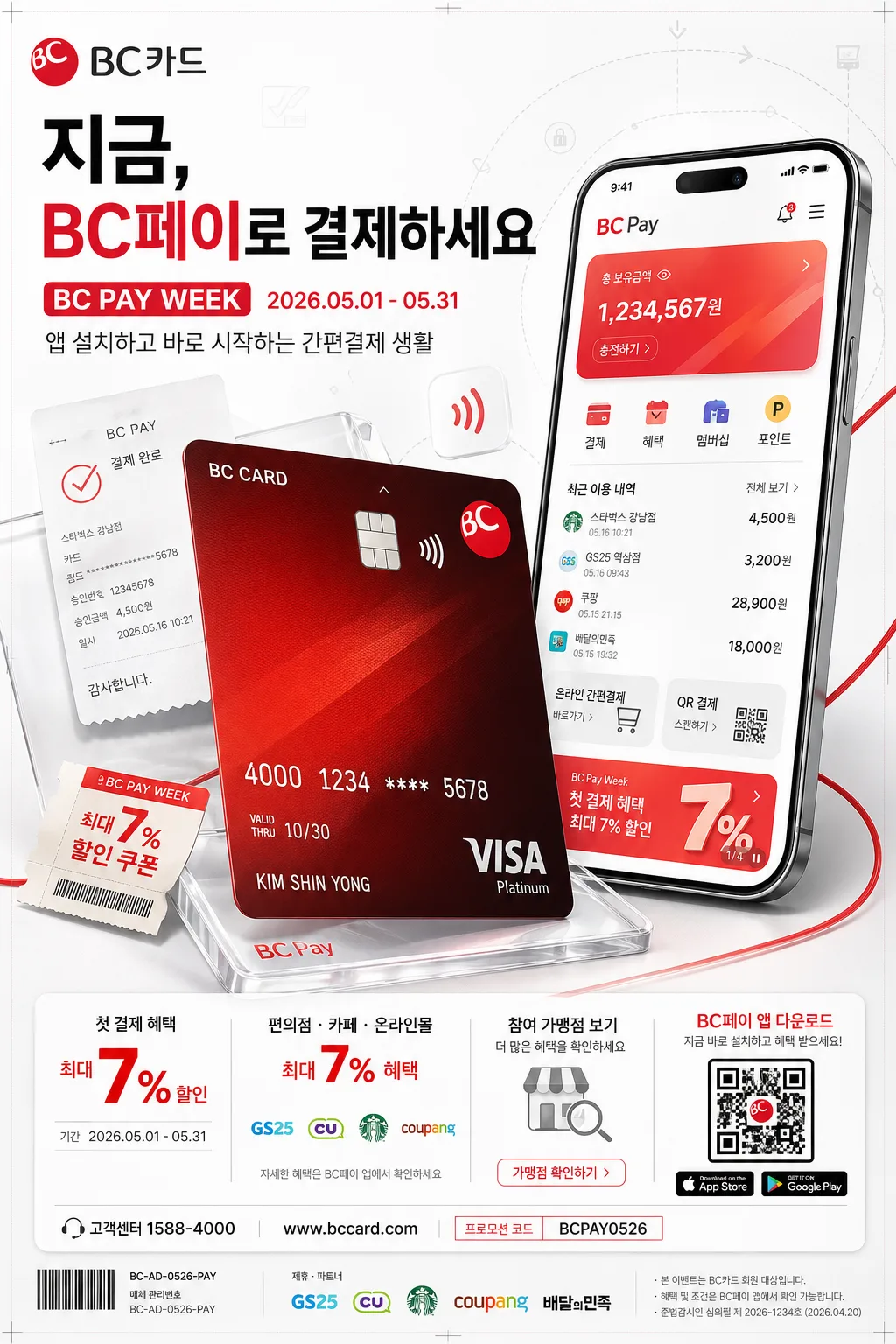
BC페이·BC카드 브랜드 광고 포스터. 카드와 앱 스크린을 함께 보여주는 세로형 핀테크 키비주얼로, 앱 설치·간편결제 브랜드 인지용 옥외광고/디지털 배너처럼 실제 캠페인 정보, 다운로드 안내, 혜택 문구, 제휴 가맹점 안내, QR형 CTA가 포함된 리얼한 상업 포스터.

[Composition]
- Main subject: {제품·소재}를 중심으로 전면 65%를 차지하게 배치하고, 카드가 앱 UI보다 약간 앞에 오도록 깊이감을 준다. 카드와 스마트폰 앱 화면은 실제 제품 촬영처럼 두께, 모서리, 반사광, 접촉 그림자, 유리 표면의 작은 스펙큘러 하이라이트가 보이게 한다.
- Composition: {레이아웃} 구조를 유지하되, 카드는 좌하단에서 우상단으로 살짝 기울어진 대각선 구도, 앱 화면은 우측 상단에 세로로 정렬한다. 카드 뒤에는 얇은 아크릴 플레이트, 작은 결제 영수증 조각, contactless wave 아이콘, BC red 라인 그래픽, 프로모션 쿠폰 태그를 자연스럽게 겹쳐 광고 현장감을 더한다.
- Background treatment: 화이트 기반에 아주 옅은 차콜 그라데이션, 반투명 유리/아크릴 표면 질감, 부드러운 스튜디오 플레인 섀도우를 더한다. 배경에는 {시그니처 결}을 은은한 패턴 라인으로 적용해 핀테크 브랜드의 흐름과 결제 동선을 시각화한다.
- Spacing: 상단은 카피 영역 18%, 중앙은 제품 영역 62%, 하단은 앱 설치·혜택·QR형 안내 영역 20%로 나누고, 포스터 가장자리에는 실제 인쇄물 같은 미세한 트림 마크 느낌의 정렬 기준선, 캠페인 코드, 매체 집행용 작은 크레딧을 배치한다.

[3. CORE STRUCTURE]
1) Header zone (top 18%): {카피·타이포}를 굵은 타이틀로 배치하고, BC카드 브랜드 광고처럼 짧고 직관적인 한글/영문 조합을 유지한다. 헤드라인에는 {헤드라인}을 크게 넣고, 아래에는 {캠페인명}, {캠페인기간}, {서브카피}를 실제 프로모션 배너처럼 정렬한다.
2) Hero zone (mid 62%): {제품·소재}를 스튜디오 촬영컷처럼 선명하게 배치한다. 카드 표면은 미세한 반사광이 있는 고급 플라스틱/금속 질감, 앱 스크린은 고해상도 UI 패널처럼 또렷하게 보여준다. 앱 UI에는 잔액/결제완료/혜택 탭/최근 이용 내역/온라인 간편결제/멤버십 포인트 같은 실제 핀테크 화면 요소를 넣고, 카드 번호 영역은 광고용 더미 숫자와 점 패턴으로 처리한다.
3) Brand color layer: {컬러 팔레트}를 기준으로 카드 엣지, 앱 CTA 버튼, 포인트 라인, contactless 아이콘, 하이라이트 리본에 강하게 사용하고, 배경의 화이트와 차콜 톤은 제품 대비를 살리도록 균형 있게 유지한다.
4) Typography layer: {브랜드 톤}을 반영해 헤드라인은 모던 산세리프, 영문은 좁지 않게 읽히는 상업 광고용 산세리프로 정렬한다. 가격·혜택·날짜·앱 다운로드 안내·제휴 가맹점·유의사항 같은 작은 정보 텍스트는 실제 광고 하단 고지처럼 정교하게 조판한다.
5) Detail polish: 카드 모서리와 앱 UI에 얇은 하이라이트를 더하고, 전체에 자연스러운 소프트 쉐도우로 떠 있는 느낌을 준다. 하단에는 {QR라벨}, App Store/Google Play 스타일의 작은 버튼, {혜택문구}, {CTA문구}, {제휴가맹점}, {고객센터}, {웹사이트}, {프로모션코드}를 넣어 실제 집행 가능한 포스터처럼 보이게 한다.

[4. STYLE RULES]
- Typography: Pretendard Bold 58~72px for headline, Pretendard Medium 26~34px for secondary text, Pretendard Regular 16~22px for campaign details and legal microcopy, English accents in Inter or Helvetica Neue; 자간은 약간 넓게, 줄간격은 타이트하게.
- Color palette: {컬러 팔레트}를 중심으로 BC red #E6002D, white #FFFFFF, charcoal #2B2B2B 계열의 강한 대비를 유지하고, 앱 버튼과 결제 상태 아이콘에는 red-to-coral gradient accent를 사용한다.
- Border/shadow: 카드 아래에 4px y-offset, 18px blur, 18% opacity의 soft drop shadow; 앱 패널에는 2px 내부 하이라이트와 스크린 유리 반사광. QR형 박스와 혜택 카드에는 얇은 1px light-gray rule과 subtle paper shadow를 적용한다.
- Poster details: 하단 정보 영역에는 {캠페인기간}, 다운로드 CTA, {혜택문구}, {제휴가맹점}, {고객센터}/{웹사이트} 라인, 작은 barcode-like inventory code, 매체 관리번호 BC-AD-0526-PAY, 스폰서/파트너 영역을 포함한다. 장식 요소는 결제 흐름을 연상시키는 점선, 라운드 태그, 작은 화살표, wave symbol, 쿠폰 스티커, 영수증 조각으로 구성한다.
- Ratio handling: {비율}에 맞춰 세로형 포스터의 시선 흐름이 상단 카피 → 카드/앱 제품 → 하단 CTA로 자연스럽게 이어지게 한다.

[5. VISUAL STYLE]
- Camera / lens: Canon EOS R5 with 85mm f/1.4 look, crisp commercial product advertising framing, shallow depth but all key UI edges remain readable.
- Lighting: {무드·라이팅}; studio softbox 45° from upper-left, weak fill from right, subtle rim light from top-right to separate card edges from background, small specular highlights on card chip and smartphone glass.
- Color grade: clean high-key commercial grade with BC red saturation preserved, neutral whites, slightly lifted shadows, controlled contrast. Printed-poster realism should show faint ink density, tiny paper grain in white areas, and clean digital-ad sharpness on the main product.

[6. MOOD]
Premium fintech brand campaign — clean corporate product advertising like a high-end bank card launch visual, but enriched with real campaign metadata, app-download cues, benefit badges, partner-store labels, barcode-like management code, and everyday payment details that make the poster feel ready for a subway station, bank branch, convenience-store counter display, or mobile landing page.

[7. CRITICAL]
- Korean text accuracy: 반드시 아래 문구가 정확히 보여야 함: 'BC카드', 'BC페이'.
- Include realistic Korean campaign text on the poster, crisp and readable: '지금, BC페이로 결제하세요', '앱 설치하고 바로 시작', '2026.05 캠페인', '첫 결제 혜택', '가맹점 혜택 보기', 'BC PAY WEEK', '고객센터 1588-4000', 'www.bccard.com'.
- Add realistic poster metadata and CTA copy: 'VOL.247', '2026년 5월호 혜택', '기간 2026.05.01-05.31', '편의점·카페·온라인몰 최대 7% 혜택', 'QR로 앱 다운로드', '프로모션 코드 BCPAY0526', '참여 가맹점 보기'.
- App UI Korean microcopy must be legible where visible: '결제완료', '오늘의 혜택', '최근 이용', '온라인 간편결제', '₩24,800'.
- Layout invariants: 카드와 앱 스크린의 2요소 구조를 유지하고, 브랜드 광고답게 단정한 상업 포스터 구성을 유지한다.
- Typography must remain crisp, legible, and professionally typeset; no distorted or broken Hangul.

[8. 🚫 PROHIBITED]
- Fake official seals / certifications
- Broken Korean characters
- Celebrity composites or unauthorized likeness