광고/포스터
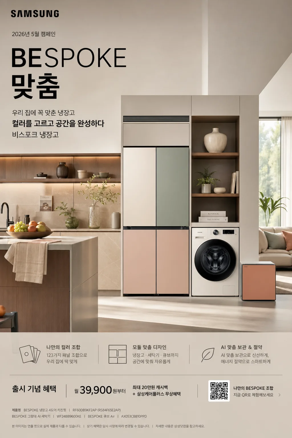
삼성 비스포크 냉장고 광고
비스포크 톤 — 컬러 가전 + 모던
삼성 비스포크 냉장고 광고 검색 요약
삼성 비스포크 냉장고 광고은 광고/포스터 결과물을 만들 때 바로 복사해 활용할 수 있는 ChatGPT 이미지 프롬프트입니다. 주제, 배경, 스타일, 구도 조건을 함께 담아 빠르게 시안을 만들 수 있도록 구성했습니다.
관련 키워드: 삼성 비스포크 냉장고 광고, 삼성 비스포크 냉장고 광고 프롬프트, 광고/포스터 프롬프트, 광고/포스터 AI 이미지 프롬프트, ChatGPT 이미지 프롬프트, AI 이미지 생성 프롬프트, AI 프롬프트, 이미지 프롬프트
삼성 비스포크 냉장고 광고 활용 포인트
원본 구조를 유지하면서 피사체, 배경, 색감, 구도를 바꿔 다양한 시안으로 확장할 수 있습니다.
- 핵심 소재는 유지하고 브랜드, 계절, 채널 목적에 맞는 색감과 배경을 바꿔보세요.
- 결과가 산만하면 배경 요소를 줄이고 피사체, 구도, 조명 조건을 구체화하세요.
- 복사한 뒤 ChatGPT에서 플랫폼, 화면 비율, 텍스트 포함 여부를 추가로 요청할 수 있습니다.
프롬프트 원문
[Input]
- language: Korean
- output_size: 1024x1536

[Purpose]
Samsung BESPOKE refrigerator advertisement, premium home-appliance hero poster with realistic interior-styled product staging for social media and print-like campaign use, rich enough to feel like a finished Korean launch campaign visual rather than a sterile product mockup.

[Composition]
- Main subject placement: {제품·소재} as the hero object occupying 45-55% of the frame, slightly off-center for a modern ad composition, with the surrounding interior filling the remaining space in a believable upscale home setting.
- Background treatment: upscale open kitchen and living-room interior with refined architectural lines, matte wall surfaces, warm wood accents, stone countertop edge, open shelving, a ceramic vase, a small plant, a folded linen towel, a fruit bowl, a cookbook stack, and soft daylight entering from one side; every object should support the premium appliance lifestyle and make the refrigerator feel installed in a real home.
- Spacing and framing: create a vertical campaign poster layout with headline copy integrated into the upper wall area, small product-information modules near the lower third, and natural interior styling around the refrigerator; use {레이아웃} to make the appliance feel integrated into the home rather than isolated.
- Advertising details: include a small Samsung-style wordmark area, a date label, a short Korean campaign subtitle, a small QR-code-like promo block, and fine-print product credit text along the lower edge, all arranged like a real home-appliance poster.
- All styling cues should follow {브랜드 톤} and {시그니처 결} so the result feels like a true BESPOKE campaign frame.

[3. CORE STRUCTURE]
1) Hero zone: place {제품·소재} as a clean, premium product centerpiece with crisp edges, subtle realistic reflections, separate modular panels, recessed handles, gasket detail, hinge seams, floor contact shadow, and showroom-level finish; the appliance should read as the primary visual anchor immediately.
2) Interior integration: surround the product with a high-end living-space context that supports {무드·라이팅}, using coordinated furniture tones, tactile surfaces, small everyday home objects, and realistic scale cues so the scene feels designed and lived-in.
3) Color system: apply {컬러 팔레트} across the appliance panels and ambient decor, with a controlled white base and carefully separated accent colors to emphasize modular customization; echo the panel colors subtly in cushions, ceramics, books, or wall art.
4) Typography zone: set {카피·타이포} as a polished campaign headline, with the English keyword "BESPOKE" and the Korean keyword "맞춤" aligned to the product’s vertical rhythm. Add supporting Korean ad text such as "우리 집에 꼭 맞춘 냉장고", "컬러를 고르고 공간을 완성하다", and "비스포크 냉장고" in clear hierarchy.
5) Campaign information layer: add a compact lower information band with "2026년 5월 캠페인", "출시 기념 혜택", "월 39,900원부터", a small QR-code-like square, a thin barcode-style promo mark, and tiny legal/product-credit text. Keep these elements elegant, readable, and subordinate to the hero refrigerator.
6) Composition finishing: keep the overall layout as a refined ad poster with {레이아웃}, ensuring the eye travels from headline area to product hero to realistic interior details and then to the campaign information band in one smooth flow.
7) Brand fidelity: preserve the exact Samsung BESPOKE advertising feel implied by {브랜드 톤} and {시그니처 결}, while adding enough believable home-styling detail to make the image feel like a real premium campaign photograph.

[4. STYLE RULES]
- Typography: use Pretendard or Noto Sans KR for Korean copy, bold weight for the main headline and medium weight for supporting text; English keyword can be set in a clean sans-serif with tight kerning and a premium tech-ad feel.
- Text hierarchy: main headline large and crisp, supporting line medium size, campaign details small but still legible; bottom fine print may be very small but should look like real advertisement production text.
- Color palette: follow {컬러 팔레트} with beige, sage, coral, dark charcoal, and white as the main tones; keep saturation controlled and premium, not pop-art bright.
- Materials: show realistic refrigerator enamel or glass-panel surfaces, subtle bevels, panel seams, warm wood grain, matte plaster wall texture, soft woven fabric, ceramic glaze, paper book covers, and natural daylight reflections.
- Border/shadow: soft studio shadow under the appliance, about 4px y-offset, 14px blur, 18% opacity; use subtle edge highlights for the panels and avoid heavy outline borders.

[5. VISUAL STYLE]
- Camera / lens: high-end commercial product photography look, Phase One IQ4 with 80mm or 110mm lens at f/5.6, straight-on framing with slight perspective depth for the interior space.
- Lighting: soft daylight from a large window on the left at about 45°, gentle fill from the right, with mild ambient bounce from the room surfaces; keep highlights controlled and premium, similar to luxury appliance campaign photography.
- Color grade: warm neutral whites with soft beige shadows, muted sage accents, and refined charcoal contrast; maintain a clean editorial appliance-ad grade with realistic material response.
- Production quality: glossy but believable Korean appliance advertisement finish, sharp product edges, accurate scale, readable printed text, realistic room depth, and premium catalog-level retouching.

[6. MOOD]
Premium appliance campaign — Samsung BESPOKE-style editorial interior ad with a sleek luxury home showcase feel, warm lived-in detail, refined domestic comfort, and a sophisticated launch-poster atmosphere.

[7. CRITICAL]
- Korean text accuracy: the image must clearly and correctly show exactly these strings where used: "맞춤", "우리 집에 꼭 맞춘 냉장고", "컬러를 고르고 공간을 완성하다", "비스포크 냉장고", "2026년 5월 캠페인", "출시 기념 혜택", "월 39,900원부터".
- English text accuracy: the image must clearly and correctly show exactly these strings where used: "BESPOKE", "SAMSUNG", "NEW COLLECTION".
- Visual invariants: product proportions must stay realistic, panel colors must remain cleanly separated, refrigerator door geometry must not warp, and the advertisement must preserve a polished premium campaign framing without accidental distortion.
- Brand and layout invariants: retain {브랜드 톤}, {시그니처 결}, {컬러 팔레트}, {카피·타이포}, {레이아웃}, and {비율} as the guiding creative system for the final poster.

[8. 🚫 PROHIBITED]
- Fake official seals or certifications
- Broken Korean characters
- Celebrity composites or unauthorized likeness