광고/포스터
발뮤다 디자인 가전 광고
발뮤다 톤 — 디자인 가전 + 럭셔리
발뮤다 디자인 가전 광고 검색 요약
발뮤다 디자인 가전 광고은 광고/포스터 결과물을 만들 때 바로 복사해 활용할 수 있는 ChatGPT 이미지 프롬프트입니다. 주제, 배경, 스타일, 구도 조건을 함께 담아 빠르게 시안을 만들 수 있도록 구성했습니다.
관련 키워드: 발뮤다 디자인 가전 광고, 발뮤다 디자인 가전 광고 프롬프트, 광고/포스터 프롬프트, 광고/포스터 AI 이미지 프롬프트, ChatGPT 이미지 프롬프트, AI 이미지 생성 프롬프트, AI 프롬프트, 이미지 프롬프트
발뮤다 디자인 가전 광고 활용 포인트
원본 구조를 유지하면서 피사체, 배경, 색감, 구도를 바꿔 다양한 시안으로 확장할 수 있습니다.
- 핵심 소재는 유지하고 브랜드, 계절, 채널 목적에 맞는 색감과 배경을 바꿔보세요.
- 결과가 산만하면 배경 요소를 줄이고 피사체, 구도, 조명 조건을 구체화하세요.
- 복사한 뒤 ChatGPT에서 플랫폼, 화면 비율, 텍스트 포함 여부를 추가로 요청할 수 있습니다.
프롬프트 원문
[Input]
- language: Korean
- output_size: 1024x1024

[Purpose]
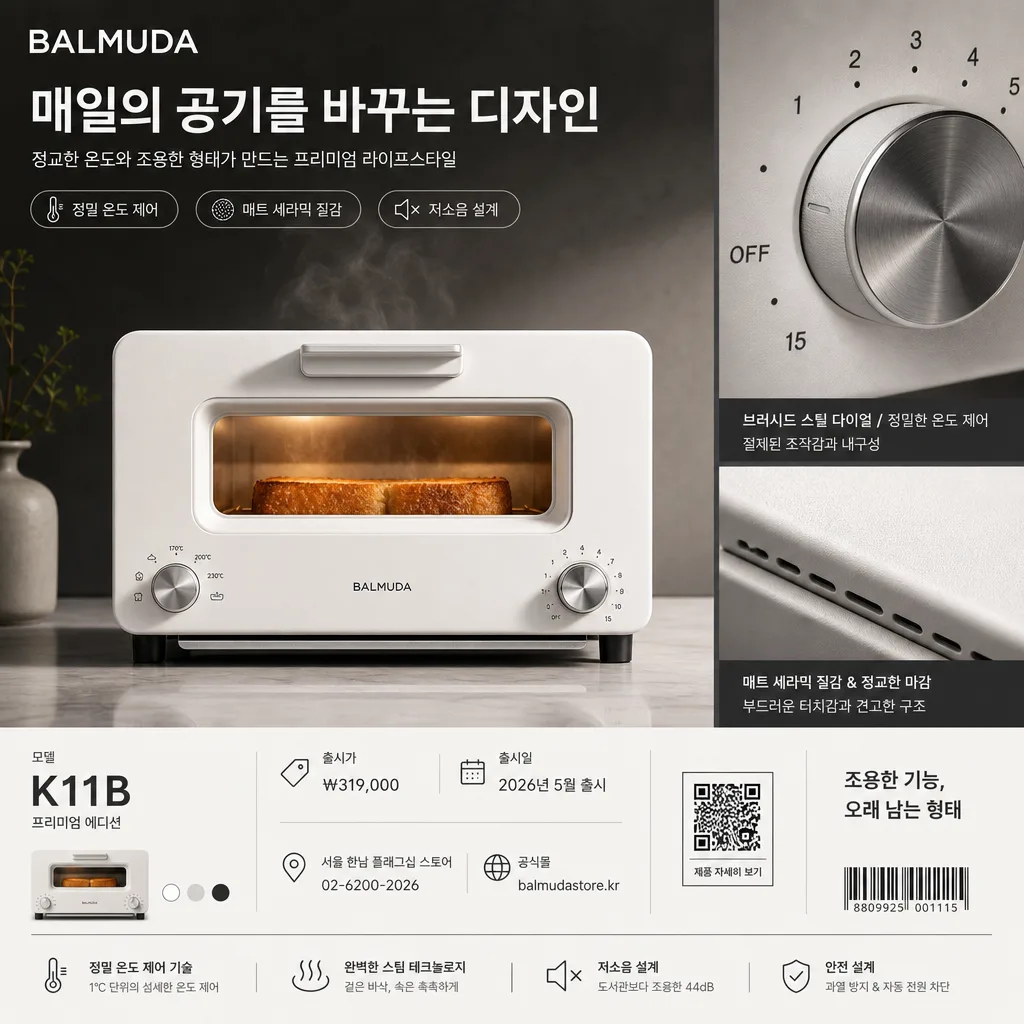
Design a BALMUDA-inspired luxury appliance advertisement, combining a product hero, macro detail view, and realistic premium ad information for square social media and brand promotion.
Create a refined studio product image that emphasizes sculptural appliance form, precision materials, tactile surface texture, and editorial-grade commercial lighting.

[Composition]
- Main product hero occupies the center 56% of the frame, with a secondary macro-detail panel on the right or lower-right showing the material finish, dial texture, vent line, switch edge, or control surface of {제품·소재}.
- Background is a premium studio set in {컬러 팔레트}: warm off-white platform, charcoal rear plane, soft reflection on the surface, and a subtle gradient that gives the appliance depth.
- Add realistic advertising information around the product: brand lockup, campaign headline, Korean body copy, product model, feature tags, price, launch date, store/contact line, small QR label, and a thin footer divider.
- Include natural product cues where appropriate, such as a faint appliance glow, soft steam, toasted bread warmth, brushed metal highlight, ceramic texture, or carefully placed shadow/reflection that supports the product story.
- Apply {브랜드 톤} and {시그니처 결} as the controlling visual direction, while preserving a polished luxury appliance-ad aesthetic.

[3. CORE STRUCTURE]
1. Hero product area: Place {제품·소재} as the dominant subject, crisply lit and precisely aligned, with a sculptural silhouette, realistic edge definition, and premium material finish.
2. Macro detail area: Add a tight close-up crop that highlights seams, control dial, vent lines, finish grain, button labeling, or brushed-metal texture; separate it with a thin graphite divider and small caption.
3. Branding zone: Set {브랜드명} near the upper-left or upper-center in a refined sans-serif wordmark style, with {메인 카피} as the primary Korean campaign headline.
4. Editorial copy zone: Add {서브 카피} below the headline, plus 2–3 compact feature tags using {기능태그} to make the ad feel like a finished product campaign.
5. Product information footer: Place {모델번호}, {가격표기}, {출시일}, {매장정보}, {웹사이트}, and {풋터문구} in the lower band with precise alignment, small icons, a QR-style square labeled {QR라벨}, and a discreet barcode-like retail mark.
6. Layout balance: Organize the frame as {레이아웃}, allowing the hero product, detail panel, and copy blocks to feel like a premium editorial spread rather than a plain product cutout.
7. Palette control: Keep the full scene anchored in {컬러 팔레트}, using off-white, charcoal, muted metal, soft warm gray, and controlled black type for a BALMUDA-like visual tone.
8. Format discipline: Maintain a square composition at {비율}, with all product edges, typography, icons, and footer details readable for direct ad usage.

[4. STYLE RULES]
- Typography: Use a refined sans-serif style such as Helvetica Neue or Pretendard; medium-to-bold weight for {브랜드명} and {메인 카피}, regular-weight Korean supporting text, tight spacing, and precise grid alignment.
- Ad copy hierarchy: Main headline should be large and confident; sub-copy should be 1–2 short Korean lines; feature tags should appear as small rounded labels or fine-line icon captions.
- Color palette: {컬러 팔레트} should resolve into off-white #F7F5F0, pure white #FFFFFF, soft graphite #2B2B2B, muted appliance-metal tones, and a restrained warm highlight from the product surface.
- Detail graphics: Use thin dividers, tiny spec icons, a compact QR-style square, barcode-like retail mark, and product specification captions to add realism without turning the image into a crowded flyer.
- Product realism: Surfaces must show believable ceramic, matte plastic, brushed metal, glass, or enamel texture depending on {제품·소재}; reflections and shadows should follow the studio lighting direction.
- Border/shadow: Use a soft studio drop shadow with 4px y-offset, 14px blur, and 18% opacity; allow subtle panel separation, glassy surface reflection, and gentle atmospheric gradients.

[5. VISUAL STYLE]
- Camera / lens: Shot like a premium product campaign on a Phase One IQ4 with an 80mm lens at f/8 for the hero, plus a 100mm macro detail crop at f/4 for texture precision.
- Lighting: Studio softbox key light from upper-left at 45°, subtle fill from front-right, and a controlled rim light from the back to separate the object from the background.
- Color grade: Neutral luxury grade with white, charcoal, and restrained warm-gray highlights; polished, crisp, and slightly contrasty without looking clinical.
- Rendering quality: High-end commercial product photography, realistic scale, straight verticals, sharp typography, accurate Korean glyphs, and refined material response.

[6. MOOD]
Premium appliance brand campaign — a BALMUDA-style editorial product advertisement with Japanese design restraint, magazine-like layout precision, tactile material close-ups, and quiet luxury studio lighting.

[7. CRITICAL]
- Korean text accuracy: 반드시 정확히 보여야 하는 문자열: "{브랜드명}", "{메인 카피}", "{서브 카피}", "{기능태그}", "{모델번호}", "{가격표기}", "{출시일}", "{매장정보}", "{웹사이트}", "{풋터문구}", "{QR라벨}".
- 제품 설명 요소도 정확히 반영: "{브랜드 톤}", "{시그니처 결}", "{제품·소재}", "{무드·라이팅}", "{컬러 팔레트}", "{레이아웃}", "{비율}".
- Preserve the exact premium appliance-ad framing: centered hero product, macro detail panel, realistic footer information, small retail/QR elements, and balanced luxury studio composition.
- All typography, QR label, model number, price, product edges, dial markings, and material seams must remain crisp, realistic, readable, and proportionally refined.

[8. 🚫 PROHIBITED]
- Fake official seals / certifications
- Broken Korean characters
- Celebrity composites or unauthorized endorsement portraits
- Warped product geometry, unreadable microcopy, or impossible material reflections