広告・ポスター
애플 미니멀 브랜드 비주얼
Apple 미니멀 시그니처 시각 톤만 빌려쓰는 결. 제품·매장·인물 자유.
애플 미니멀 브랜드 비주얼の概要
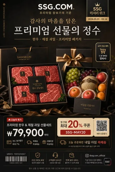
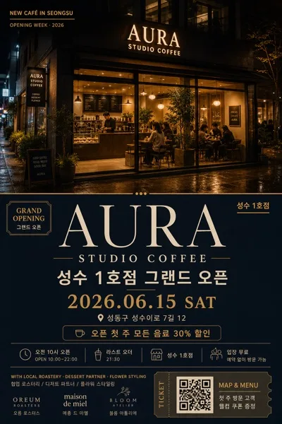
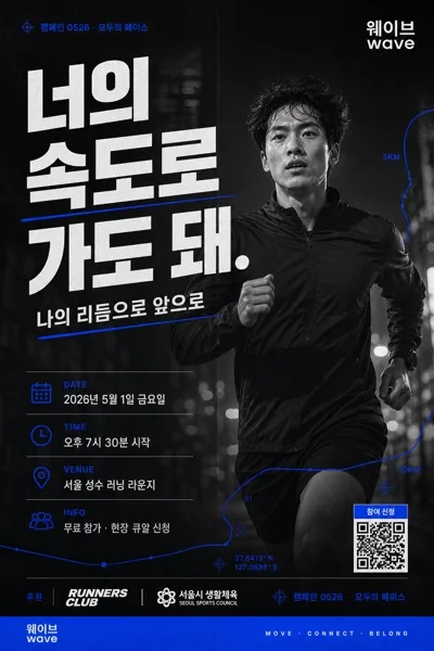
広告・ポスター画像を作るためのChatGPT画像プロンプトです。主題、背景、スタイル、構図を整理し、すぐに試せるよう構成しています。
関連キーワード: 애플 미니멀 브랜드 비주얼, 애플 미니멀 브랜드 비주얼 프롬프트, 広告・ポスター 프롬프트, 広告・ポスター AI 이미지 프롬프트, ChatGPT 이미지 프롬프트, AI 이미지 생성 프롬프트, AI 프롬프트, 이미지 프롬프트
애플 미니멀 브랜드 비주얼の活用方法
元の構造を保ちながら、被写体、背景、色、構図を変更して別案に展開できます。
- 主題を維持し、ブランドや季節、媒体に合わせて色と背景を変更してください。
- 結果が複雑な場合は背景要素を減らし、被写体、構図、照明を具体化してください。
- コピー後、ChatGPTに媒体、アスペクト比、文字の有無を追加で指定できます。
プロンプト原文
[Input]
- language: Korean
- output_size: 1024x1536

[Purpose]
Apple-inspired premium brand visual for a poster/catalog/advertising layout, centered on a single product hero with refined editorial polish.
Designed to feel like a real keynote-style product launch poster and retail catalog page: high-end, cinematic, tactile, and instantly readable at a glance, with believable publication details and launch information.

[Composition]
- Main subject should occupy the center hero zone at about 45–55% of frame height, with a confident headline area above and a compact launch-information system below.
- Background should feel like a premium studio environment: seamless curved backdrop or satin product-photography surface with subtle paper texture, soft gradient falloff, faint reflection, and realistic contact shadows.
- Use {적용 대상 (제품·매장·인물 자유)} as the focal subject, framed cleanly and symmetrically, with soft edge separation, realistic material detail, and precise product contours.
- The overall structure should read as a polished brand key visual: top headline, central hero, lower spec strip, date/venue line, price or availability note, small barcode/QR area, and tiny editorial credits.
- Keep {브랜드 톤·시그니처} as the visual rule for the whole layout, ensuring the image feels premium, product-first, and launch-ready.
- Add believable launch-poster details in Korean, such as issue/date labels, short feature blurbs, product-credit text, and a subtle retail information footer, without letting them overpower the hero subject.

[3. CORE STRUCTURE]
- Hero area (middle 50%): {적용 대상 (제품·매장·인물 자유)} placed dead center, shot against the studio backdrop, with a soft realistic shadow falling slightly down-right and a faint floor reflection under the subject.
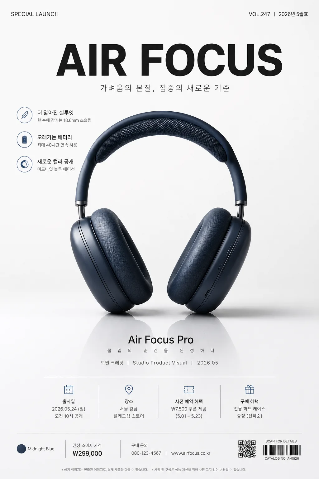
- Header area (top 18%): place a large hero headline using {타이포·카피}; add a small upper label such as "SPECIAL LAUNCH", "VOL.247", or "2026년 5월호" near the top edge like a premium catalog masthead.
- Feature blurb area (upper or side margins): include 2–3 short Korean feature lines, for example "더 얇아진 실루엣", "오래가는 배터리", "새로운 컬러 공개", set in small editorial typography.
- Secondary copy area (lower 12–15%): place a compact model/info line beneath the product, such as "모델 크레딧  |  Studio Product Visual  |  2026.05", using smaller text size and reduced contrast so it supports rather than competes with the hero.
- Launch detail footer: include date/time/venue and purchase information in Korean, for example "출시일 2026.05.24", "오전 10시 공개", "서울 강남 플래그십 스토어", "사전 예약 ₩7,500 쿠폰 제공".
- Barcode / QR area: add a small realistic barcode or QR-style block at the lower corner with tiny text like "CATALOG NO. A-0526" or "SCAN FOR DETAILS".
- Background plane: maintain a controlled field based on {컬러 팔레트}, such as white-to-soft-gray, graphite-to-black, or warm titanium tones, with subtle studio-paper grain, gentle lens falloff, and tactile surface realism.
- Accents: if the product has a signature color, let it appear as the main accent in the composition; small graphic ticks, divider lines, and spec chips may echo that hue.
- Overall framing: use tight editorial spacing, crisp geometry, premium launch-poster rhythm, and realistic catalog-print details inspired by Apple keynote slides and high-end product advertising.

[4. STYLE RULES]
- Typography: use SF Pro-like sans-serif, Pretendard, or Noto Sans KR for Korean support; headline weight 700–900, subtext weight 300–500, with clean kerning, refined hierarchy, and precise baseline alignment.
- Color palette: build from {컬러 팔레트}; translate it into controlled tones such as pure white #FFFFFF, soft gray #F3F4F6, graphite #1F1F1F, deep black #050505, and one restrained accent hue from the product.
- Border/shadow: use a soft drop shadow with 4–8px y-offset, 12–24px blur, and 10–18% opacity; keep product edges crisp, reflections subtle, and surface contact believable.
- Graphic system: add thin dividers, tiny spec badges, launch labels, barcode/QR block, footer credits, and small catalog annotations; keep all details aligned to a premium editorial grid.
- All typography should feel modular and product-launch ready: large headline, supporting feature blurbs, tiny metadata, realistic price/date/location labels, and no decorative scripts.
- Use {레이아웃} to guide alignment, grid density, and visual hierarchy while preserving a single dominant hero subject.
- Use {비율} to shape the product scale, text spacing, and poster-like vertical composition.

[5. VISUAL STYLE]
- Camera / lens: studio product photography look, shot on a medium-format body such as Phase One IQ4 with an 80mm or 110mm lens at f/8 for crisp separation and controlled detail.
- Lighting: use {라이팅·무드}; studio softbox key light from upper-left at about 45°, with a gentle fill from front-right and a subtle rim to define the silhouette; shadows should be smooth, engineered, and physically plausible.
- Color grade: neutral cool whites, clean blacks, restrained midtones, and Apple-style precision; keep saturation controlled except for the product’s signature accent tone.
- Material realism: render metal, glass, ceramic, fabric, plastic, skin, or architectural finishes accurately depending on {적용 대상 (제품·매장·인물 자유)}, with believable micro-scratches, reflections, edge highlights, and soft ambient occlusion.
- Print realism: the final layout should look like a photographed premium poster or catalog page, with tiny registration marks, subtle paper grain, fine ink texture, and sharp Korean typesetting.

[6. MOOD]
Premium product launch editorial — Apple keynote poster meets luxury tech catalog aesthetic, polished retail campaign, calm confidence, precise information hierarchy, and a real-world advertising finish.

[7. CRITICAL]
- Korean text accuracy: render all Korean text cleanly and legibly. If the design includes generated copy, use short Korean strings such as "나다운 선택이 가장 좋은 답", "더 얇아진 실루엣", "새로운 컬러 공개", "출시일 2026.05.24", "서울 강남 플래그십 스토어", and keep characters intact.
- Placeholder fidelity: preserve the meaning of {브랜드 톤·시그니처}, {적용 대상 (제품·매장·인물 자유)}, {컬러 팔레트}, {라이팅·무드}, {타이포·카피}, {레이아웃}, and {비율} throughout the image direction.
- Composition invariants: one clear hero subject only, centered and dominant; headline zone on top, product hero in the middle, launch/spec information and barcode/QR details at the bottom.
- Make the page feel like a real premium launch poster/catalog visual, not a blank mockup: include believable date labels, feature blurbs, model-name credit, footer metadata, and small retail information.
- If any Korean text is shown in the design, keep characters intact, properly spaced, and free of broken glyphs.

[8. 🚫 PROHIBITED]
- Fake official seals/certifications
- Broken Korean characters