広告・ポスター
이솝 다크 럭셔리 브랜드 비주얼
Aesop 다크 럭셔리 시그니처 시각 톤만 빌려쓰는 결. 제품·매장·인물 자유.
이솝 다크 럭셔리 브랜드 비주얼の概要
広告・ポスター画像を作るためのChatGPT画像プロンプトです。主題、背景、スタイル、構図を整理し、すぐに試せるよう構成しています。
関連キーワード: 이솝 다크 럭셔리 브랜드 비주얼, 이솝 다크 럭셔리 브랜드 비주얼 프롬프트, 広告・ポスター 프롬프트, 広告・ポスター AI 이미지 프롬프트, ChatGPT 이미지 프롬프트, AI 이미지 생성 프롬프트, AI 프롬프트, 이미지 프롬프트
이솝 다크 럭셔리 브랜드 비주얼の活用方法
元の構造を保ちながら、被写体、背景、色、構図を変更して別案に展開できます。
- 主題を維持し、ブランドや季節、媒体に合わせて色と背景を変更してください。
- 結果が複雑な場合は背景要素を減らし、被写体、構図、照明を具体化してください。
- コピー後、ChatGPTに媒体、アスペクト比、文字の有無を追加で指定できます。
プロンプト原文
[Input]
- language: Korean
- output_size: 1024x1536

[Purpose]
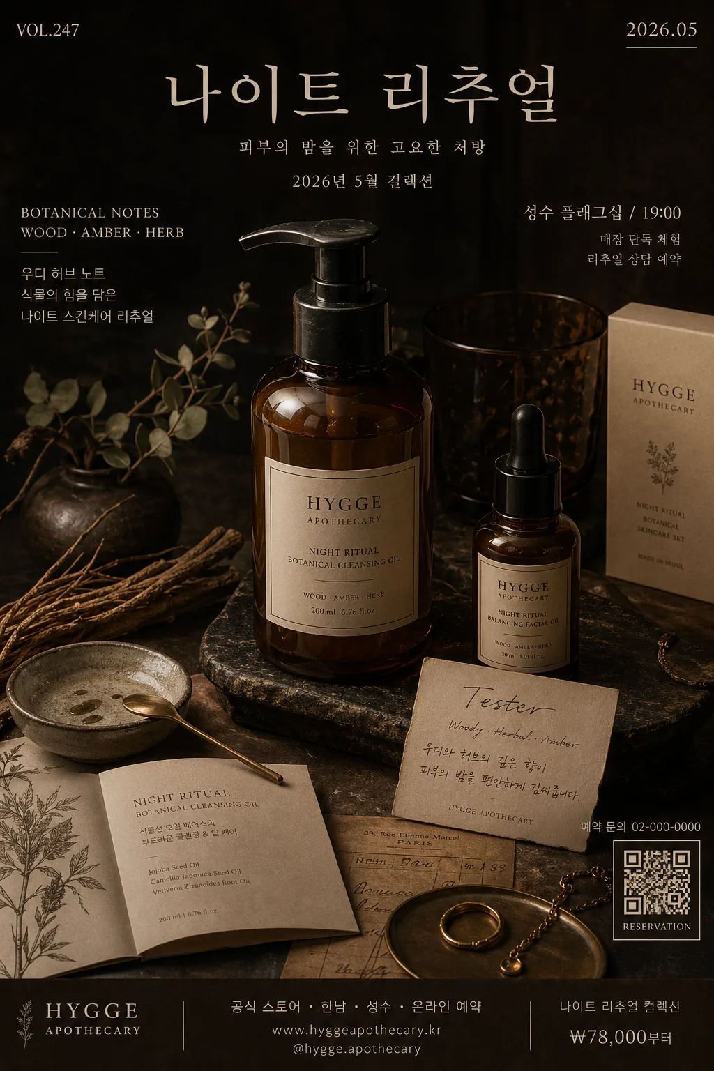
Luxury editorial product/poster visual inspired by dark apothecary branding. Create a vertical 1024x1536 catalog-cover and campaign-poster composition for skincare, fragrance, or lifestyle still life, with a real photographed boutique atmosphere, premium Korean copy, product details, date/location information, and tactile natural-material richness.

[Composition]
- Main subject: {적용 대상 (제품·매장·인물 자유)} placed as the centered hero occupying about 55–60% of the frame height, photographed like a high-end skincare campaign object in a dim boutique display.
- Background treatment: layered natural-material surface in matte dark brown stone, walnut wood, smoked glass, aged brass, and textured beige paper, with visible grain, edges, seams, tiny dust specks, and realistic contact shadows.
- Poster framing: compose as a premium vertical brand visual with editorial information blocks, a small date label, product-note captions, venue/contact line, and a discreet barcode/QR-style reservation block near the bottom edge.
- Brand tone cues: {브랜드 톤·시그니처} should be expressed through restrained materials, muted contrast, crafted packaging details, botanical fragments, and refined editorial object spacing.
- Environmental realism: include believable boutique still-life details such as a folded product leaflet, handwritten tester card, small ceramic tray, dried botanicals, amber dropper reflection, and subtle shelf or counter depth.

[3. CORE STRUCTURE]
1) Hero zone (center 55–60%): {적용 대상 (제품·매장·인물 자유)} presented realistically with premium packaging, label texture, glass/plastic material detail, cap seams, soft reflections, and one dominant focal grouping.
2) Surface layer: dark stone or matte ceramic base in deep brown-black, with tactile grain, small imperfections, paper fibers, dried water marks, and soft edge falloff.
3) Accent objects: natural elements such as dried eucalyptus, vetiver root, a small branch, smooth stone, folded beige receipt paper, brass spoon, or ceramic testing dish placed around the hero to echo {브랜드 톤·시그니처}.
4) Text area: integrate {타이포·카피} as the main Korean cover line, then add short supporting poster copy such as “나이트 리추얼”, “2026년 5월 컬렉션”, “성수 플래그십 / 19:00”, “예약 문의 02-000-0000”, and “BOTANICAL NOTES · WOOD · AMBER · HERB”.
5) Information layer: include a small campaign code like “VOL.247”, a date label “2026.05”, a tiny credit line “Still life by Studio Seoul”, a model/product credit “Featured: {적용 대상 (제품·매장·인물 자유)}”, and a clean barcode/QR-style reservation area.
6) Poster bottom band: add a tasteful sponsor/stockist area with tiny Korean microcopy such as “공식 스토어 · 한남 · 성수 · 온라인 예약”, plus price or launch note like “₩78,000부터” if suitable for the subject.
7) Framing discipline: maintain a premium still-life poster structure where every object feels intentionally placed, but allow layered realistic props, tactile surfaces, labels, receipts, shadows, and small printed details that make the scene feel photographed.

[4. STYLE RULES]
- Typography: Garamond-inspired serif for main copy, Noto Sans KR or Pretendard for small Korean subtitles, elegant contrast in weights, headline around 34–48px feel, subtitle around 14–18px feel, microcopy around 8–11px feel.
- Korean copy hierarchy: set {타이포·카피} as the strongest visible phrase; supporting short Korean blurbs may include “피부의 밤을 위한 고요한 처방”, “우디 허브 노트”, “매장 단독 체험”, and “리추얼 상담 예약”.
- Color palette: {컬러 팔레트} grounded by deep espresso brown, charcoal, warm beige, muted olive green, aged brass, amber glass, and soft off-white highlights.
- Border/shadow: subtle soft drop shadow with 4px y-offset, 14px blur, and 18% opacity; use realistic ambient occlusion, contact shadows, paper-edge shadows, and soft reflection rather than harsh outline, glossy border, or neon effects.
- Graphic elements: add thin editorial rules, small section markers, alignment ticks, product-spec lines, barcode/QR-style block, and tiny credit typography that feel like a printed luxury campaign poster.

[5. VISUAL STYLE]
- Camera / lens: Hasselblad X2D 100C with 80mm f/2.8 or Phase One IQ4 with 110mm macro, shot as a premium still-life editorial frame with crisp material detail.
- Lighting: natural side light from upper-left at about 45°, gentle fill from the right, soft shadow roll-off, and low-contrast highlights that emphasize texture.
- Color grade: deep brown and beige with muted green accents, subtle filmic contrast, slightly desaturated luxury editorial tonality.
- Realism details: shallow depth of field on secondary props, sharp hero label area, visible paper fibers, glass rim highlights, stone pores, wood grain, tiny product smudges, and realistic printed ink on labels and cards.

[6. MOOD]
Aesop-style dark luxury editorial — quiet boutique skincare campaign feel with Kinfolk-meets-apothecary material restraint, museum-catalog precision, warm shadows, herbal tactility, and the believable richness of a photographed retail counter display.

[7. CRITICAL]
- Korean text accuracy: the rendered image must preserve every Korean string exactly as written for any visible copy, with no broken syllables or misspellings.
- Layout invariant: the composition must read as a premium dark luxury still life and vertical campaign poster, with {타이포·카피} clearly integrated, natural materials, product/event microcopy, and a single hero focus.
- Visible Korean strings to render cleanly may include: “{타이포·카피}”, “나이트 리추얼”, “2026년 5월 컬렉션”, “성수 플래그십 / 19:00”, “예약 문의 02-000-0000”, “피부의 밤을 위한 고요한 처방”, “우디 허브 노트”, “매장 단독 체험”, “리추얼 상담 예약”, “공식 스토어 · 한남 · 성수 · 온라인 예약”.
- Preserve {브랜드 톤·시그니처}, {컬러 팔레트}, {라이팅·무드}, {레이아웃}, and {비율} as the guiding art-direction inputs while enriching the scene with realistic poster details and tactile still-life elements.

[8. 🚫 PROHIBITED]
- Fake official seals or certifications
- Broken Korean characters