Ads/Posters
샤넬 클래식 브랜드 비주얼
Chanel 클래식 (블랙·골드·진주) 시그니처 시각 톤만 빌려쓰는 결. 제품·매장·인물 자유.
샤넬 클래식 브랜드 비주얼 summary
Copy this ChatGPT image prompt to create Ads/Posters results. Its subject, background, style, and composition are organized for quick iteration.
Related keywords: 샤넬 클래식 브랜드 비주얼, 샤넬 클래식 브랜드 비주얼 프롬프트, Ads/Posters 프롬프트, Ads/Posters AI 이미지 프롬프트, ChatGPT 이미지 프롬프트, AI 이미지 생성 프롬프트, AI 프롬프트, 이미지 프롬프트
How to use 샤넬 클래식 브랜드 비주얼
Keep the prompt structure and swap the subject, background, palette, or composition to create new variations.
- Keep the main subject and adjust the palette and background for your brand, season, or channel.
- If the result feels busy, simplify the background and make the subject, composition, and lighting more specific.
- After copying, ask ChatGPT to adapt it for your platform, aspect ratio, or text requirements.
Original prompt
[Input]
- language: Korean
- output_size: 1024x1536

[Purpose]
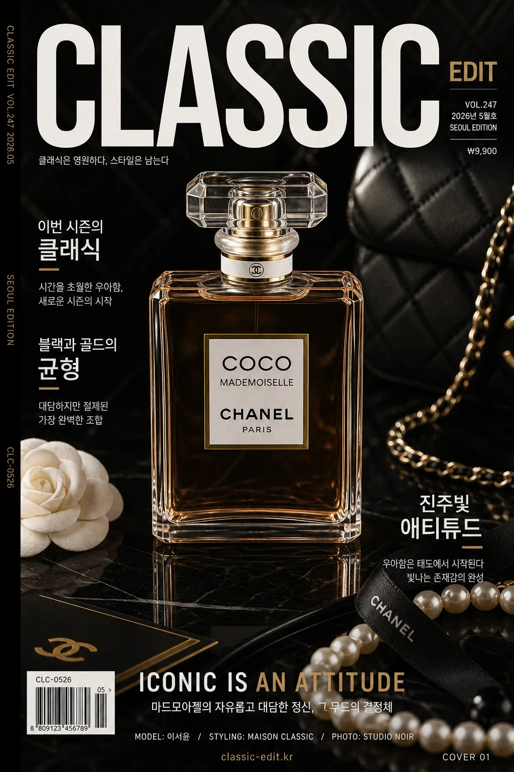
Luxury fashion brand-style editorial magazine cover / catalog hero visual inspired by Chanel’s classic black, gold, ivory, quilted leather, camellia, and pearl aesthetic. Designed as a premium product-led fashion-house campaign image with realistic publication details, suitable for a collectible catalog cover, boutique poster, or social campaign key visual.

[Composition]
- Main subject placement: {적용 대상 (제품·매장·인물 자유)} sits in the center hero zone, occupying about 55–60% of the frame height, posed or arranged like a premium fashion editorial cover subject.
- Background treatment: black-to-charcoal studio backdrop with visible satin fabric texture, faint quilted-leather geometry, pearl glow, polished gold reflections, and a subtle marble or lacquered display base beneath the subject.
- Framing direction: tall editorial cover framing using {비율}, with a strong top masthead area, layered magazine-cover typography, a barcode/price block near the lower corner, and refined cover-line hierarchy around the hero.
- Use {브랜드 톤·시그니처} as the overall visual tone cue, with {레이아웃} guiding the placement of headline, blurbs, product credit, and catalog information.
- Include real-looking luxury styling details that naturally belong in the scene: pearl strands, black ribbon, camellia flower accent, brushed-gold card edge, glossy reflection, fabric folds, and premium print grain.

[3. CORE STRUCTURE]
1. Top header zone (12–15%): place a bold fashion masthead / headline area using {타이포·카피}. Include small publication details such as VOL.247, 2026년 5월호, SEOUL EDITION, and a slim price label ₩9,900.
2. Hero zone (middle 55–60%): feature {적용 대상 (제품·매장·인물 자유)} as the dominant focal point, sharply lit with tactile material detail, luxury styling props, realistic shadows, and polished reflections on the black surface.
3. Cover-line layer: add 2–3 short Korean feature blurbs around the hero, for example: 이번 시즌의 클래식, 블랙과 골드의 균형, 진주빛 애티튜드. Keep them elegant and readable.
4. Accent detail layer: introduce small gold highlights, pearl-like sheen, quilted texture cues, camellia-inspired floral detail, refined metallic edge reflections, and boutique-catalog finishing marks.
5. Supporting text zone (lower 15–20%): add a concise subtitle or brand statement in a restrained fashion-editorial style, plus model/product credit text such as MODEL: 이서윤 / STYLING: MAISON CLASSIC / PHOTO: STUDIO NOIR.
6. Publication realism pass: include a small barcode area, issue code CLC-0526, tiny spine/credit text along one side, page marker COVER 01, and a discreet website-style line such as classic-edit.kr.
7. Finish pass: preserve crisp silhouettes, deep black shadows, polished contrast, readable Korean typography, and high-end print-magazine realism so the image reads as a luxury fashion cover at first glance.

[4. STYLE RULES]
- Typography: use bold sans-serif typography such as Helvetica Neue, Futura, or Pretendard ExtraBold for the main headline, with smaller Noto Sans KR or Pretendard Medium Korean sublines; headline size should feel oversized, editorial, and confident.
- Color palette: use {컬러 팔레트} as the core, with deep black #050505, soft ivory #F6F1E8, muted gold #B89A5A, pearl white #F7F3EE, and warm champagne reflections as supporting tones.
- Layout: follow {레이아웃} with layered fashion-cover hierarchy: masthead, hero subject, side blurbs, lower caption, barcode, issue/date labels, and tiny production credits.
- Border/shadow: premium shadow treatment, 4–6px soft y-offset, 14px blur, 18% opacity, plus subtle edge vignette, glossy surface reflection, and tactile print finish.
- Text styling: render Korean cover text with clean kerning and strong contrast; combine large title text with smaller catalog microcopy to make the image feel like a real luxury publication.

[5. VISUAL STYLE]
- Camera / lens: studio fashion-product look shot on a Phase One IQ4 with an 80mm lens at f/8, or a 85mm f/1.4 portrait-style setup for refined hero separation.
- Lighting: dramatic studio key light from upper-left at 45°, controlled fill from front-right, with a soft rim light to create metallic edge highlights, pearl shine, and deep black shadows; match {라이팅·무드}.
- Color grade: monochrome-forward black and ivory base with restrained gold accents, pearl sheen, rich shadow detail, realistic satin highlights, and high-end contrast similar to a luxury fashion campaign.
- Texture fidelity: show believable material surfaces such as satin weave, quilted leather embossing, pearl nacre, brushed gold, glossy lacquer reflection, and fine magazine-print grain.

[6. MOOD]
Prestige fashion-house editorial — a black-tie luxury campaign feel with the refined stillness of a high-end magazine spread, enriched by collectible catalog-cover details and elegant boutique atmosphere.

[7. CRITICAL]
- Korean text accuracy: the main headline should read 샤넬 클래식 브랜드 비주얼 when a headline is added, and all Korean sublines must be rendered cleanly without broken characters.
- Include realistic cover details in Korean: VOL.247, 2026년 5월호, 서울 에디션, ₩9,900, 이번 시즌의 클래식, 블랙과 골드의 균형, 진주빛 애티튜드, COVER 01.
- Preserve luxury editorial proportions: one dominant hero subject, rich but controlled fashion-cover detail, strong black-gold-pearl styling, and polished catalog realism.
- Keep {브랜드 톤·시그니처}, {컬러 팔레트}, {타이포·카피}, {레이아웃}, {비율}, and {라이팅·무드} visually reflected throughout the composition.

[8. 🚫 PROHIBITED]
- Fake official seals / certifications
- Broken Korean characters
- Celebrity composites / unauthorized likeness