Ads/Posters
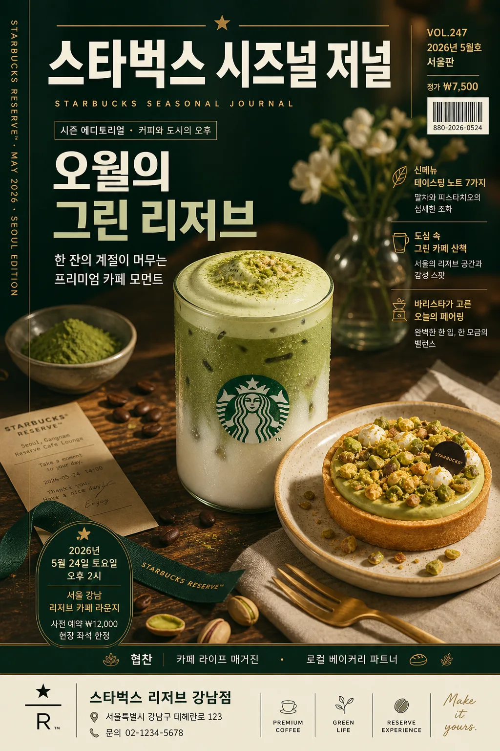
스타벅스 카페 럭셔리 비주얼
Starbucks 카페 럭셔리 시그니처 시각 톤만 빌려쓰는 결. 제품·매장·인물 자유.
스타벅스 카페 럭셔리 비주얼 summary
Copy this ChatGPT image prompt to create Ads/Posters results. Its subject, background, style, and composition are organized for quick iteration.
Related keywords: 스타벅스 카페 럭셔리 비주얼, 스타벅스 카페 럭셔리 비주얼 프롬프트, Ads/Posters 프롬프트, Ads/Posters AI 이미지 프롬프트, ChatGPT 이미지 프롬프트, AI 이미지 생성 프롬프트, AI 프롬프트, 이미지 프롬프트
How to use 스타벅스 카페 럭셔리 비주얼
Keep the prompt structure and swap the subject, background, palette, or composition to create new variations.
- Keep the main subject and adjust the palette and background for your brand, season, or channel.
- If the result feels busy, simplify the background and make the subject, composition, and lighting more specific.
- After copying, ask ChatGPT to adapt it for your platform, aspect ratio, or text requirements.
Original prompt
[Input]
- language: Korean
- output_size: 1024x1536

[Purpose]
Starbucks-inspired luxury café editorial magazine-cover / seasonal poster visual, using a premium seasonal mood with rich café realism and upscale presentation.
Commercial-style vertical hero composition for beverage, dessert, store interior, or person-based café promo, suitable for a 1024x1536 poster, catalog page, or social editorial cover.

[Composition]
- Main subject placement: {주인공 대상} placed as the central hero occupying about 55–65% of the frame, photographed with glossy condensation, ceramic/wood/stone surface contact, natural reflections, and edible detail when relevant.
- Background treatment: deep forest green to warm off-white gradient or premium café interior surface, with visible paper grain, matte acrylic texture, warm table material, espresso-toned shadows, shelf silhouettes, and seasonal light bokeh.
- Framing and editorial build: vertical {비율} magazine-cover composition with a masthead at the top, feature headlines around the subject, barcode and price information near the lower corner, and a slim spine-credit line along one side.
- Seasonal styling: arrange supporting café elements based on {레이아웃 연출} — coffee beans, pastry crumbs, menu card, receipt slip, ribbon tag, reusable cup sleeve, napkin folds, flowers, cinnamon sticks, matcha powder, or seasonal fruit accents as appropriate.
- Visual identity: {브랜드 톤} translated into a high-end café poster language with premium green, ivory, amber, and gold cues, allowing polished café-brand visual familiarity.
- Palette application: {컬러 팔레트} applied across background, props, text accents, product highlights, decorative dividers, and small editorial labels.

[3. CORE STRUCTURE]
- Masthead zone: show {매거진명} as a large editorial cover title, paired with {발행정보}, {가격}, {바코드번호}, and {스파인크레딧} for realistic magazine-cover detail.
- Hero zone: place {주인공 대상} in the middle with commercial product clarity, realistic material texture, believable scale, and appetizing café styling.
- Main copy hierarchy: use {메인카피} as the dominant Korean title and {서브카피} as the supporting subtitle, with strong hierarchy and premium magazine spacing.
- Feature headline cluster: add 2–3 readable Korean cover lines using {특집헤드라인1}, {특집헤드라인2}, and {특집헤드라인3}, arranged like a seasonal lifestyle magazine.
- Event/poster information block: include {행사날짜시간}, {행사장소}, {티켓정보}, and a lower sponsor strip reading {후원문구} so the visual works as a realistic promotional poster.
- Store information footer: include {매장명}, {주소}, and {연락처} in a compact café directory style with dividers and micro icons.
- Mood layering: blend studio realism, luxury café product photography, seasonal tabletop styling, and editorial publishing details so the image feels like an upscale campaign page.
- Finish treatment: maintain crisp highlights, soft edge separation, refined shadows, polished commercial render quality, and {라이팅 무드} throughout the composition.

[4. STYLE RULES]
- Typography: use Pretendard Bold or Noto Sans KR Bold for main Korean copy, with a clean sans-serif English companion in medium weight; masthead large, title bold, subtitle medium, feature headlines compact and legible.
- Magazine details: include an issue number/date line, price, barcode block, page-like footer, spine credit, and editorial separators; all micro labels should look printed, aligned, and intentional.
- Poster details: include date/time/venue/ticket information and a sponsor area with fine dividers, café icons, and decorative seasonal graphics.
- Color palette: {컬러 팔레트} plus ivory #F4F0E6, deep green #0E3B2E, muted gold #C8A86B, espresso brown #3A2418, and warm amber highlights.
- Border/shadow: use subtle soft drop shadow with 4px y-offset, 12px blur, 15% opacity; add refined editorial rule lines, small labels, corner ticks, and glossy highlight accents where they enhance realism.
- Text treatment: {메인카피}, {서브카피}, and feature headlines should feel premium, editorial, and clearly printed, with generous letter spacing and confident alignment.

[5. VISUAL STYLE]
- Camera / lens: full-frame medium-format commercial look, 85mm or 110mm prime, f/4, crisp product-detail clarity with shallow but controlled depth separation.
- Lighting: studio key light from upper-left at about 45°, soft diffused fill from front-right, gentle rim light to separate the hero from the background.
- Color grade: rich café green, creamy ivory, warm amber, espresso brown, muted seasonal accent tones, and a polished luxury-retail finish.
- Material realism: show condensation on cups, foam texture, pastry crumb structure, paper fibers, ceramic glaze, metal spoon highlights, and realistic printed ink on magazine/poster text.

[6. MOOD]
Premium café campaign editorial — like a Kinfolk-inspired lifestyle spread combined with a high-end specialty coffee advertisement and a realistic seasonal magazine cover.

[7. CRITICAL]
- The following Korean text must appear exactly and clearly if shown in the design: {매거진명}, {메인카피}, {서브카피}, {특집헤드라인1}, {특집헤드라인2}, {특집헤드라인3}.
- The following realistic publication and poster details must appear clearly: {발행정보}, {가격}, {바코드번호}, {스파인크레딧}, {행사날짜시간}, {행사장소}, {티켓정보}, {후원문구}.
- The following café directory text must appear legibly in Korean: {매장명}, {주소}, {연락처}.
- The image must evoke a Starbucks-style luxury café visual language through composition, palette, typography hierarchy, brand-green atmosphere, coffeehouse props, and warm premium lighting.
- Keep all Korean text properly spelled, fully legible, and printed as real magazine/poster typography.
- If a beverage, dessert, store interior, or person is included, anatomy, scale, material, and object rendering must be realistic and commercially polished.

[8. 🚫 PROHIBITED]
- Fake official seals / certifications
- Broken Korean characters
- Celebrity composites or lookalike faces
- Illegible microtext replacing required Korean copy