広告・ポスター
코스트코 창고형 마트 비주얼
Costco 창고형 (벌크·가성비) 시그니처 시각 톤만 빌려쓰는 결. 제품·매장·인물 자유.
코스트코 창고형 마트 비주얼の概要
広告・ポスター画像を作るためのChatGPT画像プロンプトです。主題、背景、スタイル、構図を整理し、すぐに試せるよう構成しています。
関連キーワード: 코스트코 창고형 마트 비주얼, 코스트코 창고형 마트 비주얼 프롬프트, 広告・ポスター 프롬프트, 広告・ポスター AI 이미지 프롬프트, ChatGPT 이미지 프롬프트, AI 이미지 생성 프롬프트, AI 프롬프트, 이미지 프롬프트
코스트코 창고형 마트 비주얼の活用方法
元の構造を保ちながら、被写体、背景、色、構図を変更して別案に展開できます。
- 主題を維持し、ブランドや季節、媒体に合わせて色と背景を変更してください。
- 結果が複雑な場合は背景要素を減らし、被写体、構図、照明を具体化してください。
- コピー後、ChatGPTに媒体、アスペクト比、文字の有無を追加で指定できます。
プロンプト原文
[Input]
- language: Korean
- output_size: 1024x1536

[Purpose]
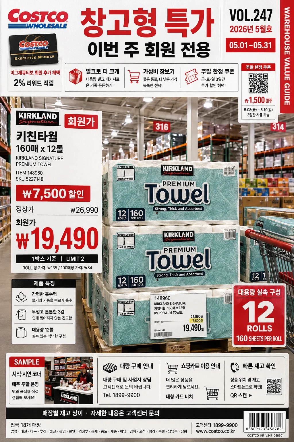
Costco-inspired warehouse retail poster, bulk-value promotional catalog look, vertical advertising layout for product or store showcase.
Create a visually unmistakable warehouse-membership retail aesthetic with oversized pricing, stacked product abundance, pallet displays, aisle signage, barcode/coupon details, and practical value-forward energy.

[Composition]
- Center composition: {적용 대상 (제품·매장·인물 자유)} occupies the lower 55% as the primary hero, with a strong frontal perspective, stacked bulk inventory around it, and dense but readable retail framing.
- Header zone: upper 18% contains a bold warehouse flyer masthead, date label, issue number, and main callout text in Korean, with a price hierarchy that feels like an in-store promo board.
- Background treatment: bright warehouse interior feel with white ceiling panels, exposed industrial beams, gray concrete floor, metal racks, stacked cartons, pallet edges, aisle markers, shopping carts, and wide aisle depth fading into the distance.
- Signage and labels: large price blocks, member-value callouts, barcode/coupon area, SKU lines, quantity tags, and small secondary info cards arranged in a stacked retail grid with hard-edged rectangular panels.
- Add realistic retail details: shelf labels, yellow/white price cards, warehouse bay numbers, sample counter sign, membership card graphic, small footer disclaimer, address/contact line, and a tiny print-production code.
- Use {브랜드 톤·시그니처}, {컬러 팔레트}, {라이팅·무드}, {타이포·카피}, {레이아웃}, {비율} to keep the visual language consistent.

[3. CORE STRUCTURE]
1. Background layer: render a full warehouse-store environment with bright overhead LED panels, long aisle perspective, tall steel shelving, palletized bulk packages, cardboard box texture, concrete floor scuffs, and practical retail signage that suggests wholesale scale.
2. Hero layer: place {적용 대상 (제품·매장·인물 자유)} as the dominant focal object, slightly below center, with crisp commercial-product-photo presence, realistic reflections, shelf context, and nearby stacked inventory for abundance.
3. Header architecture: build a top flyer band with Korean text such as "창고형 특가", "VOL.247", "2026년 5월호", "이번 주 회원 전용", plus a small date range label "05.01–05.31" and a narrow vertical spine/credit text reading "WAREHOUSE VALUE GUIDE".
4. Price architecture: add oversized bold price signage near the hero, using blocky rectangular tags, strong hierarchy, compact supporting text, and Korean price copy such as "회원가", "큰 가격", "₩7,500 할인", "1박스 기준", "LIMIT 2".
5. Supporting labels: place smaller information modules around the hero—product facts, quantity cues, value highlights, SKU number, item code, unit price, barcode area, QR-style coupon box, and shelf-card captions—aligned like a busy big-box wholesale circular.
6. Promotional modules: include 2-3 short Korean feature blurbs such as "벌크로 더 크게", "가성비 장보기", "주말 한정 쿠폰", and a footer strip with "매장별 재고 상이 · 자세한 내용은 고객센터 문의".
7. Brand-tone translation: express {브랜드 톤·시그니처} through bulk packaging emphasis, practical abundance, large warehouse signs, member-deal messaging, and retail-operational realism.
8. Color control: apply {컬러 팔레트} across signage, price blocks, cart handles, divider strips, and accent areas, while using neutral grays, cardboard browns, metallic shelving, and floor texture to support the red/white/black retail system.
9. Final polish: add realistic print/promo finish with sharp panel edges, light paper grain, subtle ink density variation, small registration marks, barcode texture, and polished retail-catalog clarity.

[4. STYLE RULES]
- Typography: bold condensed sans-serif for prices and headers, with Korean support in Pretendard or Noto Sans KR; title weight 800-900, price numerals oversized, supporting text 400-600, microcopy still legible.
- Korean copy examples to render inside the design: "창고형 특가", "회원가", "큰 가격", "벌크", "가성비", "이번 주 추천", "대용량 기획", "재고 소진 시 종료".
- Color palette: {컬러 팔레트} anchored by vivid retail red, pure white, and deep black; use neutral grays for warehouse structure, cardboard kraft tones for boxes, yellow shelf-card accents, and metallic rack highlights.
- Border/shadow: crisp rectangular panels, utilitarian dividers, price-card outlines, shelf-tag borders, subtle 2-4px drop shadow, 10-14px blur, 12-18% opacity, like real printed signage mounted in a warehouse aisle.
- Layout discipline: use hard alignment, large price emphasis, stacked modular information, barcode/footer details, and dense retail flyer rhythm like a big-box wholesale catalog page or in-store promotional poster.

[5. VISUAL STYLE]
- Camera / lens: wide 24mm lens, eye-level slightly low angle, f/5.6, realistic commercial retail photography framing with strong depth cues.
- Lighting: overhead warehouse LED panels mixed with soft daylight spill from high side windows, even exposure, bright practical reflections on packaging, visible highlights on plastic wrap, metal racks, and polished product surfaces.
- Color grade: high-contrast retail grade with clean whites, saturated red accents, neutral concrete grays, cardboard browns, and controlled black shadows.
- Realism cues: include slight floor scuffs, pallet wood grain, plastic shrink-wrap shine, small price-ticket perforations, carton seams, tape lines, shelf rail labels, and realistic perspective on all signs.

[6. MOOD]
Big-box wholesale editorial — a Costco circular meets warehouse retail poster, with the efficient, value-forward look of a modern supermarket ad spread, full of pallet-scale abundance, bright aisle lighting, practical signage, and believable promotional detail.

[7. CRITICAL]
- Korean text accuracy: render these strings exactly as written, if they appear in the layout: "회원가", "큰 가격", "벌크", "가성비".
- Include realistic Korean retail microcopy such as "창고형 특가", "2026년 5월호", "VOL.247", "05.01–05.31", "재고 소진 시 종료", "매장별 재고 상이" when space allows.
- Preserve warehouse-retail hierarchy: the hero subject, oversized price block, header masthead, coupon/barcode area, and smaller support info must remain clearly separated and readable.
- Keep {적용 대상 (제품·매장·인물 자유)} as the main subject and preserve {브랜드 톤·시그니처}, {컬러 팔레트}, {라이팅·무드}, {타이포·카피}, {레이아웃}, {비율} in the visual execution.

[8. 🚫 PROHIBITED]
- Fake official seals / certifications
- Broken Korean characters