Ads/Posters
공인중개사 퍼스널 브랜드 광고
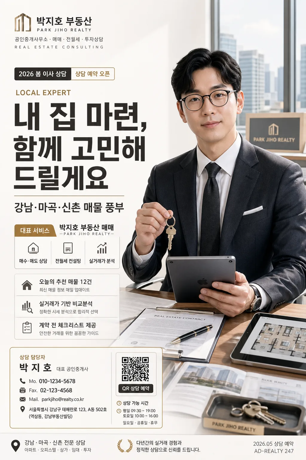
본인 사진 → 공인중개사 영업 광고 결. 회사 BI + 헤드라인 + 명함 박스 + 정장 hero.
공인중개사 퍼스널 브랜드 광고 summary
Copy this ChatGPT image prompt to create Ads/Posters results. Its subject, background, style, and composition are organized for quick iteration.
Related keywords: 공인중개사 퍼스널 브랜드 광고, 공인중개사 퍼스널 브랜드 광고 프롬프트, Ads/Posters 프롬프트, Ads/Posters AI 이미지 프롬프트, ChatGPT 이미지 프롬프트, AI 이미지 생성 프롬프트, AI 프롬프트, 이미지 프롬프트
How to use 공인중개사 퍼스널 브랜드 광고
Keep the prompt structure and swap the subject, background, palette, or composition to create new variations.
- Keep the main subject and adjust the palette and background for your brand, season, or channel.
- If the result feels busy, simplify the background and make the subject, composition, and lighting more specific.
- After copying, ask ChatGPT to adapt it for your platform, aspect ratio, or text requirements.
Original prompt
[Input]
- reference_image: {참고 이미지}
- language: Korean
- output_size: 1024x1536

[Purpose]
Korean real-estate personal brand advertisement poster, A4 vertical editorial flyer for social-media and print promotion.
Professional realtor branding layout with a left-side Korean headline, right-side portrait hero, and detailed contact card block at the bottom, enriched with realistic real-estate office materials, consultation cues, and polished local-business advertising details.

[Composition]
- Left side (about 42%): large headline block and subheadline stacked vertically, aligned flush-left with strong editorial hierarchy; include a small date/consultation label above or near the headline such as "2026 봄 이사 상담", "상담 예약 오픈", or "강남권 매물 브리핑".
- Right side (about 38%): {원본 인물} as the hero subject, standing or seated in a confident three-quarter pose based on {인물 자세}, cleanly separated from background while still integrated into a realistic premium realtor office atmosphere.
- Bottom-left: {명함 박스} as a compact contact-info card with crisp borders, neat hierarchy, and realistic micro-details such as QR 예약 영역, small map-pin icon, 상담 가능 시간, and office address line.
- Upper-left corner: {회사명·로고} placed as a small brand mark, clearly readable, with a subtle office-identity line like "REAL ESTATE CONSULTING" or "PROPERTY PARTNER" beneath it.
- Background: {배경·라이팅} with a bright modern real-estate office or premium white studio-office feel; include soft-focus hints of a desk, property folders, apartment brochure, key tray, tablet floor-plan screen, or city-window silhouette without overpowering the left-headline / right-portrait structure.
- Use {큰 한글 헤드라인}, {부제}, {대표 서비스 강조}, {직업·전문분야}, {소품}, {컬러 팔레트}, and {비율} exactly as layout-driving content.

[3. CORE STRUCTURE]
1. Background layer: bright white or very pale warm-gray studio-office backdrop with realistic depth, gentle gradient, faint city skyline/window reflection, and subtle real-estate office textures such as matte paper, glass, brushed metal, and soft desk shadows.
2. Brand mark area (top-left): {회사명·로고} set small and sharp with logo-like alignment, plus a tiny Korean/English descriptor line such as "공인중개사무소 · 매매 · 전월세 · 투자상담" or "REALTY BRAND AD".
3. Main headline area (left-center): {큰 한글 헤드라인} rendered as the dominant typographic anchor, spanning multiple lines with strong hierarchy and warm charcoal emphasis; add a small eyebrow label above it such as "LOCAL EXPERT" or "강남·마곡·신촌 전문 상담".
4. Subheadline area (below headline): {부제} placed directly under the main headline, smaller but still clearly readable, with confident leading and a real advertisement tone.
5. Service emphasis strip (mid-left or under subheadline): {대표 서비스 강조} presented like a trust-building service label; design it as a gold-accent pill, checklist strip, or compact service badge with short Korean items like "매수·매도 상담", "전월세 컨설팅", "실거래가 분석".
6. Supporting information area: add 2–3 short Korean feature blurbs in small boxes or lines, for example "오늘의 추천 매물 12건", "실거래가 기반 비교분석", "계약 전 체크리스트 제공"; include a small date stamp such as "2026.05 상담 예약" and a page/poster code like "AD-REALTY 247".
7. Hero portrait area (right side): {원본 인물} cut out or framed as a polished realtor portrait, holding {소품} naturally, wearing a suit, with a restrained smile and professional posture; nearby may include subtle realistic props such as contract folder, house key, tablet with floor plan, or rolled blueprint.
8. Contact card area (bottom-left): {명함 박스} inserted as a neat rectangular information box with name, title, phone, fax, email, address, consultation hours, and QR 예약 placeholder aligned in clean rows; include tiny labels like "상담 담당자", "대표 공인중개사", "방문 상담 예약".
9. Bottom footer layer: include small legal-style office information line and micro credit text such as "서울 주요 권역 매물 상담 · 광고문의", "PHOTO / PROFILE", or "본 광고의 매물 정보는 상담 시점에 따라 변동될 수 있습니다".
10. Finishing layer: {컬러 팔레트} applied to accents, separators, icons, service tags, QR frame, and small highlights; maintain a premium Korean real-estate brochure look with clear visual order throughout.

[4. STYLE RULES]
- Typography: Pretendard ExtraBold or Noto Sans KR Bold for {큰 한글 헤드라인}, Pretendard Medium for {부제}, Pretendard SemiBold for {대표 서비스 강조}, and Pretendard Regular for contact details; headline size should dominate the left half.
- Korean ad microcopy: add short, legible real-estate phrases only, such as "상담 예약 오픈", "매매·전세·월세", "실거래가 분석", "오늘의 추천 매물", "방문 상담 가능", "QR로 빠른 문의".
- Color palette: use {컬러 팔레트} with white #FFFFFF, warm charcoal #3A3530, deep gray #2B2B2B, and a restrained gold accent such as #B89B5E for thin separators, service badges, icon strokes, and small highlights.
- Border/shadow: use a soft 4px downward shadow, 12px blur, 15% opacity on the contact card and hero cutout; keep edges crisp and editorial, not glossy.
- Graphic details: include realistic small icons for phone, mail, location, QR, calendar, and building; add thin dividers, tiny footer text, subtle office-grid lines, and one or two premium geometric accents that support the real-estate theme.

[5. VISUAL STYLE]
- Camera / lens: studio portrait shot with a 85mm f/1.8 full-frame look, medium-close framing, shallow depth of field, crisp facial detail.
- Lighting: soft window light from upper-left at about 45°, gentle fill from front-right, mild rim light to separate the suit from the white background.
- Color grade: clean neutral whites with warm charcoal typography, subtle gold accents, slightly desaturated premium corporate tone.
- Material realism: show natural fabric texture on the suit, realistic paper texture on brochures/contracts, slight reflection on glass or tablet screen, and believable contact-card print depth.

[6. MOOD]
Premium Korean real-estate consulting advertisement — trustworthy, polished, local-expert oriented, like a high-end realtor profile poster seen in a modern office, apartment brochure, or neighborhood property magazine.

[7. CRITICAL]
- Korean text accuracy: 반드시 정확히 보여야 하는 문구 — "내 집 마련, 함께 고민해 드릴게요", "강남·마곡·신촌 매물 풍부", "대표 서비스", "OO 부동산 또는 본인 사무소", "상담 담당자: 박지호", "대표 공인중개사", "Mo: 010-XXXX-XXXX", "Fax", "Mail: name@example.co.kr", "서울특별시 강남구 ...".
- Additional small Korean text may include: "상담 예약 오픈", "2026년 5월 상담", "매매·전세·월세", "실거래가 분석", "오늘의 추천 매물 12건", "QR로 빠른 문의", "방문 상담 가능".
- Preserve the exact face from the reference image.
- Right-side portrait must keep a professional suit look and a restrained smile.
- Layout invariant: large headline on the left, hero portrait on the right, contact card at the lower-left.
- All Korean typography must be clean, unbroken, and fully legible.

[8. 🚫 PROHIBITED]
- Fake official seals / certifications
- Broken Korean characters
- Celebrity composites or unauthorized likeness