広告・ポスター
한의원·침·뜸·약침 광고
한의원 광고. 한약·침·뜸·다이어트·체질 진료 톤.
한의원·침·뜸·약침 광고の概要
広告・ポスター画像を作るためのChatGPT画像プロンプトです。主題、背景、スタイル、構図を整理し、すぐに試せるよう構成しています。
関連キーワード: 한의원·침·뜸·약침 광고, 한의원·침·뜸·약침 광고 프롬프트, 広告・ポスター 프롬프트, 広告・ポスター AI 이미지 프롬프트, ChatGPT 이미지 프롬프트, AI 이미지 생성 프롬프트, AI 프롬프트, 이미지 프롬프트
한의원·침·뜸·약침 광고の活用方法
元の構造を保ちながら、被写体、背景、色、構図を変更して別案に展開できます。
- 主題を維持し、ブランドや季節、媒体に合わせて色と背景を変更してください。
- 結果が複雑な場合は背景要素を減らし、被写体、構図、照明を具体化してください。
- コピー後、ChatGPTに媒体、アスペクト比、文字の有無を追加で指定できます。
プロンプト原文
[Input]
- language: Korean
- output_size: 1024x1536

[Purpose]
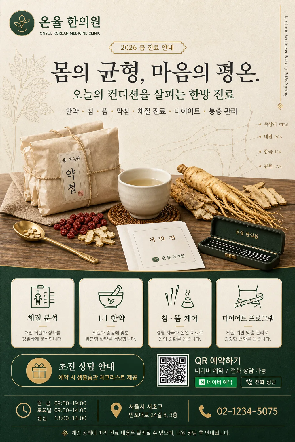
Korean traditional clinic advertisement poster, vertical A4-style promotional layout for acupuncture, moxibustion, herbal medicine, and pharmacopuncture services.
Editorial healthcare brand poster with a calm, premium, trustworthy oriental-medicine aesthetic for clinic promotion, including realistic clinic information, reservation cues, service details, and printed-poster finishing.

[Composition]
- Main layout: vertical medical poster with a balanced 60/40 split; {한의원명_로고} anchored in the upper-left brand band, {헤드라인} centered in the upper-middle, and {한약_hero} occupying the mid-lower focal area.
- Background treatment: warm beige hanji-inspired paper texture with subtle fiber grain, deep green accent panels, muted gold separators, faint meridian-line diagram overlays, and small botanical line-art details from {디자인_장식}.
- Information density: build a real clinic advertisement with readable headline, service scope, exactly four service boxes, consultation benefit badge, clinic hours, address, phone number, QR reservation block, and a short medical notice.
- Use {진료분야}, {헤드라인}, {한약_hero}, {서비스_박스}, {컬러_팔레트}, {상담_혜택}, {운영시간}, {주소_연락처}, {예약_CTA}, {하단_고지}, and {디자인_장식} as the main variable content.

[3. CORE STRUCTURE]
1. Top brand zone: place {한의원명_로고} as a compact logo/title lockup with Korean primary text and a small English subtitle beneath; add a tiny vertical spine credit on the right edge reading “K-Clinic Wellness Poster / 2026 Spring”.
2. Upper headline zone: set {헤드라인} in a restrained serif-and-sans combination, centered horizontally, with a smaller subline using {진료분야}; add a small date-style label such as “2026 봄 진료 안내” near the headline.
3. Central hero zone: render {한약_hero} as a polished still-life arrangement of herbal packets, porcelain cup, dried medicinal ingredients, brass spoon, folded prescription envelope, and a small acupuncture needle case, lit like a premium editorial product shot.
4. Service grid zone: place {서비스_박스} as exactly four evenly spaced boxed items with icon-like line illustrations; each box should include a short Korean label and a one-line descriptor.
5. Promotion and reservation zone: add {상담_혜택} as a deep-green rounded badge near the service area, then place {예약_CTA} beside a scannable-looking QR code block and a small “네이버 예약 / 전화 상담” micro-label.
6. Footer information zone: include {운영시간} and {주소_연락처} in a structured footer band with thin gold dividers, a small map-pin icon, phone icon, and a brief {하단_고지} line.

[4. STYLE RULES]
- Typography: use Pretendard Bold for headings, Noto Sans KR Medium for body/service labels, and a refined serif like Noto Serif KR or Nanum Myeongjo for the quoted headline; headline size should feel about 2.5x the service text.
- Color palette: deep green, gold, warm beige, and charcoal from {컬러_팔레트}; use gold for thin rules, small badges, and decorative highlights, while beige and green carry the main poster structure.
- Border/shadow: use thin 1px gold rules, subtle 8px blur shadow at 12% opacity under the hero still-life, soft cream service cards, rounded 8px corners, and tactile print-like ink edges.
- Graphic details: include faint herbal specimen labels, small acupuncture-point diagram fragments, paper grain, and refined botanical accents from {디자인_장식} so the poster feels like a realistic printed clinic advertisement.

[5. VISUAL STYLE]
- Camera / lens: studio product-photography look, 85mm lens at f/4 for the hero still-life, with crisp object separation and controlled depth of field.
- Lighting: soft diffused key light from upper-left at 45°, slight warm fill from front-right, gentle shadow falloff to preserve a calm clinic atmosphere.
- Color grade: deep green + warm beige + muted gold + charcoal with a slightly desaturated editorial finish, similar to premium Korean wellness brand ads.
- Print finish: matte coated paper impression, subtle ink absorption, realistic poster typography alignment, and premium healthcare brochure polish.

[6. MOOD]
Premium oriental-medicine clinic editorial — calm, trustworthy, refined, and informative, with a high-end Korean wellness brand feel combining herbal apothecary still-life, contemporary clinic advertising, and tactile printed-poster design.

[7. CRITICAL]
- Korean text accuracy: 반드시 아래 문구가 정확히 보여야 함.
  - {한의원명_로고}
  - {진료분야}
  - {헤드라인}
  - {서비스_박스}
  - {상담_혜택}
  - {운영시간}
  - {주소_연락처}
  - {예약_CTA}
  - {하단_고지}
- Rendered poster copy should include readable Korean micro-text such as “2026 봄 진료 안내”, “네이버 예약”, “전화 상담”, “초진 상담 안내”, “월–금 09:30–19:00”, and “토요일 09:30–14:00”.
- Layout invariants: maintain a strict vertical poster hierarchy; the hero still-life must remain centered, and the service boxes must appear as exactly 4 boxes in a structured grid.
- Keep all Korean characters sharp, natural, and legible with no distortion or broken glyphs.

[8. 🚫 PROHIBITED]
- Fake official seals / certifications
- Broken Korean characters
- Celebrity composites or recognizable public figures