SNS/카드뉴스
응급 의료 정보 카드 (119·심폐소생·화상)
응급 상황 대처 카드뉴스 (119·심폐소생·화상·골절). 공공 인포 결.
응급 의료 정보 카드 (119·심폐소생·화상) 검색 요약
응급 의료 정보 카드 (119·심폐소생·화상)은 SNS/카드뉴스 결과물을 만들 때 바로 복사해 활용할 수 있는 ChatGPT 이미지 프롬프트입니다. 주제, 배경, 스타일, 구도 조건을 함께 담아 빠르게 시안을 만들 수 있도록 구성했습니다.
관련 키워드: 응급 의료 정보 카드 (119·심폐소생·화상), 응급 의료 정보 카드 (119·심폐소생·화상) 프롬프트, SNS/카드뉴스 프롬프트, SNS/카드뉴스 AI 이미지 프롬프트, ChatGPT 이미지 프롬프트, AI 이미지 생성 프롬프트, AI 프롬프트, 이미지 프롬프트
응급 의료 정보 카드 (119·심폐소생·화상) 활용 포인트
원본 구조를 유지하면서 피사체, 배경, 색감, 구도를 바꿔 다양한 시안으로 확장할 수 있습니다.
- 핵심 소재는 유지하고 브랜드, 계절, 채널 목적에 맞는 색감과 배경을 바꿔보세요.
- 결과가 산만하면 배경 요소를 줄이고 피사체, 구도, 조명 조건을 구체화하세요.
- 복사한 뒤 ChatGPT에서 플랫폼, 화면 비율, 텍스트 포함 여부를 추가로 요청할 수 있습니다.
프롬프트 원문
[Input]
- language: Korean
- output_size: 1024x1024

[Purpose]
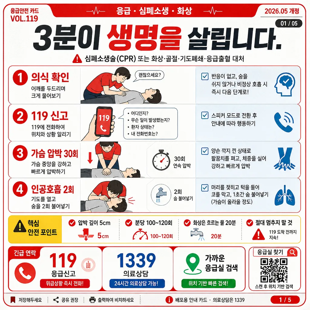
Public emergency medical information card for quick lifesaving reference, designed as a square social-media infographic.
Korean public-safety poster style, 1-page emergency card layout, realistic municipal leaflet details, clear readability at thumbnail size.

[Composition]
- Center the headline strip in the upper 16% of the frame, stack the main instruction blocks vertically in a strong grid, and use the lower band for emergency contact information and quick-action references.
- Use a bright white card base with strong red alert accents, charcoal text blocks, warning yellow highlight tags, pale blue medical cues, and subtle printed-paper texture for a realistic public-information board feeling.
- Add practical information-card details: top-left mini label “응급안전 카드 VOL.119”, top-right date label “2026.05 개정”, small slide indicator “01/05”, QR-style search box labeled “응급실 찾기”, and a footer credit line “배포용 안내 카드 · 의료상담은 1339”.
- Include compact iconography for phone, CPR hands, AED, burn cooling, location pin, magnifier, and checklist marks; use clear dividers, section labels, and realistic laminated-card shadows.
- Use {주제·상황}, {단계별 가이드}, {헤드라인}, {체크포인트}, {비상 연락처}, {컬러 팔레트}, {비율} as content placeholders.

[3. CORE STRUCTURE]
- Header area (top 16%): set {헤드라인} in a bold Korean sans-serif masthead, centered, with a red emphasis wordmark treatment and tight vertical spacing; place a thin alert bar above and below for urgency. Add small support text: “3분이 생명을 살립니다.” and a top metadata row with “VOL.119”, “응급 · 심폐소생 · 화상”, and “2026년 5월 업데이트”.
- Main guide area (middle 44%): present {단계별 가이드} as a 4-step vertical sequence with pictogram-style icons and numbered circles, each step in its own rounded rectangle, aligned for fast scanning. Suggested step labels may include “1 안전 확인”, “2 119 신고”, “3 가슴압박”, “4 AED 사용 / 구급대 인계”, with short Korean microcopy under each line.
- Safety checkpoint area (middle-lower 16%): show {체크포인트} inside a compact boxed panel with a yellow accent strip, checklist ticks, small caution triangle icons, and concise line breaks for easy reading. Include realistic checkpoint snippets such as “압박 깊이 5cm”, “분당 100~120회”, “화상은 흐르는 물 20분”, “절대 멈추지 말 것”.
- Emergency contact area (lower 16%): display {비상 연락처} in a clearly separated footer block with bold contact numbers, emergency-style spacing, and a small icon row for phone/location/search cues. Add three quick tiles: “119 응급신고”, “1339 의료상담”, “가까운 응급실 검색”. Include a small QR-style square and tiny caption “스캔 후 위치 기반 검색”.
- Context label area (small side or top tag): place {주제·상황} as a compact descriptor label that frames the card’s topic without competing with the headline. Add small card-news UI details such as “저장해두세요”, “공유 권장”, and a bottom page marker “1 / 5”.
- Overall layout note: treat {컬러 팔레트} and {비율} as the governing presentation cues, keeping every section aligned to a rigid infographic grid while allowing useful safety icons, micro-labels, divider rules, paper grain, and realistic print-registration details.

[4. STYLE RULES]
- Typography: use Pretendard or Noto Sans KR in heavy 800 weight for the headline, 600–700 weight for body labels, and smaller 500 weight for auxiliary notes; keep size hierarchy strong and legible.
- Color palette: follow a public-safety scheme based on white #FFFFFF, emergency red #E53935, charcoal #263238, warning yellow #FBC02D, pale medical blue #E3F2FD, and light gray dividers #E0E0E0.
- Border/shadow: use thin red outline rules, soft card shadows with 0px x-offset, 4px y-offset, 12px blur, 12% opacity, rounded corners on internal boxes, and subtle offset shadows under labels to make the card feel printed and handled.
- Graphic details: add small icon badges, arrow connectors between steps, tiny dotted divider lines, barcode-like reference strip, QR-style search box, and realistic microtext such as “응급처치 참고용 · 상황별로 119 안내를 따르세요”.

[5. VISUAL STYLE]
- Camera / lens: front-facing graphic poster composition, equivalent to a flat 50mm documentary layout with no perspective distortion, perfectly orthographic and centered.
- Lighting: even studio-like diffuse illumination, high-key presentation with clean contrast, gentle paper-surface shading, and controlled laminated-card sheen.
- Color grade: crisp white base with saturated safety red and restrained charcoal, matching municipal emergency pamphlet printing, with slight ink texture, soft gray paper fibers, and realistic printed infographic edges.

[6. MOOD]
Korean municipal emergency safety flyer — practical public-health infographic like a hospital triage notice, civil defense poster, and saved social-media card for urgent first-aid reference.

[7. CRITICAL]
- Korean text accuracy: “3분이 생명을 살립니다.”, “119”, “1339”, “응급”, “의료상담”, “가까운 응급실 검색”, “압박 깊이 5cm”, “분당 100~120회”, “절대 멈추지 말 것”, “화상은 흐르는 물 20분”, “저장해두세요”.
- Keep the layout as a square 1024x1024 card with clear boxed sections, readable hierarchy, realistic emergency-card metadata, and no missing or garbled Korean characters.
- All step blocks must remain separate and visually distinct so the sequence is easy to follow at a glance.
- Render all Korean text cleanly in a professional public-safety style; the placeholders {주제·상황}, {단계별 가이드}, {헤드라인}, {체크포인트}, {비상 연락처}, {컬러 팔레트}, {비율} must remain available as the primary content drivers.

[8. 🚫 PROHIBITED]
- Fake official seals / certifications
- Broken Korean characters