広告・ポスター
클래식·오페라 공연 포스터
클래식·오페라 공연 포스터. 예술의전당·세종문화회관 결.
클래식·오페라 공연 포스터の概要
広告・ポスター画像を作るためのChatGPT画像プロンプトです。主題、背景、スタイル、構図を整理し、すぐに試せるよう構成しています。
関連キーワード: 클래식·오페라 공연 포스터, 클래식·오페라 공연 포스터 프롬프트, 広告・ポスター 프롬프트, 広告・ポスター AI 이미지 프롬프트, ChatGPT 이미지 프롬프트, AI 이미지 생성 프롬프트, AI 프롬프트, 이미지 프롬프트
클래식·오페라 공연 포스터の活用方法
元の構造を保ちながら、被写体、背景、色、構図を変更して別案に展開できます。
- 主題を維持し、ブランドや季節、媒体に合わせて色と背景を変更してください。
- 結果が複雑な場合は背景要素を減らし、被写体、構図、照明を具体化してください。
- コピー後、ChatGPTに媒体、アスペクト比、文字の有無を追加で指定できます。
プロンプト原文
[Input]
- language: Korean
- output_size: 1024x1536

[Purpose]
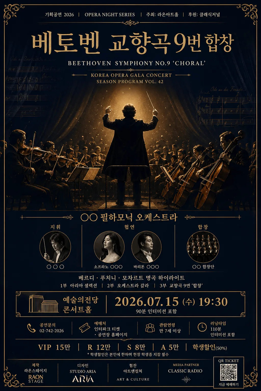
Classic opera performance poster for premium theater marketing, vertical B2 format.
Elegant concert announcement with a formal editorial feel, suitable for print-ready lobby display, outdoor poster boards, and social sharing.

[Composition]
- Center the title block in the upper-middle 28% of the frame, with the hero visual occupying the central 38–45% and the event details anchored in a refined lower information band.
- Background treatment: deep navy matte field with subtle charcoal-to-navy vignette, faint archival paper grain, light ink texture, and barely visible orchestral score fragments woven into the shadows.
- Build a realistic premium concert-poster layout with theatrical depth: small venue-program details, decorative gold rules, corner flourishes, sponsor strip, booking note, and ticket information that feels printed rather than sterile.
- Use {공연 제목}, {연주자·지휘자}, {공연장·일시}, {티켓 가격}, {hero 이미지}, {컬러 팔레트}, {비율} as editable content placeholders.

[3. CORE STRUCTURE]
- Top area (first 18%): place {공연 제목} as the primary masthead, large and centered, with compact line breaks if needed; add a smaller bilingual subtitle treatment beneath it for a classical concert-poster feel, such as KOREA OPERA GALA CONCERT and SEASON PROGRAM VOL. 42.
- Add a small top metadata row above the title: 기획공연 2026, OPERA NIGHT SERIES, 주최: 라온아트홀, 후원: 클래식저널, using tiny ivory and muted-gold text.
- Mid area (middle 40%): feature {hero 이미지} as the focal artwork, either as a dramatic orchestra silhouette, an opera singer under stage light, or a luxurious close-up of violin/cello details, with gold rim light and clear silhouette separation.
- Enrich the hero zone with subtle stage-curtain shadows, faint sheet-music overlays, warm dust in the spotlight, and engraved ornamental accents around the image so it reads as a real printed opera poster.
- Lower mid area (next 22%): set {연주자·지휘자} in a structured information block, aligned centrally or slightly left-balanced, using thin divider rules to organize ensemble, conductor, soloist, chorus, and program lines.
- Include short program-copy lines in Korean beneath the performer block, for example 베르디 · 푸치니 · 모차르트 명곡 하이라이트 and 1부 아리아 셀렉션 / 2부 오케스트라 갈라.
- Event details band (lower 12%): place {공연장·일시} in a highly legible block with precise spacing, and make the date/time line visually prioritized over venue copy.
- Add practical poster details near the event band: 공연문의 02-742-2026, 예매처 인터파크 티켓 · 공연장 홈페이지, 관람연령 만 7세 이상, 러닝타임 110분 인터미션 포함.
- Ticket area (bottom 8%): show {티켓 가격} in a compact row or stacked list, separated by subtle rules; make prices easy to scan without overpowering the title.
- Add a realistic bottom sponsor/credit strip with small logo-like text marks and labels: 제작 라온스테이지, 디자인 STUDIO ARIA, 협찬 아트앤컬처, media partner CLASSIC RADIO, plus a small QR-ticket placeholder box.
- Preserve the classic poster cadence: title first, hero image second, event information third, ticket pricing last.

[4. STYLE RULES]
- Typography: use a refined serif display face such as Cormorant Garamond or Noto Serif KR for the title, bold 72–96px; use Pretendard or Noto Sans KR for supporting text, medium 26–34px; use 12–18px microtype for sponsor, booking, and credit text; maintain crisp Korean glyph rendering.
- Color palette: {컬러 팔레트} with deep navy #0B1430, gold #C8A24A, white #F6F2EA, charcoal #1D1D22; gold accents should feel premium, with clean ink-like edges and subtle foil warmth.
- Border/shadow: use thin hairline rules in muted gold, delicate corner ornaments, small typographic dividers, and a soft drop shadow 4px y-offset, 12px blur, 15% opacity beneath the hero image only.
- Add realistic print finishing cues: slight paper tooth, gentle ink absorption, tiny registration texture, and subtle wear at the darkest edges while keeping all text sharp.

[5. VISUAL STYLE]
- Camera / lens: if photographic, use a Phase One IQ4 look with 110mm macro at f/4 for instrument close-ups, or a 85mm f/1.4 portrait-style compression for silhouette drama.
- Lighting: soft spotlight from upper-left at 45° with a subtle right-side rim light, creating elegant gold edge separation against the dark background.
- Color grade: deep navy, antique gold, warm ivory highlights, charcoal shadows, restrained contrast, cinematic concert-poster tonality.
- Rendering quality: realistic premium print poster, editorial theater campaign design, crisp typography, tactile matte paper, refined classical ornamentation, and believable event-promotion details.

[6. MOOD]
Premium classical concert editorial — feel of a New York Philharmonic season poster with the restrained elegance of a Vogue cultural spread, enhanced by the atmosphere of an opera house lobby poster with warm stage light, formal program details, and collectible season-campaign polish.

[7. CRITICAL]
- Korean text accuracy: 반드시 정확히 보여야 하는 문구:
  - {공연 제목}
  - {연주자·지휘자}
  - {공연장·일시}
  - {티켓 가격}
- Additional Korean poster text must also be clean and readable when used: 기획공연 2026, 베르디 · 푸치니 · 모차르트 명곡 하이라이트, 예매처 인터파크 티켓, 관람연령 만 7세 이상, 러닝타임 110분.
- Preserve exact Korean glyph clarity, spacing, punctuation, and line breaks; no broken syllables or merged characters.
- Layout invariants: title, hero image, and information blocks must remain in the described vertical hierarchy; keep all text readable and evenly spaced.

[8. 🚫 PROHIBITED]
- Fake official seals / certifications
- Broken Korean characters
- Celebrity composites / unauthorized likeness