広告・ポスター
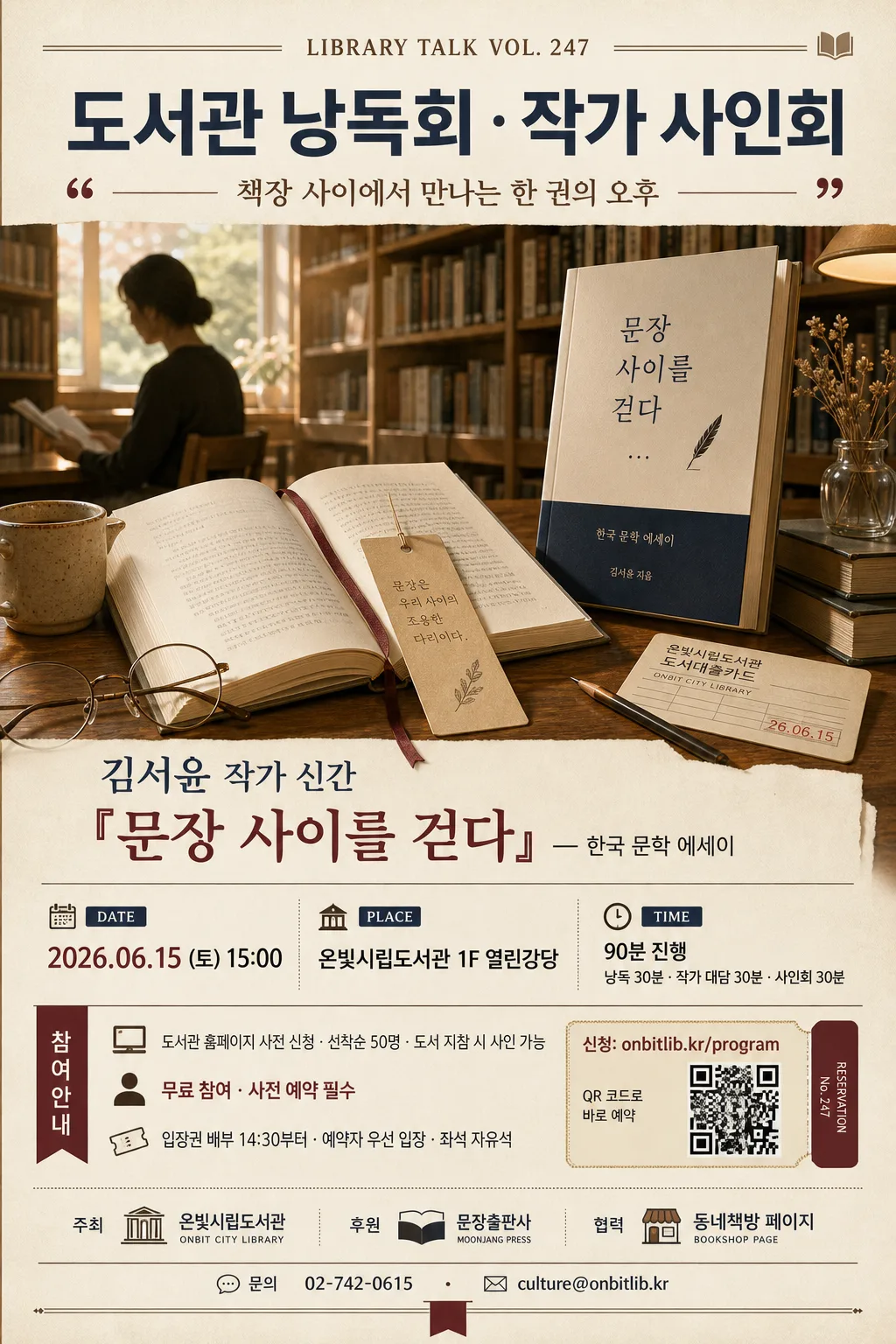
도서관 낭독회·작가 사인회 포스터
공공도서관·서점 낭독회·작가 사인회 안내 포스터.
도서관 낭독회·작가 사인회 포스터の概要
広告・ポスター画像を作るためのChatGPT画像プロンプトです。主題、背景、スタイル、構図を整理し、すぐに試せるよう構成しています。
関連キーワード: 도서관 낭독회·작가 사인회 포스터, 도서관 낭독회·작가 사인회 포스터 프롬프트, 広告・ポスター 프롬프트, 広告・ポスター AI 이미지 프롬프트, ChatGPT 이미지 프롬프트, AI 이미지 생성 프롬프트, AI 프롬프트, 이미지 프롬프트
도서관 낭독회·작가 사인회 포스터の活用方法
元の構造を保ちながら、被写体、背景、色、構図を変更して別案に展開できます。
- 主題を維持し、ブランドや季節、媒体に合わせて色と背景を変更してください。
- 結果が複雑な場合は背景要素を減らし、被写体、構図、照明を具体化してください。
- コピー後、ChatGPTに媒体、アスペクト比、文字の有無を追加で指定できます。
プロンプト原文
[Input]
- language: Korean
- output_size: {비율}

[Purpose]
도서관 낭독회·작가 사인회 안내 포스터, {비율} 기반의 A4 세로형 이벤트 홍보물, 도서관/서점 현장 게시와 SNS 공유용.
책 정물, 작가 실루엣, 서가 배경을 활용한 문학 행사 포스터 느낌으로, 행사명·일시·장소·신청 정보를 한눈에 전달하는 편집형 레이아웃.

[Composition]
- Poster is a vertical A4 layout with a strong top-to-bottom reading flow; title block occupies the top 18%, hero illustration/photo area takes about 38–42%, and event details, ticket/application info, sponsor strip fill the lower section.
- Main subject stays slightly above center; {hero 이미지} is framed as the central visual anchor with warm paper texture, library shelf depth, reading lamp glow, bookmark, pencil note, open book pages, and small decorative literary motifs.
- Background treatment: warm library interior tone with subtle paper grain, ivory base, soft shelf texture, visible book spines, a table edge, gentle shadows, and print-friendly matte finish.
- Use {행사번호}, {포스터 카피}, {행사 종류}, {초청 작가·작품}, {일시}, {장소}, {진행 시간}, {참여 방법}, {참가비}, {신청 링크 문구}, {문의처}, {주최·후원}, {티켓 안내}, {hero 이미지}, {장식 모티프}, {컬러 팔레트}, {비율} as editable content anchors.
- Lower third contains a realistic event information panel: date/time/venue line, participation method, ticket or reservation note, inquiry contact, and a sponsor/organizer area separated by thin editorial rules.

[3. CORE STRUCTURE]
1. Top header band: place {행사번호} as a small catalog-like label near the top edge, then set {행사 종류} as the primary headline, large and bold, with {포스터 카피} as a short sub-copy below it; add a thin separator rule and small decorative book/page marks.
2. Hero zone: show {hero 이미지} as the visual focal point, either a warm book still life, a soft author silhouette near shelves, or a quiet library desk scene; include tactile details such as page texture, bookmark ribbon, pencil annotation, reading glasses, library checkout card, and warm shelf lighting.
3. Event title block: place {초청 작가·작품} directly below or overlapping the lower edge of the hero zone in stacked lines for author name and book title; use a refined editorial emphasis so it reads as the featured program.
4. Information block: arrange {일시}, {장소}, {진행 시간} in a clearly divided section with date/time emphasized; use small pictogram-style labels such as DATE, PLACE, TIME rendered as simple typographic tags.
5. Participation / ticket block: place {참여 방법}, {참가비}, {티켓 안내}, and {신청 링크 문구} in a practical lower-panel layout; include a small QR-style application box, reservation number tab, or perforated ticket-like shape to make the poster feel real.
6. Footer area: add {주최·후원} and {문의처} as a sponsor/organizer strip with small logo placeholders, library branch line, contact phone/email text, and page-like divider decoration using {장식 모티프}.

[4. STYLE RULES]
- Typography: Pretendard or Noto Sans KR for the main body, weight 700–800 for headlines, 400–500 for details; title 42–58 px, program title 30–42 px, details 18–24 px, footer 13–16 px; use comfortable line spacing for Korean readability.
- Color palette: use {컬러 팔레트} with ivory #F5F0E6 as base, warm brown #8A6446, indigo #2F3E5C, charcoal #2B2B2B, and a muted burgundy accent for ticket tags or bookmarks.
- Editorial decoration: thin charcoal rules, book-page dividers, small quotation marks, bookmark ribbon, date stamp texture, library checkout-card grid, and a modest sponsor strip at the bottom.
- Border/shadow: thin charcoal rules, soft drop shadow 4px y-offset, 12px blur, 15% opacity; matte poster print feel with natural paper grain and realistic ink density.
- Ratio/layout: keep the whole design optimized for {비율}, preserving generous margins, clear vertical hierarchy, and enough safe area so no essential text is cropped.

[5. VISUAL STYLE]
- Camera / lens: editorial still-life look shot on a full-frame camera with 50mm lens at f/4 for balanced depth and clean product-style framing; if using a library interior feel, emulate a 35mm documentary composition.
- Lighting: soft window light from upper-left at about 45°, with a faint fill from the right to keep book edges and silhouette contours readable; warm practical lamp glow may appear near the hero desk area.
- Color grade: warm cream + brown + muted indigo + charcoal, with slightly desaturated shadows, paper-like highlights, realistic printed ink texture, and a calm cultural-event poster finish.

[6. MOOD]
Premium literary event editorial — think Kinfolk magazine spread meets a quiet Korean public library poster, with a warm, trustworthy, well-organized cultural-announcement tone.

[7. CRITICAL]
- Korean text accuracy: 반드시 정확히 들어가야 하는 문구:
  - {행사번호}
  - {포스터 카피}
  - {행사 종류}
  - {초청 작가·작품}
  - {일시}
  - {장소}
  - {진행 시간}
  - {참여 방법}
  - {참가비}
  - {티켓 안내}
  - {신청 링크 문구}
  - {주최·후원}
  - {문의처}
  - {비율}
- 포스터 하단에는 실제 행사물처럼 “신청”, “문의”, “주최/후원” 정보가 구분되어 보여야 하며, QR-style 박스나 티켓 탭은 장식이 아니라 신청 안내 요소처럼 배치한다.
- All Hangul characters must render cleanly with no broken syllables, no substitution glyphs, and no accidental English replacements in the Korean text zones.
- Keep the composition poster-like and readable, with all event information legible at A4 viewing distance.

[8. 🚫 PROHIBITED]
- Fake official seals / certifications
- Broken Korean characters
- Celebrity composites or misleading real-person likeness
- Illegible event details caused by text distortion