広告・ポスター
수영장·워터파크 시즌 광고
수영장·워터파크 여름 시즌 광고. 캐리비안베이·오션월드 결.
수영장·워터파크 시즌 광고の概要
広告・ポスター画像を作るためのChatGPT画像プロンプトです。主題、背景、スタイル、構図を整理し、すぐに試せるよう構成しています。
関連キーワード: 수영장·워터파크 시즌 광고, 수영장·워터파크 시즌 광고 프롬프트, 広告・ポスター 프롬프트, 広告・ポスター AI 이미지 프롬프트, ChatGPT 이미지 프롬프트, AI 이미지 생성 프롬프트, AI 프롬프트, 이미지 프롬프트
수영장·워터파크 시즌 광고の活用方法
元の構造を保ちながら、被写体、背景、色、構図を変更して別案に展開できます。
- 主題を維持し、ブランドや季節、媒体に合わせて色と背景を変更してください。
- 結果が複雑な場合は背景要素を減らし、被写体、構図、照明を具体化してください。
- コピー後、ChatGPTに媒体、アスペクト比、文字の有無を追加で指定できます。
プロンプト原文
[Input]
- language: Korean
- output_size: 1024x1536

[Purpose]
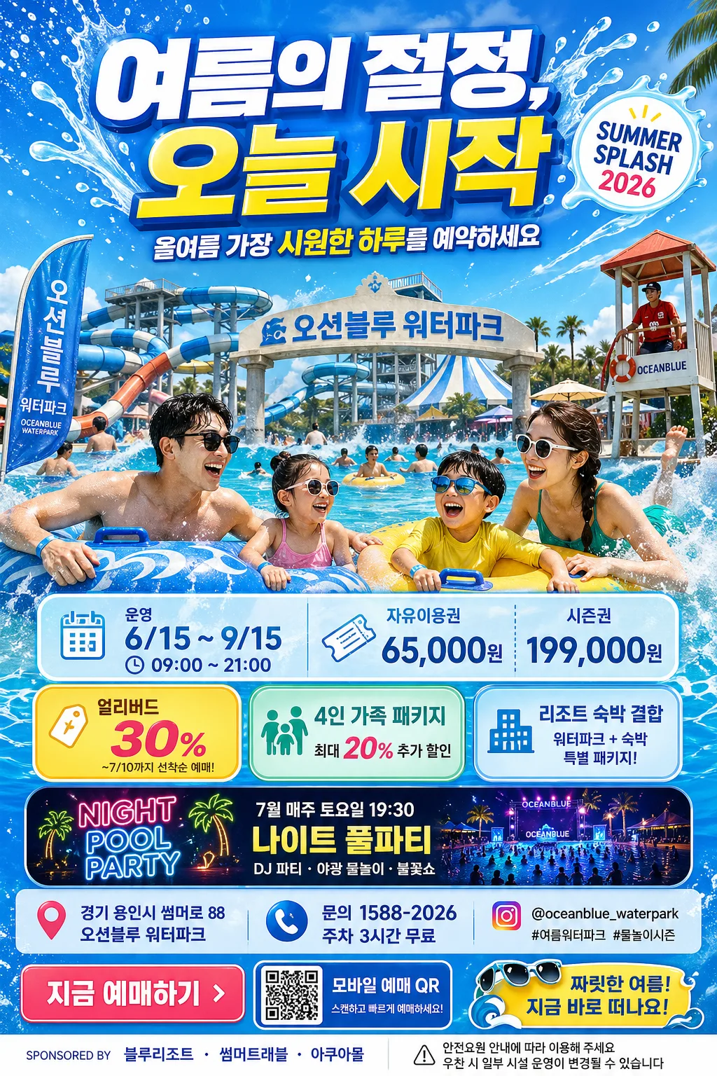
Korean water park seasonal advertisement poster, tall A4-style promotional layout for summer campaign, ticket sales, and family leisure promotion.
Designed for social ads, in-store posters, resort lobby signage, subway lightbox-style prints, and outdoor seasonal banners with a vivid splash aesthetic.

[Composition]
- Vertical poster composition with a festive resort-ad layout: headline campaign band across the top 18%, hero splash zone occupying the middle 50%, and layered ticket / event / sponsor information across the lower 32%.
- Use {워터파크시설명} as the main facility anchor, visible as a signboard, entrance arch, towel tag, or poolside banner within the hero scene, supported by water slides, wave pool, tube splash, lifeguard tower, palm-style shade umbrellas, and summer crowd atmosphere.
- Top area should feel like a real seasonal campaign poster: large {헤드라인문구}, smaller {서브카피}, a compact season badge, and decorative splash graphics that frame the typography.
- Lower section uses stacked information panels for {운영정보}, {티켓가격}, {할인이벤트}, {행사일정}, and {장소정보}, with icon dividers for calendar, clock, ticket, map pin, and phone.
- Add realistic poster details: ticket reservation CTA, QR-code placeholder block, small sponsor strip, safety notice line, social handle, and a bright promotional sticker-style badge.
- Background should feel like bright summer water spray over aqua-blue skies, with foam, droplets, slide shadows, towel colors, pool reflections, signage, and small resort details that make the advertisement believable.
- Keep framing frontal and slightly elevated, like a premium promo poster photographed for a resort seasonal campaign.

[3. CORE STRUCTURE]
- Top header area: Place {헤드라인문구} centered and oversized, with dynamic splash-shaped accents behind the text; add {서브카피} underneath in a smaller bold line and a round badge reading {시즌배지} near the upper-right.
- Hero area (mid frame): Showcase {히어로이미지} as the dominant visual, with energetic water spray, tube curves, slides, wave-pool foam, smiling family/friends silhouettes, and facility signage integrated naturally into the resort environment.
- Facility label integration: Weave {워터파크시설명} into the composition as a prominent but believable branded caption, entrance sign, poolside flag, or hero descriptor.
- Mid-lower ticket block: Present {운영정보} and {티켓가격} in a scan-friendly layout using translucent aqua panels, rounded cards, small pictogram icons, and a bold ticket button reading {예매CTA}.
- Lower event block: Present {할인이벤트} and {행사일정} as bright yellow and teal sticker badges, separated by wave-shaped dividers and small dotted coupon edges.
- Venue / contact row: Include {장소정보}, {문의정보}, and {SNS핸들} in the final row with map-pin, phone, and share-style micro icons.
- Sponsor and notice area: Add a small sponsor strip reading {스폰서문구} plus a tiny safety notice line {안내문구}; include a decorative QR reservation box labeled {QR라벨}.
- Final polish: Use splash highlights, water reflections, realistic pool tiles, wristbands, floating tubes, towel texture, umbrella shadows, and crisp print-poster edge control so the result feels like a real commercial summer campaign.

[4. STYLE RULES]
- Typography: Use Pretendard ExtraBold or Noto Sans KR Black for {헤드라인문구}; Pretendard SemiBold for {서브카피}, {시즌배지}, and CTA; Pretendard Medium for info blocks; size hierarchy should be very strong, with headline roughly 3x the info text.
- Color palette: Build from {컬러팔레트} with vivid ocean blue, clean white, sunny yellow, and teal accents; support with deep navy for text, coral-orange sale stickers, and pale aqua highlights for splash glow.
- Panel and shadow treatment: Use soft drop shadows at 4px y-offset, 12px blur, 15% opacity for floating panels; thin white dividers, coupon-style dashed lines, glossy badge highlights, and rounded card corners at 18px radius.
- Decorative graphics: Use wave ribbons, water-drop bullets, sunburst mini icons, inflatable tube curves, ticket perforation motifs, and small sparkle highlights around price and discount areas.
- Text treatment: Keep Korean text sharp, well-kerned, and high contrast; avoid decorative distortion that reduces legibility.

[5. VISUAL STYLE]
- Camera / lens: High-resolution advertising photograph look, shot on a Phase One IQ4 with 80mm lens at f/5.6 for the hero, with crisp detail and controlled depth separation.
- Lighting: Bright summer daylight, simulated as hard but diffused sunlight from upper-left with soft fill from right, plus subtle specular highlights on water spray, wet tile, and floating tubes.
- Color grade: Saturated summer aqua, clean cobalt blue, warm yellow highlights, coral event accents, and bright white foam; overall commercial resort-promo grading with fresh contrast.
- Print finish: Glossy laminated poster feel, rich ink density, crisp vector-like text overlays, realistic photo-composite depth, and high-end Korean leisure advertising polish.

[6. MOOD]
Premium summer resort campaign — akin to a glossy travel magazine ad spread and subway lightbox poster for a major Korean water park, energetic, refreshing, family-friendly, and immediately ticket-purchase oriented.

[7. CRITICAL]
- Korean text accuracy: 반드시 정확히 보여야 하는 주요 문구: "여름의 절정, 오늘 시작", "올여름 가장 시원한 하루를 예약하세요", "SUMMER SPLASH 2026", "운영 6/15 ~ 9/15 · 09:00~21:00", "자유이용권 65,000원 · 시즌권 199,000원", "얼리버드 30% · 4인 가족 패키지 · 리조트 숙박 결합", "7월 매주 토요일 19:30 나이트 풀파티", "지금 예매하기".
- Layout invariants: vertical A4-style poster, clear top headline, central hero splash, lower ticket/event/venue blocks, QR reservation box, sponsor strip, and all Korean text aligned cleanly and readable.
- The waterpark/facility identity must remain family-friendly and promotional, with realistic swimmers, natural anatomy, appropriate swimwear styling, and believable resort signage.
- Prices, dates, hours, ticket CTA, venue, contact line, and discount badges must feel like a coherent seasonal advertisement rather than random decorative text.

[8. 🚫 PROHIBITED]
- Fake official seals / certifications
- Broken Korean characters
- Fabricated celebrity composites or unauthorized celebrity likeness
- Distorted people or unnatural anatomy