廣告/海報
게스트하우스·한옥스테이 광고
게스트하우스·한옥스테이 광고. 전주·경주·서울 결.
게스트하우스·한옥스테이 광고摘要
這是用來製作廣告/海報內容的 ChatGPT 圖像提示詞,已整理主題、背景、風格與構圖,方便快速調整。
相關關鍵字: 게스트하우스·한옥스테이 광고, 게스트하우스·한옥스테이 광고 프롬프트, 廣告/海報 프롬프트, 廣告/海報 AI 이미지 프롬프트, ChatGPT 이미지 프롬프트, AI 이미지 생성 프롬프트, AI 프롬프트, 이미지 프롬프트
게스트하우스·한옥스테이 광고使用方式
保留原始結構並替換主體、背景、色彩或構圖,即可延伸出不同版本。
- 保留核心主體,並依品牌、季節或平台調整色彩與背景。
- 如果畫面太複雜,請減少背景元素並具體描述主體、構圖與光線。
- 複製後可要求 ChatGPT 配合平台、長寬比或文字需求調整。
提示詞原文
[Input]
- language: Korean
- output_size: 1024x1536

[Purpose]
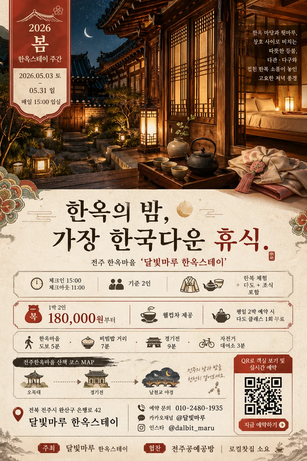
Korean hanok guesthouse / hanok stay advertisement poster, vertical A4-style editorial layout for social media and print use.
A premium travel poster that promotes traditional lodging, seasonal stay dates, cultural add-ons, local walking routes, and reservation information in one glance.

[Composition]
- Poster uses a vertical travel-ad layout with the hero image occupying the upper 54–58% of the frame, a headline and seasonal event band crossing the upper-middle, and practical booking / guide / sponsor details stacked in the lower section.
- Main subject is {숙소·지역} represented through a serene hanok courtyard / eaves / maru / lattice-window scene, framed as the visual anchor.
- Background treatment should feel like warm hanji paper and aged wood textures, with ivory paper fibers, subtle brush-grain, dancheong accent graphics, and charcoal typographic dividers.
- Use {숙소·지역}, {헤드라인}, {hero 사진}, {숙박 정보}, {주변 안내}, {컬러 팔레트}, {행사명}, {일정}, {장소}, {예약 문의}, {가격 및 혜택}, {주최 협찬}, {지도 라벨}, {QR 문구} as editable content placeholders.
- Add realistic poster details: a small seasonal label, date/time/venue row, reservation CTA, tiny map-style guide strip, sponsor/partner line, and a QR-code placeholder box drawn as a printed graphic element.

[3. CORE STRUCTURE]
- Top hero area (mid 56%): {hero 사진} rendered as the main scenic block, showing hanok yard / maru / wooden eaves / lattice windows with warm lantern light, tea utensils, linen bedding glimpsed through the window, shallow depth of field, and a refined magazine-editorial crop.
- Seasonal event ribbon (top or over hero edge): {행사명} and {일정} placed like a printed travel campaign label, with a small monoline roof icon, moon motif, or dancheong corner ornament.
- Headline band (upper-middle 12%): {헤드라인} set prominently over a cream overlay or beneath the hero, using a dignified promotional hierarchy and a serif accent.
- Accommodation / price block (lower-middle 14%): {숙박 정보} and {가격 및 혜택} placed in a compact, highly legible information area with separator dots, check icons, and short lines.
- Local guide block (lower 10%): {주변 안내} and {지도 라벨} placed as a small walking-route strip with simple map pins, distance labels, and a charcoal route line.
- Booking / venue block (bottom 10%): {장소}, {예약 문의}, and {QR 문구} integrated with a small QR placeholder square, contact line, and call-to-action button shape.
- Sponsor footer (bottom edge): {주최 협찬} shown as a tasteful partner strip with small text and simple logo-like Korean wordmarks.

[4. STYLE RULES]
- Typography: use Pretendard or Noto Sans KR for body text, with a high-contrast serif accent such as Nanum Myeongjo for the headline; headline weight 700–800, body weight 400–500, headline size larger by 2.2–2.8x than body.
- Color palette: ivory, hanji beige, dancheong red, and charcoal based on {컬러 팔레트}; use #F4EFE6 / #E7D8C4 / #9E2F2F / #2B2B2B as practical anchors.
- Graphic details: thin charcoal rules 1–2px, soft shadow only under the hero image (4px y-offset, 12px blur, 15% opacity), paper-grain overlays, small roof-line icons, brush-dot separators, map pins, and a printed QR placeholder.
- Poster information hierarchy should feel like a real boutique-stay advertisement: destination, emotional headline, stay package, date/time/venue, reservation method, nearby guide, sponsor/partner line.

[5. VISUAL STYLE]
- Camera / lens: 35mm full-frame documentary interior/exterior hybrid look, with a 50mm f/1.8 feel for detail cuts; if featuring courtyard-wide framing, use a 24mm top-down/straight-on architectural perspective.
- Lighting: warm lantern practicals mixed with soft dusk ambient light, slightly from upper-left, with gentle fill from the front and a faint rim on wood edges.
- Color grade: warm ivory + muted wood brown + vermilion accents + deep charcoal, with low saturation and soft contrast resembling a premium travel magazine spread.

[6. MOOD]
Premium Korean travel editorial — a quiet Kinfolk x architecture digest feel, with the composed hospitality tone of a boutique hanok stay brochure, enriched by realistic printed-poster information and cozy evening travel details.

[7. CRITICAL]
- Korean text accuracy: the following strings must appear correctly and legibly in the design:
  - {숙소·지역}
  - {헤드라인}
  - {행사명}
  - {일정}
  - {장소}
  - {숙박 정보}
  - {가격 및 혜택}
  - {주변 안내}
  - {예약 문의}
  - {지도 라벨}
  - {QR 문구}
  - {주최 협찬}
- Fixed Korean labels may be added and must be readable: “체크인”, “체크아웃”, “예약하기”, “도보 여행”, “오늘의 다도”, “조식 포함”.
- Preserve the vertical A4 poster hierarchy: hero first, headline second, date/event cue third, booking and package info fourth, nearby guide and reservation CTA last.
- Keep all typography fully readable; no broken Korean characters, no garbled line breaks, no mixed-up order in the information blocks.

[8. 🚫 PROHIBITED]
- Fake official seals / certifications
- Broken Korean characters
- Celebrity composites or unauthorized celebrity likenesses
- Distorted architecture, warped hanok structures, or inaccurate traditional details