Social/Card News
비자·여권·환전 카드뉴스
여행 준비 비자·여권·환전 정보 카드뉴스. 인포그래픽 결.
비자·여권·환전 카드뉴스 summary
Copy this ChatGPT image prompt to create Social/Card News results. Its subject, background, style, and composition are organized for quick iteration.
Related keywords: 비자·여권·환전 카드뉴스, 비자·여권·환전 카드뉴스 프롬프트, Social/Card News 프롬프트, Social/Card News AI 이미지 프롬프트, ChatGPT 이미지 프롬프트, AI 이미지 생성 프롬프트, AI 프롬프트, 이미지 프롬프트
How to use 비자·여권·환전 카드뉴스
Keep the prompt structure and swap the subject, background, palette, or composition to create new variations.
- Keep the main subject and adjust the palette and background for your brand, season, or channel.
- If the result feels busy, simplify the background and make the subject, composition, and lighting more specific.
- After copying, ask ChatGPT to adapt it for your platform, aspect ratio, or text requirements.
Original prompt
[Input]
- language: Korean
- output_size: 1024x1024
- format_note: {비율}

[Purpose]
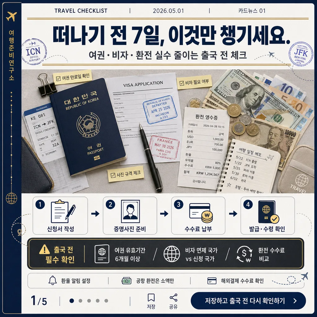
Korean travel-prep informational card news graphic for passport, visa, and currency exchange. Designed as a shareable social carousel cover with an editorial public-information feel, combining practical checklist clarity with realistic travel-desk details.

[Composition]
- Square carousel cover layout: a narrow top metadata strip, a strong headline band occupying about 18% of the frame, a central hero flat-lay occupying about 40%, and a lower information zone for step icons, caution box, page indicator, and CTA.
- Background uses matte white and cool-gray paper texture with deep navy framing, thin gold rules, subtle map-grid lines, airport code stamps, small route arrows, and checklist tick marks.
- Top metadata strip should read like a card-news issue label: “TRAVEL CHECKLIST | {발행일} | 카드뉴스 {슬라이드번호}”, with {발행처} as a small spine-style vertical credit along the left edge.
- Keep {헤드라인} large and centered at the top, with {보조카피} directly underneath as a smaller supporting line.
- Place {hero비주얼} in the middle as a realistic editorial travel-desk still life; include practical objects such as a passport-style booklet, visa application sheet, fictional entry stamp marks, USD/EUR/JPY cash, exchange receipt, itinerary memo, pen, boarding-pass-like paper, binder clip, and small travel pouch.
- Arrange {단계별안내} as a clear four-step pictogram flow, and place {주의사항박스} in a prominent caution callout near the lower third.
- Bottom navigation should include {페이지표시}, carousel dots, a save/share micro-icon pair, and {CTA문구} as a compact end-card CTA preview.
- Use {주제} as the guiding theme so the card immediately reads as passport, visa, and currency exchange preparation rather than generic finance or office stationery.

[3. CORE STRUCTURE]
- Top metadata zone: place “TRAVEL CHECKLIST”, {발행일}, and “카드뉴스 {슬라이드번호}” in small uppercase-style sans-serif with gold separators; add {발행처} vertically on the left spine margin like an editorial credit.
- Header zone: render {헤드라인} in bold Korean sans-serif, centered, with strong hierarchy; add {보조카피} below it in medium-weight Korean text and use thin gold separator rules above and below the title block.
- Hero zone: build {hero비주얼} as a crisp top-down flat lay. The passport-style booklet sits slightly left of center, currency notes and coins fan out to the right, a visa application sheet and boarding-pass-like paper overlap beneath, and a small exchange receipt shows Korean labels such as “환전 영수증”, “수수료”, and “우대율”.
- Practical micro-labels: add small sticky-note tags around the hero such as “여권 만료일 확인”, “비자 필요 여부”, “환율 알림”, and “사진 규격 체크” to make the graphic feel useful and lived-in.
- Step zone: render {단계별안내} as four numbered pictogram cards with icons for form, ID photo, payment, and pickup; connect the cards with small route arrows and keep label lengths balanced.
- Caution zone: set {주의사항박스} inside a charcoal callout box with white text, gold border, caution icon, and a small label reading “출국 전 필수 확인”.
- Bottom utility zone: include {환전팁} as a small one-line tip, then show “{페이지표시}” with five carousel dots, save/share micro-icons, and {CTA문구} in a navy pill-shaped button.
- Decorative information graphics may include dotted flight routes, passport-page line art, small currency symbols, and checklist boxes, all integrated into the editorial layout.

[4. STYLE RULES]
- Typography: Pretendard ExtraBold for the headline, Pretendard SemiBold for step labels, Noto Sans KR Medium for caution text, and Noto Sans KR Regular for metadata and microcopy; size hierarchy roughly 54–60 px / 26–30 px / 20–22 px / 14–16 px.
- Color palette follows {컬러팔레트}: deep navy #0B1F3A, gold #C8A24A, white #FFFFFF, charcoal #2B2F36, cool gray #E9EDF2, with a small travel-red accent #D64A3A for caution and stamp details.
- Border/shadow: thin 2px gold rules, soft shadow under hero objects with 4px y-offset, 14px blur, 12% opacity; layered paper pieces should cast subtle realistic contact shadows.
- Icon style: simple filled-line hybrid pictograms, rounded corners, consistent stroke weight, and small gold number circles.
- Text treatment: all Korean text should be horizontally aligned to a clear grid, with sufficient contrast against navy, white, and charcoal areas.

[5. VISUAL STYLE]
- Camera / lens: top-down flat lay photographed like an editorial travel checklist, using a Canon EOS R5 with RF 35mm f/1.8 macro at f/5.6.
- Lighting: soft studio light from upper-left at 45° with a very light fill from the right, controlled reflections on glossy passport-style cover, gentle highlights on currency and paper texture.
- Color grade: deep blue, muted gold, crisp white, and charcoal with slightly cool highlights for a clean institutional print look.
- Material realism: matte paper grain, slightly embossed passport cover texture, crisp receipt thermal-paper feel, translucent sticky notes, and lightly worn travel-document edges.

[6. MOOD]
Premium public-information travel editorial — like a Condé Nast Traveler checklist page mixed with a clean government brochure layout, but warmer and more practical through real desk objects, micro-labels, and carousel UI details.

[7. CRITICAL]
- 반드시 다음 한글 문구가 정확히 보여야 함: 떠나기 전 7일, 이것만 챙기세요.
- 반드시 다음 주의사항 문구가 정확히 보여야 함: 여권 유효기간 6개월 이상 / 비자 면제 국가 vs 신청 국가 / 환전 수수료 비교
- 카드뉴스 표기: 카드뉴스 {슬라이드번호}, 페이지 표시 {페이지표시}, 발행일 {발행일}, 발행처 {발행처}가 읽히게 배치.
- CTA 문구 {CTA문구}와 환전 팁 {환전팁}을 하단에 작게 넣되 선명하게 렌더링.
- Step section must clearly show a four-step sequence with distinct numbered icons, route arrows, and balanced spacing.
- Keep all Korean text fully legible, with 깨짐 없는 한글 글자와 정확한 맞춤법.

[8. 🚫 PROHIBITED]
- Fake official seals / certifications
- Broken Korean characters
- Celebrity composites or likeness swaps