광고/포스터
항공·기차 시즌 광고 톤
항공·기차·KTX·SRT 광고 톤. 명절·시즌 한정 결.
항공·기차 시즌 광고 톤 검색 요약
항공·기차 시즌 광고 톤은 광고/포스터 결과물을 만들 때 바로 복사해 활용할 수 있는 ChatGPT 이미지 프롬프트입니다. 주제, 배경, 스타일, 구도 조건을 함께 담아 빠르게 시안을 만들 수 있도록 구성했습니다.
관련 키워드: 항공·기차 시즌 광고 톤, 항공·기차 시즌 광고 톤 프롬프트, 광고/포스터 프롬프트, 광고/포스터 AI 이미지 프롬프트, ChatGPT 이미지 프롬프트, AI 이미지 생성 프롬프트, AI 프롬프트, 이미지 프롬프트
항공·기차 시즌 광고 톤 활용 포인트
원본 구조를 유지하면서 피사체, 배경, 색감, 구도를 바꿔 다양한 시안으로 확장할 수 있습니다.
- 핵심 소재는 유지하고 브랜드, 계절, 채널 목적에 맞는 색감과 배경을 바꿔보세요.
- 결과가 산만하면 배경 요소를 줄이고 피사체, 구도, 조명 조건을 구체화하세요.
- 복사한 뒤 ChatGPT에서 플랫폼, 화면 비율, 텍스트 포함 여부를 추가로 요청할 수 있습니다.
프롬프트 원문
[Input]
- language: Korean
- output_size: 1024x1536

[Purpose]
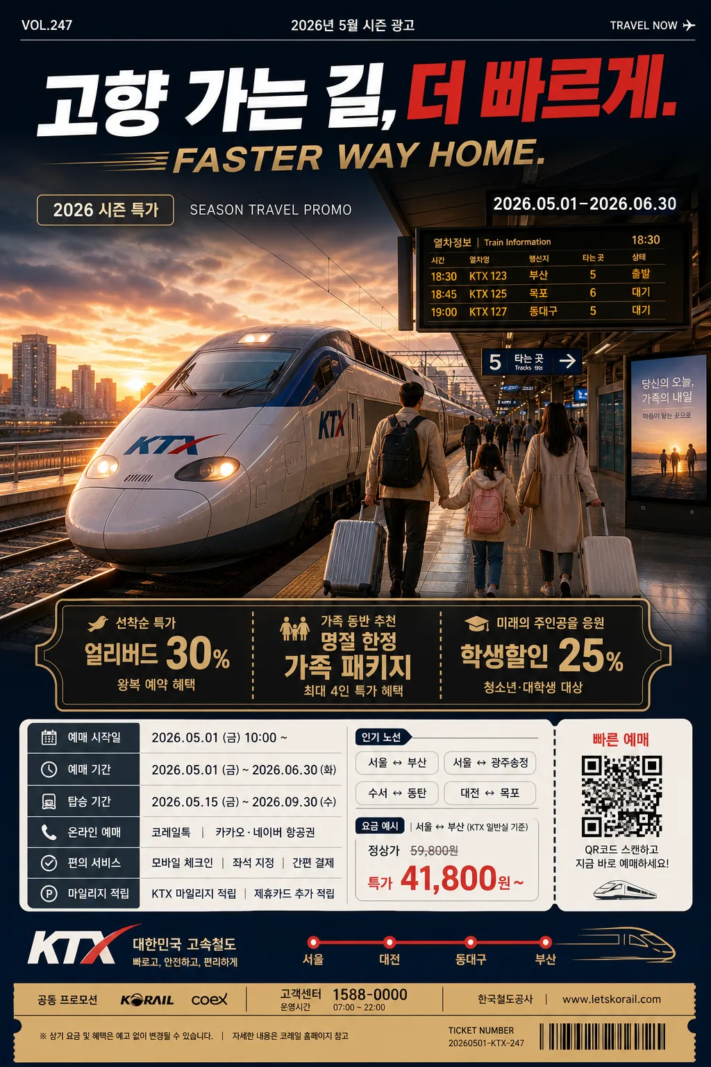
Seasonal transportation advertisement poster for flights and trains, vertical A4-style marketing layout for holiday travel promotion.
Commercial campaign design with a strong Korean headline, cinematic hero travel scene, promotional offer block, booking information area, realistic date/route details, sponsor strip, and ticket-style travel cues.

[Composition]
- Vertical poster in {비율} with a dominant hero image occupying the upper 52% of the frame, headline band across the upper third, and information blocks stacked in the lower third.
- Main subject area: {교통수단} as the central travel category, presented with a premium Korean seasonal ad look; the hero scene should clearly imply departures, family reunions, weekend trips, holidays, or peak-season travel depending on the selected transport.
- Background treatment: atmospheric airport terminal, train platform, runway, station concourse, or scenic route environment blended with a polished gradient backdrop; include realistic signage glow, timetable screens, platform lights, luggage silhouettes, travel reflections, and seasonal air depth while keeping the hierarchy readable.
- Add authentic poster details: campaign label "2026 시즌 특가", short English line "SEASON TRAVEL PROMO", small date label "2026.05.01–2026.06.30", route chips such as "서울 ↔ 부산" and "김포 ↔ 제주", ticket-style microcopy, a QR-code-like booking box, and a small barcode/pricing strip in the lower area.
- Use {교통수단}, {헤드라인}, {hero 이미지}, {할인·이벤트}, {예매 정보}, {컬러 팔레트}, {비율} placeholders exactly where variable content is needed.

[3. CORE STRUCTURE]
- Top header zone (about 18%): place {헤드라인} in large, bold Korean typography with a secondary English emphasis line if included in the headline; align center or slightly left depending on balance, with strong contrast against the background. Add small header metadata such as "VOL.247", "2026년 5월 시즌 광고", and "TRAVEL NOW" near the top edge.
- Hero zone (about 52%): render {hero 이미지} as the main visual centerpiece with cinematic commercial polish; for aircraft, show takeoff motion, runway perspective, airport windows, boarding lights, and distant travelers with luggage; for KTX/SRT/train, show departure or platform motion with platform markers, overhead signs, rails, and timetable boards; for bus, show premium long-distance travel atmosphere with terminal bays, road glow, and luggage loading details. Keep transport proportions realistic and perspective accurate.
- Promotional badge area (about 10%): place {할인·이벤트} in a compact, attention-grabbing box, angled ribbon, or ticket coupon panel, using gold or accent color fill with dark text. Add supporting short Korean microcopy such as "선착순 특가", "왕복 예약 혜택", "가족 동반 추천" without overpowering the main offer.
- Booking/info zone (about 12%): place {예매 정보} in structured lines or small blocks, with route, date, fare, and booking CTA styling. Include practical labels such as "예매 기간", "탑승 기간", "온라인 예매", "모바일 체크인", plus tiny transport icons, dotted ticket separators, and a QR-code-like square labeled "빠른 예매".
- Footer balance area (about 8%): use {교통수단} and {컬러 팔레트} to reinforce brand identity through decorative route lines, corner accents, sponsor-style blocks, small partner text like "공동 프로모션", contact line "고객센터 1588-0000", and a base band with barcode-style marks and fine print.

[4. STYLE RULES]
- Typography: bold modern Korean sans serif such as Pretendard or Noto Sans KR for the headline, weight 800–900, with 54–78px visual scale; use 400–500 weight for booking details and event copy, and allow select English words to sit in condensed uppercase for campaign energy.
- Color palette: use {컬러 팔레트} as the primary identity colors, supported by charcoal #1F1F1F, warm gold #C8A24A, off-white #F5F1E8, and one vivid accent color that matches the transport category.
- Border/shadow: soft drop shadow 0px 6px 16px at 18% opacity for the hero cutout or info cards; use thin divider lines in 1.5px gold or white to structure the poster.
- Layout detail: combine glossy ad photography with printed-poster realism, including ticket perforation lines, tiny terms text, route-map curves, platform/airport pictograms, small fare tags, and sponsor rectangles. All decorative elements should support a real transportation campaign look.
- Text density: include 2–3 short Korean promotional blurbs around the lower and side areas, for example "연휴 좌석 조기 오픈", "가족 여행 추천 노선", "주말 출발 추가 할인"; keep them readable and secondary to {헤드라인}.

[5. VISUAL STYLE]
- Camera / lens: premium advertising photography look shot on a Phase One IQ4 with an 80mm lens for aircraft/travel subject clarity, or a 24–70mm full-frame commercial lens for broader transport scenes, f/4 to f/5.6 depending on depth.
- Lighting: controlled studio-style commercial lighting with soft key light from upper-left at about 45°, gentle fill from the front-right, and subtle rim light to separate the hero from the background; if the scene suggests departure time, add a faint dusk or early-morning atmosphere.
- Color grade: airline-and-rail campaign grade with crisp blues or reds depending on the brand palette, balanced by warm gold highlights, charcoal shadows, clean neutral whites, subtle terminal reflections, and realistic motion highlights.
- Material realism: glossy printed ad finish, semi-transparent information cards, metallic gold accents, reflective glass or platform surfaces, natural sky haze, and finely detailed transport textures such as windows, doors, wheels, rails, runway lights, or seat silhouettes.

[6. MOOD]
Premium Korean travel campaign — major airline and national rail holiday advertising aesthetic, like a polished airport lounge poster mixed with a high-end transport brand launch, filled with realistic seasonal travel anticipation, departure energy, and practical booking urgency.

[7. CRITICAL]
- Korean text accuracy: "고향 가는 길, 더 빠르게." must appear exactly if used in the headline.
- Korean text accuracy: {교통수단}, {할인·이벤트}, and {예매 정보} must be rendered in clean, legible Korean without broken characters.
- Include realistic Korean poster details such as "2026 시즌 특가", "예매 기간", "탑승 기간", "빠른 예매", "서울 ↔ 부산", or "김포 ↔ 제주" where appropriate, rendered cleanly.
- Composition invariant: the poster must keep a clear top headline, large hero center, promotional block, booking information block, sponsor/contact footer, and ticket-style details; do not collapse the hierarchy.
- If the hero includes people, they must look natural and anatomically correct, with believable travel clothing, luggage, gestures, and facial proportions.

[8. 🚫 PROHIBITED]
- Fake official seals / certifications
- Broken Korean characters