広告・ポスター
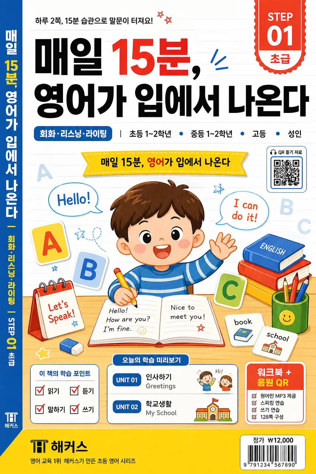
영어 학습지 표지
영어 학습지 표지 (파닉스·문법·회화). 어린이 결.
영어 학습지 표지の概要
広告・ポスター画像を作るためのChatGPT画像プロンプトです。主題、背景、スタイル、構図を整理し、すぐに試せるよう構成しています。
関連キーワード: 영어 학습지 표지, 영어 학습지 표지 프롬프트, 広告・ポスター 프롬프트, 広告・ポスター AI 이미지 프롬프트, ChatGPT 이미지 프롬프트, AI 이미지 생성 프롬프트, AI 프롬프트, 이미지 프롬프트
영어 학습지 표지の活用方法
元の構造を保ちながら、被写体、背景、色、構図を変更して別案に展開できます。
- 主題を維持し、ブランドや季節、媒体に合わせて色と背景を変更してください。
- 結果が複雑な場合は背景要素を減らし、被写体、構図、照明を具体化してください。
- コピー後、ChatGPTに媒体、アスペクト比、文字の有無を追加で指定できます。
プロンプト原文
[Input]
- language: Korean
- output_size: 1024x1536

[Purpose]
English workbook cover for Korean educational publishing, vertical B5-style front cover, designed to read clearly as a real study guide on a bookstore shelf, classroom desk, or digital thumbnail.
Make it feel like a commercially printed Korean English-learning worksheet cover with a strong headline, clear level labeling, unit/course information, workbook badges, barcode area, and a friendly learning visual system depending on {학습지 종류} and {레벨·대상}.

[Composition]
- Main title zone: place {헤드라인} across the upper 22% of the page, centered and dominant, with confident textbook-cover hierarchy and strong thumbnail readability.
- Subject label zone: show {학습지 종류} and {레벨·대상} as smaller supporting text near the title area, aligned like a real Korean workbook series label.
- Learning promise strip: include the exact Korean copy “매일 15분, 영어가 입에서 나온다” as a clear cover line beneath the title or in a colored ribbon.
- Illustration zone: center {표지 일러} as the main visual anchor occupying the middle 45–50% of the frame, surrounded by relevant study elements such as alphabet cards, notebook grids, pencils, speech bubbles, flashcards, check marks, and small English word samples.
- Publisher/series zone: place {출판사·시리즈} as a small imprint-style mark near the lower corner or top corner, legible like a real workbook publisher cue.
- Real cover details: add a top corner badge such as “STEP 01”, “VOL. 03”, or “개정판”, a small “QR 듣기 자료” label, unit preview tabs like “UNIT 01 인사하기 / UNIT 02 학교생활”, a lower back-cover-style barcode box, price text “정가 ₩12,000”, and tiny spine/credit text along one edge.
- Background treatment: educational cover surface with color blocking, ruled notebook lines, faint vocabulary patterning, soft paper grain, or subtle classroom icon texture using {컬러 팔레트}.
- Keep the composition portrait, stable, front-facing, and print-ready, with realistic trim/bleed awareness for a 1024x1536 B5 cover crop.

[3. CORE STRUCTURE]
1. Background layer — Build a textbook-cover backdrop using the tones from {컬러 팔레트}; for children, use bright blue, yellow, and red blocks with crisp separation, playful notebook grid textures, letter patterns, and sticker-like labels; for adult versions, use off-white, charcoal, and one muted accent with refined study-note rules, section tabs, and clean editorial bands.
2. Hero title layer — Render {헤드라인} in the upper third with bold publication-style typography, sized to command attention while still allowing room for the course labels, badge, and learning promise strip.
3. Level and course information — Set {학습지 종류} and {레벨·대상} as compact informational labels beneath or beside the headline, using textbook hierarchy with realistic secondary copy such as “기초 회화 + 파닉스 + 문장쓰기”, “하루 2쪽 완성”, or “듣기·말하기 통합 워크북”.
4. Illustration layer — Place {표지 일러} in the center as a friendly cover visual; if child-oriented, make it cheerful with books, pencils, alphabet blocks, flashcards, speech bubbles reading “Hello!”, “I can do it!”, and cute classroom motifs; if adult-oriented, keep it polished with a notebook, coffee cup, pencil, vocabulary cards, calendar marks, and organized study graphics.
5. Workbook information layer — Add realistic printed details: “STEP 01”, “초급”, “워크북 + 음원 QR”, “UNIT 01 Greetings”, “UNIT 02 My School”, a small checklist “읽기 / 듣기 / 말하기 / 쓰기”, and a page-count/format line such as “128쪽 구성”. Keep these short and secondary to {헤드라인}.
6. Publisher mark layer — Add {출판사·시리즈} as a small branded series cue, tucked into a corner with discreet scale, like a real workbook imprint; include a tiny designer/editor credit line such as “기획 편집부 · 표지 일러스트 김하루” if it fits the layout.
7. Retail layer — Place a small barcode area at the lower right or lower left with “ISBN 979-11-0000-000-0”, “정가 ₩12,000”, and a tiny distribution note; make it look printed on the cover, not like a sticker floating above it.
8. Ratio handling — Preserve the vertical B5 cover feel of {비율}, optimized for a 1024x1536 portrait crop with clean trim edges, subtle paper thickness, and all essential text inside the printable cover area.

[4. STYLE RULES]
- Typography: use Pretendard ExtraBold or Noto Sans KR Bold for {헤드라인}, 54–72px feel, with smaller Pretendard SemiBold or Noto Sans KR Medium for {학습지 종류}, {레벨·대상}, badges, unit tabs, and price details; if the tone is more classic, use a clean serif accent such as Nanum Myeongjo for one supporting line only.
- Color palette: follow {컬러 팔레트}; for child workbook style, use vivid #4A90E2 blue, #FFD84D yellow, and #FF5A4F red with fresh white panels and playful sticker accents; for adult style, use off-white #F7F5F0, charcoal #222222, and one muted accent such as sage #A7B8A1 or navy #1F3A5F.
- Print realism: include slight paper grain, realistic ink coverage, fine registration-like detail, subtle cover lamination sheen, and soft textbook-cover shadows such as 4px y-offset, 12px blur, and 15% opacity.
- Panels and labels: use thin clean outlines at 1–2px, colored tabs, round badges, ruled lines, speech-bubble frames, and small checklist icons that support the workbook theme.
- Layout discipline: use crisp print-like spacing, consistent alignment, and believable textbook hierarchy; decorative elements should reinforce English learning and classroom study, not compete with the headline.

[5. VISUAL STYLE]
- Camera / lens: emulate a clean product-cover layout shot with a Canon EOS R5 and 50mm standard lens look, front-on orthographic presentation; if slight depth is needed, use a 35mm editorial cover framing while keeping the cover rectangular and paper-like.
- Lighting: use even studio softbox lighting from upper-left at about 45° with gentle fill from the right, producing soft cover shadows, readable ink detail, and a polished retail photography feel.
- Color grade: bright school-supplies palette for children or soft neutral editorial grade for adults, with controlled saturation, clean whites, crisp black text, and accurate color separation for print.
- Material detail: show realistic matte or semi-gloss workbook stock, subtle edge thickness, tiny barcode lines, fine type, and slightly tactile printed illustration texture.

[6. MOOD]
Korean educational publishing cover — like a polished EBS-style workbook or Oxford-style English study guide adapted for a Korean classroom, practical, friendly, content-rich, and ready for retail display.

[7. CRITICAL]
- Korean text accuracy: 반드시 다음 문구가 정확히 보여야 함: "매일 15분, 영어가 입에서 나온다".
- The cover must clearly communicate an English-learning worksheet/booklet with a textbook-like hierarchy, not a poster or magazine.
- Include realistic cover microcopy in Korean such as “기초 회화”, “듣기 QR”, “하루 2쪽”, “정가 ₩12,000”, and short unit labels, while keeping {헤드라인}, {학습지 종류}, {레벨·대상}, and {출판사·시리즈} visually accurate.
- All Korean labels must render without broken characters, spacing errors, or garbled punctuation.
- If {표지 일러} includes a character, keep the illustration clean, friendly, and anatomically correct; do not distort hands, faces, books, pencils, or stationery objects.

[8. 🚫 PROHIBITED]
- Fake official seals / certifications
- Broken Korean characters
- Celebrity composites or unauthorized likeness