광고/포스터
한글·국어 학습지
한글·국어 학습지 (받침·맞춤법·독해). 어린이·성인 결.
한글·국어 학습지 검색 요약
한글·국어 학습지은 광고/포스터 결과물을 만들 때 바로 복사해 활용할 수 있는 ChatGPT 이미지 프롬프트입니다. 주제, 배경, 스타일, 구도 조건을 함께 담아 빠르게 시안을 만들 수 있도록 구성했습니다.
관련 키워드: 한글·국어 학습지, 한글·국어 학습지 프롬프트, 광고/포스터 프롬프트, 광고/포스터 AI 이미지 프롬프트, ChatGPT 이미지 프롬프트, AI 이미지 생성 프롬프트, AI 프롬프트, 이미지 프롬프트
한글·국어 학습지 활용 포인트
원본 구조를 유지하면서 피사체, 배경, 색감, 구도를 바꿔 다양한 시안으로 확장할 수 있습니다.
- 핵심 소재는 유지하고 브랜드, 계절, 채널 목적에 맞는 색감과 배경을 바꿔보세요.
- 결과가 산만하면 배경 요소를 줄이고 피사체, 구도, 조명 조건을 구체화하세요.
- 복사한 뒤 ChatGPT에서 플랫폼, 화면 비율, 텍스트 포함 여부를 추가로 요청할 수 있습니다.
프롬프트 원문
[Input]
- language: Korean
- output_size: 1024x1536

[Purpose]
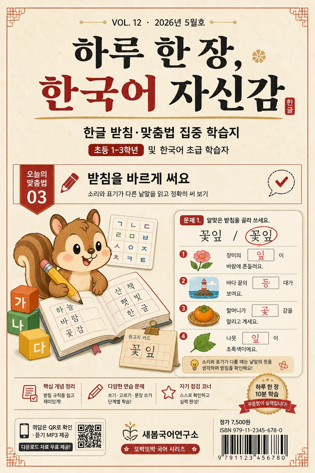
Korean learning worksheet cover, B5 portrait educational handout for elementary students, Korean learners, or adult spelling correction use.
A realistic published workbook front cover with classroom-ready hierarchy, including issue/date information, unit label, sample exercise snippets, publisher mark, barcode-style retail block, and downloadable-material cue.

[Composition]
- Main cover area: vertical B5 workbook cover layout with the headline occupying the upper 18–22%, the level/category band directly below, the central illustration and sample worksheet preview occupying the middle 45%, and the publisher/ISBN/barcode area placed in the lower 15%.
- Background treatment: warm hanji paper beige surface with subtle paper fiber texture, printed ink grain, and light tactile workbook paper feel; use small ruled-line, grid, or manuscript-paper motifs where appropriate for a Korean worksheet.
- Cover content density: include realistic educational details such as {권호·날짜}, {단원명}, {학습목표}, {예시문항}, {부가자료}, and {가격·ISBN} so the cover feels like an actual purchasable study sheet rather than a blank poster.
- Use {학습지 종류}, {레벨·대상}, {헤드라인}, {표지 일러스트}, {출판사·시리즈}, {컬러 팔레트} placeholders as the main design system.

[3. CORE STRUCTURE]
- Top header band: place {권호·날짜} as a small series/date line at the very top, then set {헤드라인} in a bold Korean serif headline, centered, with strong weight contrast between thick and thin strokes, occupying the upper 15–20% of the page.
- Subtitle/support line area: place {학습지 종류} and {레벨·대상} beneath the headline in smaller sans-serif text, formatted like a real workbook cover subtitle with a compact level badge and a clear subject tag.
- Unit and objective strip: add a horizontal learning strip reading {단원명} and {학습목표}, using small icons such as 연필, 체크박스, 말풍선, or 원고지 cells; keep it educational and print-ready.
- Central illustration zone: render {표지 일러스트} as a friendly educational illustration with crisp edges, flat-but-friendly styling, and clear separation from the background; combine it with a partial worksheet preview card showing {예시문항}, answer boxes, circled examples, and neat red correction marks.
- Lower publisher zone: position {출판사·시리즈} as a small publisher mark or series label near the bottom, with {부가자료} as a QR/download cue and {가격·ISBN} beside a barcode-style retail block.
- Overall structure: preserve a textbook cover composition with calm academic rhythm, clear reading order, realistic workbook microcopy, and balanced alignment suitable for a B5 printed Korean learning sheet.

[4. STYLE RULES]
- Typography: use Pretendard or Noto Sans KR for body, labels, captions, badges, and exercise text, and a Korean serif such as Noto Serif KR or a bold 명조 style for the headline; headline weight 800–900, subtitle weight 400–600, microcopy weight 350–500, size contrast clearly visible.
- Color palette: use {컬러 팔레트} with dancheong red, hanji beige, charcoal, and restrained metallic gold accents; apply gold to small badges, rule lines, or unit markers only.
- Workbook realism: add thin ruled lines, manuscript-paper squares, check circles, small page tabs, chapter numbering, red teacher-style correction marks, and tiny caption labels to make the design feel like a real Korean study booklet.
- Border/shadow: use a soft printed-paper shadow, 2–4px y-offset, 10–14px blur, 12–18% opacity; if a frame appears, make it like a workbook trim line, subject divider, or printed rule rather than an ornate decoration.

[5. VISUAL STYLE]
- Camera / lens: front-facing flat editorial layout, simulated as a clean graphic cover rather than a photographed scene; if any illustrative depth is used, keep it equivalent to a 50mm normal-lens perspective with no distortion.
- Lighting: even diffused studio light, no harsh directionality, with a very slight paper-highlight on the center area and soft falloff at the edges.
- Color grade: warm beige and dancheong red with charcoal text and restrained gold accents, similar to a Korean educational publisher cover with print-friendly saturation.

[6. MOOD]
Korean educational workbook cover — polished publisher-style textbook design with the calm clarity of a real school learning sheet, enriched by practical study cues, unit information, and familiar printed worksheet details.

[7. CRITICAL]
- Korean text accuracy: the rendered image must correctly show these verbatim Korean strings if included: “하루 한 장, 한국어 자신감”, “오늘의 맞춤법”, “받침을 바르게 써요”, “정답은 QR로 확인”.
- Keep all Korean characters crisp and fully legible; no broken syllables, no garbled spacing, no incorrect jamo composition.
- Maintain a real workbook cover hierarchy: date/series line, headline, level and category, unit objective, central illustration with sample worksheet preview, publisher and barcode area.
- The cover should include realistic Korean workbook microcopy such as slide/page number style labels, small captions, price/ISBN block, and downloadable-material cue without overpowering the main headline.

[8. 🚫 PROHIBITED]
- Fake official seals / certifications
- Broken Korean characters
- Celebrity composites or altered real-person identity
- Text overflow outside the page frame