広告・ポスター
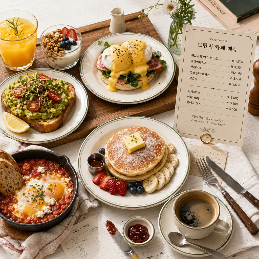
브런치 카페 메뉴 사진
브런치 카페 메뉴 사진. 에그베네딕트·아보카도토스트·팬케이크 결.
브런치 카페 메뉴 사진の概要
広告・ポスター画像を作るためのChatGPT画像プロンプトです。主題、背景、スタイル、構図を整理し、すぐに試せるよう構成しています。
関連キーワード: 브런치 카페 메뉴 사진, 브런치 카페 메뉴 사진 프롬프트, 広告・ポスター 프롬프트, 広告・ポスター AI 이미지 프롬프트, ChatGPT 이미지 프롬프트, AI 이미지 생성 프롬프트, AI 프롬프트, 이미지 프롬프트
브런치 카페 메뉴 사진の活用方法
元の構造を保ちながら、被写体、背景、色、構図を変更して別案に展開できます。
- 主題を維持し、ブランドや季節、媒体に合わせて色と背景を変更してください。
- 結果が複雑な場合は背景要素を減らし、被写体、構図、照明を具体化してください。
- コピー後、ChatGPTに媒体、アスペクト比、文字の有無を追加で指定できます。
プロンプト原文
[Input]
- language: Korean
- output_size: 1024x1024

[Purpose]
Brunch cafe menu photo designed as a square editorial social post for Instagram and blog use.
Flat lay / 45-degree hybrid composition that feels like a real curated café magazine spread, combining appetizing food photography with a visible café menu/pricelist layout.

[Composition]
- Main plating zone: {대표 메뉴} arranged as the clear hero subject, occupying about 55–60% of the frame, with realistic café table context around it: plates, cutlery, napkin folds, drink glasses, crumbs, sauce streaks, and small garnish details that make the meal feel freshly served.
- Surface and setting: white tabletop with visible wood grain texture, paired with a natural wood tray, white ceramic plates, stainless cutlery, linen napkin, and a small printed menu card; show tactile materials such as ceramic glaze, condensation on glass, toasted bread texture, egg gloss, fruit skins, and coffee crema.
- Side props: include small coffee and juice accents near the lower-right or upper-left edge, plus jam dish, butter knife, syrup cup, receipt slip, subtle flower stem, folded café newspaper, or book corner as part of {스타일링}, arranged naturally like a real brunch table.
- Menu/pricelist element: place a small refined café menu card or standing paper menu partially visible beside the hero dish, with store name, address/contact line, decorative dividers, and multiple Korean menu items with prices, e.g. "브런치 카페 메뉴", "아보카도 에그 토스트 ₩13,500", "프렌치 토스트 ₩12,000", "그릴드 샌드위치 ₩11,500", "아메리카노 ₩5,000", "오렌지 주스 ₩6,500".
- Framing and spacing: keep the food centered or slightly off-center depending on {각도}, with lively but organized café-table layering so the composition feels authentic, dimensional, and ready for a real menu/social post.

[3. CORE STRUCTURE]
1. Hero dish area: showcase {대표 메뉴} as the most visually dominant plate arrangement, with crisp food definition, fresh garnish, appetizing layering, visible sauce sheen, toasted edges, soft egg or cream texture, fruit highlights, and small edible details that communicate freshness.
2. Table styling layer: place {상차림} beneath and around the hero dish, ensuring the wood tray, ceramic plate, napkin, side drinks, cutlery, and menu card read clearly while overlapping naturally like a real café table setting.
3. Light and shadow layer: apply {조명} so shadows remain soft and natural, with gentle contrast that preserves texture on eggs, toast, cream, fruit, sauce, coffee crema, glass condensation, paper grain, and wood tabletop.
4. Color balance layer: keep {컬러} across food, props, and tabletop materials, with warm ivory whites, natural green accents, muted yellow highlights, fresh fruit tones, light wood brown, and dark charcoal anchoring details.
5. Camera angle layer: render from {각도}, maintaining clean geometry, visible plating structure, readable menu/pricelist details, and an editorial tabletop perspective suitable for a square social media brunch post.
6. Styling details: incorporate {스타일링} through realistic edge details such as a folded newspaper section, small flowers, handwritten order slip, spoon reflection, linen wrinkles, café stamp graphic on paper, and a few natural crumbs or herbs near the plate.
7. Format fit: preserve the square {비율} framing with a polished brunch-cafe menu aesthetic, ensuring all key food items stay fully visible and the supporting menu/pricelist elements remain legible enough to enrich the image.

[4. STYLE RULES]
- Typography: include small café-menu typography on the printed menu card using Pretendard SemiBold or Noto Sans KR Medium; make the Korean text neat and readable, with clear item names, prices, address/contact line, and simple decorative dividers.
- Korean text on menu card may include: "브런치 카페 메뉴", "오늘의 브런치", "평일 10:00–15:00", "서울 성동구 카페거리 24", "예약 02-1234-5678", plus several short item/price lines that match the brunch theme.
- Color palette: use ivory, natural green, warm yellow, charcoal, off-white, light wood brown, muted cream, and small accents from fruit or jam; align with {컬러} and keep saturation moderate.
- Border/shadow: subtle soft drop shadow, about 4px y-offset, 12px blur, 15% opacity, with natural contact shadows under plates, glasses, tray edges, paper menu, and cutlery.

[5. VISUAL STYLE]
- Camera / lens: full-frame 50mm lens for a tabletop editorial look, shot at f/4 for crisp food detail and gentle depth separation.
- Lighting: bright window light from the left at about 45°, diffused through sheer white curtains, with a faint fill from the opposite side to keep shadows soft while allowing realistic highlights on ceramic, glass, coffee, fruit, and sauce.
- Color grade: warm cream + sage green + soft butter yellow + charcoal-neutral balance, with a clean café editorial finish and realistic food-photography texture.

[6. MOOD]
Modern brunch editorial — a warm, lived-in Kinfolk-style café spread with the polished clarity of a lifestyle magazine food shoot and the practical detail of a real brunch menu/pricelist.

[7. CRITICAL]
- Korean text accuracy: "브런치 카페 메뉴" must appear correctly on the visible menu card if any text is rendered in the image.
- Render Korean menu text cleanly, such as "오늘의 브런치", "아보카도 에그 토스트 ₩13,500", "프렌치 토스트 ₩12,000", "아메리카노 ₩5,000", and "서울 성동구 카페거리 24" without broken characters.
- Preserve the exact square composition feel, with the food presentation reading as a brunch café menu photo rather than a lifestyle portrait.
- Keep hands, people, and faces out of frame unless absolutely necessary; if any human element appears, it must remain natural and unobtrusive, such as a partial hand placing a cup at the edge.

[8. 🚫 PROHIBITED]
- Fake official seals / certifications
- Broken Korean characters