Ads/Posters
운전학원·운전면허 광고
운전학원·운전면허 광고. 1·2종 보통·자동·수동 결.
운전학원·운전면허 광고 summary
Copy this ChatGPT image prompt to create Ads/Posters results. Its subject, background, style, and composition are organized for quick iteration.
Related keywords: 운전학원·운전면허 광고, 운전학원·운전면허 광고 프롬프트, Ads/Posters 프롬프트, Ads/Posters AI 이미지 프롬프트, ChatGPT 이미지 프롬프트, AI 이미지 생성 프롬프트, AI 프롬프트, 이미지 프롬프트
How to use 운전학원·운전면허 광고
Keep the prompt structure and swap the subject, background, palette, or composition to create new variations.
- Keep the main subject and adjust the palette and background for your brand, season, or channel.
- If the result feels busy, simplify the background and make the subject, composition, and lighting more specific.
- After copying, ask ChatGPT to adapt it for your platform, aspect ratio, or text requirements.
Original prompt
[Input]
- language: Korean
- output_size: 1024x1536

[Purpose]
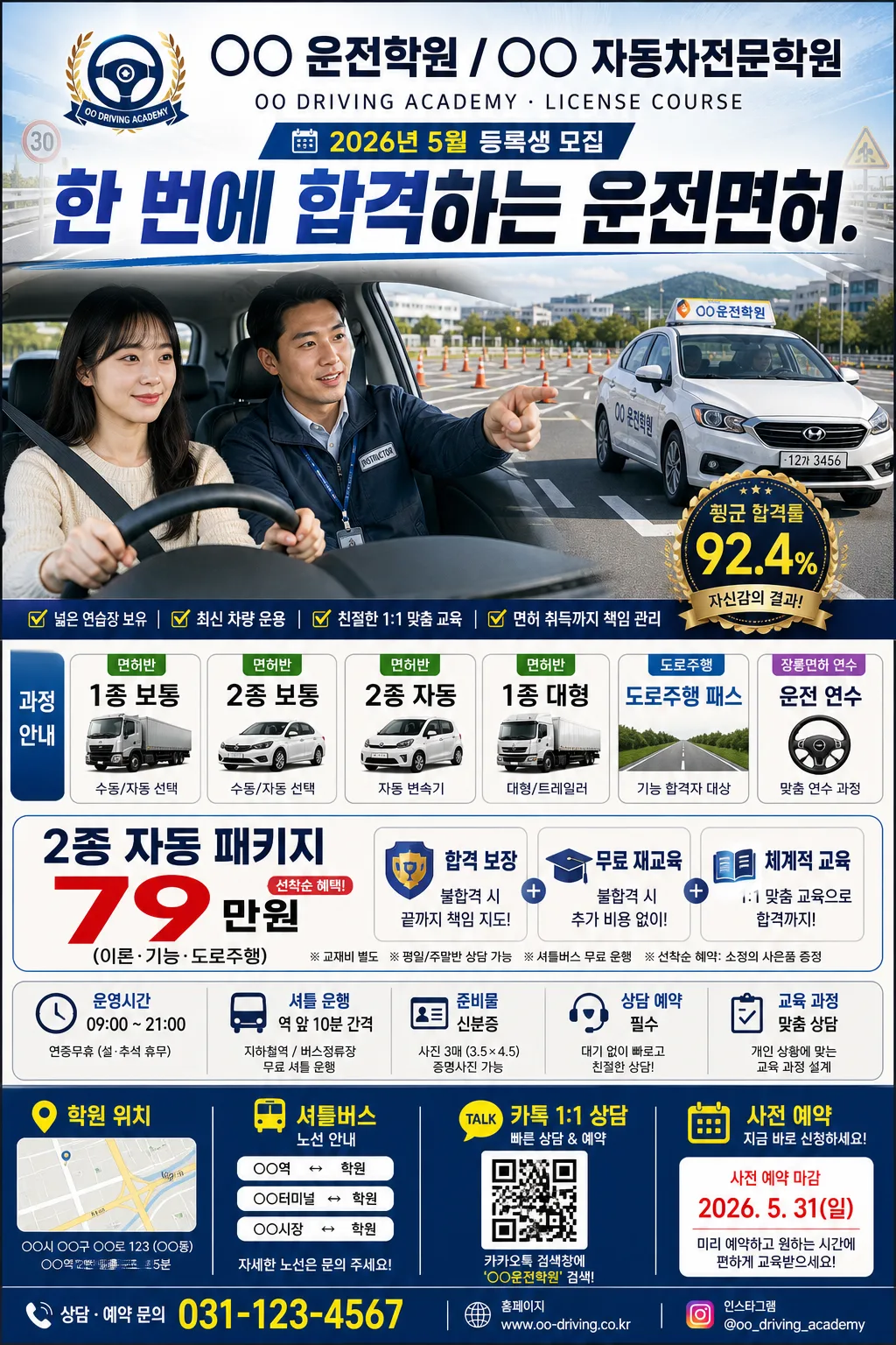
Korean driving school promotional poster for admissions, license lessons, and road-driving packages, designed as a tall A4 advertising flyer for offline print, academy windows, bus-stop boards, and social media sharing.
Create a realistic local-service advertisement with strong conversion hierarchy, believable academy details, course list, pricing block, date/venue/contact information, and a bottom booking CTA optimized for fast readability.

[Composition]
- Top zone (18%): centered {학원명·로고} as the brand masthead with a small academy emblem, compact English sub-label, issue-style promo tag such as "2026 봄 등록 이벤트", and the {헤드라인} directly beneath it in a bold promotional banner style.
- Middle hero zone (42%): {hero 이미지} as the main visual anchor, framed as a real driving-instruction scene: student driver, calm instructor, academy vehicle with roof sign, road cones, crosswalk markings, blue sky reflection, and safe road-travel energy.
- Lower information zone (25%): stacked service list and price/package blocks using {수업·면허 종류} and {가격·패키지}, with extra realistic sub-panels for class timetable, shuttle notice, registration benefits, and small comparison badges.
- Bottom CTA zone (15%): {CTA·매장} placed as a strong contact strip with phone-booking, Kakao consultation, QR-code area, address line, shuttle route note, and reservation deadline.
- Background treatment: commercial poster background with subtle automotive dashboard texture, asphalt-road gradient, faint lane-line graphics, traffic-sign accents, modern blue-white-gray gradients, and yellow emphasis labels for pass-rate and package highlights.
- Use {학원명·로고}, {헤드라인}, {수업·면허 종류}, {가격·패키지}, {hero 이미지}, {CTA·매장}, {비율} placeholders exactly where user content varies.

[3. CORE STRUCTURE]
1. Masthead area: place {학원명·로고} at the top center with a strong advertisement logo treatment, wide tracking, compact emblem-like balance, and small Korean/English academy descriptor such as "DRIVING ACADEMY · LICENSE COURSE".
2. Promo label and headline block: add a small date ribbon "2026년 5월 등록생 모집" and set {헤드라인} immediately below the masthead in large, bold Korean typography, occupying the visual anchor position above the hero image.
3. Hero panel: render {hero 이미지} in the central stage as a bright, persuasive driving-school visual, with instructor/student or academy vehicle composition, realistic steering-wheel/dashboard details, road-practice cones, license-test course markings, crisp edges, and believable reflections.
4. Course list panel: show {수업·면허 종류} in a neat multi-item layout, using pill labels, small vehicle icons, checkmarks, and section tags like "면허반", "도로주행", "장롱면허 연수" for fast scanning.
5. Pricing panel: display {가격·패키지} in a high-contrast box with emphasis on the package price and support benefits, plus small realistic notes such as "교재비 별도", "평일/주말반 상담 가능", and "선착순 혜택" without overpowering the main price.
6. Details strip: include believable poster information blocks: "운영시간 09:00–21:00", "셔틀 운행: 역 앞 10분 간격", "준비물: 신분증", "상담 예약 필수", and a tiny map-pin line connected visually to the bottom CTA.
7. CTA panel: place {CTA·매장} at the bottom as a contact and action strip, with a phone-booking / chat-consultation feel, QR-code placeholder box, contact icons, address line, and compact spacing.
8. Overall framing: keep all sections vertically stacked with strong separation, preserving an A4 portrait promotional flyer structure while adding real-world ad elements like barcode/QR area, small disclaimer text, sponsor/partner strip, road-sign decorations, and micro-copy.

[4. STYLE RULES]
- Typography: Pretendard ExtraBold or Noto Sans KR Black for headlines, Pretendard Medium for details, 58–72px headline scale, 24–34px supporting text scale, 14–18px micro-copy for date, address, notes, and QR labels.
- Color palette: navy #163B6B, sky blue #4FA3D9, white #F7FAFC, light gray #E5EAF0, asphalt gray #606A75, yellow accent #FFD24A for emphasis, with small red-orange alert tags only for deadlines or limited offers.
- Border/shadow: thin white dividers, soft drop shadow 0px 8px 20px 12% opacity, rounded rectangle panels with polished brochure styling, realistic paper-print contrast, glossy hero-panel highlight, and subtle road-lane divider graphics.
- Decorative elements: use automotive icons, map pin, steering wheel symbol, traffic cone, road sign shape, QR-code box, mini timetable grid, and partner/sponsor area as small supporting graphics that make the poster feel printed and local.

[5. VISUAL STYLE]
- Camera / lens: 50mm standard lens look, f/4, crisp commercial advertising perspective with slight depth separation on the hero area.
- Lighting: bright studio key from upper-left at 45° with soft fill from front-right, balanced highlight control, clean high-visibility poster lighting, and natural reflections on car windows and dashboard surfaces.
- Color grade: cool blue-white corporate grade with subtle warm yellow accents for trust, pass-rate emphasis, and promotional urgency.
- Print realism: sharp vector-style typography over a photographic hero composite, slight paper grain, believable poster ink density, clean QR/barcode-like micro area, and realistic local academy flyer finish.

[6. MOOD]
Commercial education brochure aesthetic — trustworthy, energetic Korean driving academy flyer with the disciplined clarity of a real local service advertisement, enhanced by practical details, road-practice atmosphere, and approachable registration guidance.

[7. CRITICAL]
- Korean text accuracy: 반드시 정확히 보여야 하는 문자열:
  - "○○ 운전학원 / ○○ 자동차전문학원 — 한글 + 영문"
  - "한 번에 합격하는 운전면허."
  - "1종 보통 / 2종 보통 / 2종 자동 / 1종 대형 / 도로주행 패스 / 운전 연수"
  - "2종 자동 패키지 79만원 (이론·기능·도로주행) / 합격 보장 / 무료 재교육"
  - "학원 위치 / 셔틀버스 / 카톡 1:1 상담 / 사전 예약"
  - "2026년 5월 등록생 모집"
  - "운영시간 09:00–21:00"
  - "셔틀 운행: 역 앞 10분 간격"
  - "준비물: 신분증"
  - "QR 상담예약"
  - "평일반 · 주말반 · 야간반"
- Layout invariants: keep the poster in a vertical A4 portrait hierarchy with the headline above the hero, course/pricing information below the hero, and CTA anchored at the bottom.
- Text must be sharp, evenly spaced, and fully legible in Korean with no broken characters.
- Maintain all placeholders exactly: {학원명·로고}, {헤드라인}, {수업·면허 종류}, {가격·패키지}, {hero 이미지}, {CTA·매장}, {비율}.

[8. 🚫 PROHIBITED]
- Fake official seals / certifications
- Broken Korean characters
- Celebrity composites / unauthorized likeness