社群/圖卡
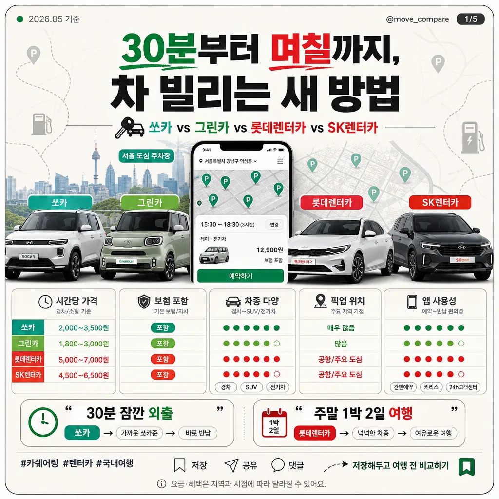
카쉐어링·렌터카 비교 카드
카쉐어링·렌터카 비교 카드. 쏘카·그린카·롯데렌터카·SK렌터카 결.
카쉐어링·렌터카 비교 카드摘要
這是用來製作社群/圖卡內容的 ChatGPT 圖像提示詞,已整理主題、背景、風格與構圖,方便快速調整。
相關關鍵字: 카쉐어링·렌터카 비교 카드, 카쉐어링·렌터카 비교 카드 프롬프트, 社群/圖卡 프롬프트, 社群/圖卡 AI 이미지 프롬프트, ChatGPT 이미지 프롬프트, AI 이미지 생성 프롬프트, AI 프롬프트, 이미지 프롬프트
카쉐어링·렌터카 비교 카드使用方式
保留原始結構並替換主體、背景、色彩或構圖,即可延伸出不同版本。
- 保留核心主體,並依品牌、季節或平台調整色彩與背景。
- 如果畫面太複雜,請減少背景元素並具體描述主體、構圖與光線。
- 複製後可要求 ChatGPT 配合平台、長寬比或文字需求調整。
提示詞原文
[Input]
- language: Korean
- output_size: 1024x1024

[Purpose]
카쉐어링·렌터카 비교 인포카드, 4개 서비스 비교 그리드, 소셜 공유용 정사각형 카드.
짧은 시간 대여부터 주말 여행까지의 사용 시나리오를 한눈에 비교하는 모바일 친화형 정보 디자인.
실제 카드뉴스 1장처럼 날짜, 슬라이드 번호, 저장/공유 유도 문구, 출처 라벨을 포함해 정보성과 공유성을 높인다.

[Composition]
- Center composition: the hero zone occupies about 40% of the frame, with {히어로 이미지} arranged as a compact collage in the upper-middle area.
- Header block spans the top 17% with {헤드라인} as the main title, followed by a smaller comparison subtitle using {서비스 비교}.
- Add a small top meta row: {발행일} on the left, {계정명} on the right, plus a compact slide indicator {슬라이드 번호}.
- Comparison module sits in the middle 33% as a 5-box grid for {비교 항목}, with equal spacing, thin dividers, small pictogram icons, and color-coded service chips.
- Scenario strip sits in the lower 18% with {추천 시나리오} as two short quote-style callouts, aligned left and right for balance.
- Footer zone includes {해시태그}, a tiny save/share icon row, {CTA 문구}, and a small source note {출처 문구}.
- Background uses off-white matte paper with faint Seoul city-map lines, parking-pin marks, dashed road graphics, tiny fuel/EV charging symbols, and soft editorial card framing.

[3. CORE STRUCTURE]
1. Top meta row: place {발행일}, {계정명}, and {슬라이드 번호} in small Pretendard Medium text, using charcoal gray and one green accent dot.
2. Header area: place {헤드라인} in bold Korean typography, large and centered-left, with tight but readable line breaks; emphasize “30분” and “며칠” with green/red highlight underlines.
3. Service comparison line: set {서비스 비교} as a compact subheading beneath the headline, separated by a thin rule and small car-key icon.
4. Hero collage: place {히어로 이미지} as the main visual cluster, combining 4 vehicle silhouettes, app screen mockups, parking lot pins, a city skyline strip, and colored service labels in the order shown by {서비스 비교}.
5. Comparison grid: render {비교 항목} as five evenly sized rounded boxes, each with concise labels, mini icons, and four tiny brand-colored rating dots or short tags.
6. Scenario callouts: place {추천 시나리오} in two quote bubbles with small route arrows and calendar/clock pictograms, creating a quick decision guide.
7. Footer social layer: add {해시태그}, micro save/share/comment icons, {CTA 문구}, and {출처 문구} as real social-card details without disrupting the main reading order.

[4. STYLE RULES]
- Typography: Pretendard ExtraBold for the headline at 44–52px, Pretendard SemiBold for subheads at 20–24px, Pretendard Regular for labels at 14–16px; keep Korean text crisp and evenly tracked.
- Color palette: {컬러 팔레트} mapped to vivid green, muted green, saturated red, dark charcoal, and clean white; use accent colors to separate the four services and support quick scanning.
- Border/shadow: thin 1px charcoal rules, rounded 18px cards, soft drop shadow with 0px x-offset, 6px y-offset, 18px blur, 12% opacity.
- Box styling: comparison boxes should have white fill, subtle tint borders using brand accents, icon-label layout, micro captions, and small check/clock/map symbols.
- Realistic UI details: add app-style top bars, tiny map pins, tab labels, price tags, insurance badge labels, and car-class chips such as “경차”, “SUV”, “전기차”.
- Social-card details: save/share micro icons, slide number, handle, hashtag line, and CTA must look like a polished Korean Instagram card news asset.

[5. VISUAL STYLE]
- Camera / lens: 35mm full-frame documentary-style product composite, equivalent to a Sony A7R IV with a 35mm f/2.8 lens look, straight-on editorial framing.
- Lighting: even studio softbox from upper-left at 45° with a gentle fill from lower-right, soft reflections on the vehicle surfaces, controlled contrast across all elements.
- Color grade: bright editorial white base with saturated brand accents in green and red, neutral charcoal text, slight cool undertone for a modern app-comparison feel.
- Surface detail: matte laminated card texture, faint paper grain, subtle printed-ink edge texture, and light shadowing around each rounded module.

[6. MOOD]
실용적인 자동차 소비 가이드 카드뉴스 — 한국 모빌리티 앱, 여행 플랫폼, 생활경제 매거진의 SNS 비교 콘텐츠처럼 신뢰감 있고 빠르게 읽히는 분위기.

[7. CRITICAL]
- Korean text accuracy: 반드시 아래 문구가 이미지에 정확히 보이도록 할 것.
  - "30분부터 며칠까지, 차 빌리는 새 방법"
  - "쏘카 vs 그린카 vs 롯데렌터카 vs SK렌터카"
  - "시간당 가격 / 보험 포함 / 차종 다양 / 픽업 위치 / 앱 사용성"
  - "30분 잠깐 외출 → 쏘카"
  - "주말 1박 2일 여행 → 롯데렌터카"
  - "저장해두고 여행 전 비교하기"
- Render the meta/social text clearly: "2026.05 기준", "@move_compare", "1/5", "#카쉐어링 #렌터카 #국내여행".
- All four services must be represented consistently in the comparison structure, with no missing item or swapped brand order.
- Headline, comparison items, scenario text, hashtags, CTA, and source note must remain legible, properly spaced, and free of broken Korean characters.

[8. 🚫 PROHIBITED]
- Fake official seals / certifications
- Broken Korean characters
- Missing or altered required Korean text strings
- Celebrity composites or recognizable public figures