Ads/Posters
스킨케어 단계별 광고
스킨케어 단계별 광고. 토너·앰플·세럼·크림 결.
스킨케어 단계별 광고 summary
Copy this ChatGPT image prompt to create Ads/Posters results. Its subject, background, style, and composition are organized for quick iteration.
Related keywords: 스킨케어 단계별 광고, 스킨케어 단계별 광고 프롬프트, Ads/Posters 프롬프트, Ads/Posters AI 이미지 프롬프트, ChatGPT 이미지 프롬프트, AI 이미지 생성 프롬프트, AI 프롬프트, 이미지 프롬프트
How to use 스킨케어 단계별 광고
Keep the prompt structure and swap the subject, background, palette, or composition to create new variations.
- Keep the main subject and adjust the palette and background for your brand, season, or channel.
- If the result feels busy, simplify the background and make the subject, composition, and lighting more specific.
- After copying, ask ChatGPT to adapt it for your platform, aspect ratio, or text requirements.
Original prompt
[Input]
- language: Korean
- output_size: 1024x1536

[Purpose]
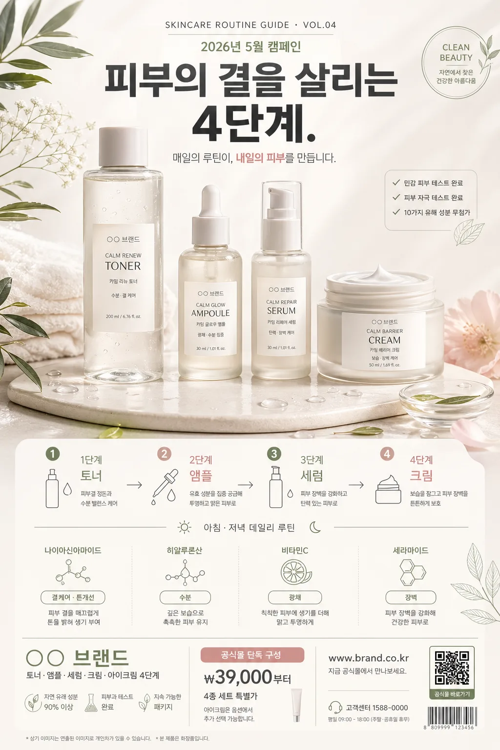
Korean skincare step-by-step advertisement poster, clean beauty editorial layout, vertical A4-like social ad for skincare routine education and product branding.
Premium cosmetic campaign feel with a structured four-step product story, realistic retail information, ingredient callouts, and a polished skincare routine guide designed for a real in-store or social media launch.

[Composition]
- Main composition: {브랜드·제품} is presented as a staged skincare lineup, with the hero still life occupying the middle 55% of the frame and a clear text hierarchy stacked above, beside, and below it.
- Background treatment: smooth off-white to soft gradient backdrop, matte paper-like surface, subtle linen texture, ceramic tray, translucent water droplets, botanical sprigs, soft petals, and a small glass dish to create a believable premium skincare set.
- Framing direction: headline in the upper third, hero product routine in the center, step guidance and ingredient information in the lower third, with a small retail footer including campaign date, website-style line, QR/barcode area, and customer-service micro text.
- Use {브랜드·제품}, {헤드라인}, {hero 정물}, {단계 안내}, {성분·효능}, {컬러 팔레트}, {비율} placeholders.

[3. CORE STRUCTURE]
1) Header zone (top 18%): place {헤드라인} centered, bold and highly legible, with a small upper label such as “SKINCARE ROUTINE GUIDE · VOL.04” and “2026년 5월 캠페인” above it for a realistic campaign-poster feel.
2) Hero zone (middle 45-55%): show {hero 정물} as the main visual, arranged as a premium cosmetic still life with four containers in a refined editorial composition on a ceramic tray; include visible product label details, caps, pumps, cream jar texture, soft shadows, condensation-like droplets, and a folded cotton towel partially visible behind the lineup.
3) Step zone (lower middle 15-20%): render {단계 안내} as a clear sequential flow, using numbered circular markers, tiny skincare pictograms, arrows, and short Korean labels that guide the routine from left to right; include a small caption line “아침·저녁 데일리 루틴” beneath the flow.
4) Ingredient zone (lower 10-15%): place {성분·효능} as concise keyword chips or small caption text, supported by delicate divider lines, tiny molecule icons, leaf illustrations, and benefit tags such as “수분”, “광채”, “장벽”, “결케어”.
5) Brand zone (integrated identity): place {브랜드·제품} as the brand/product identifier near the footer and subtly repeated on product packaging; add realistic ad details including “공식몰 단독 구성”, “₩39,000부터”, “www.brand.co.kr”, “고객센터 1588-0000”, a small QR code block, and a thin barcode-style rectangle without implying certification.
6) Layout ratio: design for {비율} within the 1024x1536 vertical poster format, balancing product photography, Korean copy, ingredient chips, and footer information like a finished cosmetic campaign key visual.

[4. STYLE RULES]
- Typography: use Pretendard or Noto Sans KR for the headline in bold 800 weight, 44-56px equivalent; use 500-600 weight for supporting labels, product notes, campaign date, price, QR caption, and ingredient text, keeping the hierarchy crisp and modern.
- Color palette: follow {컬러 팔레트}, with ivory / dusty pink / sage green / charcoal accents; keep main text in deep charcoal or muted green for premium clarity, with dusty rose highlights and soft sage label panels.
- Graphic system: use rounded ingredient chips, fine divider rules, small numbered badges, translucent pastel panels, subtle botanical line art, and realistic print-ad microcopy to make the poster feel complete and commercially usable.
- Product finish: soft matte glass and satin plastic surfaces, legible Korean label printing, realistic cap seams, faint reflection on the tray, and gentle contact shadows that anchor every object.
- Footer details: add a small campaign information bar with date/time-style copy, online-store note, QR/barcode area, and short disclaimer-like product-use text in Korean at tiny but cleanly rendered size.

[5. VISUAL STYLE]
- Camera / lens: high-end product photography look, shot on a Phase One IQ4 with an 80mm or 110mm macro lens at f/8 for sharp packaging detail and clean separation.
- Lighting: soft window light from upper-left at about 45°, with gentle fill from the front-right and a faint rim highlight to define bottle edges; controlled cosmetic reflections, natural tray shadows, and delicate highlights on droplets and glass.
- Color grade: clean beauty editorial grade with soft ivory highlights, dusty rose mids, muted sage accents, and deep charcoal text contrast; slightly desaturated, premium, airy finish with believable print-ad realism.

[6. MOOD]
Premium clean-beauty campaign — Aesop / Byredo product editorial with Kinfolk magazine restraint, enriched with real skincare retail-poster details, tactile product styling, and calm Korean beauty-brand sophistication.

[7. CRITICAL]
- Korean text accuracy: the following Korean strings must appear correctly and cleanly in the image: “피부의 결을 살리는 4단계.”, “1단계 토너 → 2단계 앰플 → 3단계 세럼 → 4단계 크림”, “나이아신아마이드·히알루론산·비타민C·세라마이드”.
- Additional Korean microcopy may appear as realistic poster details: “아침·저녁 데일리 루틴”, “2026년 5월 캠페인”, “공식몰 단독 구성”, “₩39,000부터”, “수분·광채·장벽·결케어”.
- Text integrity: keep all Korean characters sharp and correctly formed, with no broken syllables and no spacing errors; hierarchy should make the headline, step sequence, ingredients, brand/product name, and footer details readable.

[8. 🚫 PROHIBITED]
- Fake official seals / certifications
- Broken Korean characters