廣告/海報
속눈썹·왁싱·반영구 광고
속눈썹 연장·왁싱·반영구 화장 광고. 살롱 결.
속눈썹·왁싱·반영구 광고摘要
這是用來製作廣告/海報內容的 ChatGPT 圖像提示詞,已整理主題、背景、風格與構圖,方便快速調整。
相關關鍵字: 속눈썹·왁싱·반영구 광고, 속눈썹·왁싱·반영구 광고 프롬프트, 廣告/海報 프롬프트, 廣告/海報 AI 이미지 프롬프트, ChatGPT 이미지 프롬프트, AI 이미지 생성 프롬프트, AI 프롬프트, 이미지 프롬프트
속눈썹·왁싱·반영구 광고使用方式
保留原始結構並替換主體、背景、色彩或構圖,即可延伸出不同版本。
- 保留核心主體,並依品牌、季節或平台調整色彩與背景。
- 如果畫面太複雜,請減少背景元素並具體描述主體、構圖與光線。
- 複製後可要求 ChatGPT 配合平台、長寬比或文字需求調整。
提示詞原文
[Input]
- language: Korean
- output_size: 1024x1536

[Purpose]
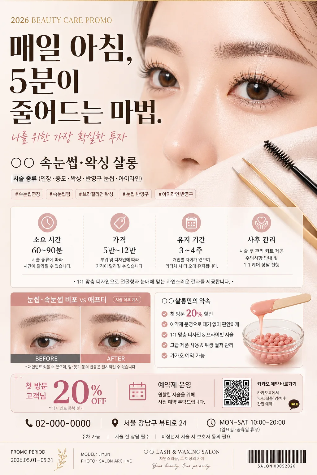
Korean salon advertisement poster for eyelash, waxing, and semi-permanent beauty services, designed as a polished beauty campaign poster with practical booking information, seasonal promotion details, and optional before/after proof.
Vertical A4-style commercial poster for social media and print, with premium Korean beauty-salon editorial polish, readable Korean typography, realistic salon atmosphere, and content-rich promotional details.

[Composition]
- Main hero placement: {hero 이미지} occupies the upper 42% of the layout as the visual anchor, cropped tightly around eyes, brows, lashes, brow mapping tools, tweezers, wax beads, or a treatment-bed detail, with the headline integrated over a soft translucent panel or adjacent editorial title area.
- Header zone: {헤드라인} sits in the top 16% with strong hierarchy, aligned slightly left of center for a modern magazine-ad feel; add a small campaign kicker such as “2026 BEAUTY CARE PROMO” or “NEW CLIENT EVENT” above it.
- Service block: {살롱·시술} appears beneath the header in a smaller but highly legible line, keeping eyelash, waxing, and semi-permanent treatment categories immediately identifiable.
- Information block: {시술 정보} is arranged in a mid-lower salon menu panel with compact spacing, thin dividers, dot leaders, service times, price cues, maintenance notes, and booking guidance.
- Optional comparison block: {비포·애프터} appears as a smaller boxed element in the lower third, balanced against the information block, clearly labeled “BEFORE” and “AFTER” plus Korean micro-copy such as “시술 직후 예시”.
- Promotional detail area: include realistic poster elements such as “첫 방문 20%”, “예약제 운영”, “1:1 맞춤 디자인”, “카카오 예약 가능”, a small QR-code-style booking box, phone/contact line “02-000-0000”, address line “서울 강남구 뷰티로 24”, and business hours “MON–SAT 10:00–20:00”.
- Footer and brand information: add small salon credit text, model/service credit, promotion period, and a subtle barcode or receipt-style reference strip for a real printed-ad feeling: “PROMO PERIOD 2026.05.01–05.31”, “MODEL: JIYUN”, “PHOTO: SALON ARCHIVE”.
- Background surface: soft nude-beige or warm off-white satin paper backdrop with realistic salon-editorial texture; include delicate shadows from beauty tools, faint cosmetic powder marks, pearl pins, clean cotton pads, brow pencil, wax spatula, or lash brush details where natural.
- Use {살롱·시술}, {헤드라인}, {hero 이미지}, {시술 정보}, {비포·애프터}, {컬러 팔레트}, {비율} placeholders throughout the layout.

[3. CORE STRUCTURE]
1. Hero area (upper 42%): {hero 이미지} rendered as the dominant focal image, either a close-up of a woman’s eyes and brows after lash or brow styling, or an elegant still life of beauty tools on a salon tray, with soft realistic shadow, crisp edges, fine skin texture, individual lash strands, and credible treatment-room lighting.
2. Headline area (top band): {헤드라인} set in bold Korean display type with strong contrast, positioned to feel like a premium salon campaign headline; include the exact Korean cover-style line “매일 아침, 5분이 줄어드는 마법.” as a supporting slogan when possible.
3. Service identifier line: {살롱·시술} placed directly under the headline in a smaller clean sans-serif line, clarifying service category and treatment types at a glance; add small separator dots or tags such as “속눈썹펌 · 브라질리언 왁싱 · 눈썹 반영구”.
4. Information panel (mid-lower): {시술 정보} arranged as structured salon service details with separators, dot leaders, time, price, retouch period, aftercare, and consultation notes; include short Korean rows like “소요시간 60–90분”, “유지기간 4–6주”, “첫 방문가 ₩59,000~”, “당일 세안 주의”.
5. Comparison block (lower section): {비포·애프터} shown as a boxed before/after comparison if used, with symmetrical proportions, consistent cropping, small labels “BEFORE / AFTER”, and caption text “개인별 결과 차이 있음” so the result feels credible and tidy.
6. Booking and trust details: add a bottom-right QR-code-style reservation block labeled “빠른 예약”, a small channel handle “@your_salon”, contact line, address, business hours, and “100% 예약제” as realistic commercial poster information without implying official certification.
7. Footer color support: {컬러 팔레트} applied to accents, thin rules, highlight tags, price markers, service icons, and small decorative stars or curved line graphics so the poster feels coordinated and brand-consistent.
8. Canvas ratio discipline: {비율} maintained as a strict vertical poster grid with clear hierarchy from hero to headline to service menu to booking footer, allowing natural salon props and printed-ad details around the main content.

[4. STYLE RULES]
- Typography: use Pretendard ExtraBold or Noto Sans KR Bold for the headline at roughly 58–72px, Pretendard Medium for supporting lines at 24–32px, and Noto Sans KR Regular for details at 18–24px; use small condensed English labeling for “BEFORE”, “AFTER”, “BOOKING”, and “PROMO PERIOD”.
- Color palette: follow {컬러 팔레트} with soft pink, nude beige, charcoal, and gold accents; suggested tones include #F3D7D7, #E9D7C7, #2E2E2E, and muted gold #B89A5A.
- Border/shadow: thin gold separator lines, soft drop shadow with 4px vertical offset, 12px blur, and 15% opacity for hero, comparison boxes, booking QR area, and service cards.
- Texture: matte paper or satin print finish with subtle grain, realistic ink density, soft cosmetic powder texture, and gentle reflections on tweezers, lash brushes, wax jars, or acrylic salon trays.
- Decorative details: use small blush-pink stickers, gold line flourishes, tiny sparkle icons, service tags, dot dividers, and receipt-like footer marks to make the poster look like an actual salon promotion rather than a flat mockup.

[5. VISUAL STYLE]
- Camera / lens: Canon EOS R5 with 85mm f/1.4 portrait look for the eye/brow close-up, or Canon EOS R5 with 50mm macro at f/4 for the beauty-tool still life; clean focus, shallow depth of field, sharp lashes and brows, and softly blurred salon background.
- Lighting: soft studio key light from upper-left at 45°, gentle fill from the right, controlled cosmetic highlights on skin and tools, and natural shadow softness across paper panels and product surfaces.
- Color grade: soft blush pink + warm beige + charcoal contrast, with restrained gold accents, slightly desaturated skin tones, creamy highlights, and polished beauty-campaign retouching.

[6. MOOD]
Premium Korean beauty editorial ad — Elle Korea / W Korea campaign polish blended with a real Gangnam salon promotion: feminine, trustworthy, appointment-ready, detailed, and commercially usable.

[7. CRITICAL]
- Korean text accuracy: the following exact Korean string must appear correctly in the layout: “매일 아침, 5분이 줄어드는 마법.”
- Include believable Korean promotional text where appropriate, such as “첫 방문 20%”, “1:1 맞춤 디자인”, “빠른 예약”, “유지기간 4–6주”, “당일 세안 주의”, “서울 강남구 뷰티로 24”, and “@your_salon”.
- Preserve clean facial anatomy if a model is shown: eyes, brows, lashes, eyelids, and skin proportions must look natural and professionally retouched, with visible individual lash strands and realistic brow texture.
- If a before/after block is used, the comparison must stay visually balanced, clearly labeled, and credible, with a small disclaimer “개인별 결과 차이 있음”.

[8. 🚫 PROHIBITED]
- Fake official seals / certifications
- Broken Korean characters
- Celebrity composites / unauthorized likeness