廣告/海報
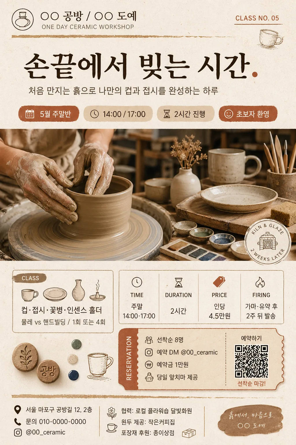
도자기·도예 원데이 클래스
도자기·도예 원데이 클래스 광고. 핸드메이드 결.
도자기·도예 원데이 클래스摘要
這是用來製作廣告/海報內容的 ChatGPT 圖像提示詞,已整理主題、背景、風格與構圖,方便快速調整。
相關關鍵字: 도자기·도예 원데이 클래스, 도자기·도예 원데이 클래스 프롬프트, 廣告/海報 프롬프트, 廣告/海報 AI 이미지 프롬프트, ChatGPT 이미지 프롬프트, AI 이미지 생성 프롬프트, AI 프롬프트, 이미지 프롬프트
도자기·도예 원데이 클래스使用方式
保留原始結構並替換主體、背景、色彩或構圖,即可延伸出不同版本。
- 保留核心主體,並依品牌、季節或平台調整色彩與背景。
- 如果畫面太複雜,請減少背景元素並具體描述主體、構圖與光線。
- 複製後可要求 ChatGPT 配合平台、長寬比或文字需求調整。
提示詞原文
[Input]
- language: Korean
- output_size: 1024x1536

[Purpose]
Korean pottery one-day class promotional poster, A4 vertical editorial flyer for a ceramics studio. Designed for workshop signup, Instagram feed promotion, local class listing, and printed notice board use, with realistic event information, reservation cues, and tactile ceramic-studio atmosphere.

[Composition]
- Top identity area (about 14%): {공방명·로고} as a refined studio lockup with a small English subtitle, issue-style class label, and a thin handmade-clay divider.
- Main headline zone (about 16%): {헤드라인} set large and prominent, anchored near the upper-middle so it reads first, with a short supporting caption {서브카피} beneath it.
- Event detail ribbon: include {행사 정보} as date, time, class duration, and class type in compact poster-style chips or small stacked labels.
- Hero image zone (mid 40%): {히어로 이미지} as the dominant visual, framed like an editorial studio feature with visible clay texture, tools, hands, wheel marks, glaze samples, and finished ceramic pieces.
- Class and pricing blocks: {수업 종류}, {일정·가격}, and {예약 안내} arranged as readable information cards with small icons such as calendar, clock, map pin, and ticket tag.
- Venue/contact footer: {장소·문의} plus {협력·후원} in a sponsor/partner strip, with a small reservation QR-style square, social handle, and ticket note.
- Decorative craft graphics: {장식 요소} integrated around the layout as small clay stamps, brush strokes, glaze dots, kiln-line marks, and hand-drawn ceramic silhouettes that support the workshop theme.
- Palette and background: {컬러 팔레트} with a paper-like warm off-white base, subtle craft-studio fiber texture, earthy contrast, and layered editorial depth.

[3. CORE STRUCTURE]
1) Header zone: place {공방명·로고} at the top as a compact bilingual brand mark, adding “ONE DAY CERAMIC WORKSHOP” and a small class number/date tag such as “CLASS NO. 05”.
2) Headline zone: set {헤드라인} large in a bold Korean serif, preserving the quotation style and strong visual emphasis; place {서브카피} below in a calmer sans-serif line.
3) Event ribbon: show {행사 정보} in three to four small information chips, for example “5월 주말반”, “14:00 / 17:00”, “2시간 진행”, “초보자 환영”.
4) Hero zone: show {히어로 이미지} as the primary visual, either hands shaping clay on a wheel, a cup being trimmed, glaze being brushed, or finished cups and plates on a studio table, photographed with realistic tactile texture.
5) Information zone: place {수업 종류} and {일정·가격} as two separate cards or stacked rows, each with label headers such as “CLASS”, “PRICE”, “FIRING”, and “DELIVERY”.
6) Reservation zone: include {예약 안내} as a ticket-style box with reservation deadline, deposit note, QR-style square, and Instagram or Kakao contact cue.
7) Footer zone: include {장소·문의} and {협력·후원}; add a small sponsor strip, address line, phone/contact, and “선착순 마감” note, while keeping the poster clearly readable at 1024x1536.

[4. STYLE RULES]
- Typography: headline in Pretendard SemiBold or Noto Serif KR Bold, around 54–72px; supporting text in Pretendard Regular/Medium around 22–30px; small labels and footer information around 16–20px with clear contrast.
- Color palette: use {컬러 팔레트} with clay beige #D8C1A1, warm amber #C9893E, off-white #F7F2EA, charcoal #2F2A26, and muted terracotta #A96542; keep saturation earthy and handmade.
- Poster details: use small event-label boxes, fine dividers, sticker-like ticket tags, QR-style reservation block, sponsor strip, and subtle ceramic-tool icons to make the flyer feel like a real local class advertisement.
- Border/shadow: subtle soft drop shadow 4px y-offset, 14px blur, 12% opacity for the hero image, information cards, or ceramic objects; avoid hard bevels and glossy plastic effects.
- Texture handling: show real clay grains, wheel rings, glaze test tiles, linen apron fabric, wooden table marks, and paper fiber background without overpowering the typography.

[5. VISUAL STYLE]
- Camera / lens: editorial product-photo look shot on a Canon EOS R5 with 85mm f/1.4 for hands-and-clay closeups, or a 50mm lens for a balanced studio scene; shallow depth of field but still legible texture.
- Lighting: soft window light from upper-left at 45° with gentle fill from the right, creating realistic clay highlights and soft shadows; studio-natural, not flashy.
- Color grade: warm cream + clay beige + amber + charcoal, with slightly desaturated highlights and rich midtones for a tactile ceramics-magazine look.

[6. MOOD]
Premium craft studio editorial — feels like a contemporary Korean ceramics workshop poster with the quiet tactile warmth of a magazine feature, practical signup information, and inviting handmade detail.

[7. CRITICAL]
- Korean text accuracy: the following Korean strings must appear correctly and without broken characters: “손끝에서 빚는 시간.”, “○○ 공방”, “○○ 도예”, “ONE DAY CERAMIC WORKSHOP”, “컵·접시·꽃병·인센스 홀더”, “물레 vs 핸드빌딩”, “1회 또는 4회”, “5월 주말반”, “14:00 / 17:00”, “2시간 진행”, “인당 4.5만원”, “가마·유약 후 2주 뒤 발송”, “선착순 8명”, “예약 DM @00_ceramic”, “서울 마포구 공방길 12”.
- Required poster realism: include date/time/venue, ticket or reservation information, contact handle, small QR-style reservation square, class capacity note, and a sponsor/partner area.
- Composition invariants: vertical A4 poster framing, headline-first hierarchy, hero image as the dominant visual element, readable class information blocks, and crisp Korean typography.

[8. 🚫 PROHIBITED]
- Fake official seals / government certifications
- Broken Korean characters
- Celebrity composites or unauthorized celebrity likeness
- Fake award badges presented as official credentials