광고/포스터
캘리그래피·서예 클래스 포스터
캘리그래피·서예 클래스 포스터. 동양·서양 결.
캘리그래피·서예 클래스 포스터 검색 요약
캘리그래피·서예 클래스 포스터은 광고/포스터 결과물을 만들 때 바로 복사해 활용할 수 있는 ChatGPT 이미지 프롬프트입니다. 주제, 배경, 스타일, 구도 조건을 함께 담아 빠르게 시안을 만들 수 있도록 구성했습니다.
관련 키워드: 캘리그래피·서예 클래스 포스터, 캘리그래피·서예 클래스 포스터 프롬프트, 광고/포스터 프롬프트, 광고/포스터 AI 이미지 프롬프트, ChatGPT 이미지 프롬프트, AI 이미지 생성 프롬프트, AI 프롬프트, 이미지 프롬프트
캘리그래피·서예 클래스 포스터 활용 포인트
원본 구조를 유지하면서 피사체, 배경, 색감, 구도를 바꿔 다양한 시안으로 확장할 수 있습니다.
- 핵심 소재는 유지하고 브랜드, 계절, 채널 목적에 맞는 색감과 배경을 바꿔보세요.
- 결과가 산만하면 배경 요소를 줄이고 피사체, 구도, 조명 조건을 구체화하세요.
- 복사한 뒤 ChatGPT에서 플랫폼, 화면 비율, 텍스트 포함 여부를 추가로 요청할 수 있습니다.
프롬프트 원문
[Input]
- language: Korean
- output_size: 1024x1536
- aspect_ratio: {비율}

[Purpose]
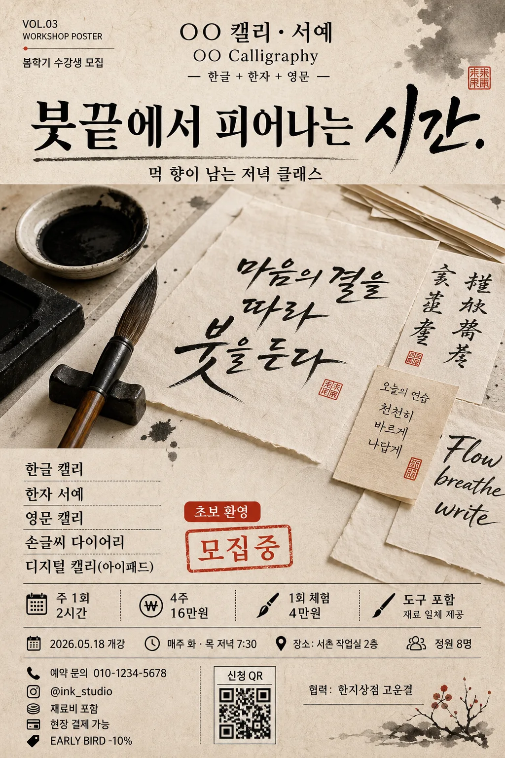
Korean calligraphy and brush-lettering class poster, A4 vertical editorial flyer for studio promotion.
Designed for workshop signup, with a tactile print-poster composition that emphasizes brush, ink, hanji paper, class details, and handmade lettering atmosphere.

[Composition]
- Overall layout: A4 portrait poster with a top studio logo zone, a bold headline band beneath it, a central hero image area occupying about 42% of the frame, and a detailed class-information block at the bottom.
- Subject placement: {hero 이미지} sits as the main visual anchor in the center-mid area, surrounded by natural studio-context details such as ink stone, brush rest, stacked hanji sheets, drying brush strokes, and small paper labels that support the workshop theme.
- Background treatment: matte hanji-paper texture in warm beige, with visible fiber grain, slight deckled edges, faint ink smudges, and subtle pressure marks from real printed paper.
- Spacing and framing: left-aligned text hierarchy with editorial rules, brushed dividers, tiny registration marks, and a practical poster rhythm readable from a distance.
- Poster enrichment: include event details, date/time/venue, ticket or signup information, sponsor/cooperation area, a small QR-style signup box, a red accent tag, and decorative ink-wash graphic elements that feel hand-printed rather than digital.
- Use {공방·로고}, {헤드라인}, {수업 종류}, {일정·가격}, {hero 이미지}, {컬러 팔레트}, {비율} placeholders exactly where the customizable content belongs.

[3. CORE STRUCTURE]
- Top band: place {공방·로고} near the upper center as a studio mark, styled like a refined workshop masthead. Add tiny editorial metadata nearby: "VOL.03 WORKSHOP POSTER" and "봄학기 수강생 모집" in small, crisp type.
- Headline band: set {헤드라인} directly below the logo area, larger and more dramatic, with the feeling of brushed ink on paper and a strong vertical presence. Include the short supporting line "먹 향이 남는 저녁 클래스" beneath the headline.
- Hero area: show {hero 이미지} in the center as a close-up editorial composition of brush, ink, paper, or handwritten stroke detail; keep it crisp, tactile, and naturally imperfect. Add visible ink pooling, feathered stroke edges, a small ceramic ink dish, brush fibers, paper fibers, and a few handwritten practice sheets partially overlapping.
- Course information block: place {수업 종류} as a compact multi-line list, clearly separated with line breaks, dot separators, or thin charcoal rules. Add a small red label reading "초보 환영" and a stamp-like decorative accent reading "모집중".
- Schedule and pricing block: position {일정·가격} near the lower third in a smaller but still prominent type size, using structured lines for weekly schedule, price, trial class, materials included, ticket/signup status, and reservation note.
- Event detail row: include "2026.05.18 개강", "매주 화·목 저녁 7:30", "장소: 서촌 작업실 2층", and "정원 8명" as practical poster information.
- Signup/footer area: add "예약 문의 010-1234-5678", "@ink_studio", "신청 QR", "재료비 포함", "현장 결제 가능", and "EARLY BIRD -10%" in small supporting text, plus a sponsor/cooperation line "협력: 한지상점 고운결".
- Footer balance: use the lower margin for a realistic printed flyer finish with small contact text, a QR-style square, light ink flecks, and fine paper texture.

[4. STYLE RULES]
- Typography: combine a bold Korean serif style similar to Noto Serif KR or Nanum Myeongjo for the headline, with a clean sans-serif such as Pretendard for supporting details; headline weight heavy, body weight regular to medium, sizes clearly separated by hierarchy.
- Color palette: use {컬러 팔레트} with hanji beige, sumi black, seal red, and charcoal; keep the red as a controlled accent for labels, small stamp marks, and signup emphasis.
- Graphic system: use thin editorial rules, hand-brushed divider strokes, small vertical labels, understated registration marks, and a QR-style signup block to make the poster feel like a real workshop flyer.
- Border/shadow: allow a subtle printed-paper edge, faint ink-wash corner texture, and a soft shadow under the hero detail, about 3px y-offset, 10px blur, 12% opacity, to preserve a tactile printed-poster feel.

[5. VISUAL STYLE]
- Camera / lens: editorial still-life captured with a Canon EOS R5, 50mm lens at f/4, or an 85mm lens at f/2.8 for a tighter close-up of brush and ink texture.
- Lighting: soft diffused window light from upper-left at roughly 45°, with a gentle fill on the right side; preserve paper grain, ink edges, brush hairs, and ceramic ink-dish texture without harsh specular highlights.
- Color grade: warm cream and paper beige base, deep charcoal blacks, muted vermilion red accent, and slightly desaturated tones for a calm print-editorial finish.
- Material realism: show absorbent hanji fibers, uneven ink density, tiny brush bristle marks, slight paper curling, and authentic offset-print softness in small text areas.

[6. MOOD]
Premium Korean arts workshop editorial — feels like a refined gallery class poster combined with a warm neighborhood studio signup flyer, tactile, crafted, calm, and inviting.

[7. CRITICAL]
- Korean text accuracy: "붓끝에서 피어나는 시간.", "한글 캘리", "한자 서예", "영문 캘리", "손글씨 다이어리", "디지털 캘리(아이패드)", "주 1회 2시간", "4주 16만원", "1회 체험 4만원", "도구 포함"
- Additional poster text accuracy: "봄학기 수강생 모집", "먹 향이 남는 저녁 클래스", "2026.05.18 개강", "매주 화·목 저녁 7:30", "장소: 서촌 작업실 2층", "정원 8명", "예약 문의 010-1234-5678", "@ink_studio", "신청 QR", "재료비 포함", "현장 결제 가능", "초보 환영", "모집중", "협력: 한지상점 고운결", "VOL.03 WORKSHOP POSTER", "EARLY BIRD -10%"
- The composition must remain A4 vertical with a clear top-to-bottom hierarchy: logo, headline, hero, course list, schedule/pricing, signup/footer details.
- Keep brush stroke edges, ink texture, paper grain, QR-style box, small contact text, and all Korean characters crisp and correctly formed.

[8. 🚫 PROHIBITED]
- Fake official seals / certifications
- Broken Korean characters