광고/포스터
게임 플랫폼별 광고 톤
게임 광고 톤. 모바일 RPG·콘솔·PC·캐주얼 결.
게임 플랫폼별 광고 톤 검색 요약
게임 플랫폼별 광고 톤은 광고/포스터 결과물을 만들 때 바로 복사해 활용할 수 있는 ChatGPT 이미지 프롬프트입니다. 주제, 배경, 스타일, 구도 조건을 함께 담아 빠르게 시안을 만들 수 있도록 구성했습니다.
관련 키워드: 게임 플랫폼별 광고 톤, 게임 플랫폼별 광고 톤 프롬프트, 광고/포스터 프롬프트, 광고/포스터 AI 이미지 프롬프트, ChatGPT 이미지 프롬프트, AI 이미지 생성 프롬프트, AI 프롬프트, 이미지 프롬프트
게임 플랫폼별 광고 톤 활용 포인트
원본 구조를 유지하면서 피사체, 배경, 색감, 구도를 바꿔 다양한 시안으로 확장할 수 있습니다.
- 핵심 소재는 유지하고 브랜드, 계절, 채널 목적에 맞는 색감과 배경을 바꿔보세요.
- 결과가 산만하면 배경 요소를 줄이고 피사체, 구도, 조명 조건을 구체화하세요.
- 복사한 뒤 ChatGPT에서 플랫폼, 화면 비율, 텍스트 포함 여부를 추가로 요청할 수 있습니다.
프롬프트 원문
[Input]
- language: Korean
- output_size: 1536x1024

[Purpose]
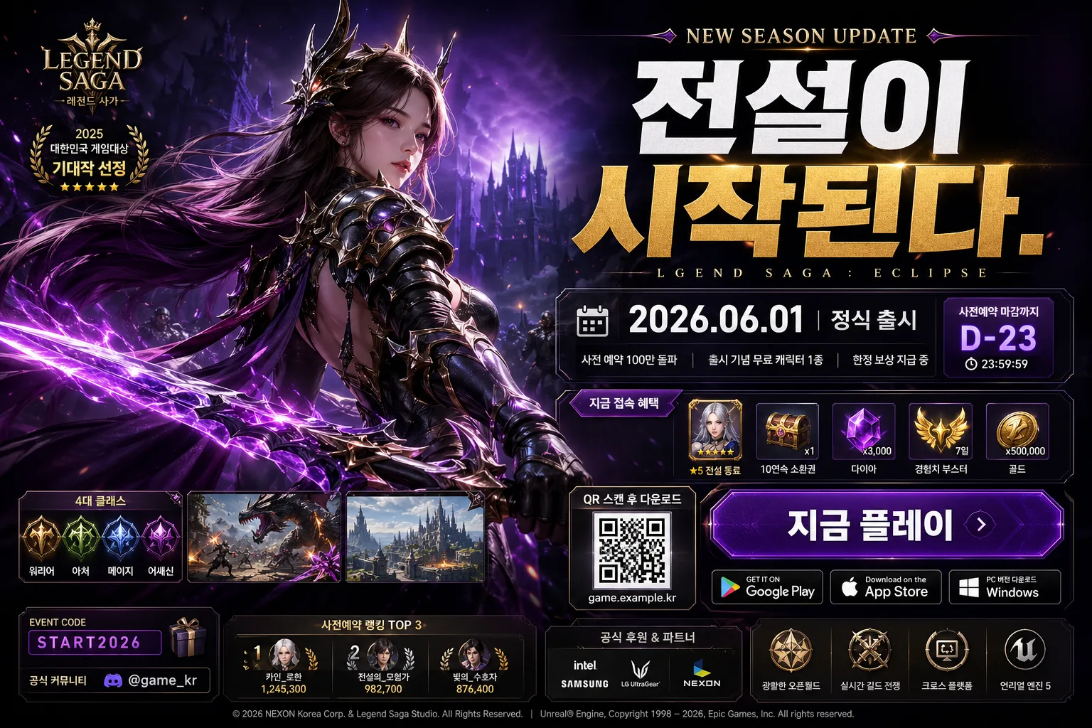
Game platform-specific ad banner for a game campaign, designed to match the selected genre/platform while remaining conversion-focused, visually rich, and ready for paid media, launcher banners, store promotions, and social sharing.
Create a polished promotional layout that can adapt from mobile RPG to console action, PC MMORPG, esports shooter, or casual puzzle without changing the core ad structure, while adding believable campaign details and platform-specific advertising cues.

[Composition]
- Hero subject placement: {hero 이미지} occupies the left 55–60% of the frame as the primary focal point, with the right side reserved for headline, release info, CTA, and platform/download information in a stacked advertising column.
- Background treatment: deep cinematic backdrop matched to {컬러 팔레트}, layered with in-game environment silhouettes, faint battle/city/map fragments, UI hologram panels, skill particles, platform-themed light streaks, and subtle depth haze so the banner feels like a real launch campaign.
- Information framing: build a strong left-to-right reading flow with the hero breaking slightly into the center, headline and campaign details on translucent glass panels or metallic UI plates, plus small realistic ad elements such as a QR download box, event tag, countdown label, community handle, and tiny legal/credit text.
- Layout must adapt to {게임 장르·플랫폼} while preserving the same ad structure, with {비율} as a horizontal banner composition.

[3. CORE STRUCTURE]
1. Main hero zone (left 55–60%): render {hero 이미지} as a high-impact centerpiece with cinematic contrast, crisp edges, textured costume/armor/skin detail, dynamic pose, and controlled special effects such as weapon glow, skill trails, speed lines, puzzle sparkles, mech HUD reflections, or UI-like aura depending on {게임 장르·플랫폼}.
2. Headline block (upper-right): place {헤드라인} in bold, oversized Korean typography with strong hierarchy; add a short campaign kicker above it such as “NEW SEASON UPDATE”, “GRAND OPEN”, or “런칭 캠페인” and keep the main headline dominant and readable.
3. Release / event block (mid-right): show {출시·이벤트} as compact supporting copy inside a capsule or panel, separated with accent dividers, small calendar icon, timer chip, and one or two short Korean micro-blurbs such as “한정 보상 지급” and “지금 접속 혜택”.
4. CTA / download block (lower-right): place {플랫폼·다운로드} as a row or stacked list of platform labels/icons, styled like realistic distribution channels for the selected game type; add a bold CTA button reading “지금 플레이” or “사전예약하기”, a small QR code area labeled “QR 스캔 후 다운로드”, and a tiny URL-style line such as “game.example.kr”.
5. Supporting ad details: include believable campaign texture such as reward item cards, small character class icons, screenshot thumbnails, leaderboard strip, coupon code label “EVENT CODE: START2026”, official community handle “@game_kr”, and a compact sponsor/partner strip if it fits the platform tone.
6. Color and accent system: apply {컬러 팔레트} consistently across glow effects, separators, key text accents, CTA button, reward cards, and background highlights so the ad feels genre-specific and cohesive.
7. Finishing details: add energy particles, lens bloom, subtle motion blur on effects, metallic or glass UI reflections, tiny publisher-credit text, and premium ad polish that makes the composition feel like a major launch campaign rather than a generic poster.

[4. STYLE RULES]
- Typography: use Pretendard ExtraBold or Noto Sans KR Black for the headline at very large size, with tight tracking and clean geometric alignment; use Pretendard Medium or Noto Sans KR Medium for supporting copy, CTA labels, platform text, and micro-copy; if the selected genre leans fantasy, allow a secondary accent in Nanum Myeongjo Bold for emphasis only.
- Color palette: follow {컬러 팔레트} with genre-matched tones such as dark purple and gold for RPG, pastel accents for casual puzzle, neon cyan/magenta for sci-fi or esports, or cool metallic cinematic tones for console; keep high-priority text in white, pale gold, electric cyan, or near-black depending on contrast.
- Panel and shadow system: use translucent glassmorphism panels, beveled sci-fi plates, parchment-like fantasy labels, or glossy mobile UI cards depending on {게임 장르·플랫폼}; use a soft drop shadow with 6px y-offset, 18px blur, 18% opacity on headline text; add subtle inner glow around hero effects and a faint vignette to anchor the composition.
- Realism of ad details: make platform icons, QR area, event chips, reward cards, and community labels look intentionally designed and printable, with tiny but plausible Korean microtext and clear visual hierarchy.

[5. VISUAL STYLE]
- Camera / lens: cinematic promotional key art look, shot as if on a full-frame 85mm f/1.8 portrait lens for hero depth, or a 35mm editorial game poster framing if the image resembles a wider scene; keep subject separation sharp and premium.
- Lighting: dramatic studio key light from upper-left at roughly 45°, with a soft fill from lower-right and a narrow rim light to carve out the hero silhouette; add glow sources that match the game effects and platform tone.
- Color grade: match {컬러 팔레트} with deep shadows, saturated accent highlights, and controlled contrast; keep blacks rich but not crushed, preserve bright UI-like text readability, and allow atmospheric reflections on panels and metallic surfaces.

[6. MOOD]
Premium game launch advertising — a AAA trailer-poster feel with the clarity and punch of a major mobile-to-console campaign, similar to high-end publisher key art, game launcher takeover banners, social ad creatives, and store-feature graphics packed with believable launch-event information.

[7. CRITICAL]
- Korean text accuracy: the following verbatim Korean strings must appear correctly in the rendered image: {헤드라인}, {출시·이벤트}, {플랫폼·다운로드}
- Also include several short Korean ad details rendered cleanly, such as “지금 플레이”, “사전예약하기”, “한정 보상 지급”, “QR 스캔 후 다운로드”, “공식 커뮤니티 @game_kr”, and “EVENT CODE: START2026”.
- The overall composition must keep the hero on the left and information on the right in a stable advertising layout.
- Typography must stay crisp and correctly rendered in Korean and English, with no broken characters.
- The image should feel like a real game ad with campaign UI, download cues, reward/event information, and platform-specific atmosphere, not an illustrated editorial or generic poster.

[8. 🚫 PROHIBITED]
- Fake official seals or fake certification marks
- Broken Korean characters
- Celebrity composites or unauthorized real-person likeness