廣告/海報
주민자치센터 문화 프로그램 모집
주민자치센터·동사무소 문화 프로그램 모집 (요가·필라테스·서예·악기 등).
주민자치센터 문화 프로그램 모집摘要
這是用來製作廣告/海報內容的 ChatGPT 圖像提示詞,已整理主題、背景、風格與構圖,方便快速調整。
相關關鍵字: 주민자치센터 문화 프로그램 모집, 주민자치센터 문화 프로그램 모집 프롬프트, 廣告/海報 프롬프트, 廣告/海報 AI 이미지 프롬프트, ChatGPT 이미지 프롬프트, AI 이미지 생성 프롬프트, AI 프롬프트, 이미지 프롬프트
주민자치센터 문화 프로그램 모집使用方式
保留原始結構並替換主體、背景、色彩或構圖,即可延伸出不同版本。
- 保留核心主體,並依品牌、季節或平台調整色彩與背景。
- 如果畫面太複雜,請減少背景元素並具體描述主體、構圖與光線。
- 複製後可要求 ChatGPT 配合平台、長寬比或文字需求調整。
提示詞原文
[Input]
- language: Korean
- output_size: 1024x1536

[Purpose]
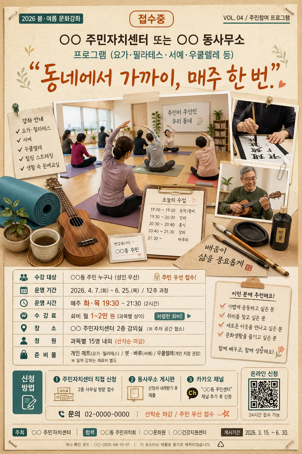
A community-center recruitment poster for local cultural classes, designed as a realistic A4 portrait notice that feels practical, friendly, and easy to read on an apartment lobby or 주민센터 bulletin board.
Use a warm editorial layout with strong hierarchy, believable printed-paper details, and enough civic information for residents scanning program schedules, venue, fee, and application route at a glance.

[Composition]
- The poster is a vertical A4-style recruitment notice with a strong top header band, a content-rich central hero collage area, and a lower information block; the layout should feel like a real neighborhood bulletin poster produced by a 주민자치센터, not a sterile template.
- Top header occupies about 18% of the frame, centered and bold; the hero area takes the middle 42–48%; the schedule, venue, fee, and application information sits in organized boxed sections near the bottom.
- Background treatment: warm beige paper texture with slight grain, subtle off-white mottling, faint print-ink imperfections, light staple or tape marks near the corners, and mild photocopy registration texture to mimic a real community-center printed notice.
- Add realistic poster metadata and civic details: small date label, 모집기간 line, venue line, 문의 phone placeholder, QR-code-like application box, small sponsor/cooperation strip, and a bottom posting-code/footer line.
- Maintain clear separation between headline, visual, and details with a practical municipal notice feel, using readable spacing and structured boxes rather than a glossy advertisement composition.
- Main placeholders: {주최·프로그램}, {헤드라인}, {hero 이미지}, {수강 정보}, {신청 방법}, {컬러 팔레트}, {비율}.

[3. CORE STRUCTURE]
1. Header band (top 18%): Place {주최·프로그램} as the organizing label, centered in a strong Korean headline style. Set {헤드라인} directly below it in a larger warm handwritten or soft display font, with quotation-mark style emphasis and airy line spacing. Include small realistic labels around the header such as “2026 봄·여름 문화강좌”, “접수중”, and “VOL. 04 / 주민참여 프로그램”.
2. Hero collage area (middle 45%): Build a friendly neighborhood-class collage using {hero 이미지} as the main visual cue. Show a community-center classroom scene with residents of mixed ages participating naturally, combined with still-life elements such as a rolled yoga mat, simple 우쿨렐레, calligraphy brushes, ink dish, folded class handout, tea cup, name stickers, and a small schedule clipboard, arranged as a layered printed-photo-and-cut-paper composition.
3. Visual framing: Keep the hero collage centered and slightly tall, with the classroom element carrying the main visual weight and smaller class-related props orbiting around it. Use crisp cut-paper edges, subtle overlaps, soft drop shadows, masking-tape details, and pinned-note accents so the poster feels handmade but professionally organized.
4. Information block (lower 25%): Present {수강 정보} in neatly aligned rows or boxed bullet lines with clear separators. Add practical sublabels in Korean such as “수강 대상”, “운영 기간”, “수강료”, “장소”, “정원”, and “준비물”, using small icons, thin dividers, and a timetable-like arrangement.
5. Application block (bottom strip): Place {신청 방법} in a contrasting but restrained accent area, such as a rounded rectangle or thin-outlined box, so the sign-up route is immediately visible. Include a small QR-code-style square labeled “온라인 신청”, a phone/contact line “문의 02-0000-0000”, and a short note “선착순 마감 / 주민 우선 접수”.
6. Footer accent: Use {컬러 팔레트} in decorative divider lines, small corner motifs, program-category color chips, and a sponsor/cooperation strip reading “주관 주민자치회 · 협력 동네문화공방 · 장소 2층 다목적실” to unify the poster and reinforce a local, welcoming neighborhood identity.
7. Size treatment: Respect {비율} as a portrait poster layout with print-ready proportions, realistic bulletin-board presence, and legible information density suitable for 1024x1536 output.

[4. STYLE RULES]
- Typography: Use Pretendard Bold for the main program name, Noto Sans KR Medium for information rows, and a hand-drawn or brush-inspired Korean display font for the headline. Keep sizes roughly 64–76px for the main title, 38–48px for the headline, 24–30px for details, and 16–20px for micro labels, footer metadata, and captions.
- Color palette: warm beige, amber, teal, and charcoal based on {컬러 팔레트}; suggested tones include #F3E7D3, #D89B2B, #2D8C8A, and #3B3B3B. Add small coral or sage accent chips only if they harmonize with the given palette.
- Border/shadow: use thin charcoal rules, soft 4px y-offset shadows at 12px blur with about 14% opacity, lightly rounded boxes for application and timetable sections, and small dotted dividers for class categories.
- Print feel: slight ink spread, subtle paper grain, minor toner speckles, believable paper creases, and restrained contrast so it resembles a real printed community-center flyer posted on a public notice board.
- Decorative elements: include modest Korean notice-board details such as tape tabs, tiny check marks, simple calendar icon, location pin icon, phone icon, arrow markers, and small class-category badges like “건강”, “예술”, “취미”, “음악”.

[5. VISUAL STYLE]
- Camera / lens: documentary-style 35mm full-frame look with a 50mm lens at f/4 for the classroom scene, combined with flat-lay object styling for props; keep perspective natural and grounded.
- Lighting: soft window light from upper-left at about 45°, with a gentle fill from the lower-right and very mild ambient bounce; no harsh specular highlights.
- Color grade: warm cream, amber, and muted teal with charcoal text; keep saturation moderate and the paper background slightly sunlit but not yellowed.
- Material realism: the hero photo should have mild depth of field and natural skin tones, while the surrounding paper elements should show printed halftone texture, slight edge shadows, and tactile collage layering.

[6. MOOD]
Neighborhood civic-poster editorial with the approachable clarity of a local community newsletter, the warm print tactility of a Kinfolk-style layout, and the believable fullness of a real 주민자치센터 모집 공고 posted for local residents.

[7. CRITICAL]
- Korean text accuracy: the following strings must appear correctly and clearly in the rendered image:
  - 주민자치센터
  - ○○ 주민자치센터 또는 ○○ 동사무소 / 프로그램 (요가·필라테스·서예·우쿨렐레 등)
  - "동네에서 가까이, 매주 한 번." — 따뜻 한글
  - 매주 화·목 19:30 / 12주 과정 / 회비 월 1~2만 (저렴) / 주민 우선
  - 주민자치센터 직접 신청 / 동사무소 게시판 / 카카오 채널
- Additional Korean poster details should appear as small but legible supporting text where appropriate:
  - 2026 봄·여름 문화강좌
  - 모집기간 2026.05.01–05.20
  - 장소 2층 다목적실 / 문의 02-0000-0000
  - 정원 15명 내외 / 선착순 마감
  - 온라인 신청 QR / 현장 접수 가능
  - 주관 주민자치회 · 협력 동네문화공방
- The poster must preserve a clear A4 portrait notice layout with headline on top, hero in the middle, and information/application details below.
- All text must be properly formed Korean with no broken characters, no accidental English substitutions in the rendered Korean strings, and no malformed punctuation.

[8. 🚫 PROHIBITED]
- Fake official seals / certifications
- Broken Korean characters