Ads/Posters
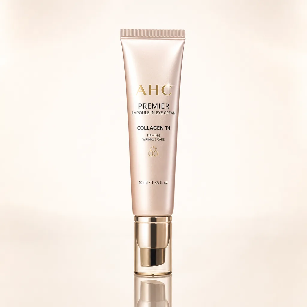
화장품 반사 강조 누끼
화장품 한 점 → 병·튜브 반사·하이라이트 강조.
화장품 반사 강조 누끼 summary
Copy this ChatGPT image prompt to create Ads/Posters results. Its subject, background, style, and composition are organized for quick iteration.
Related keywords: 화장품 반사 강조 누끼, 화장품 반사 강조 누끼 프롬프트, Ads/Posters 프롬프트, Ads/Posters AI 이미지 프롬프트, ChatGPT 이미지 프롬프트, AI 이미지 생성 프롬프트, AI 프롬프트, 이미지 프롬프트
How to use 화장품 반사 강조 누끼
Keep the prompt structure and swap the subject, background, palette, or composition to create new variations.
- Keep the main subject and adjust the palette and background for your brand, season, or channel.
- If the result feels busy, simplify the background and make the subject, composition, and lighting more specific.
- After copying, ask ChatGPT to adapt it for your platform, aspect ratio, or text requirements.
Original prompt
[Input]
- reference_image: {참고 이미지}
- language: Korean
- output_size: 1024x1024

[Purpose]
High-end cosmetic cutout i2i for premium product photography, focused on strong reflection accents, realistic material depth, and crisp label readability.
A single premium beauty product isolated as a studio hero image for e-commerce, ads, marketplace thumbnails, and luxury catalog use, with richer studio lighting behavior and a polished commercial finish.

[Composition]
- Main subject: {원본 제품} remains the exact same physical product from the reference image, occupying about 62% of the frame, centered with a slight premium product-photography tilt if present in the source.
- Product type handling: {제품 종류} determines the natural silhouette, scale, standing angle, cap/bottle/tube/palette proportions, and how the material catches light; no redesign, no shape correction, and no added accessories attached to the product.
- Background treatment: {배경} as a seamless luxury studio backdrop with a soft tonal gradient, subtle reflective floor contact, and realistic large softbox reflections that support clean cutout use while still feeling like a real product shoot.
- Framing and ratio: compose for {비율}, keeping the product visually dominant with balanced commercial spacing around the silhouette and enough room for marketplace cropping.
- Studio realism: include a faint glossy acrylic or lacquered surface reflection directly below the product, realistic contact shadow, controlled edge glow, and soft falloff that make the product feel physically present.
- Maintain the original label, printed text, logo placement, color balance, material finish, and surface texture as seen in the reference.

[3. CORE STRUCTURE]
- Hero product area (center 62%): {원본 제품} isolated cleanly with precise edge separation, preserving the exact silhouette, label geometry, cap shape, bottle curvature, tube seams, pump/nozzle details, jar rim, compact hinge, or palette structure from the reference.
- Reflection control layer: add studio specular highlights guided by {라이팅}, with a clean sheen on curved surfaces, softbox strip reflections on glossy caps, and controlled mirror-like reflections on glass, foil, acrylic, or polished plastic parts only.
- Highlight detail layer: apply {하이라이트 결} as a narrow rim highlight, fine glossy streaks, and small realistic sparkle points concentrated on product edges, metallic accents, transparent zones, and high-gloss areas without overexposure.
- Surface/background layer: render {배경} as a smooth premium cosmetic studio set with gentle gradient depth, subtle floor reflectivity, soft shadow pooling under the base, and physically plausible bounce light.
- Label readability layer: keep printed packaging text sharp and aligned; preserve micro text, volume marks, product claims, batch-style markings, foil stamping, embossing, translucent labels, and ink density exactly as they appear in the reference.
- Optical fidelity layer: use {카메라} look to keep label text, metallic foil, transparent liquid, glass refraction, plastic translucency, cap seams, molded edges, and surface imperfections sharp and realistic.
- Final preservation pass: ensure the exact product identity from {원본 제품} is unchanged, with no invented packaging details, no style reinterpretation, and no change to branding or packaging proportions.

[4. STYLE RULES]
- Typography: do not add separate promotional typography outside the product; preserve any existing printed packaging text exactly as-is, with no font substitution or re-typesetting.
- Color palette: use {배경} as the base, plus natural product tones from the reference; keep whites clean, beige warm-neutral, metallics accurate, glass/clear plastic believable, and reflections physically plausible.
- Border/shadow: subtle soft drop shadow 3px y-offset, 10px blur, 12% opacity, plus a faint natural reflected base contact; shadow should sit directly under the object and fade outward smoothly.
- Finish rules: keep edges crisp, gloss controlled, and label surfaces readable; do not apply beauty retouching that changes product color or material.
- Commercial detailing: allow realistic studio cues such as softbox bands, gradient glow, tiny surface reflection, controlled rim separation, and natural microscopic packaging texture that enhance premium realism without altering the product.

[5. VISUAL STYLE]
- Camera / lens: Phase One digital medium format look, 120mm macro at f/8, high-detail product reproduction with flat distortion and clean reflection separation.
- Lighting: studio 3-light setup with key from upper-left at 45°, gentle fill from right, and a restrained overhead hair light to emphasize bottle sheen, cap contours, tube reflections, glass edges, and foil highlights.
- Color grade: neutral luxury product grade with warm white, soft beige, and precise surface speculars; keep saturation faithful to the reference and avoid stylized tint shifts.
- Rendering quality: high-resolution cosmetic catalog finish, crisp cutout-ready silhouette, realistic refraction and reflection behavior, smooth tonal transitions, and premium editorial polish.

[6. MOOD]
Luxury beauty e-commerce product hero — clean Sephora-style catalog presentation with high-end editorial polish, realistic studio presence, luminous reflective accents, and precise premium packaging detail.

[7. CRITICAL]
- Korean text accuracy: preserve every existing printed Korean string exactly as it appears in the reference image, including any labels, warnings, volume marks, product names, ingredient snippets, claims, and brand text.
- Exact product fidelity: replicate the reference product exactly — shape, proportion, texture, color, label, logo, branding, cap form, surface finish, and all printed text must remain unchanged.
- Only the background, lighting, reflection behavior, contact shadow, and studio surface treatment may change; do not redesign, beautify, reinterpret, or invent any product detail.
- If the reference contains reflective surfaces, glass, foil, metallic ink, transparent liquid, pump components, molded plastic, or translucent labels, keep the material behavior physically correct and consistent with the original object.
- Ensure the result remains usable as a product cutout image: clear silhouette, readable front label, realistic base contact, and no visual elements that appear attached to or replacing the original packaging.

[8. 🚫 PROHIBITED]
- Fake official seals / certifications
- Broken Korean characters
- Celebrity composites or unauthorized likeness