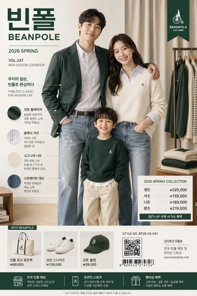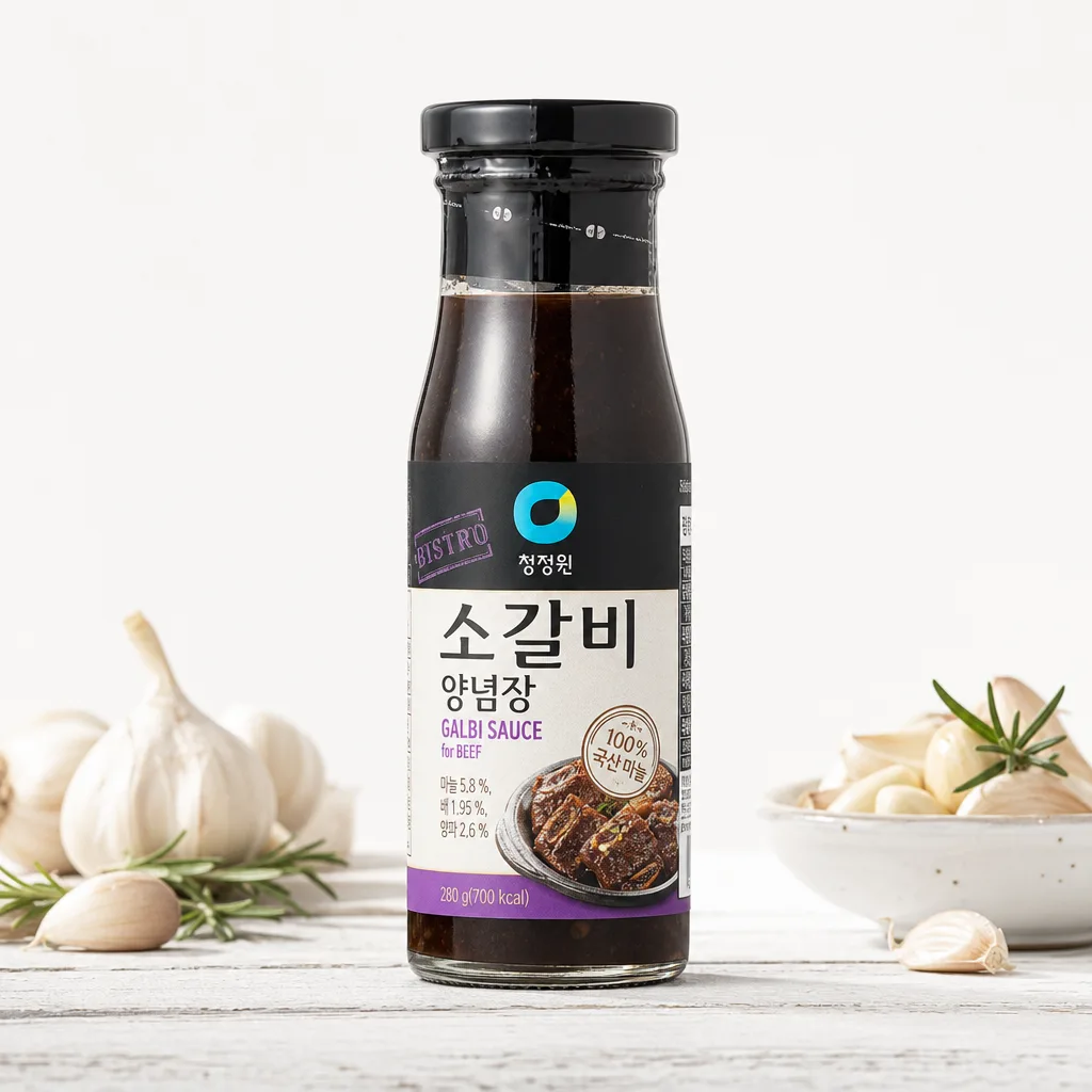
廣告/海報
식품·음료 라벨 정면 누끼
식품·음료 패키지 → 라벨 정면 깨끗 + 광고 결.
식품·음료 라벨 정면 누끼摘要
這是用來製作廣告/海報內容的 ChatGPT 圖像提示詞,已整理主題、背景、風格與構圖,方便快速調整。
相關關鍵字: 식품·음료 라벨 정면 누끼, 식품·음료 라벨 정면 누끼 프롬프트, 廣告/海報 프롬프트, 廣告/海報 AI 이미지 프롬프트, ChatGPT 이미지 프롬프트, AI 이미지 생성 프롬프트, AI 프롬프트, 이미지 프롬프트
식품·음료 라벨 정면 누끼使用方式
保留原始結構並替換主體、背景、色彩或構圖,即可延伸出不同版本。
- 保留核心主體,並依品牌、季節或平台調整色彩與背景。
- 如果畫面太複雜,請減少背景元素並具體描述主體、構圖與光線。
- 複製後可要求 ChatGPT 配合平台、長寬比或文字需求調整。
提示詞原文
[Input]
- reference_image: {참고 이미지}
- language: Korean
- output_size: 1024x1024

[Purpose]
Food and beverage cutout-style front label product shot for crisp e-commerce, menu, and delivery-app use. Create a high-end studio re-photograph of the exact same {제품 종류}, preserving the original label and packaging with precise readability while enriching the scene with realistic commercial food-photography detail.

[Composition]
- The original product {원본 제품} is the hero subject, occupying about 70% of the frame height, centered with a straight front-facing orientation and a natural product-photography stance.
- Keep the product silhouette, proportions, texture, color, label placement, logo, and all printed text exactly as in the reference; only replace the original environment with a professional studio setup.
- Background treatment: {배경} rendered as a realistic studio surface, such as seamless white sweep, pale ceramic tile, light stone, or subtle wood tabletop depending on the product category.
- Composition should feel like a premium Korean retail catalog shot: centered packshot clarity with enough surrounding tabletop context to make the product look real and photographed, not computer-flat.
- Optional accent detail: {소품 옵션} may appear as category-appropriate styling, such as fresh ingredients, ice cubes, a small glass, condensation droplets, a spoon, citrus slices, coffee beans, grains, herbs, or a folded napkin, placed around the base or side without covering the label.
- Maintain {비율} framing and a square 1024x1024 commercial product-image feel.

[3. CORE STRUCTURE]
- Hero product area (center 70%): {원본 제품} rendered as a precise cutout-quality product subject with clean edges, matching the reference shape and material finish, with no redesign.
- Label focus zone: the front label is fully visible, flat to camera, sharp enough to read every character; no perspective skew, warping, glare, or reflection that distorts Korean text.
- Background layer: realistic {배경} studio surface with a soft contact shadow, faint bounce light, and subtle material texture that supports the product without competing with the label.
- Accent layer: {소품 옵션} arranged naturally as small supporting food-and-beverage cues near the base or lateral edges, adding freshness, scale, and appetite appeal while keeping the product silhouette and printed text unobstructed.
- Material realism: glass bottles should show controlled highlights, transparency, rim reflections, and possible condensation; cans should show metallic curvature and specular bands; paper cartons and pouches should show folds, seams, matte fibers, and edge thickness; plastic bottles should show molded ridges and glossy refraction.
- Lighting pass: {라이팅} with studio-grade highlight control so the brand mark and label edges remain clear, with controlled reflections on glass or glossy packaging and a believable grounding shadow.

[4. STYLE RULES]
- Typography: do not add new typography to the product; preserve the original printed label typography exactly as seen on the reference product.
- Color palette: use clean whites #FFFFFF / #F7F7F7, soft neutral gray #D9D9D9 for shadow, natural tabletop neutrals, and the product’s original packaging colors unchanged.
- Border/shadow: very soft realistic contact shadow, approximately 4px y-offset, 12px blur, 12–15% opacity, with additional faint ambient occlusion directly under the product for a real studio-photographed look.
- Styling should feel premium, appetizing, and commercially polished, similar to Korean café menu photography or high-end grocery delivery thumbnails.
- Any supporting prop, texture, or surface must reinforce the {제품 종류} category and must not imply a different flavor, product line, size, or brand variation.

[5. VISUAL STYLE]
- Camera / lens: Hasselblad medium format, 80mm f/8, straight-on packshot framing with minimal distortion; apply {카메라} only as a shooting-direction cue while retaining the concrete medium-format product-photography look.
- Lighting: {라이팅}; top key light with left-side fill, crisp label reveal, controlled speculars, studio-white environment, short soft shadow, and subtle bounce reflections from the tabletop.
- Color grade: neutral commercial product grade, clean whites and true-to-reference packaging tones, no warm tint or cinematic cast.
- Focus: label and front packaging tack-sharp from edge to edge, with only very gentle depth falloff on side props if present.
- Texture rendering: preserve realistic micro-textures such as paper grain, plastic seams, foil crinkles, condensation beads, embossed caps, printed ink edges, and transparent glass thickness where they exist in the reference.

[6. MOOD]
Premium Korean food-and-beverage studio product catalog shot with a realistic retail-packaging / high-end e-commerce aesthetic. The image should feel clean, fresh, appetizing, and professionally photographed, like a polished product listing for a grocery app, café menu, or brand store.

[7. CRITICAL]
- Korean text accuracy: preserve every printed Korean string exactly as it appears in the reference image; do not invent, translate, correct, summarize, or replace any label text.
- Product fidelity: replicate the EXACT product from the reference image — preserve its precise shape, proportion, texture, color, label, logo, branding, barcode if visible, nutrition facts if visible, and any printed text.
- Replace only the background, lighting, surface, shadow, and optional surrounding styling with a professional product photography setup.
- Do NOT redesign, beautify, recolor, rebrand, resize, relabel, or invent any part of the product.
- The product must remain front-facing, centered, and fully legible, with the label as the primary visual focus.
- If props appear through {소품 옵션}, they must stay separate from the package design and must never look like added label graphics or invented packaging information.

[8. 🚫 PROHIBITED]
- Fake official seals / certifications
- Broken Korean characters