굿즈/목업
제품 라이프스타일 사용 목업
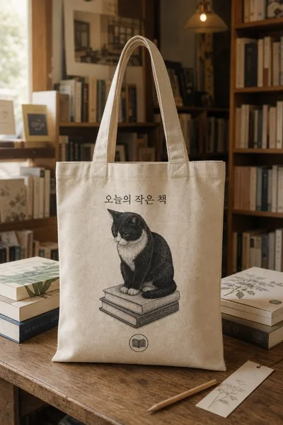
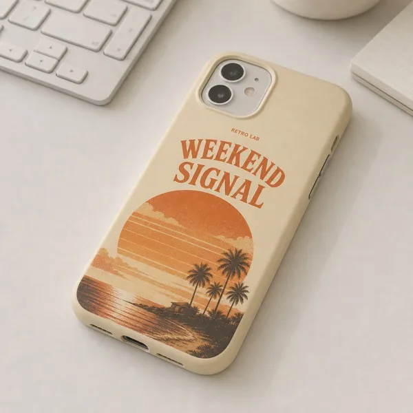
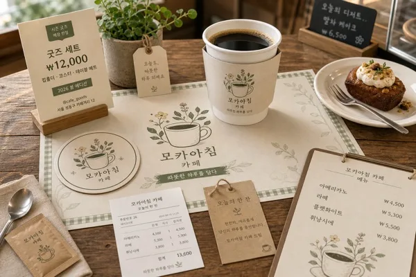
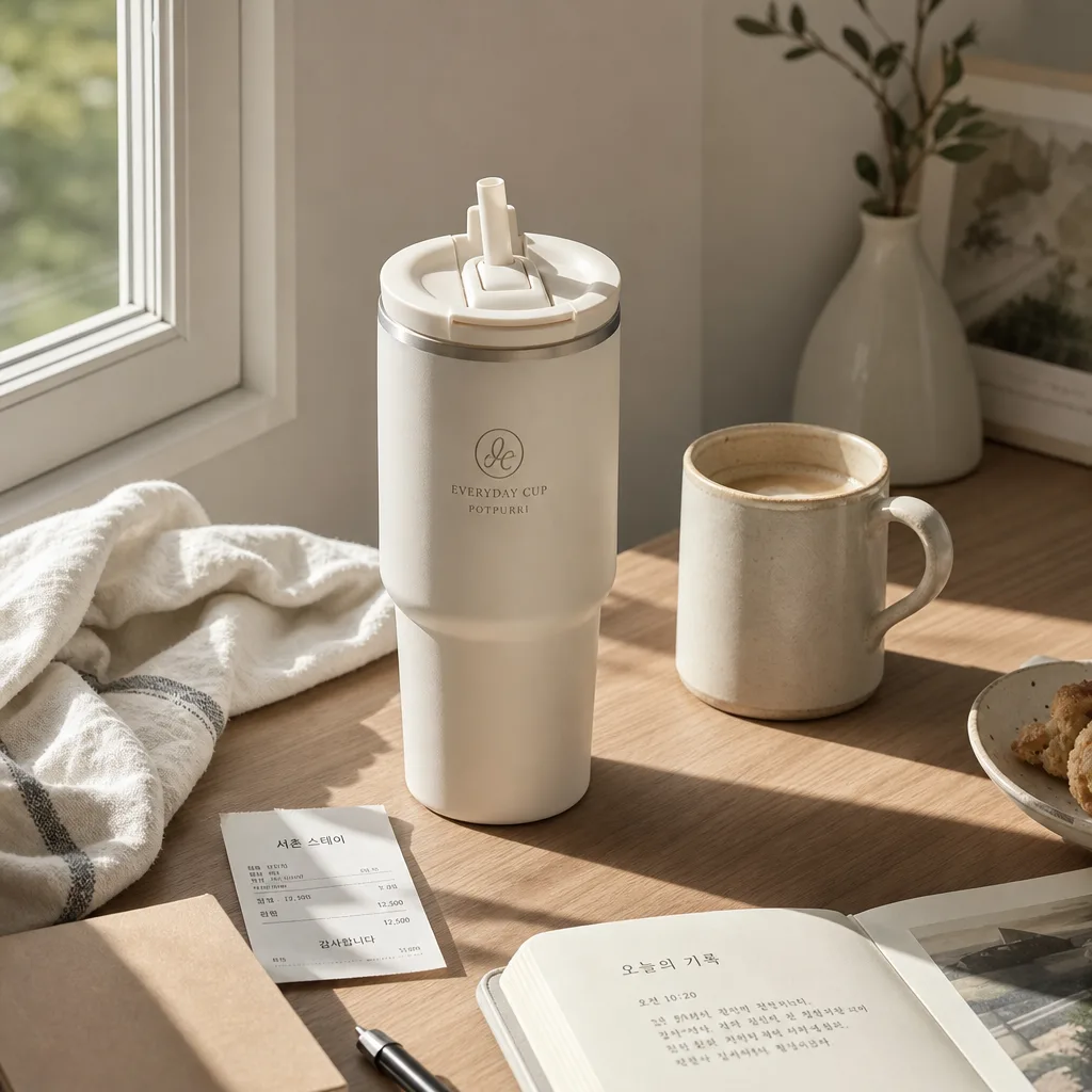
제품 + 자연스러운 라이프스타일 시연 (책상·침실·테이블).
제품 라이프스타일 사용 목업 검색 요약
제품 라이프스타일 사용 목업은 굿즈/목업 결과물을 만들 때 바로 복사해 활용할 수 있는 ChatGPT 이미지 프롬프트입니다. 주제, 배경, 스타일, 구도 조건을 함께 담아 빠르게 시안을 만들 수 있도록 구성했습니다.
관련 키워드: 제품 라이프스타일 사용 목업, 제품 라이프스타일 사용 목업 프롬프트, 굿즈/목업 프롬프트, 굿즈/목업 AI 이미지 프롬프트, ChatGPT 이미지 프롬프트, AI 이미지 생성 프롬프트, AI 프롬프트, 이미지 프롬프트
제품 라이프스타일 사용 목업 활용 포인트
원본 구조를 유지하면서 피사체, 배경, 색감, 구도를 바꿔 다양한 시안으로 확장할 수 있습니다.
- 핵심 소재는 유지하고 브랜드, 계절, 채널 목적에 맞는 색감과 배경을 바꿔보세요.
- 결과가 산만하면 배경 요소를 줄이고 피사체, 구도, 조명 조건을 구체화하세요.
- 복사한 뒤 ChatGPT에서 플랫폼, 화면 비율, 텍스트 포함 여부를 추가로 요청할 수 있습니다.
프롬프트 원문
[Input]
- reference_image: {참고 이미지}
- language: Korean
- output_size: {비율}

[Purpose]
1-2 English lines: high-end lifestyle product mockup i2i, showcasing the same product in a natural everyday scene for marketing/social use.
{비율} 포맷의 제품 라이프스타일 재촬영 이미지로, 매거진급 스타일링과 실제 사용 맥락, 자연스러운 물리적 배치를 통해 {채널 용도}에 적합한 대표 비주얼을 만든다.

[Composition]
- Main product placement: {원본 제품} occupies the hero position at the center or slightly off-center, taking about 40–55% of the frame, with clear silhouette separation from the surface and nearby lifestyle objects.
- Scene setting: {목업 장면} with lived-in location details from {장면 디테일}, using realistic materials such as matte wood grain, woven linen, ceramic tile, brushed metal, stone countertop, painted wall panel, or softly wrinkled bedding.
- Background treatment: {배경 무드} using soft daylight, subtle depth separation, visible surface tactility, and a believable everyday environment that supports the product story.
- Prop arrangement: {소품 톤} and {실사용 소품} arranged as if the product is genuinely being used, with layered heights, contact shadows, partial overlaps, and practical placement that does not cover the product label or key silhouette.
- Camera framing: {구도} with balanced asymmetry, product faces the viewer at a readable angle, edges remain comfortable inside the {비율} crop, and the surrounding objects help guide attention back to the hero product.
- Context cue: include a small lifestyle cue such as {현장 텍스트} on a note, receipt, bookmark, coaster, calendar card, pouch tag, or phone screen near the product, never printed onto the product itself.

[3. CORE STRUCTURE]
1) Hero zone: {원본 제품} is placed first and kept visually dominant, with the exact product shape, proportions, texture, surface finish, label, logo, branding, and any printed text preserved from the reference image.
2) Surface zone: build the scene on a location-appropriate surface for {목업 장면}, such as lightly textured oak, linen cloth, stone countertop, bathroom shelf laminate, cafe marble, or ceramic tray, with realistic contact shadows and small material imperfections.
3) Support props: add practical objects matching {실사용 소품}, such as a used notebook, laptop corner, folded towel, coffee cup with crema, spoon, candle, magazine page, linen napkin, skincare spatula, small tray, dried flower stem, receipt, or phone, positioned to tell a real-use story.
4) Environmental details: include subtle cues from {장면 디테일} and {계절감}, such as window-frame shadow, morning condensation on glass, fabric folds, ceramic speckles, handwritten memo, tiny crumbs, water droplets, opened book edge, or a soft reflection on polished stone.
5) Light behavior: use directional natural light that shapes the object cleanly, with soft falloff, gentle highlight rolloff, and realistic reflections appropriate to the product material.
6) Depth and spacing: create layered foreground, hero, and background zones so the image feels photographed in a real room; allow some props to be partially cropped at the edge for candid editorial realism while keeping the product fully readable.
7) Integration rule: the product must look physically placed in the scene, not pasted in; retain realistic shadows, reflections, occlusion, scale consistency, and edge softness consistent with the surface and lighting.

[4. STYLE RULES]
- Typography: no added typography on the product itself; if scene text appears on props, render it in clean Korean using Pretendard or Noto Sans KR Medium, small but readable, such as “오늘의 기록”, “오전 10:20”, “서촌 스튜디오”, “주말 루틴”, or {현장 텍스트}.
- Color palette: use {소품 톤} with tactile neutrals such as warm beige, mocha brown, soft cream, muted gray, clean white, pale sage, oatmeal linen, and muted charcoal, with accent colors borrowed from the original product.
- Border/shadow: subtle natural contact shadow under the product, roughly 4px y-offset, 14px blur, 12–18% opacity; avoid harsh outline or cutout halo.
- Finish: preserve original product surface detail exactly; do not smooth, repaint, re-label, or increase saturation unnaturally.
- Marketing usability: composition should work for {채널 용도}, with the product instantly recognizable at thumbnail size while still feeling like a premium lifestyle photograph.

[5. VISUAL STYLE]
- Camera / lens: {카메라}. 자연스러운 제품 사진 관점, 과한 왜곡 없이 실제 촬영된 듯한 원근감과 초점 깊이를 유지한다.
- Lighting: soft window light from upper-left at about 45°, gentle bounce fill from lower-right, with realistic ambient shadowing and mild specular control.
- Color grade: editorial warm-neutral grade with creamy whites, soft brown undertones, lightly lifted shadows, natural blacks, and a gentle magazine still-life finish.

[6. MOOD]
Indie boutique lifestyle product photo — Aesop / Kinfolk magazine spread aesthetic, practical, tactile, refined, and realistically lived-in rather than showroom-staged. {계절감}이 은은하게 느껴지도록 실내 공기감, 표면 질감, 소품의 온도를 자연스럽게 조정한다.

[7. CRITICAL]
- Korean text accuracy: any Korean text already present on the reference product must remain exact and fully legible, with no broken characters, no altered spelling, no invented words, and no warped logo or label text.
- Product fidelity: replicate the EXACT product from the reference image — preserve precise shape, proportion, texture, color, label, logo, branding, cap, lid, wrapper, paper grain, glass reflection, embossed mark, and any printed text.
- Scene-only change: replace ONLY the background, surface, props, and lighting; do not redesign, beautify, repackage, recolor, or invent any part of the product.
- Rendered scene text may appear only on separate props, for example “오늘의 기록”, “오전 10:20”, “서촌 스튜디오”, “주말 루틴”, “₩7,500”, “감사합니다”, or {현장 텍스트}; all Hangul must be clean, correctly spaced, and readable.
- Physical realism: all objects must cast believable shadows, sit naturally on the surface, match the same light direction, and maintain accurate scale relative to the hero product.

[8. 🚫 PROHIBITED]
- Fake official seals / certifications / award badges
- Broken Korean characters or unreadable Hangul
- Celebrity composites or unauthorized face swaps
- Fabricated safety, legal, medical, or government compliance marks