Ads/Posters
마켓 메인 컷 풀세트
본인 제품 → 쿠팡·네이버·아마존 메인 + 추가 4컷 시트.
마켓 메인 컷 풀세트 summary
Copy this ChatGPT image prompt to create Ads/Posters results. Its subject, background, style, and composition are organized for quick iteration.
Related keywords: 마켓 메인 컷 풀세트, 마켓 메인 컷 풀세트 프롬프트, Ads/Posters 프롬프트, Ads/Posters AI 이미지 프롬프트, ChatGPT 이미지 프롬프트, AI 이미지 생성 프롬프트, AI 프롬프트, 이미지 프롬프트
How to use 마켓 메인 컷 풀세트
Keep the prompt structure and swap the subject, background, palette, or composition to create new variations.
- Keep the main subject and adjust the palette and background for your brand, season, or channel.
- If the result feels busy, simplify the background and make the subject, composition, and lighting more specific.
- After copying, ask ChatGPT to adapt it for your platform, aspect ratio, or text requirements.
Original prompt
[Input]
- reference_image: {참고 이미지}
- language: Korean
- output_size: 1536x1024

[Purpose]
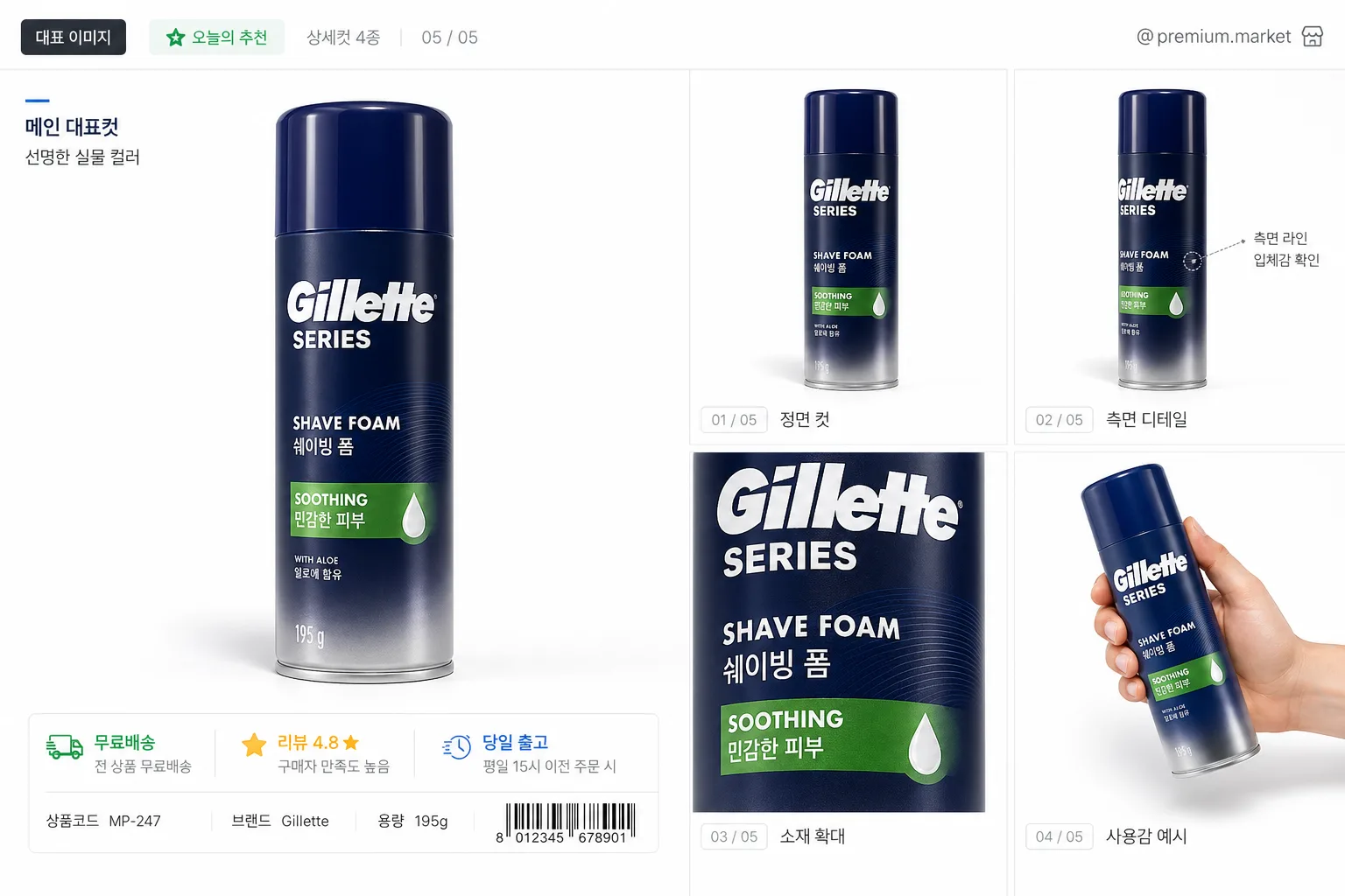
Create a high-end marketplace main image for product listing use, combining one large hero product view and a 4-cut detail grid in a polished commercial studio style.
Designed to feel like a premium e-commerce product sheet for Coupang, Naver Smart Store, or Amazon-style marketplace presentation, with realistic marketplace UI labels, short Korean feature captions, panel tags, and product-detail information that make the image feel ready for an actual online listing.

[Composition]
- Single product hero placement: the main product occupies the left 55–60% of the frame, while the right side is divided into a 2x2 grid of four smaller supporting views.
- Background treatment: bright white studio base #FFFFFF with subtle real contact shadows, faint paper-like tonal variation, and lightly separated panel areas so the product sheet feels photographed and designed rather than sterile.
- Add a marketplace-style header strip near the top with small Korean UI text such as “대표 이미지”, “오늘의 추천”, “상세컷 4종”, and a small store-style handle like “@premium.market”. Keep this text secondary and do not cover the product.
- Add short panel captions in Korean under or beside each supporting view: “정면 컷”, “측면 디테일”, “소재 확대”, “사용감 예시”. Include tiny page/thumbnail indicators such as “01 / 05”, “02 / 05”, “03 / 05”, “04 / 05”, “05 / 05”.
- Include a compact marketplace information block in the lower-left or lower-center margin area with realistic Korean listing microcopy: “무료배송”, “리뷰 4.8 ★”, “당일 출고”, “상품코드 MP-247”, and a small barcode-like SKU area rendered as decorative listing metadata, not as an official certification.
- Framing direction: all five views stay aligned to the same visual axis so the product reads as one coherent series while still showing useful selling angles and detail information.
- Use {원본 제품} as the exact source product, preserving its real shape, proportions, texture, label, logo, branding, and printed text.
- Use {마켓 결} to determine the marketplace-oriented crop logic, browsing rhythm, caption hierarchy, and listing-ready presentation.
- Use {레이아웃} to place the hero and the four supporting panels with clear visual separation, consistent panel rhythm, and realistic commercial spacing.
- Use {배경} as the consistent base surface for all panels, allowing subtle studio surface realism and gentle panel tinting while keeping the product color accurate.
- Use {라이팅} so the hero and all four supporting views share the same lighting direction, shadow softness, highlight behavior, and exposure.
- Use {카메라} for the entire series so the product surface detail remains crisp, sharp, and commercial.
- Use {비율} as the final canvas structure and panel distribution guide.

[3. CORE STRUCTURE]
1. Hero area (left 55–60%): render {원본 제품} as the largest cutout, centered vertically, with a realistic studio contact shadow beneath and slightly behind it, keeping the original label, logo, material, finish, and surface details exactly intact. Add a small title-card label nearby in Korean, such as “메인 대표컷” and “선명한 실물 컬러”, sized like marketplace UI text.
2. Top-right panel: show a clean front or primary-angle view of {원본 제품}, cropped tighter than the hero, aligned to the same white background and shadow logic. Add a compact caption: “정면 컷 · 01”.
3. Middle-right panel: show a side-angle or secondary-angle view that reveals depth, thickness, or profile without changing the product’s actual geometry. Add a small callout line or dot marker pointing to a real existing edge, cap, seam, label area, or texture feature, with Korean text like “측면 라인” or “입체감 확인”.
4. Bottom-right left panel: show a sharp macro detail crop of the most important printed area, texture, cap, seam, material feature, or finish. Keep focus crisp and distortion minimal. Add a small caption: “디테일 확대” and a realistic zoom indicator such as “x2.5”.
5. Bottom-right right panel: show a usage or scale/context-safe view of {원본 제품} that still preserves the product exactly. It may include a subtle hand interaction, tabletop placement, soft fabric shadow, or simple lifestyle surface if appropriate to {마켓 결}, but the product must remain the clear subject and must not be redesigned.
6. Add thin neutral-gray divider lines, tiny thumbnail index boxes, and marketplace-style micro badges around the panels, using Korean text such as “BEST”, “빠른배송”, “재구매 많은 상품”, and “상세정보 확인”. These should look like practical e-commerce interface elements, not decorative official seals.
7. Series consistency: every panel must match in exposure, shadow softness, edge quality, color accuracy, and material rendering so the set feels like one professional product shoot prepared for a real marketplace listing.

[4. STYLE RULES]
- Typography: if any UI text is present, use Pretendard SemiBold for headers and Pretendard Regular for secondary text, sized like marketplace title cards, thumbnail labels, SKU metadata, and product listing badges rather than editorial poster typography.
- Korean text to render accurately in the image may include: “대표 이미지”, “정면 컷”, “측면 디테일”, “소재 확대”, “사용감 예시”, “무료배송”, “오늘 출고”, “리뷰 4.8 ★”, “상품코드 MP-247”, “01 / 05”.
- Color palette: pure white #FFFFFF, neutral gray #D9D9D9, soft shadow gray #B8B8B8, black #111111; use restrained marketplace accent colors such as blue #2F6BFF or green #03C75A only for small UI badges and keep all tones product-accurate.
- Border/shadow: subtle soft drop shadow with 4px y-offset, 14px blur, 12–18% opacity; use fine neutral-gray panel dividers, light card shadows, and small UI tag backgrounds to create realistic e-commerce structure without overpowering the product.
- Keep the visual hierarchy clear: hero product first, four detail panels second, marketplace metadata third.

[5. VISUAL STYLE]
- Camera / lens: Phase One XF IQ4 with 120mm macro at f/8 for the hero, matching detail clarity across the 4-cut grid.
- Lighting: high-key studio setup with large softbox from upper-left at 45°, very gentle fill from right, controlled realistic contact shadow, clean reflective highlights where the material naturally supports them.
- Color grade: clean neutral commercial grade with white-balanced highlights, true-to-life product color, accurate label reproduction, and no saturation push.
- Rendering quality: premium e-commerce product photography with crisp edges, natural material microtexture, readable product print, subtle surface reflections, and realistic compression-free detail suitable for a 1536x1024 marketplace main image.

[6. MOOD]
Premium marketplace product sheet — clean studio catalog aesthetic with the precision of an Aesop-style object photo and the clarity of a top-tier e-commerce listing, enriched with realistic Korean shopping UI details, useful angle captions, and practical product-information cues.

[7. CRITICAL]
- Korean text accuracy: render all Korean UI labels cleanly and legibly, especially “대표 이미지”, “정면 컷”, “측면 디테일”, “소재 확대”, “사용감 예시”, “무료배송”, “오늘 출고”, “리뷰 4.8 ★”, and “상품코드 MP-247”.
- Preserve the exact product from {원본 제품}: shape, proportion, texture, color, label, logo, branding, and all printed text must remain unchanged.
- All 5 views must be the same product family and the same original item; do not mix variants or invent alternate packaging.
- Maintain identical lighting logic, shadow behavior, white balance, and material response across all panels.
- Any added UI badges, barcode-like SKU marks, captions, callout dots, or thumbnail indicators must look like marketplace presentation graphics and must not imply official certification.

[8. 🚫 PROHIBITED]
- Fake official seals / certifications
- Broken Korean characters