広告・ポスター
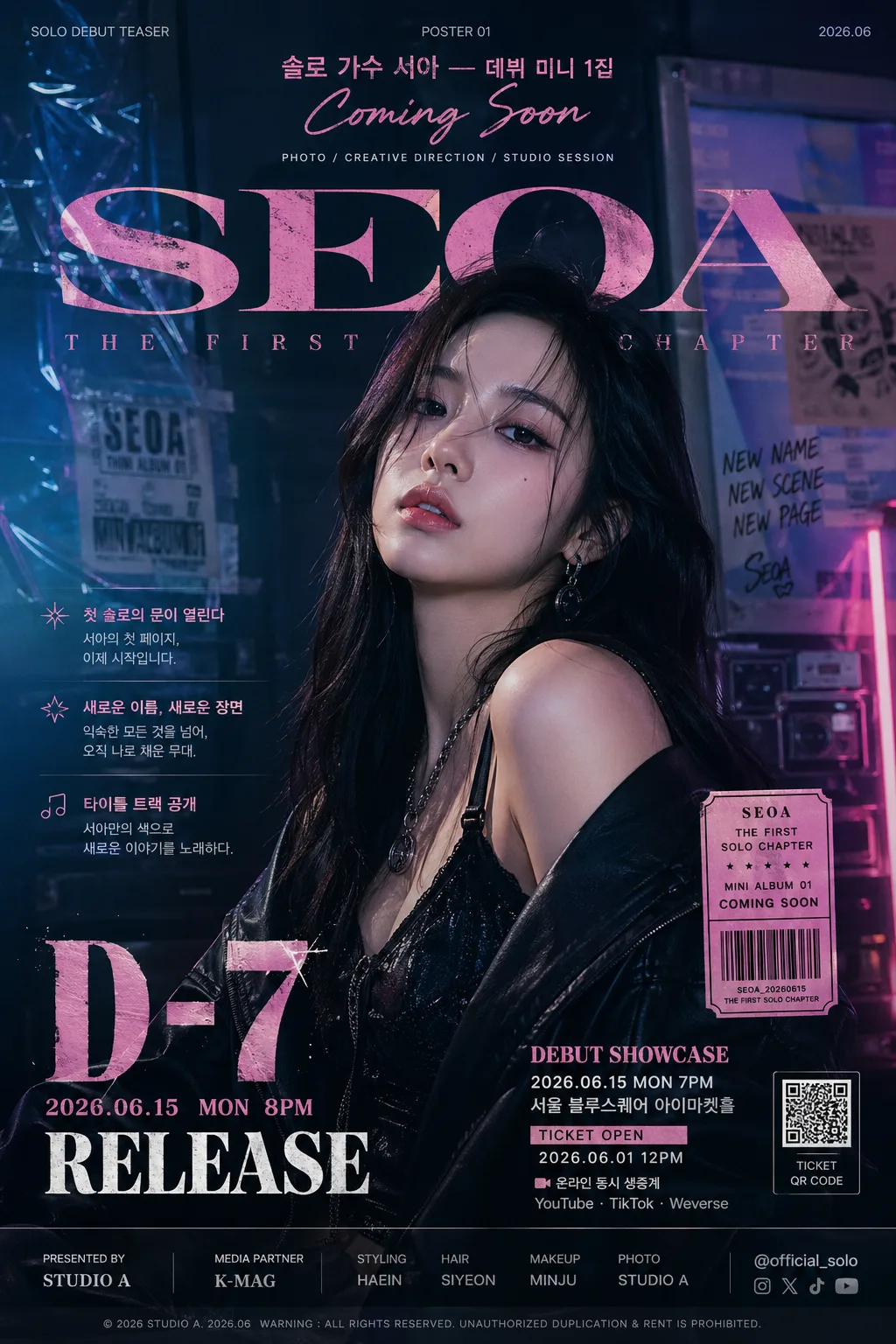
K-pop 솔로 데뷔 티저 포스터
솔로 데뷔 티저 — 단독 hero + 카운트다운.
K-pop 솔로 데뷔 티저 포스터の概要
広告・ポスター画像を作るためのChatGPT画像プロンプトです。主題、背景、スタイル、構図を整理し、すぐに試せるよう構成しています。
関連キーワード: K-pop 솔로 데뷔 티저 포스터, K-pop 솔로 데뷔 티저 포스터 프롬프트, 広告・ポスター 프롬프트, 広告・ポスター AI 이미지 프롬프트, ChatGPT 이미지 프롬프트, AI 이미지 생성 프롬프트, AI 프롬프트, 이미지 프롬프트
K-pop 솔로 데뷔 티저 포스터の活用方法
元の構造を保ちながら、被写体、背景、色、構図を変更して別案に展開できます。
- 主題を維持し、ブランドや季節、媒体に合わせて色と背景を変更してください。
- 結果が複雑な場合は背景要素を減らし、被写体、構図、照明を具体化してください。
- コピー後、ChatGPTに媒体、アスペクト比、文字の有無を追加で指定できます。
プロンプト原文
[Input]
- language: Korean
- output_size: 1024x1536
- aspect_ratio: {비율}

[Purpose]
K-pop solo debut teaser poster, vertical A4-style promotional key visual for a first solo release announcement.
Fashion-forward idol teaser designed for social sharing, music-platform reveal posts, street-poster realism, and fan repost culture, with strong title hierarchy, countdown emphasis, and credible event-poster details.

[Composition]
- Subject placement: {hero 컷} should occupy the central 55–65% of the frame, with the upper 18% reserved for headline typography and the lower 14% reserved for the countdown and release block.
- Background treatment: build a layered concept set that matches {컨셉}, using visible surfaces such as painted studio wall, reflective floor, fabric sweep, chrome panel, paper-poster wall, light leaks, concert-ticket scraps, lyric-sheet fragments, or subtle stage equipment silhouettes that support the idol debut atmosphere.
- Framing direction: poster should feel like a premium single-artist teaser sheet photographed for a real agency campaign, with the face or full body rendered as the clear hero and the surrounding typography, ticket labels, microcredits, and graphic marks locked to a strong vertical grid.
- Visual balance: keep {아티스트·데뷔} as the emotional anchor, while {타이포}, {카운트다운}, release information, showcase details, and supporting Korean blurbs create a stacked magazine-cover-meets-concert-poster hierarchy.
- Real poster details: include a small barcode or QR-style ticket block, issue-like label such as “TEASER POSTER 01”, date/time/venue line, ticket-open notice, sponsor/presenter strip, tiny copyright/production credit, and 2–3 short Korean feature blurbs related to the solo debut.

[3. CORE STRUCTURE]
1. Top header zone (upper 18%): place the artist/debut line {아티스트·데뷔} as the primary identity statement, centered or slightly above center, with strong spacing. Add small supporting labels such as “SOLO DEBUT TEASER”, “POSTER 01”, “2026.06”, and a tiny credit line like “PHOTO / CREATIVE DIRECTION / STUDIO SESSION”.
2. Hero zone (mid 55–65%): render {hero 컷} as the dominant visual, with polished studio presentation, crisp silhouette separation, expressive pose, detailed wardrobe texture, stage-ready hair and makeup, and tangible set elements that match the chosen concept tone.
3. Typography zone: set {타이포} in a bold, high-contrast style that feels like a debut announcement, with English name emphasis and compact layout. Add 2–3 short Korean promo blurbs around the hero, for example “첫 솔로의 문이 열린다”, “새로운 이름, 새로운 장면”, “타이틀 트랙 공개”, keeping them readable and secondary to the main title.
4. Countdown zone (lower 14%): display {카운트다운} as the most readable secondary callout, using oversized numerals or release-date treatment with strong contrast. Include realistic release information such as “2026.06.15 MON 8PM”, “D-7”, “RELEASE”, or “COMING SOON”.
5. Event and ticket block: below or beside the countdown, add compact poster information such as “DEBUT SHOWCASE”, “서울 블루스퀘어 아이마켓홀”, “TICKET OPEN 2026.06.01 12PM”, “온라인 동시 생중계”, and a small barcode/QR-style rectangle for ticketing realism.
6. Sponsor and credit strip: near the bottom edge, add a believable presenter/sponsor area with small text like “Presented by STUDIO A”, “Media Partner K-MAG”, “Styling / Hair / Makeup / Photo”, and a tiny handle such as “@official_solo”, designed as microtypography rather than a major focal point.
7. Concept integration: reinforce {컨셉} through pose, wardrobe texture, set materials, props, lighting color, graphic overlays, and finishing details, so the image reads as one coherent debut campaign rather than a generic portrait.
8. Palette application: apply {컬러 팔레트} to the background, accent glow, poster markings, text color, shadows, small stickers, and ticket-block graphics, keeping the palette disciplined and consistent across all layout elements.

[4. STYLE RULES]
- Typography: use Pretendard ExtraBold for modern Korean text, Noto Sans KR Bold for supporting labels, and a condensed Latin sans such as Bebas Neue or Anton for the name/countdown treatment; title size should be poster-large, with tight leading and controlled letter spacing.
- Korean text rendering: all Korean headline, date, venue, and ticket text must be crisp, correctly spaced, and printed like real poster typography, not decorative gibberish.
- Color palette: derive the entire layout from {컬러 팔레트}; if the concept is dark, bias toward charcoal, deep navy, black, and metallic gold accents; if neon, bias toward electric pink, cyan, violet, and graphite; if vintage, bias toward cream, sepia, muted burgundy, and warm brass.
- Poster graphic elements: use layered rectangular labels, diagonal accent bars, small starbursts, transparent tape marks, holographic sticker-like shapes, cropped lyric snippets, thin divider rules, date stamps, and production microtext to make the poster feel physically designed and campaign-ready.
- Border/shadow: use either a full-bleed poster edge or a very thin hairline border; add a soft drop shadow only if needed, about 4px y-offset, 12px blur, 15% opacity, to separate the hero from the background. Subtle paper grain, print texture, and edge wear are welcome if they suit {컨셉}.

[5. VISUAL STYLE]
- Camera / lens: fashion-editorial studio look shot on a Hasselblad X2D 100C with an 85mm lens at f/2.8 for a portrait hero, or a 50mm lens at f/4 for a more graphic full-body teaser composition.
- Lighting: use controlled studio lighting with a key light from upper-left at roughly 45°, a subtle rim light from the opposite side for edge separation, and a gentle fill to preserve facial detail, costume texture, metallic accents, and printed poster elements.
- Color grade: finish with a cinematic editorial grade aligned to {컨셉}; use deep blacks and metallic highlights for dark luxury, soft warm neutrals for elegant vintage, saturated neon accents for cyber style, or muted cream-and-rose tones for warm magazine styling.
- Material realism: include realistic fabric sheen, skin detail, hair texture, jewelry reflections, printed-paper grain, soft floor reflection, and small light falloff so the image feels photographed and professionally composited rather than flat.

[6. MOOD]
Premium K-pop debut teaser — fashion magazine cover meets concert announcement poster, with the polished intensity of a Vogue Korea campaign visual and the excitement of a real agency countdown drop.

[7. CRITICAL]
- Korean text accuracy: 반드시 정확히 보여야 하는 문구: "솔로 가수 ○○ — 데뷔 미니 1집 / Coming Soon", "D-7 또는 2026.06.15 RELEASE", "한글·영문 정확".
- Required placeholder integration: {아티스트·데뷔}, {hero 컷}, {타이포}, {카운트다운}, {컨셉}, {컬러 팔레트}, and {비율} must remain visually reflected in the final poster concept.
- Additional small poster text may include: "DEBUT SHOWCASE", "2026.06.15 MON 8PM", "서울 블루스퀘어 아이마켓홀", "TICKET OPEN 2026.06.01 12PM", "온라인 동시 생중계", "@official_solo", "TEASER POSTER 01".
- Layout invariants: the hero must remain the single dominant focus, the countdown must be clearly legible, and the overall composition must feel like a legitimate idol solo debut teaser poster with real campaign typography, ticket details, credits, and balanced graphic density.
- Text handling: preserve the intended English/Korean mix cleanly; avoid garbling, mirrored letters, broken spacing, or unreadable microtype in headline, countdown, venue, ticket, and credit treatments.

[8. 🚫 PROHIBITED]
- Fake official seals / certifications
- Broken Korean characters
- Unauthorized celebrity likeness composites or face-swapped real idols