興趣/生活
한국 명소 에디토리얼 풍경 사진
한국 지역별 명소 풍경 에디토리얼. 제주/부산/경주 등 자유 입력. 여행 매거진·블로그 헤더용.
한국 명소 에디토리얼 풍경 사진摘要
這是用來製作興趣/生活內容的 ChatGPT 圖像提示詞,已整理主題、背景、風格與構圖,方便快速調整。
相關關鍵字: 한국 명소 에디토리얼 풍경 사진, 한국 명소 에디토리얼 풍경 사진 프롬프트, 興趣/生活 프롬프트, 興趣/生活 AI 이미지 프롬프트, ChatGPT 이미지 프롬프트, AI 이미지 생성 프롬프트, AI 프롬프트, 이미지 프롬프트
한국 명소 에디토리얼 풍경 사진使用方式
保留原始結構並替換主體、背景、色彩或構圖,即可延伸出不同版本。
- 保留核心主體,並依品牌、季節或平台調整色彩與背景。
- 如果畫面太複雜,請減少背景元素並具體描述主體、構圖與光線。
- 複製後可要求 ChatGPT 配合平台、長寬比或文字需求調整。
提示詞原文
[Input]
- language: Korean
- output_size: 1024x1536

[Purpose]
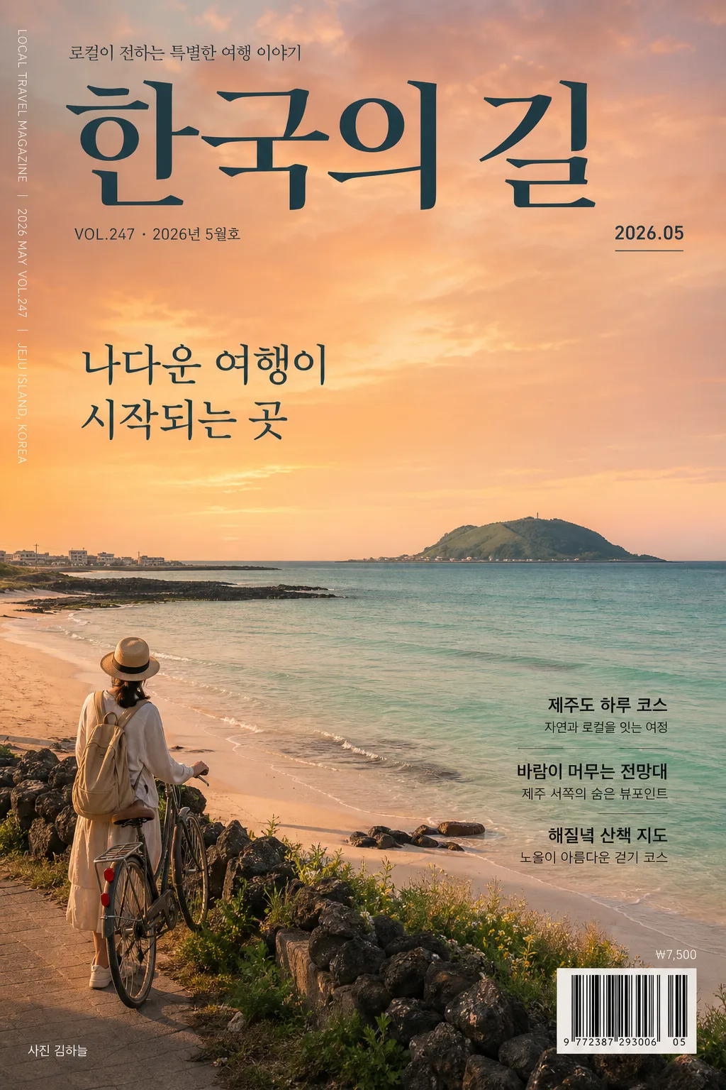
Korean travel magazine editorial landscape photograph, portrait-oriented scenic cover feature for social media and print-style editorial use.
Showcase a famous Korean destination with a cinematic, photo-realistic atmosphere, real magazine-cover context, and a strong sense of place.

[Composition]
- Main subject: {장소} as the clear focal point, with the strongest visual interest placed across the middle and lower thirds.
- Frame structure: {구도} with a polished vertical cover layout that allows the landmark, coastline, mountain, street, or vista to remain instantly readable.
- Background treatment: distant horizon, atmospheric depth, and natural texture in water, sand, rock, trees, street surfaces, rooftops, or sky depending on {장소}.
- Time and atmosphere: {시간대} to define the color of the sky, reflections, shadow length, and realistic local weather texture.
- Mood layer: {무드} carried through spacing, contrast, horizon placement, human scale, and the rhythm of natural details.
- Regional context: {지역} should be readable as the visual identity of the scene through architecture, coastline, terrain, vegetation, local walking paths, seasonal details, or small authentic travel cues.
- Editorial cover context: include a refined Korean travel magazine masthead and cover typography integrated over the photograph, with issue information, short feature blurbs, barcode area, and small credit text.

[3. CORE STRUCTURE]
- Hero landscape area: {장소} occupies most of the frame with a premium scenic read; keep the primary landmark, shoreline, vista, street, or natural formation sharply legible.
- Cover masthead zone: place a large Korean magazine title near the top, such as “한국의 길” or “로컬 트래블”, with small issue text “VOL.247 · 2026년 5월호” and a date label “2026.05”.
- Feature headline zone: add one strong Korean cover line over a visually calm part of the sky or darker land area: “나다운 여행이 시작되는 곳”.
- Supporting blurbs: add 2–3 short Korean editorial teasers placed along the side or lower third, such as “{지역} 하루 코스”, “바람이 머무는 전망대”, “해질녘 산책 지도”.
- Magazine details: include a small vertical spine/credit text near one edge, a discreet barcode box in the lower corner, tiny price text “₩7,500”, and photo credit “사진 김하늘”.
- Secondary detail zone: include a small human presence, backpack, camera strap, bicycle, ferry rail, café chair, trail marker, or travel object only if it fits naturally into {구도}, scaled modestly so the landscape remains dominant.
- Sky and light zone: {시간대} creates a layered sky gradient, soft edge highlights, and subtle reflective color on sea, river, terrain, glass, stone, or sand.
- Spatial depth: foreground texture, midground focal area, and distant background should be clearly separated to create a premium editorial travel-photo feel.
- Emotional tone: {무드} should come from the scale of the view, the lived-in travel details, natural weather, and gentle sunset color transition.

[4. STYLE RULES]
- Typography: Korean magazine-cover typography should feel professionally typeset and printed on top of the photograph; use crisp Hangul, high contrast, elegant hierarchy, and realistic editorial alignment.
- Korean text to render in image: “한국의 길”, “VOL.247”, “2026년 5월호”, “나다운 여행이 시작되는 곳”, “{지역} 하루 코스”, “바람이 머무는 전망대”, “해질녘 산책 지도”, “사진 김하늘”, “₩7,500”.
- Color palette: warm sunset palette with orange-pink sky, sea-glass emerald, soft sand beige, and muted slate shadows; if needed, refine with #F6D2B8, #F3E7D3, #6FC7B8, #2F4A57.
- Graphic treatment: magazine elements should sit naturally on the photograph with subtle print-like opacity, clean alignment, and realistic contrast against sky, water, stone, or shadowed terrain.
- Environmental realism: include location-appropriate textures such as rippled water, wind-shaped grass, stone steps, coastal railings, distant boats, tiled roofs, pine silhouettes, tide marks, footprints, mist, or warm window lights where appropriate to {장소}.

[5. VISUAL STYLE]
- Camera / lens: full-frame landscape shot, 24mm wide-angle lens at f/8, crisp editorial detail with deep scenic clarity.
- Lighting: golden hour sunset light from the low horizon, soft side illumination with gentle atmospheric haze and mild reflective fill from water or sand.
- Color grade: slight HDR processing with controlled highlights, warm cream + orange-pink sunset tones, and clean emerald blues kept natural rather than oversaturated.
- Material fidelity: printed cover typography, barcode, and small editorial details should appear sharp and believable while the underlying photograph remains the dominant photorealistic scene.

[6. MOOD]
Korean travel magazine editorial scenic cover — like a refined National Geographic Traveler cover story with calm Kinfolk-like pacing, but richer with authentic destination details, small travel cues, and polished Korean magazine design.

[7. CRITICAL]
- Korean text accuracy: all visible Korean text must be clean, readable Hangul with no garbled characters; prioritize these exact strings: “한국의 길”, “VOL.247”, “2026년 5월호”, “나다운 여행이 시작되는 곳”, “{지역} 하루 코스”, “사진 김하늘”.
- Composition invariant: portrait framing must preserve a wide scenic read, with the landscape remaining the dominant subject and any human/object accent staying small.
- Photorealism: water, sky, sand, stone, vegetation, architecture, and distant landforms must look physically believable with no surreal distortions.
- Editorial realism: cover lines, barcode, issue number, date label, and credit text should look like a real Korean travel magazine cover, not a blank poster mockup.

[8. 🚫 PROHIBITED]
- Broken Korean characters
- Fake official seals / certifications