YouTube・サムネイル
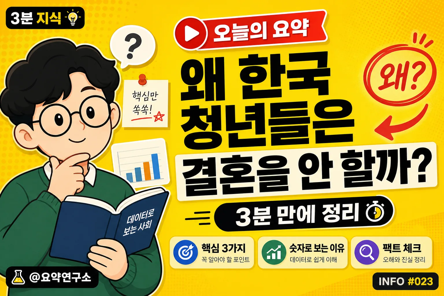
정보 요약 유튜브 썸네일
한국 정보·요약 채널. 노란 배경 + 검정 굵은 한글 + 캐릭터 일러스트. 깔끔한 인포 채널 톤.
정보 요약 유튜브 썸네일の概要
YouTube・サムネイル画像を作るためのChatGPT画像プロンプトです。主題、背景、スタイル、構図を整理し、すぐに試せるよう構成しています。
関連キーワード: 정보 요약 유튜브 썸네일, 정보 요약 유튜브 썸네일 프롬프트, YouTube・サムネイル 프롬프트, YouTube・サムネイル AI 이미지 프롬프트, ChatGPT 이미지 프롬프트, AI 이미지 생성 프롬프트, AI 프롬프트, 이미지 프롬프트
정보 요약 유튜브 썸네일の活用方法
元の構造を保ちながら、被写体、背景、色、構図を変更して別案に展開できます。
- 主題を維持し、ブランドや季節、媒体に合わせて色と背景を変更してください。
- 結果が複雑な場合は背景要素を減らし、被写体、構図、照明を具体化してください。
- コピー後、ChatGPTに媒体、アスペクト比、文字の有無を追加で指定できます。
プロンプト原文
[Input]
- language: Korean
- output_size: 1536x1024

[Purpose]
Korean YouTube thumbnail for an information-summary-educational channel, built for fast mobile readability and high click-through in a landscape layout.
Flat-vector editorial style with a lively real-channel thumbnail finish: bold Korean headline hierarchy, small channel branding cues, quick-summary labels, and curiosity-triggering visual hooks, similar in tone to 너진똑, 슈카, and 일주일에 책 한 권.

[Composition]
- Full-frame background uses {배경 색} as the dominant field, with subtle printed-paper grain, faint halftone dots, and a few soft geometric blocks to make the thumbnail feel like a finished broadcast graphic.
- Left 35% of the canvas: {캐릭터/일러스트} placed as a cropped hero illustration, large enough to be instantly recognizable, with a small desk-note motif, simple chart card, or speech bubble nearby to reinforce the information-summary theme.
- Right 65%: oversized Korean headline block aligned for maximum legibility, with compact subtitle support beneath and a high-contrast title badge above it.
- Add real thumbnail packaging details: a small channel handle label, a bold “오늘의 요약” ribbon, one arrow or circle highlight, and a small emoji/accent shape that increases click appeal without covering the main text.
- Include 2–3 short supporting blurbs around the headline area, such as “핵심 3가지”, “숫자로 보는 이유”, and “팩트 체크”, set smaller than the main title but still crisp.

[3. CORE STRUCTURE]
1. Background layer — Fill the entire canvas with {배경 색}, then overlay faint grain/noise texture, subtle halftone circles, and a few translucent rectangular panels so the flat color feels like a polished Korean YouTube explainer thumbnail.
2. Left hero zone — Place {캐릭터/일러스트} in the left 35% area, cropped dynamically at the edge if needed, with simple flat-vector shading, a soft cast shadow, and small educational props such as a floating memo card, mini bar chart, or question bubble.
3. Right headline zone — Set {메인 텍스트} as the main visual anchor in the right 65%, using very large black sans-serif type with tight line breaks, thick weight, and occasional off-white highlight backing behind key words for instant mobile readability.
4. Subtitle zone — Position {부제} near the lower portion of the text block inside a rounded pill or rectangular tag, keeping it secondary but sharp and readable on mobile.
5. Thumbnail hook layer — Add a red play-button-inspired triangle, a thick arrow, or a circled highlight pointing toward the headline; add one punchy Korean sticker label such as “왜?” or “진짜 이유”.
6. Channel micro-branding — Add a small top or bottom corner handle label reading “@요약연구소”, a tiny episode tag “INFO #023”, and a compact series label “3분 지식” to make the design feel like an authentic uploaded thumbnail.

[4. STYLE RULES]
- Typography: Pretendard ExtraBold or Noto Sans KR Black for the main headline, with subtitle in Pretendard SemiBold or Noto Sans KR Medium; headline size should feel thumbnail-scale dominant, subtitle about 35–45% of headline size.
- Color palette: {배경 색} as the main field, black #111111 for primary text, optional off-white #FFF8E7 for text backing, red #FF3B30 or deep blue #1D4ED8 for arrow/play accents, and muted gray #4B5563 for small metadata.
- Use thick graphic outlines, sticker-like label boxes, and crisp vector shadows around the character and headline so the image reads clearly in a crowded YouTube feed.
- Supporting labels should be short Korean phrases only, never long paragraphs: “핵심 3가지”, “팩트 체크”, “숫자로 보기”, “오늘의 요약”.
- Keep the main text hierarchy dominant even with extra details: decorative shapes, channel tags, and feature blurbs must frame the headline rather than compete with it.

[5. VISUAL STYLE]
- Camera / lens: digital flat illustration look inspired by a 50mm product-photography framing mindset, but rendered as vector design rather than a real photo.
- Lighting: simulated studio clarity with directional depth from upper-left to lower-right; soft vector shadows under the hero illustration, title stickers, and accent shapes add dimensionality.
- Color grade: bright primary-yellow editorial palette with crisp black typography, off-white highlight panels, red/blue click accents, and the energetic finish of a modern Korean educational thumbnail system.

[6. MOOD]
Korean knowledge-channel thumbnail — compact, witty, editorial, and scroll-stopping, with the punchy clarity of a modern YouTube explainer visual system and enough small details to feel like a real uploaded video thumbnail.

[7. CRITICAL]
- Korean text accuracy: the following strings must appear exactly and clearly in the image: "왜 한국 청년들은 결혼을 안 할까?", "3분 만에 정리".
- Additional Korean thumbnail text may appear clearly: "오늘의 요약", "핵심 3가지", "팩트 체크", "숫자로 보는 이유", "@요약연구소", "INFO #023", "3분 지식".
- Keep all Korean characters crisp and correctly formed, with no warped strokes, missing 받침, or accidental English substitutions.
- Illustration should remain friendly and scholarly, never aggressive or sensational.

[8. 🚫 PROHIBITED]
- Fake official seals, badges, or certification marks
- Broken Korean characters or misspelled Hangul