廣告/海報
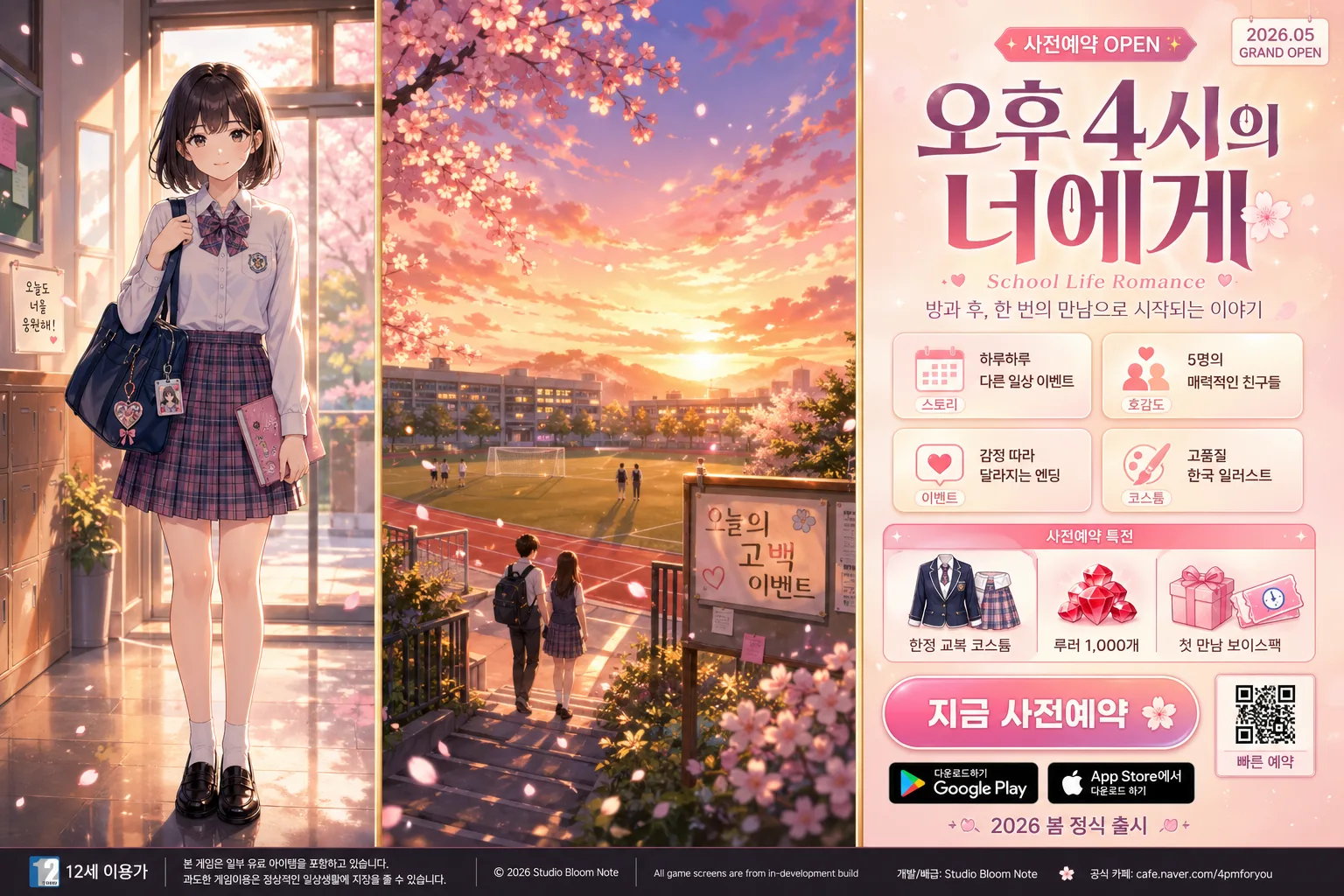
학원 로맨스 모바일 게임 광고
한국 학원물 청춘 로맨스 시뮬 광고. 교복 캐릭터 + 청춘 배경 + 한글 카피. 12세 이용가 톤.
학원 로맨스 모바일 게임 광고摘要
這是用來製作廣告/海報內容的 ChatGPT 圖像提示詞,已整理主題、背景、風格與構圖,方便快速調整。
相關關鍵字: 학원 로맨스 모바일 게임 광고, 학원 로맨스 모바일 게임 광고 프롬프트, 廣告/海報 프롬프트, 廣告/海報 AI 이미지 프롬프트, ChatGPT 이미지 프롬프트, AI 이미지 생성 프롬프트, AI 프롬프트, 이미지 프롬프트
학원 로맨스 모바일 게임 광고使用方式
保留原始結構並替換主體、背景、色彩或構圖,即可延伸出不同版本。
- 保留核心主體,並依品牌、季節或平台調整色彩與背景。
- 如果畫面太複雜,請減少背景元素並具體描述主體、構圖與光線。
- 複製後可要求 ChatGPT 配合平台、長寬比或文字需求調整。
提示詞原文
[Input]
- language: Korean
- output_size: 1536x1024

[Purpose]
Korean school-life romance mobile game advertising banner, 3 vertical panels, preorder promotion layout.
High-impact game ad designed for app store / social banner use, with clear title hierarchy, readable Korean UI text, youthful romance atmosphere, and rich campaign details such as preorder rewards, platform badges, mini feature cards, and event labels.

[Composition]
- Canvas uses a strict 3-panel vertical split, each panel occupying exactly 1/3 of the width, separated by thin gold dividers with subtle metallic sheen.
- Left panel: {캐릭터} shown as a full-body front-facing heroine, centered vertically, occupying about 72% of panel height, with school bag, ribbon accessory, ID-card charm, polished loafers, and believable uniform fabric folds.
- Center panel: {배경} as a scenic storytelling backdrop with the horizon line placed slightly below mid-height for depth; include school athletic field, sunset sky, distant school building windows, soft cherry blossom petals, a noticeboard, and a few small background student silhouettes for lived-in school atmosphere.
- Right panel: title stack, subtitle, CTA button, feature icons, release info, preorder reward strip, QR-code area, and platform badges arranged from top to bottom with strong mobile-ad readability.
- Overall framing must avoid a left-text/right-character ad formula; keep all three panels equally weighted and visually distinct, like a premium mobile game launch key visual.

[3. CORE STRUCTURE]
1. Left panel: full-body school uniform character, crisp anime cel-shading with premium game key-art rendering, clear silhouette separation, slight sparkle particles around hair and shoulders, soft edge lighting to lift from background. Add small natural props such as a school bag strap, diary notebook edge, phone charm, hair ribbon, and subtle shoe reflections on the floor.
2. Center panel: school athletic field at sunset, warm golden-hour sky, cherry blossoms or spring greenery drifting lightly, realistic bokeh circles in the distance, distant classmates walking home, a soccer goal, track lane markings, classroom windows catching amber light, and a small handwritten-style sign reading '오늘의 고백 이벤트'.
3. Right panel top: {게임 제목} in very large Korean display type, strong vertical stack, followed by {장르 라벨} as a smaller genre tag and {부제} beneath it in lighter weight. Add a compact campaign label above the title: '사전예약 OPEN', plus a small date chip reading '2026.05 GRAND OPEN'.
4. Right panel middle: four feature icons stacked in a polished 2x2 app-card grid, each icon paired with one short line from {feature 1}, {feature 2}, {feature 3}, {feature 4}; use pictograms with consistent line weight, glossy highlights, and small supporting labels such as '스토리', '호감도', '코스튬', '이벤트'.
5. Right panel lower-middle: include a preorder reward band with Korean microcopy '사전예약 특전' / '한정 교복 코스튬' / '루비 1,000개' / '첫 만남 보이스팩', plus tiny gem, gift box, heart, and ticket graphics.
6. Right panel bottom: CTA button with {CTA 문구} in bold white text, next to Google Play / App Store badges, a small QR-code area labeled '빠른 예약', and {출시 정보} placed just above the footer edge.
7. Footer strip across the full width: age rating text {연령 등급} in a small, highly legible label style, aligned to the lower edge. Add small legal-style publisher text such as '© 2026 Studio Bloom Note' and 'All game screens are from in-development build' in tiny readable Korean/English mixed footer type.

[4. STYLE RULES]
- Typography: use Pretendard ExtraBold for the title, Pretendard SemiBold for labels, Noto Sans KR Medium for subtitle/body, and a clean rounded sans for CTA; title size should dominate the right panel, with compact tracking and sharp stroke contrast.
- Color palette: warm peach #F9D7C2, soft pink #F7B9C8, sunset gold #E8C36A, cream white #FFF7EF, deep rose #D66A8A, muted sky blue #BFD7EA.
- Borders and dividers: thin gold divider lines 2px wide with 20% sheen, subtle inner glow, refined mobile-campaign finish.
- CTA button: rounded rectangle, coral-pink gradient to gold accent, 4px vertical shadow, 12px blur, 18% opacity, glossy highlight strip, small animated-heart style accent beside the text.
- Icon style: polished app-icon look, soft outline, small highlights, consistent spacing and size, with tiny UI labels and reward counters that feel like a real mobile game advertisement.
- Add realistic printed/digital campaign details: tiny barcode-like promo code area, QR-code square, app-store badge texture, coupon ticket strip, sparkly heart stickers, and faint translucent romance dialogue bubbles.

[5. VISUAL STYLE]
- Camera / lens: 50mm prime look, eye-level composition, gentle poster-like perspective with minimal distortion.
- Lighting: golden-hour sunlight from upper-left, soft fill from front-right, faint rim light around character hair and shoulders, background haze kept diffused.
- Color grade: warm peach + rose + amber cinematic anime grade, slightly lifted highlights, clean midtones, mild bloom on sparkles and sunset sky.
- Rendering: premium anime mobile game ad polish, high-resolution cel-shaded character over semi-realistic painted school environment, glossy UI panels, crisp readable typography, believable texture on fabric, paper tickets, metallic dividers, and app badges.

[6. MOOD]
Premium Japanese-Korean school romance game key art feel — polished mobile otome-ad style with a glossy App Store campaign finish, warm first-love emotion, spring semester excitement, and convincing preorder-ad realism.

[7. CRITICAL]
- Korean text accuracy: the following Korean strings must appear exactly and be legible: {게임 제목}, {장르 라벨}, {부제}, {feature 1}, {feature 2}, {feature 3}, {feature 4}, {CTA 문구}, {출시 정보}, {연령 등급}.
- Additional Korean ad text should be clean and readable, including short labels such as '사전예약 OPEN', '사전예약 특전', '한정 교복 코스튬', '루비 1,000개', '첫 만남 보이스팩', and '빠른 예약'.
- The layout must remain a 3-panel vertical split with equal widths and thin gold dividers.
- Left panel character must be full-body, front-facing, and clearly school-uniformed, with wholesome school-life styling and natural proportions.
- Do not merge panels or reintroduce a left-text/right-character layout.
- Hands, if visible, must be anatomically correct and natural.
- All UI elements, badges, QR area, reward tickets, feature cards, and footer text should look like a real mobile game launch advertisement, not a blank template.

[8. 🚫 PROHIBITED]
- Fake official seals / certifications
- Broken Korean characters
- Celebrity composites or unauthorized likeness